Re: Rail S America [21.11.13] BETA READY
Moderator: Cartographers
Forum rules
Please read the Community Guidelines before posting.
Please read the Community Guidelines before posting.
Re: Rail South America
Anyone ready to get this one moving again 

* Pearl Harbour * Waterloo * Forbidden City * Jamaica * Pot Mosbi
Re: Rail South America
That might be possible...i don't know if it would be too much for the map - there is already a lot happening...but we can see.Nola_Lifer wrote:It would be cool to see some mountains and rivers on this one or some sort of topography.

* Pearl Harbour * Waterloo * Forbidden City * Jamaica * Pot Mosbi
Re: Rail South America
onbekende...i hope you're still around....onbekende wrote:Hello, its your friendly neighbourhood occational, sporadic, hardly around, sometimes, ghostly poster on maps. Yo cairnswk
i think the difference between you calcs and mine....was the 9 divider...why did you do 9?In light of your Rail Asia map I read about this one, popped in to see how it is and throw in totally unwanted and mostly ignorable advice.Will do the usual bonus calc and general observations and will do them per line/letter (not nitcpicking every detail). The bonus I calc is my old formula (slightly adjusted) of: [( #terts * 1.5 ) + ( #terts to defend * 4 ) + ( #terts that can be attacks from it * 2 ) + ( #continents adjecent * 1 )] / 9 => #bonus
sorry, simply don't understand this...can you explain please?So we got an obvious GNSET-stronghold and a lesser HODUKM stronghold that is an expantion stronghold (first H => HO => HODU => HODUKM)

* Pearl Harbour * Waterloo * Forbidden City * Jamaica * Pot Mosbi
Re: Rail S America [27.12.12] V3-P2
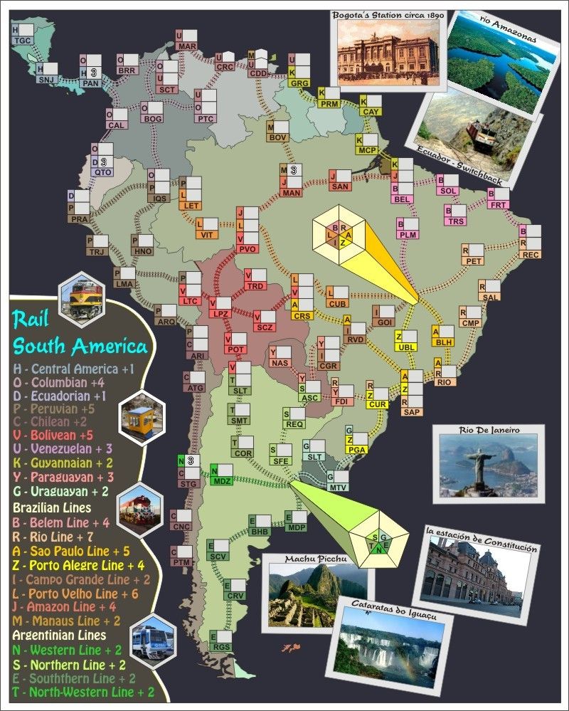
the red in the legend is really blurry, is that the way you want it?
Re: Rail S America [27.12.12] V3-P2
No, greenoaks and thanks for dropping in...belated Xmas wishes.greenoaks wrote:the red in the legend is really blurry, is that the way you want it?
this is possibly from the background colour, so will see about adjusting those next version.
Version 3.
1. added 2 more terts (SMT - T line and CMP - R LIne) to make 108 with 4 neutrals for 104 golden number drop.
2. map shows 4 neutrals.
3. some adjustments made from onbekende suggestions about the columbian line for BRR.
4. Onbekende's bonus recommendations implemented but will need review
5. feedback requireed about having station shapes like CDD and CRC
To Do List:
1. Get names on Brazilia and Buenos Aires stations.
2. Discuss bonuses.
3. Get approval for Super Size.

* Pearl Harbour * Waterloo * Forbidden City * Jamaica * Pot Mosbi
- koontz1973
- Posts: 6960
- Joined: Thu Jan 01, 2009 10:57 am
Re: Rail S America [27.12.12] V3-P2
Thanks for move koontz, and supersize request done.koontz1973 wrote:Quick move for you. Do not forget to PM isaiah40 for supersize.

* Pearl Harbour * Waterloo * Forbidden City * Jamaica * Pot Mosbi
Re: Rail S America [27.12.12] V3-P2
greenoaks. pls refresh. i've changed that Neon Red to Tropical Pink....and it is mucho better now.cairnswk wrote:No, greenoaks and thanks for dropping in...belated Xmas wishes.greenoaks wrote:the red in the legend is really blurry, is that the way you want it?
this is possibly from the background colour, so will see about adjusting those next version.
To Do List:
1. Get names on Brazilia and Buenos Aires stations.
2. Discuss bonuses.
3. Get approval for Super Size.

* Pearl Harbour * Waterloo * Forbidden City * Jamaica * Pot Mosbi
- Funkyterrance
- Posts: 2494
- Joined: Wed Jan 19, 2011 10:52 pm
- Gender: Male
- Location: New Hampshire, USA
Re: Rail S America [27.12.12] V3-P2
The closest I ever came to crying when looking at a new map. You don't need to know the colors to read it! It's a beautiful thing. If this system of map labeling could be applied to all maps you would be the hero of chromatically challenged players everywhere!
I have to admit that at first glance I let out a sigh when I saw all the subtle color changes but was oh so pleasantly surprised when I noticed they didn't matter. The map could appear like Das Schloss to me but I wouldn't care as long as I could figure the bonuses easily like I can on this one.
On a small side note, I would prefer that the photos were run through a paintbrush filter or something so they matched the vibe of the map better but this of course is purely a creative viewpoint.

Re: Rail S America [27.12.12] V3-P2
Pleased the system works for you FT.Funkyterrance wrote:The closest I ever came to crying when looking at a new map. You don't need to know the colors to read it! It's a beautiful thing. If this system of map labeling could be applied to all maps you would be the hero of chromatically challenged players everywhere!
I have to admit that at first glance I let out a sigh when I saw all the subtle color changes but was oh so pleasantly surprised when I noticed they didn't matter. The map could appear like Das Schloss to me but I wouldn't care as long as I could figure the bonuses easily like I can on this one.
You mean like the ones I did in Moscow?On a small side note, I would prefer that the photos were run through a paintbrush filter or something so they matched the vibe of the map better but this of course is purely a creative viewpoint.

* Pearl Harbour * Waterloo * Forbidden City * Jamaica * Pot Mosbi
Re: Rail S America [29.12.12] V4-P2 Gameplay
Front page upadted with codes and names of towns and continents from preliminary XML, and the drop, plus names for starting neutral territories, plus prelim 88s from xml.

* Pearl Harbour * Waterloo * Forbidden City * Jamaica * Pot Mosbi
Re: Rail S America [29.12.12] V5-P3 Gameplay
i like the 'red' much better now.
Re: Rail S America [29.12.12] V5-P3 Gameplay
Excellent, any other suggestions ?greenoaks wrote:i like the 'red' much better now.

* Pearl Harbour * Waterloo * Forbidden City * Jamaica * Pot Mosbi
Re: Rail S America [29.12.12] V5-P3 Gameplay
i would be interested to see what FT is suggesting with the photos however i do like them the way they are.
i can't find anything to nitpick you about.
i can't find anything to nitpick you about.
Re: Rail S America [29.12.12] V5-P3 Gameplay
OK thanks. point noted.greenoaks wrote:i would be interested to see what FT is suggesting with the photos however i do like them the way they are.
Well have a go at this below.i can't find anything to nitpick you about.
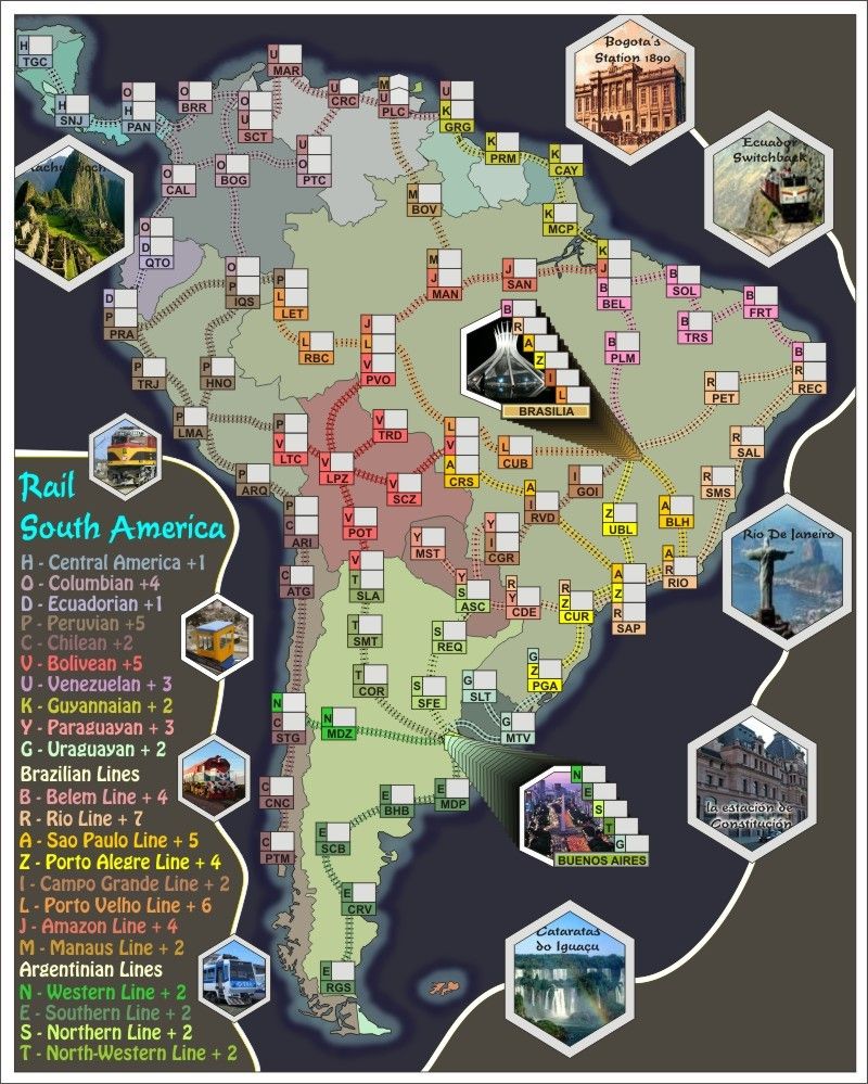
I wasn't quite happy with the photos and the legend images being different.
So i've spent a few hours re-designing...not quite finished yet...but didn't want to take it any further in case no-one liked it.
As you can see Brasilia and Buenos Aires have new "building" type stations which is a departure from the previous main terminals with exception of Rail Australia.
I think this design works well allowing those images in there.
Anyway....what does everyone think?

* Pearl Harbour * Waterloo * Forbidden City * Jamaica * Pot Mosbi
Re: Rail S America [29.12.12] V6-P3 Design Change?
I think the E-bonus is a bit too isolated. It'll be hard to reach for an elimination if someone has the dropped on RGS.
I've always liked Railmaps, so I hope you're gonna make another awesome one.
I've always liked Railmaps, so I hope you're gonna make another awesome one.

Re: Rail S America [29.12.12] V6-P3 Design Change?
OK. I understand. Do you offer an alternative.JBlombier wrote:I think the E-bonus is a bit too isolated. It'll be hard to reach for an elimination if someone has the dropped on RGS.
I've always liked Railmaps, so I hope you're gonna make another awesome one.
I could put the neutral 3 that was going on CUR down there so that nobdy gets that on the drop.

* Pearl Harbour * Waterloo * Forbidden City * Jamaica * Pot Mosbi
- koontz1973
- Posts: 6960
- Joined: Thu Jan 01, 2009 10:57 am
Re: Rail S America [29.12.12] V6-P3 Design Change?
cairns, the new photo look is nice. It brings in a sense of the older maps with the shapes but the frame can do with a lot of love (early days I know but just want to get my opinion in). Which leads me onto my next point, the terminus, the shape, or lack of one is different and nice (I always like different). But does B connect to L and N to G. This will need to be put onto the map.
To sort the E bonus out, why not connect PTM to SCB?
Falkland islands, why are they on the map? They do not have railways and certainly not owned by anyone in the region.


Overall, a good update.
To sort the E bonus out, why not connect PTM to SCB?
Falkland islands, why are they on the map? They do not have railways and certainly not owned by anyone in the region.
Overall, a good update.

Re: Rail S America [29.12.12] V6-P3 Design Change?
Claimed by Argentinakoontz1973 wrote:...
Falkland islands, why are they on the map? They do not have railways and certainly not owned by anyone in the region.


* Pearl Harbour * Waterloo * Forbidden City * Jamaica * Pot Mosbi
Re: Rail S America [30.12.12] V7-P3 Design Change?
Thanks koontz. pleased you like.koontz1973 wrote:cairns, the new photo look is nice. It brings in a sense of the older maps with the shapes but the frame can do with a lot of love (early days I know but just want to get my opinion in). Which leads me onto my next point, the terminus, the shape, or lack of one is different and nice (I always like different). But does B connect to L and N to G. This will need to be put onto the map.
To sort the E bonus out, why not connect PTM to SCB?
...
Overall, a good update.
Version 7.
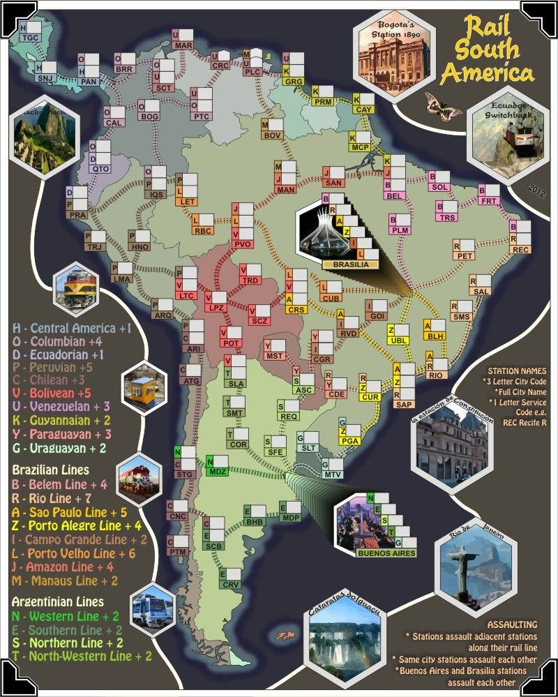
1. Assault and Station Name notation placed on map
2. photos a little more sorted
3. corner holders in place, that should finish the frame
4. SCB connected CNC, and RGS removed to still make 109 regions.
5. Title, sig etc in place.
6. All photos have been treated through the high quality tracing utility
7. Legend spread out a little

* Pearl Harbour * Waterloo * Forbidden City * Jamaica * Pot Mosbi
- koontz1973
- Posts: 6960
- Joined: Thu Jan 01, 2009 10:57 am
- koontz1973
- Posts: 6960
- Joined: Thu Jan 01, 2009 10:57 am
Re: Rail S America [29.12.12] V6-P3 Design Change?
cairns, 2 things before this map can go forward.
- Firstly the sizing issue. This is a big concern at the moment and it looks like it will not be needed for this one. You have a 1000 in height but you need to get it down to the 800 limit. This should really not be to much hassle. It will make the map more square but this is a must right now.
- Secondly, this is going to be the last one allowed. That means no Rail Antarctica or Rail Mars etc.

Re: Rail S America [29.12.12] V6-P3 Design Change?
No. no-one has got back to me about the size as it seems everyone except you (and now Nolefan5311) are on hols.koontz1973 wrote:Heard anything about the size application yet?

* Pearl Harbour * Waterloo * Forbidden City * Jamaica * Pot Mosbi
Re: Rail S America [29.12.12] V6-P3 Design Change?
Downsizing the map loses its flavour and i'm not prepared to squash S America to be more square for the sake of a few pixels.koontz1973 wrote:cairns, 2 things before this map can go forward.
koontz
- Firstly the sizing issue. This is a big concern at the moment and it looks like it will not be needed for this one. You have a 1000 in height but you need to get it down to the 800 limit. This should really not be to much hassle. It will make the map more square but this is a must right now.
- Secondly, this is going to be the last one allowed. That means no Rail Antarctica or Rail Mars etc.
I have examined the map and without including the bottom where there is no rail line, i can bring it down to a small version of 750W x 800H.
As for being the last map in the Rail series, i never intended to make R Antartica and R Mars, but did intend on making a R North America.
May i ask who made that decision that this was to be the last rail map? and why it was made? I am sure all the rail fans out there would like to know also.

* Pearl Harbour * Waterloo * Forbidden City * Jamaica * Pot Mosbi
- koontz1973
- Posts: 6960
- Joined: Thu Jan 01, 2009 10:57 am
Re: Rail S America [29.12.12] V6-P3 Design Change?
You know full well decisions like this are made above my pay grade.
But get this one down as small as you can get it cairns. It will not be allowed forward if a pixel cannot be justified. These are the new rules we all have to live by.
As for the last one, even I have to say that this is not unique in any way now. As you know, that is one of the requirements for a new map. As for Rail North America, we already have Rail USA. Nothing unique about that at all.


