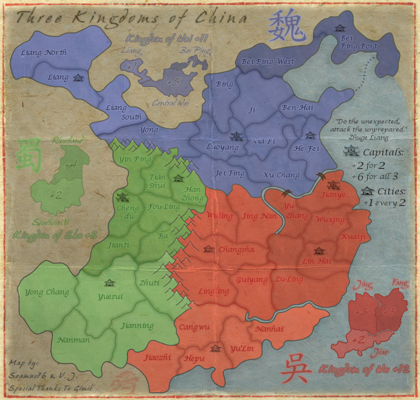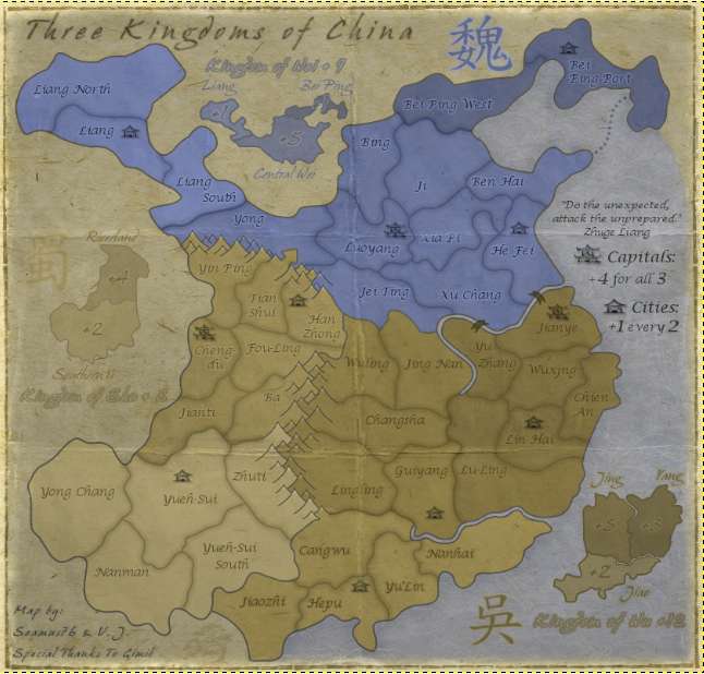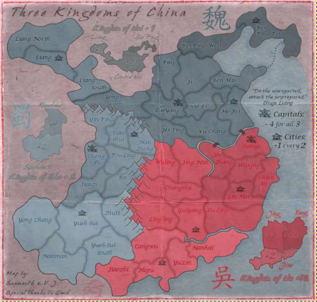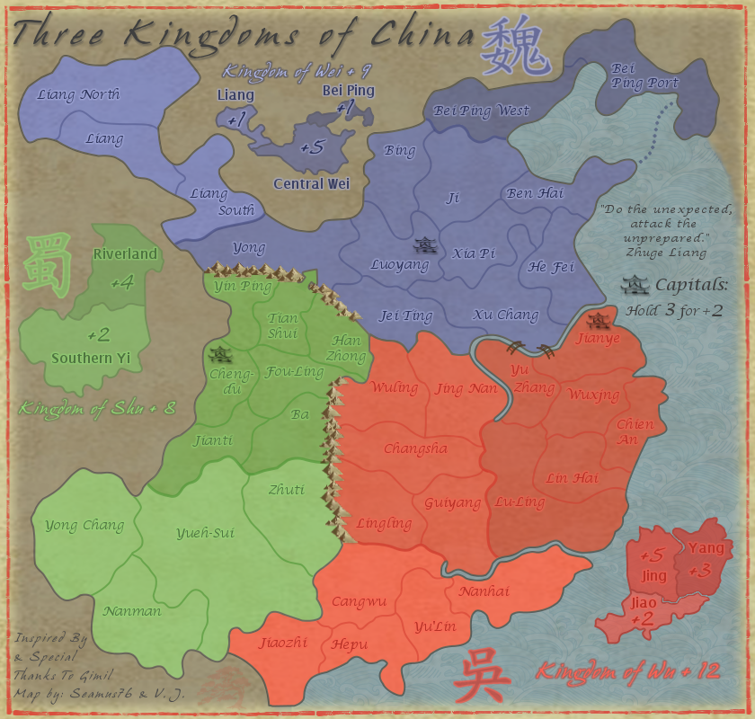


Map Name:Three Kingdoms of China
Mapmaker(s): Seamus76 & V.J.
Number of Territories: 42
Special Features: Super Region bonuses, etc.
What Makes This Map Worthy of Being Made: It's based on an interesting time period in the history of China, a very culturally and historically important region.
"I love this map, it's graphics draw you in like a warm, soft blanket that snugly wraps around you, and then suffocates you with massively simplistic gameplay." says CC Map Reviewer Mas Sue67
Description: "Do the unexpected, attack the unprepared." Zhuge Liang
This map takes place from approximately 220ce-280ce when China was split into Three Kingdoms following the loss of power of the Han Dynasty. The map features incredibly nice Asian themed graphics, and incorporates multiple bonus opportunities including taking capitals, and overriding super region bonuses.
Based on gimil's original Era of The Three Kingdoms map, http://www.conquerclub.com/forum/viewto ... 42&t=51881, this map will try to stay true to his main intention of creating a nice map with simple, easy gameplay that anyone could play.
TERRITORIES
42 territories in total
3 will be Capitals, and are included in the Capital Bonus listed below. All three will be coded neutral to avoid a bonus on the drop.
8 will be Cities, and are included in the City Bonus listed below. Each player will start with 1, the others will end up being neutral.
BONUSES
Region Bonus = 8 regions in total (bonuses +1 to +5)
Super Region Bonus = 3 super regions in total (bonuses +8 to +12)
Capital Bonus = +2 for holding 2, and +6 for holding all 3. (Each Capital starts 2 neutral)
City Bonus = +1 for every 2 Cities held (Each starting neutral City will start 2 neutral)
STARTING POINTS
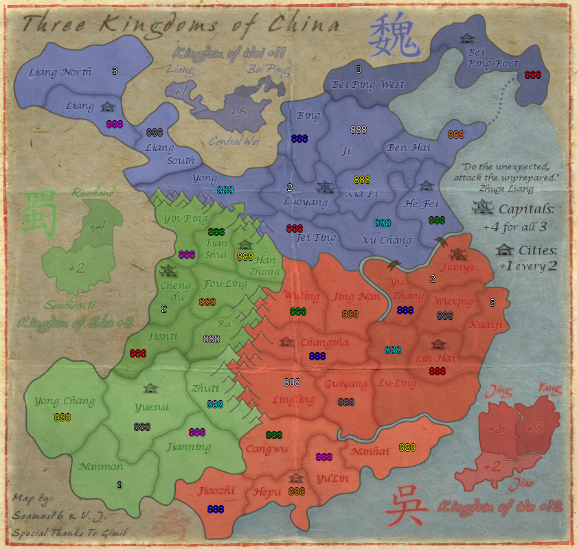
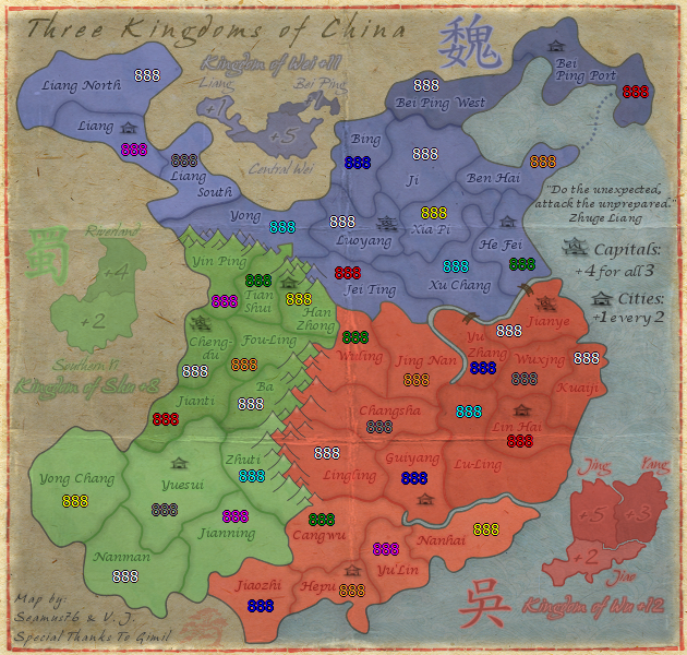
Currently 36 territories can be starting positions. This excludes 3 Capitals, Bei Ping West, Liang North, and Nanman(2n) which will all be coded neutral (6 terts in total).
2p: 1 city position plus 9 other regions (10 total) each, 6 coded neutrals, 6 neutral city positions, 10 random neutrals = 42 total
3p: 1 city position plus 9 other regions (10 total) each, 6 coded neutrals, 5 neutral city positions, 1 random neutral = 42 total
4p: 1 city position plus 7 other regions (8 total) each, 6 coded neutrals, 4 neutral city positions, 0 random neutrals = 42 total
5p: 1 city position plus 5 other regions (6 total) each, 6 coded neutrals, 3 neutral city positions, 3 random neutrals = 42 total
6p: 1 city position plus 4 other regions (5 total) each, 6 coded neutrals, 2 neutral city positions, 4 random neutrals = 42 total
7p: 1 city position plus 4 other regions (5 total) each, 6 coded neutrals, 1 neutral city position, 0 random neutrals = 42 total
8p: 1 city position plus 3 other regions (4 total) each, 6 coded neutrals, 0 neutral city positions, 4 random neutrals = 42 total
CURRENT MAP VERSION
v10.1 - Large (840x800) v10.1 - Small (630x600) CURRENT UPDATE INFO - 2015-01-20:
Spoiler
- Tried to bring out the Wu tert names a bit (the red names), but can't really change those too much without changing the entire color scheme.
- I did not change the Wu symbol, because again that would require changing the other colors, which I really don't want to do. I also think it adds to the overall "aged" look of the map to have the symbols faded in a way. They are also just there for aesthetic purposes, so not really a big part.
- I'm not sure about the character to the left of jiaozhi, maybe the little red bonsai tree? There were a couple of scratches in that tert I cleaned up, but the bonsai is just a symbol I threw in at the beginning.
Spoiler
Spoiler
Spoiler
Spoiler
v10.0 - Small (630x600) http://imageshack.com/a/img163/4/pf9z.png
v9.0 - Large (840x800) http://img196.imageshack.us/img196/733/kb48.png
v9.0 - Small (630x600) http://img19.imageshack.us/img19/1343/eogz.png
v8.0 - Large (840x800) http://img43.imageshack.us/img43/8729/t ... arge84.png
v8.0 - Large (840x800)-with 888's and starting neutrals http://img221.imageshack.us/img221/8729 ... arge84.png
v8.0 - Small (630x600) http://img197.imageshack.us/img197/7511 ... mall63.png
v7.0 - Large (840x800) http://img254.imageshack.us/img254/5756 ... arge84.png
v7.0 - Small (630x600) http://img20.imageshack.us/img20/6019/t ... mall63.png
v6.4 - Large (840x800) http://img96.imageshack.us/img96/8619/t ... arge84.png
v6.3 - Large (840x800) http://img812.imageshack.us/img812/5072 ... arge84.png
v6.2 - Large (840x800) http://img594.imageshack.us/img594/2876 ... arge84.png
v6.1 - Large (840x800) http://img689.imageshack.us/img689/9990 ... arge84.png
v6.0 - Large (840x800) http://img825.imageshack.us/img825/2847 ... arge84.png
v5.2 - Large (840x800) http://img843.imageshack.us/img843/9590 ... arge84.png
v5.1 - Large (840x800) http://img707.imageshack.us/img707/8503 ... arge84.png
v5.0 - Large (840x800) http://img689.imageshack.us/img689/3156 ... arge84.png
v4.2 - Large (840x800) http://img201.imageshack.us/img201/7420 ... arge84.png
v4.1 - Large (840x800) http://img138.imageshack.us/img138/8900 ... arge84.png
v4.0 - Large (840x800) http://img405.imageshack.us/img405/8438 ... arge84.png
v3.2 - Large (840x800) http://img705.imageshack.us/img705/2996 ... arge84.png
v3.1 - Large (840x800) http://img515.imageshack.us/img515/1422 ... arge84.png
v3.0 - Large (840x800) http://img96.imageshack.us/img96/815/th ... arge84.png
v2.3 - Large (840x800) http://img7.imageshack.us/img7/3003/thr ... arge84.png
v2.2 - Large (840x800) http://img7.imageshack.us/img7/974/thre ... arge84.png
v2.1 - Large (840x800) http://img42.imageshack.us/img42/8748/t ... arge84.png
v2.0 - Large (840x800) http://img705.imageshack.us/img705/8154 ... arge84.png
v1.1 - Large (840x800) http://img541.imageshack.us/img541/6972 ... arge84.png
v1.0 - Large (840x800) http://img534.imageshack.us/img534/8133 ... arge84.png
Spoiler
- Updated the Capital bonus from being only +4 for 3, to +2 for 2 and +6 for all 3.
Attached are the updated map images and xml.
UPDATE INFO - 2013-08-05:
- Updated the XML (China-v10) to fix Liang North being a City.
FOR NEXT UPLOAD:
- We need to make sure whatever version is uploaded next has Liang North as a regular tert, not a City, and has a City bonus equaling +1 for every 2 Cities. Right now those have been the only issues, but whatever current version is being used has no City bonus at all, which is a big problem.
UPDATE INFO - 2013-07-31:
- Updated the XML (china8) to fix the City bonus error. Thanks Gilligan.
UPDATE INFO - 2013-07-01:
- Moved the City from Guiyang to Changsha to enhance gameplay.
Will update OP with new XML ASAP.
UPDATE INFO - 2013-06-09:
- Updated only the 888's & Starting Position versions for both maps.
- Changed Kuaiji to a coded neutral tert to make all of our starting numbers work.
- Updated all of the starting numbers listed above to now work correctly. Mainly changed 1v1 games from 10 starting terts per player to 14.
UPDATE INFO - 2013-04-21:
Updated both versions with the below:
- Increased the Kingdom of Wei bonus from +9 to +11
- Decreased the coded neutral on Nanman from 3n to 2n (updated in the 888 and Starting Position version below)
- Changed Chien-An to Kuaiji,
- Changed Yueh-Sui to Yuesui
- Changed Yueh-Sui South to Jianning
UPDATE INFO - 2013-04-06:
Posted are the current large and small versions, including 888 versions of both. These should be good to go, but if there is anything that needs tweeking let me know, but once we get the stamp I'll kick V.J.'s ass to get the xml asap.
UPDATE INFO - 2013-03-24[/b]:
- Changed the Wu character outer edge color to the lighter color that's also inside the Kingdom of Wu header.isaiah40 wrote:I think the Wu character would look better if the outside is a lighter color, which would also be in line with the other 2. While you get that done I'll go ahead and get this stickied for you!!
Thanks for the sticky. Working on small version now as well.
UPDATE INFO - 2013-03-22[/b]:
- Made a lot changes, including all of the below from isaiah40, and Koontz, I also made those bonus lines darker, they should work for you.
UPDATE INFO - 2013-03-20:isaiah40 wrote:1. The bonus amounts on the mini-map for Wu, especially on Yang is very hard to read. Maybe increase the outer glow a tad bit to make it stand out more. The same on Jing. Done
2. The bonus amount on Bei Ping is also hard to read, move it beside Bei Ping. I don't want to move it out, but I did bring out the outer glow more, which makes it easier to read.
3. The Chinese character for Shu is hard to see as well, it needs to be darkened a bit.Done
4. Kingdom of Wu text is hard to tell exactly what it is. It looks like the "g" is an "s".
5. Kindom of Shu text is hard to read due to the light color you have. My suggestion is to use the same dark color you have for the bonus amounts.
6. I think that you will also need to adjust the kerning of the text for each "the Kingdom of ..." as the letters are very close together which also makes them hard to read. I can read them fine because I've been following the map, but first time players probably will have a hard time reading them.Numbers 4-6 should be good as well. I brought them all out more, and increased the kerning on all of the "Kingdoms" test from 2-4, so double. Also, used a separate layer for the "+" values so I could bring them closer to the text, rather than being effected so much by the kerning.
- Added in the Eastern mountains.
- Redid the Northern mountains to include a few blue ones.
- Did a ton of general touch ups, border lines, stray pixels, etc. Still need to go over it again.
If this is acceptable I will go ahead and start on the small map. Let me know your thoughts.
UPDATE INFO - 2013-03-18:
- Redid the Northern Shu mountains, and added a bit of "snow color" to the tops, but nothing else at the moment. Before I add more color to them, and more importantly before I do the Eastern mountains I want to get everyone's thoughts on these, especially isaiah40. I actually think they do look better and fit more with the style of the map, and if everyone agrees I'll go ahead and finish them up in this style.
UPDATE INFO - 2013-02-25:
- Moved any tert names that were under a crease. On tert names where I could not move them due to the size of the tert I used a couple of different ways to get it to look more effected by the crease then before, but keeping them still readable.
UPDATE INFO - 2013-02-22:
- Redid the Southern mountains, which I think look pretty good, and are no longer just a straight line.
- Redid the mini-map bonus label text fonts, which now match the kingdom font.
- Worked on the title again.
As for the crease I think it actually looks pretty good as well, and much more realistic than the previous lines. Correct me if I'm wrong but I also think it makes it stand out from other maps, as I'm not sure there are any others with such a style of crease. I plan to be going with this version moving forward, but can certainly move tert names around as needed if people have a problem with any overlaps.
UPDATE INFO - 2013-02-14:
Thanks everyone for the feedback. I'll try to work on the mountains and see if I can give them a little more life. Based on the mountains I currently have please let me know any thoughts or suggestions on helping them. Things I did do are:
- Worked on the title to make it more part of the paper, so that it wasn't floating above the piece.
- Completely redid the creases.
UPDATE INFO - 2013-02-03:
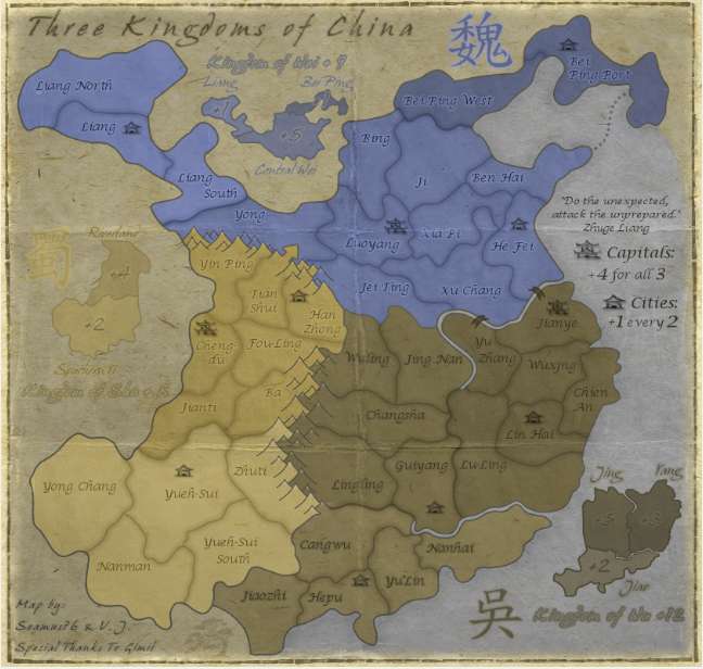
- After great feedback (thank you all so much), Noles comments, discussion with Koontz and V.J. we're going to keep the Capital bonus as it is, +4 for holding all 3 Capitals. The change will be that the Capitals will start 2n instead of 3n. This will help keep the map simple and not over-bonus a small map, and at the same time allow the Capital bonus to come into play for more types of games. So the map itself hasn't really been updated since v4.1, but the Starting Neutral/888 version has been updated in the OP, and the OP itself has been updated to reflect the new neutrals. I think this will work best, and hope everyone agrees.
UPDATE INFO - 2013-01-29:
Starting to work on graphics in anticipation of GP stamp. Personally I really like this map, so please let me know what I need to work on.
- Added slight shadow to the coastline.
UPDATE INFO - 2013-01-23:
- Split Yueh-Sui into two terts, which was something I had been looking at for awhile, but was confirmed by bison kings comment. It had come up in the original thread, but for some reason gimil was against splitting it.
- Updated the tert count info at the top of the OP, can someone take a look and make sure it all adds up and makes sense based on the updated v4.0 with 888's and starting neutrals below? Do any more terts need to be coded neutral, etc.
UPDATE INFO - 2013-01-11:
- Moved the red and green mini-map labels outside of the map.
- Brought out the names more.
- For now just lowered the opacity of the line.
UPDATE INFO - 2013-01-11:
- Scaled down the Shu mini-map.
- Lowered the opacity of some of the mini-map bonus names. I think they pop less, and all blend in better.
- Added in a different paper background along the lines of what Koontz suggested, and added creases to grunge it up and make it a little more
As for the one-way arrow, I'm not sure adding text for that is going to work, spacially that is. I tried moving the mini-map around to see where and how it would fit, and it was really rather awkward and detached.
UPDATE INFO - 2013-01-09:
- Added some more color to the bridges to fill them in, but they are meant to be oriental style walking bridges, so I didn't want to completely fill them in.
- Re-did the one-way arrow from Tian Shui to Yong. Should be pretty clear now, but if not let me know.
- Need to add a little shadow to the mountains, as per cairns' suggestion.
Let's get some stamps on this bad boy.
UPDATE INFO - 2013-01-08:
- Updated the mountains. Not sure I can do much better than these. If these are acceptable I'll work on the coloring at the base of the mountains to blend them in a bit better.
- Lightened the map a bit.
- Added a little more texture to the entire map.
- Added a dark shadow around the tert lines.
What else? Let's get some stamps on this bad boy.
UPDATE INFO - 2013-01-03:
- Moved the City icon from Liang North to Liang.
What else? Let's keep this one moving.
As for the bonsai tree, it's supposed to be a faded red silhouette, red being the Chinese color for good luck. I also did try using an actual looking tree, but it didn't look right with the rest of the look and feel of the map. Surely this shouldn't hold up the progress of the map, right.Postby koontz1973 on Thu Jan 03, 2013 1:30 am
Seamus, Last thing from me before I pass you over to the game play boys, that bonsai tree, make it look like a tree. Brown trunk, green leaves.
UPDATE INFO - 2013-01-02[/b]:
- Adjusted the size of the title to fit better.
- Brought out the Bonsai tree in the bottom left a little bit more.
- Redid all of the mountains by hand. (Insert patting self on back here
The main thing is that I added 8 cities to be part of the new City Bonus of +1 for every 2. Each player will start with 1 city. I also plan to move the City from Liang North to Liang, so that it has two borders.
UPDATE INFO - 2013-01-01[/b]:
- Updated the title and added a slight drop shadow. The position still needs to be adjusted though.
- Brought out the tert borders a little, especially for Wu.
- Toned down the Wei mini-map labels.
- Added the one-way assault through the mountains.
- Updated the mountains.
- Other general cosmetic touch ups.
Looking for some input on the capital bonus. Is it too simple the way it is? Should it be something like Hold all 3 for one round to win, or +5 for 3, etc.? I think other than that most of the gameplay issues were all worked out on the original map, but please let me know some thoughts.
UPDATE INFO - 2012-12-26[/b]:
To Do:
- Finish mountains
- Touch up bridges
- Tone down blue mini-map text color
- Touch up border where ocean meets brown land
- Add drop shadow to title
