It would appear that development of this map has stalled. If the mapmaker wants to continue with the map, then one of the Foundry Moderators will be able to help put the thread back into the Foundry system, after an update has been made.
Philadelphia [Quenched]
Moderator: Cartographers
Re: Philadelphia - [3 November 2012] pg 33-Minimap?
[Moved]
It would appear that development of this map has stalled. If the mapmaker wants to continue with the map, then one of the Foundry Moderators will be able to help put the thread back into the Foundry system, after an update has been made.
It would appear that development of this map has stalled. If the mapmaker wants to continue with the map, then one of the Foundry Moderators will be able to help put the thread back into the Foundry system, after an update has been made.
-
 isaiah40
- Posts: 3990
- Joined: Mon Aug 27, 2007 7:14 pm


Re: Philadelphia: 12/7 Lg & Sm + slight alterations pg. 34
Jeez... take a lil longer than you thought and people think you're dead. 

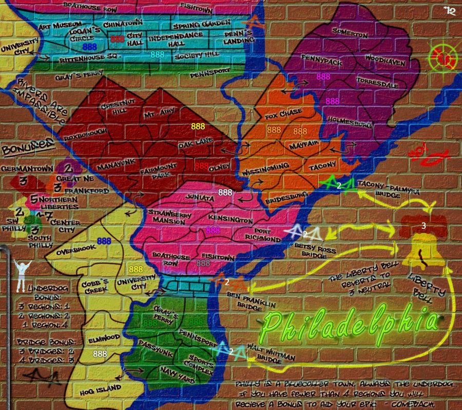
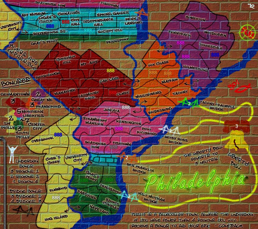
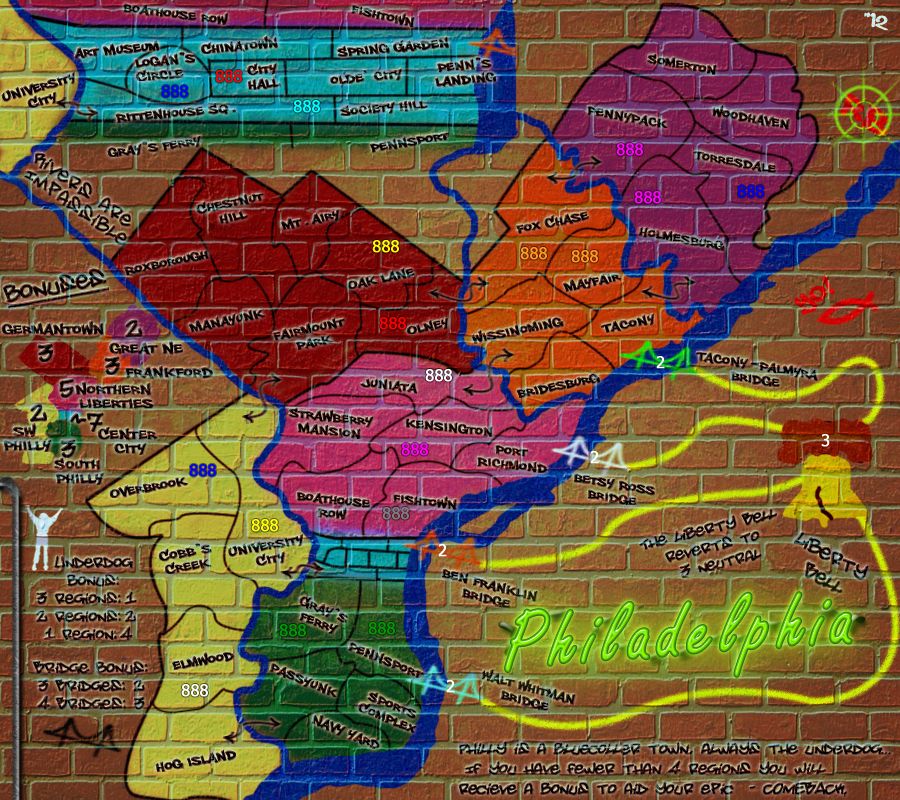
Large:
Image size: 900x800
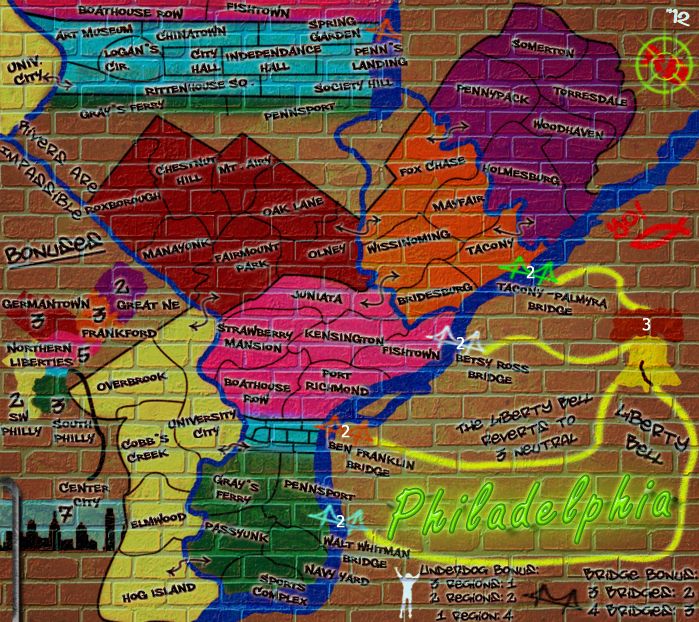
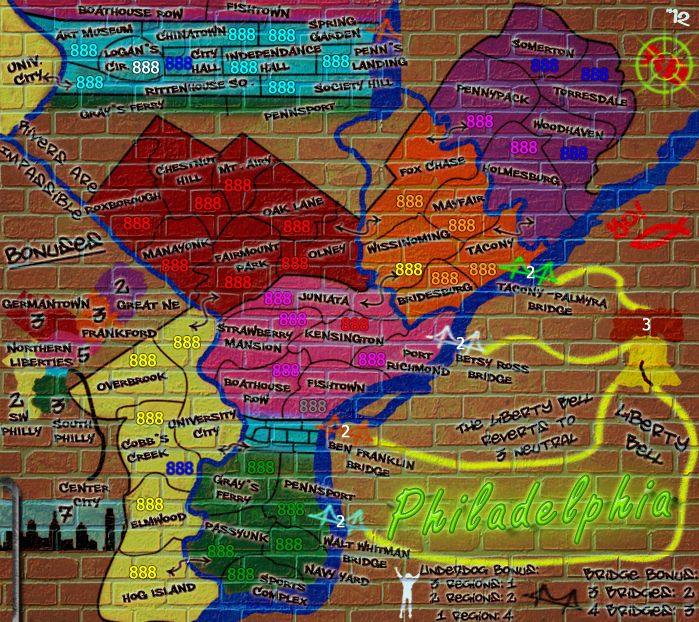
Small:
Image size: 700x622
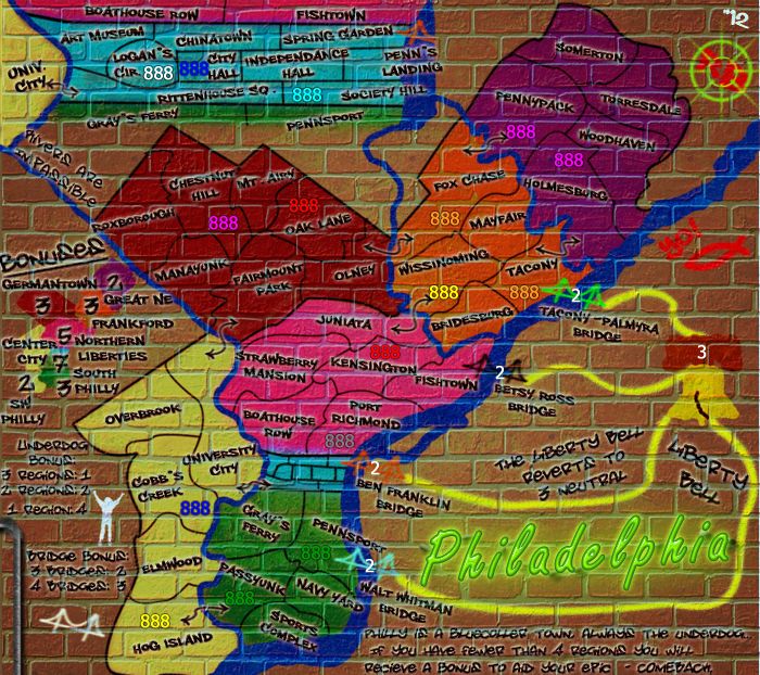
Feeling a lil cramped on the small map, mainly in the inset, and the minimap. Also trying paths with out the arrow ends on the small map what does you guys think? And I see the 1 pixel artifact on the right side of the small map, I have already rectified this for the next update.


-

 RedBaron0
- Posts: 2657
- Joined: Sun Aug 19, 2007 12:59 pm
- Location: Pennsylvania


Re: Philadelphia: 12/7 Lg & Sm + slight alterations pg. 34
RedBaron0 wrote:Jeez... take a lil longer than you thought and people think you're dead.
Well, if you act like a dead person, we will hold a wake for you, get completely pissed and pass around funny stories of when e knew you.
Back you go.
For how long this time, we can only guess.

-

 koontz1973
- Posts: 6960
- Joined: Thu Jan 01, 2009 10:57 am


Re: Philadelphia: 12/7 Lg & Sm + slight alterations pg. 34
RB0, right now, my impression is this: with the style of map you have chosen, you are not likely to get it any better. People will say that this or that needs changing, but this is likely to be all opinion. Graphically, their is nothing really wrong with it apart from the small maps text. A little hard to read but again, that is something people can get over very easily so does not really need changing. Lets see if we can get this moved on.

-

 koontz1973
- Posts: 6960
- Joined: Thu Jan 01, 2009 10:57 am


Re: Philadelphia: 12/7 Lg & Sm + slight alterations pg. 34
yeah that's my impression as well, I'll tweak here and there and see if I can't squeeze a point or 2 of legibility out of the small map text.


-

 RedBaron0
- Posts: 2657
- Joined: Sun Aug 19, 2007 12:59 pm
- Location: Pennsylvania


Re: Philadelphia: 12/7 Lg & Sm + slight alterations pg. 34
RedBaron0 wrote:yeah that's my impression as well, I'll tweak here and there and see if I can't squeeze a point or 2 of legibility out of the small map text.
RB0...only things i can't read on the small map are the story and the bridges and underdog bonuses....fwiw
but then i could always look a the big map to see what is what, but some others might not do that.

* Pearl Harbour * Waterloo * Forbidden City * Jamaica * Pot Mosbi
-

 cairnswk
- Posts: 11510
- Joined: Sat Feb 03, 2007 8:32 pm
- Location: Australia


Re: Philadelphia: 12/7 Lg & Sm + slight alterations pg. 34
I could leave the story off the small map all together, have it just be a large map perk. Move the underdog and bridge legend stuff over to that portion of the map? Or even cut it out of the map entirely, then I can expand on the main bonus section, break up the mini map along the left side of the map?


-

 RedBaron0
- Posts: 2657
- Joined: Sun Aug 19, 2007 12:59 pm
- Location: Pennsylvania


Re: Philadelphia: 12/7 Lg & Sm + slight alterations pg. 34
RedBaron0 wrote:I could leave the story off the small map all together, have it just be a large map perk. Move the underdog and bridge legend stuff over to that portion of the map? Or even cut it out of the map entirely, then I can expand on the main bonus section, break up the mini map along the left side of the map?
Mmm. would that not lose the essence of the map, and particularly since most players seem to prefer the small maps. Up to you.

* Pearl Harbour * Waterloo * Forbidden City * Jamaica * Pot Mosbi
-

 cairnswk
- Posts: 11510
- Joined: Sat Feb 03, 2007 8:32 pm
- Location: Australia


Re: Philadelphia: 12/7 Lg & Sm + slight alterations pg. 34
For the story, just increase the spacing between the lines to have each line on a row of bricks. I like how the mini-map is on the versions in the OP better IMHO, as they are clearer and easy to read. I thin this one should be ready to move on up soon.
-
 isaiah40
- Posts: 3990
- Joined: Mon Aug 27, 2007 7:14 pm


Re: Philadelphia: 12/7 Lg & Sm + slight alterations pg. 34
isaiah40 wrote:...I thin this one should be ready to move on up soon.
Yay!

* Pearl Harbour * Waterloo * Forbidden City * Jamaica * Pot Mosbi
-

 cairnswk
- Posts: 11510
- Joined: Sat Feb 03, 2007 8:32 pm
- Location: Australia


Re: Philadelphia: 12/12 Lg & Sm + slight alterations pg. 35
Large:
Image size: 900x800
Small:
Image size: 699x622
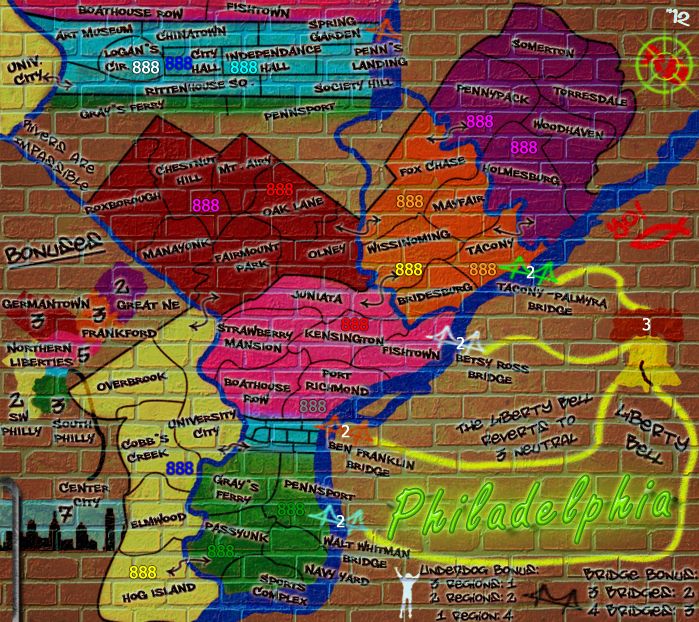
And here we go! Maybe I tinkered a lil too much with the small map, but I kinda like how it all turned out. Each map has something unique, the small with the Center City skyline, and the large with the "story."
I think the only question that pops up for me is whether I should have the yellow connector lines have arrow heads on them or not. (Large wit, small witout) kudos to those of you who get that reference... XD


-

 RedBaron0
- Posts: 2657
- Joined: Sun Aug 19, 2007 12:59 pm
- Location: Pennsylvania


Re: Philadelphia: 12/12 Lg & Sm + slight alterations pg. 35
Yellow connector lines are fine as is, leave them. But the line that connects city centre to the mini map, bring back out fully when it goes under the yellow. Apart from that, go club isaiah over the head.

-

 koontz1973
- Posts: 6960
- Joined: Thu Jan 01, 2009 10:57 am


Re: Philadelphia: 12/12 Lg & Sm + slight alterations pg. 35
koontz1973 wrote:... Apart from that, go club isaiah over the head.
Agreed.

* Pearl Harbour * Waterloo * Forbidden City * Jamaica * Pot Mosbi
-

 cairnswk
- Posts: 11510
- Joined: Sat Feb 03, 2007 8:32 pm
- Location: Australia


Re: Philadelphia: 12/12 Lg & Sm + slight alterations pg. 35
cairnswk wrote:koontz1973 wrote:... Apart from that, go club isaiah over the head.
Agreed.
Sorry, forgot to add the visual incase isaiah did not get what will be done to him.


-

 koontz1973
- Posts: 6960
- Joined: Thu Jan 01, 2009 10:57 am


Re: Philadelphia: 12/12 Lg & Sm + slight alterations pg. 35
Last Call
If anyone has any other comments on graphics, now is the time to speak up! If there are no other concerns within the next couple of days, this map will be moved to the Final Forge!
isaiah40
If anyone has any other comments on graphics, now is the time to speak up! If there are no other concerns within the next couple of days, this map will be moved to the Final Forge!
isaiah40
-
 isaiah40
- Posts: 3990
- Joined: Mon Aug 27, 2007 7:14 pm


Re: Philadelphia: 12/12 Lg & Sm + slight alterations pg. 35
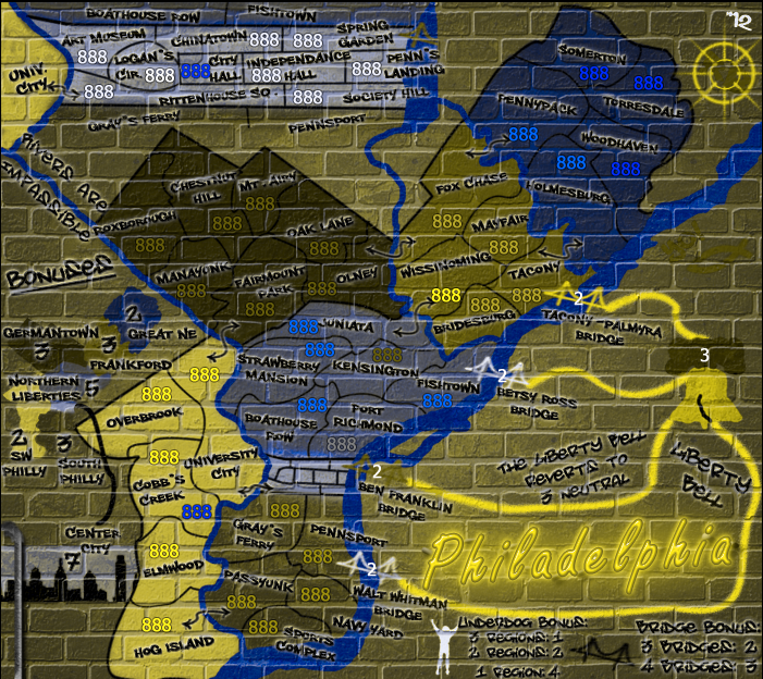
hi, i am very color blind and have no trouble with the latest version, easy to see the different regions, thanks
-

 y2manypbr
- Posts: 179
- Joined: Mon Aug 30, 2010 9:54 pm
- Location: Ohio


Re: Philadelphia: 12/16 with a pretty bow on it pg. 35
Large:
Image size: 900x800
Small:
Image size: 699x622
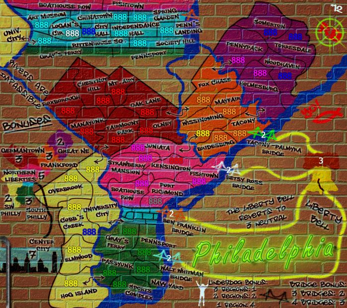
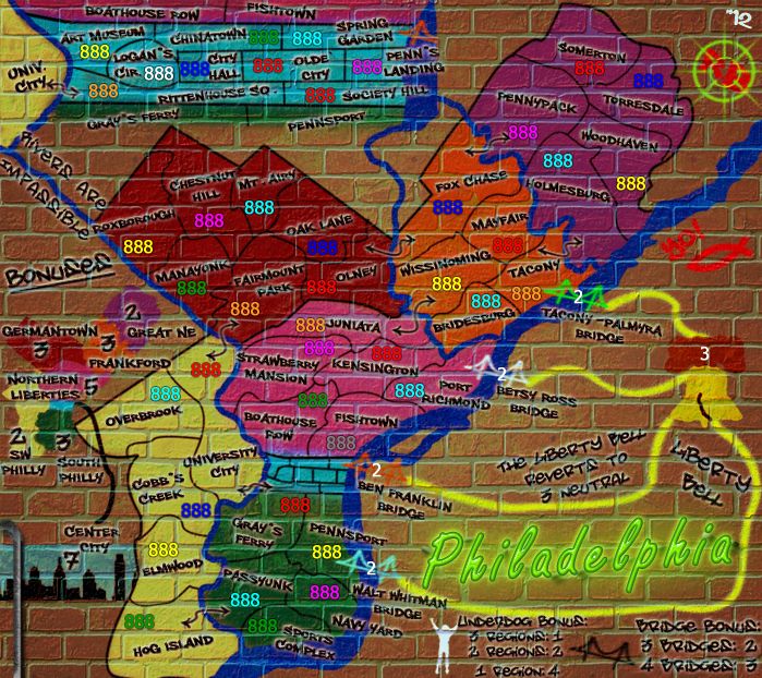
Small with numbers:
Image size: 699x622
color blindness test
Thanks y2manypbr, here's an updated CB image, I did tweak the green in South Philly a little, thought was still sorta close to the green army color, annoying enough to be an issue anyways.
Also posted is a small map with 888's colors test. Space isn't an issue with the numbers posted, it cramped in Center City... but what major city center isn't.... A minor tweak here, for the sake of space, annoyingly may have me change "Independence Hall" to just "Olde City" much shorter and reflects the entirety of the historical center of the city, which includes Independence Hall, the Liberty Bell, the Constitution Center, Betsy Ross's house, and so on...
Also the arrow head are off both maps, for now, its an easy tweak to re-add them if there is a call for it.
UGH... Just realized I flipped Fishtown and Port Richmond on the small map, I got it, quick fix.


-

 RedBaron0
- Posts: 2657
- Joined: Sun Aug 19, 2007 12:59 pm
- Location: Pennsylvania


Re: Philadelphia: 12/16 with a pretty bow on it pg. 35
The map is a bit off. Some views are actually opposite of what is shown. The names are correct but location in reference to each other is off. Good idea though.
-
 Xeno Storm
- Posts: 1
- Joined: Sat Nov 24, 2012 5:55 am

Re: Philadelphia: 12/16 with a pretty bow on it pg. 35
The blue 888's are hard to see in the Great NE, and the pink and red 888's are very hard to see in Northern Liberties. The colors will need to be changed in those two areas.
-
 isaiah40
- Posts: 3990
- Joined: Mon Aug 27, 2007 7:14 pm


Re: Philadelphia: 12/16 with a prettier bow on it pg. 35
Tweaked.
Large:
Image size: 900x800
Small:
Image size: 699x622
Large:
Image size: 900x800
Small:
Image size: 699x622


-

 RedBaron0
- Posts: 2657
- Joined: Sun Aug 19, 2007 12:59 pm
- Location: Pennsylvania


Re: Philadelphia: 12/16 with a prettier bow on it pg. 35
Northern Liberties looks ok to me, but Great NE I'm still having trouble. I think I'll wait and see if anyone else is having trouble see the blue 888's there.
-
 isaiah40
- Posts: 3990
- Joined: Mon Aug 27, 2007 7:14 pm


Re: Philadelphia: 12/16 with a prettier bow on it pg. 35
RB0, in relation to above, i can see the dark blues on that purple, but really have to examine it. It is really not the best. 
Without wanting to suggest a change, wouldn't someone with the map options -> circle whiteness be able to adjust the behind circle for themselves with Bob.
Do you have the xml partially finished so you can present a full generated 888s test from the xml in the xml tool?
it would be interesting to see how the other colours look on those backgrounds.

* Pearl Harbour * Waterloo * Forbidden City * Jamaica * Pot Mosbi
-

 cairnswk
- Posts: 11510
- Joined: Sat Feb 03, 2007 8:32 pm
- Location: Australia


Re: Philadelphia: 12/16 with a prettier bow on it pg. 35
I don't, but I can move the numbers around and contiue to play with the purple color, or even change it to something else, maybe a dark-dark blue


-

 RedBaron0
- Posts: 2657
- Joined: Sun Aug 19, 2007 12:59 pm
- Location: Pennsylvania


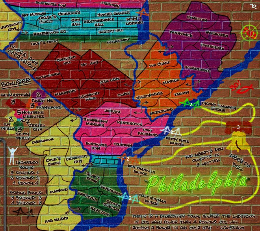
Re: Philadelphia: 12/19 purple tweaking pg. 35
Image size: 900x800
Small:
Image size: 699x622
More tweakage to the purple


-

 RedBaron0
- Posts: 2657
- Joined: Sun Aug 19, 2007 12:59 pm
- Location: Pennsylvania


Who is online
Users browsing this forum: No registered users


