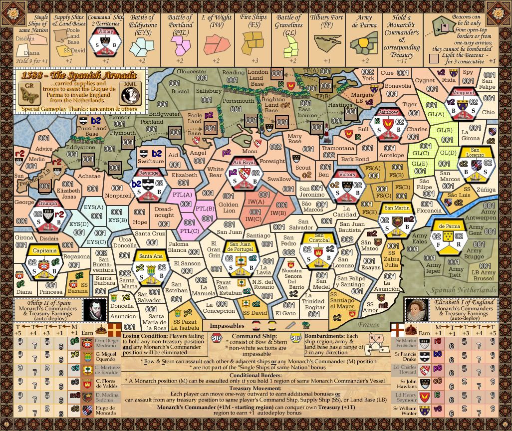
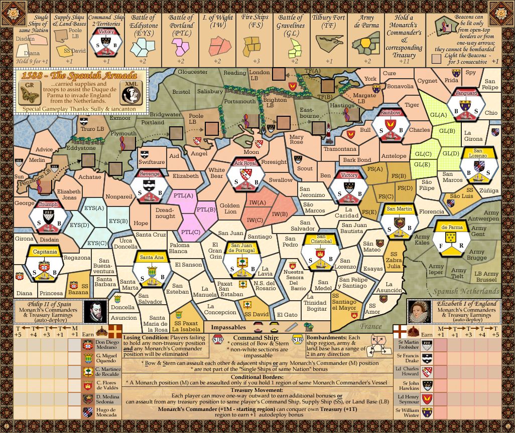
isaiah40 wrote:A few things, small, but needed for extra clarity.
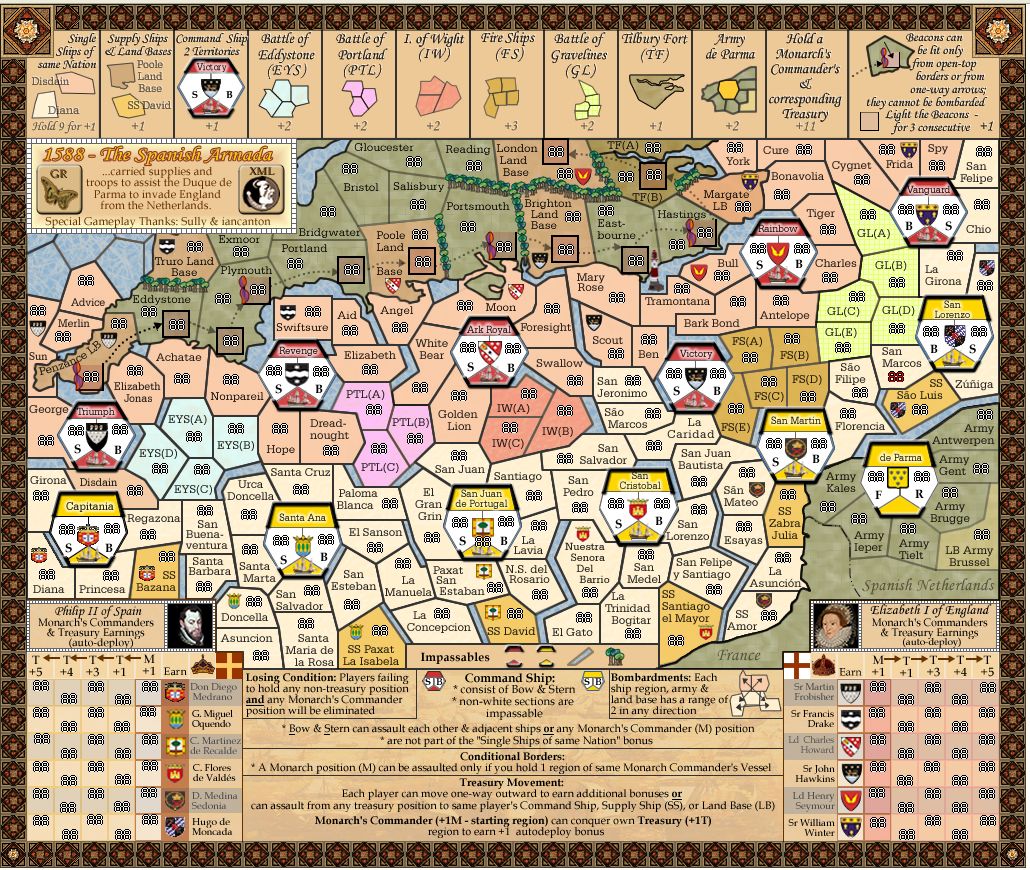
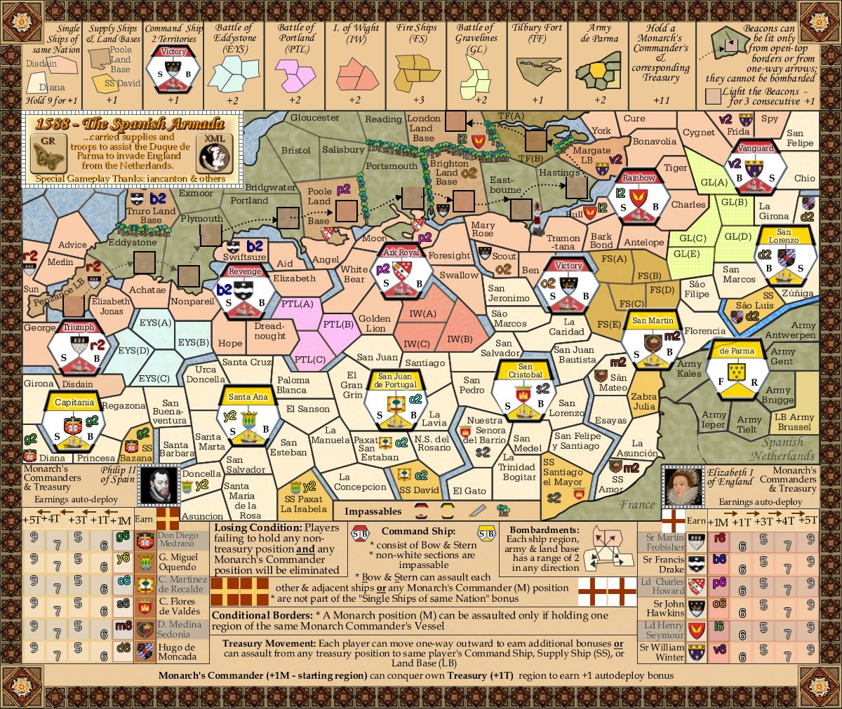
1. In the top legend: Can you increase the text spacing on (PTL)?
Done. i have increased the kerning on all of
those abbreviations to 10 for consistency across the legend
2. Battle of Gravelines: The outline of the area can be made a tad smaller, or, moved so that the tail on the "G" isn't covered.
Done
3. The story, the text looks blurry. It looks like you have a shadow on it like the title.
Fixed.
4. Does TF(A) and TF(B) connect? If so then I suggest that the rive be shortened to make it clearer.
Yes they connect and fixed.

5. Under the Impassables legend: The Spanish command ship, the bottom yellow triangle can not be seen. Maybe (if possible) outline both yellow areas to make them clearer.
Done and all impassables increased in size slightly
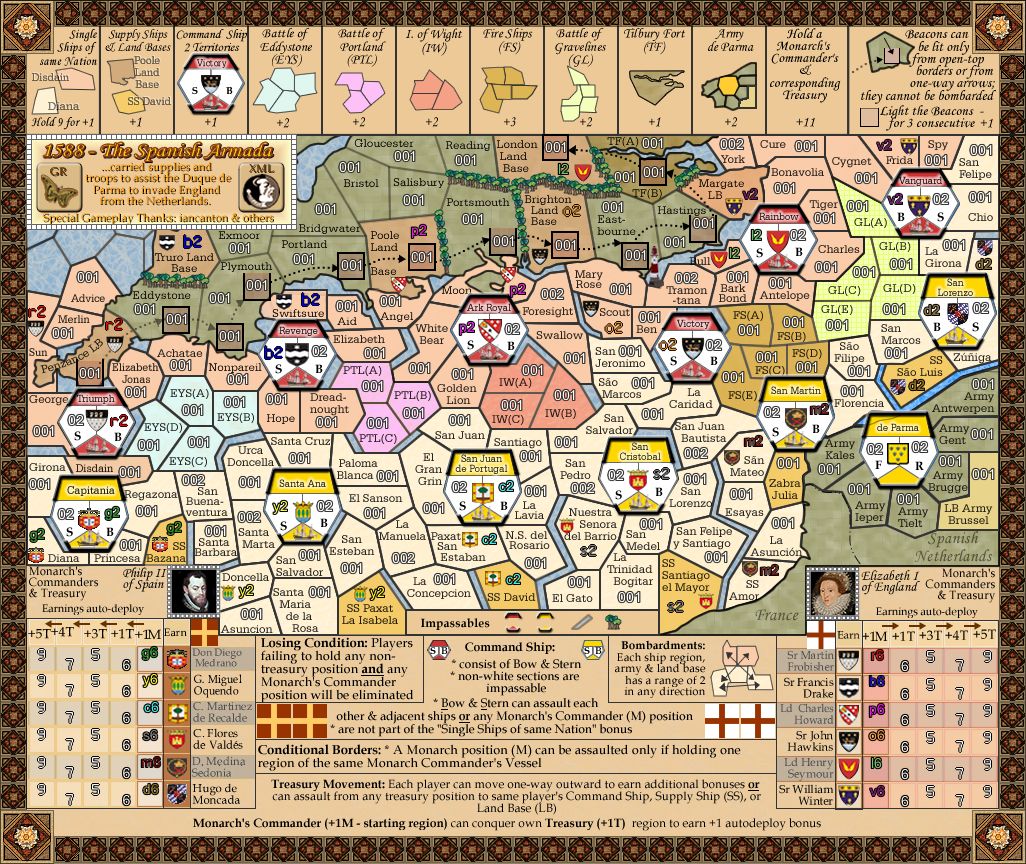
6. I'm a little concerned that the 888's will be too close together in the Monarch Treasury regions. Can you place some 888's so I can look at it please. My initial observation is that we might have to go a little wider to make sure they fit in properly.
The squares are 27x27. as you can see from the brit side i have done, there is plenty of room for 888s in there. i paid considerable attention in design to ensure these were wide/high enough to pass over each other, but unless someone gets into the 1000s that shouldn't be a prob. I have also tested these spaces on a dummy xml and they fit perfectly

Other than these few things this is really close!! Great work cairns!
Cool. and thank-you for promptness.

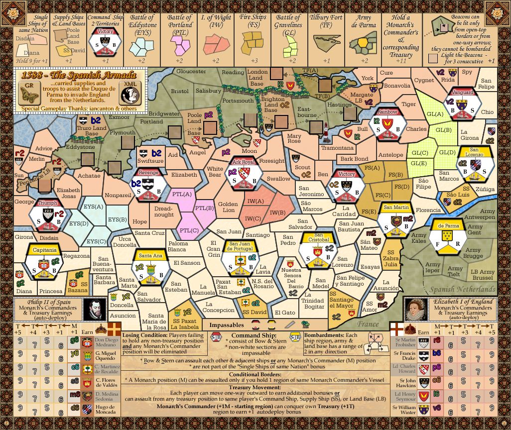
Posting Version 28...

I have also done this Version 28 with 88s generated from the xml and posted it on front page under a spoiler
