Conquer Club

[Abandoned] Alamo

Abandoned and Vacationed maps. The final resting place, unless you recycle.

Moderator: Cartographers

Forum rules
Please read the Community Guidelines before posting.

Re: Alamo map [6/11] Pg6

Postby generalhead on Sun Nov 11, 2012 2:26 pm

Seamus76 wrote:
Enjoy our humiliation. ;)

You shouldn't have humiliation, You guys worked hard to create two awesome maps.
For me this is encouragement, that I can take my map the way it is and hopefully make it as cool as Rorke's Drift, or Tribal War-Florida.
Sergeant generalhead
 
Posts: 806
Joined: Mon Apr 26, 2010 10:09 pm

Re: Alamo map [11/11] Pg7

Postby tkr4lf on Sun Nov 11, 2012 4:37 pm

Looking good, generalhead!

Since Koontz and Seamus have commented on the other stuff, I will comment on the gameplay issues.


First off...the cannons. You have too many in the Alamo, I think. Two or three of them in the west area should suffice. Possibly adding one to the Chapel as well would be good.

Can the cannons attack, or only bombard? I ask because if they can only bombard, then you're going to need to move some of them. Right now you have a cannon at the north entrance to the Alamo and you have cannons in both terits that the ladders lead to. If they can only bombard, then nobody can ever get into or out of the Alamo in the north, and the Mexican army's advance over the walls will stop dead in its tracks at those cannons.

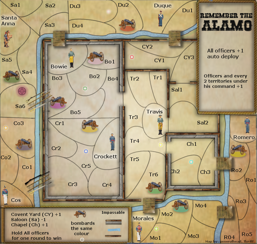
My suggestion is to make the cannons only able to bombard, and just reduce the number of them on the west wall and move them around. I also think that you should have one cannon pointing towards Duque, one towards Santa Anna and one towards Cos. It's up to you whether to use that idea or not, you can take it or leave it. If you take it, then my thoughts on positions are to get rid of the 4 cannons you have now except for the cannon at Cr2 (that one can stay), place one cannon at Tr1 facing Duque's area, place one cannon at Tr5 (if you look at those pictures I posted earlier, you will see that there were some cannons positioned in the middle of the fort) facing Santa Anna's area, and have the cannon at Cr2 facing Cos' area.

Then I would also suggest placing a cannon at Ch2 and having it face Morales' area, but then you would have to move Mo2's bombard target to Ch1, which should be fine. If you're going to go with the cannons having multiple bombard targets (which I still think is a good idea), then you could face the Ch2 cannon towards the middle of Morales' and Romero's areas, and give it bombard locations in both areas. That would make it to where the Alamo is capable of bombing at least 1 terit in each of the Mexican Army's areas, which I think is a good idea.


Another issue is one similar to the previous Travis/Bowie issue. You have Morales right at the entrance to the Alamo, making it too easy to secure that chokepoint. I would suggest swapping him with Mo1.


Those are the main issues I see for now. As for the locations of the targets if you're going to have multiple targets for each cannon (I would think 2 would be a nice number), I'll leave that up to you. Place them where you think they should go, and then we can provide feedback on that.

Keep up the good work!
User avatar
Major tkr4lf
 
Posts: 1976
Joined: Thu Nov 06, 2008 11:35 am
Location: St. Louis

Re: Alamo map [11/11] Pg7

Postby generalhead on Sun Nov 11, 2012 7:11 pm

Ty tk, I like those adeas. Some one also suggested making the cannon colors that same color as the regions they are in and if I move them I will be able to do that.
Sergeant generalhead
 
Posts: 806
Joined: Mon Apr 26, 2010 10:09 pm

Re: Alamo map [11/11] Pg7

Postby generalhead on Mon Nov 12, 2012 12:17 am

Koontz wrote:Morales and Travis are the best looking offices, it might help game play if you got rid of the others (do not delete them) and used these two only for all officers. But I will leave that to you to decide now.

It won't look funny if my guys look the same?
On the next draft I might try it, because some of my officers are sized a little different.
Plus I know you did that on Rorke's and it looks good.
Click image to enlarge.
image

My target do looked squished and some of them are missing the bottoms
legend borders still need work
Sergeant generalhead
 
Posts: 806
Joined: Mon Apr 26, 2010 10:09 pm

Re: Alamo map [11/12/12] Pg7

Postby kennys777 on Mon Nov 12, 2012 10:05 am

I like the way it looks. Looking forward to the gameplay.

As for IMO, well the colors for the targets (corresponding to the cannons that can attack them) seem to be very similar, for example SA4 and SA6 are very similar to CR1 and CR5, and HO2 and CH1 seem to be a little lighter in color from their respective cannon. I think that is because the cannon is on a brown background giving it more a highlight versus its targets being on lighter backgrounds taking away from its color.

Anyway, with BOB it really won't make a difference to me personally, but not everyone uses BOB.

Since you are using very light colors, maybe think about using a red, or some other dark color in 1 or 2 of the cannons to offset the similarity. Again IMO, and I like the way it is coming along, it will be a useful map in future clan wars.
User avatar
Sergeant kennys777
 
Posts: 976
Joined: Tue Dec 02, 2008 3:27 pm
Location: Chicago, IL

Re: Alamo map [11/12/12] Pg7

Postby tkr4lf on Mon Nov 12, 2012 1:21 pm

Nice, I like how it looks and like how having multiple targets work out.

It might be better to make sure that no cannons can bombard the commanders, and maybe not even each other. I think the no commanders bit is more important than the no cannons bit, but either way. That would mean the targets at Co3, Duque and Travis would need to move.

Other than that, I have nothing to add. This looks 10000X better than it did. Great job on this man.

I know a lot of it will probably change once the game play mods get a hold of it, but it's been fun helping you iron the game play out. I'm looking forward to playing this one!
User avatar
Major tkr4lf
 
Posts: 1976
Joined: Thu Nov 06, 2008 11:35 am
Location: St. Louis

Re: Alamo map [11/12/12] Pg7

Postby tkr4lf on Tue Nov 13, 2012 1:13 am

I just noticed the story you added.

Two things about that...

1) There were closer to 300 men after some reinforcements arrived to defend the Alamo.
2) Where you say that the Mexican Government sent General Santa Anna, that's not quite correct. General Santa Anna was the Mexican Government. He was the dictator. So there should be a better way to word that then how you have it.
User avatar
Major tkr4lf
 
Posts: 1976
Joined: Thu Nov 06, 2008 11:35 am
Location: St. Louis

Re: Alamo map [11/12/12] Pg7

Postby DoomYoshi on Tue Nov 13, 2012 4:23 pm

I like the different looking officers. However, the pictures are a bit grainy. Same with the bridges.
░▒▒▓▓▓▒▒░
User avatar
Captain DoomYoshi
 
Posts: 10723
Joined: Tue Nov 16, 2010 9:30 pm
Location: Niu York, Ukraine

Re: Alamo map [11/12/12] Pg7

Postby koontz1973 on Wed Nov 14, 2012 4:51 am

Hows it going GH, waiting to see what you have come up with since we spoke last. Post or PM me if any problems.
Image
User avatar
Lieutenant koontz1973
 
Posts: 6960
Joined: Thu Jan 01, 2009 10:57 am

Re: Alamo map [11/12/12] Pg7

Postby generalhead on Wed Nov 14, 2012 6:35 pm

Sorry been a little busy, my son had a science fair project due. I have been working on the cannon, trying to make it look good. Friday I will have more time to work on everything.
Sergeant generalhead
 
Posts: 806
Joined: Mon Apr 26, 2010 10:09 pm

Re: Alamo map [11/12/12] Pg7

Postby generalhead on Fri Nov 16, 2012 11:25 am

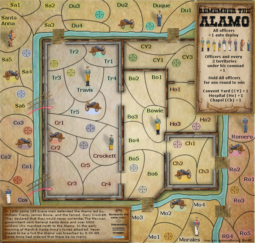
I tried to take every ones information and suggestions into account, and I hope I did them all correctly.
Click image to enlarge.
image

forgot to install a cannon in the legend, I will do that now.
I have some color bleed over from cos into Santa Anna
Last edited by generalhead on Fri Nov 16, 2012 11:44 am, edited 1 time in total.
Sergeant generalhead
 
Posts: 806
Joined: Mon Apr 26, 2010 10:09 pm

Re: Alamo map [11/12/12] Pg7

Postby generalhead on Fri Nov 16, 2012 11:30 am

You guys are awesome. Every time you give me information and suggestions this map just keeps getting better and better. :D \:D/
Sergeant generalhead
 
Posts: 806
Joined: Mon Apr 26, 2010 10:09 pm

Re: Alamo map [11/16/12] Pg8

Postby Seamus76 on Fri Nov 16, 2012 11:41 am

Looking great buddy. I really like the cannons, and you did a great job on the targets. =D> The one in the legend is still a little squished, and I do think you'll need to work on the colors, which is touch to get right. That will along for sure, no worries, but for now it's looking really good. Oh, and keep working on those one-way arrows. You can steel one of my moves, which is to take a weapon they used and turn it all black and use it as your directional arrow. Not sure if the Mexican Army used rifles with bayonets but that might be something that could work. I'll play around with it as well and see if I can come up with something. That's basically what I did with the War Zone Arrows for TW-FLA, and the Sword Arrows for TW-Israel.
ImageImageImage
User avatar
Sergeant 1st Class Seamus76
 
Posts: 1574
Joined: Fri Feb 25, 2011 5:41 pm
Location: Atlanta, GA

Re: Alamo map [11/16/12] Pg8

Postby generalhead on Fri Nov 16, 2012 11:55 am

Seamus76 wrote: I really like the cannons,

Thank you, I didn't know if I should make the end more tapered. I like the look of this though
Seamus76 wrote: you did a great job on the targets. The one in the legend is still a little squished, =D>

Thank you for the targets by the way. I forgot to change that one. I also need to add a cannon there.
Seamus76 wrote: I do think you'll need to work on the colors, which is touch to get right.

The target colors, name colors, cannon colors, or region colors. I know the blended name, cannon and target colors kind of look like easter. I might have to see if I can get away from the pastels. You can only use the main colors once though and then you have to try and deviate to something different.
Seamus76 wrote: keep working on those one-way arrows. You can steel one of my moves, which is to take a weapon they used and turn it all black and use it as your directional arrow. Not sure if the Mexican Army used rifles with bayonets but that might be something that could work. I'll play around with it as well and see if I can come up with something. That's basically what I did with the War Zone Arrows for TW-FLA, and the Sword Arrows for TW-Israel.

Koontz didn't like the arrows which I kind of agree with. The map is a little more realistic 3-d (not really), but arrows would seem out of place floating there. I think they look good in the legend. The only way I might be able to have them is if they were incorporated into the ladders, but then they might not be that visible.
Sergeant generalhead
 
Posts: 806
Joined: Mon Apr 26, 2010 10:09 pm

Re: Alamo map [11/16/12] Pg8

Postby Seamus76 on Fri Nov 16, 2012 12:23 pm

I'm sure there is something out there that would be a good one-way arrow. I'm not sure one would work, and you can prob find something better, but below I found a Mexican Army rifle and bayonet. One I made all black and added a little drop shadow. Others I left the original image, and the others I used just the bayonet. In the legend you would just show a pic of one and say "Rife & Bayonet - One-way Attack", or something like that. Just some things to get your creative juices flowing, but basically lots of things can be used as arrows.

Click image to enlarge.
image
ImageImageImage
User avatar
Sergeant 1st Class Seamus76
 
Posts: 1574
Joined: Fri Feb 25, 2011 5:41 pm
Location: Atlanta, GA

Re: Alamo map [11/16/12] Pg8

Postby generalhead on Fri Nov 16, 2012 12:34 pm

which lighting looks better
show

show

show

I vote for the top once
Last edited by generalhead on Fri Nov 16, 2012 1:54 pm, edited 1 time in total.
Sergeant generalhead
 
Posts: 806
Joined: Mon Apr 26, 2010 10:09 pm

Re: Alamo map [11/16/12] Pg8

Postby koontz1973 on Fri Nov 16, 2012 1:43 pm

GH, well done. =D>
Texture looks nice.
River looks nice but could do with darkening up a tad.
Top lighting looks the best.
Cannons look a million times better than the jpegs. I would suggest that you shrink them by 25%.
Legend text needs to be sorted. The bottom left legend has very small text and will not be able to be read on the small map. Cut the story down to give yourself some more room. Have all the text the same size.
I would suggest to remove the territ names you have, replace with proper names. you have different colours for the bonus regions and the glows allow players to see the different bonus regions.
Men on map, shrink to same scale as the cannons.

Oh, forgot to say, stickied this for now. Expect a stamp soon. ;)

But do not think that this is the end. It is only the beginning. ;)
Image
User avatar
Lieutenant koontz1973
 
Posts: 6960
Joined: Thu Jan 01, 2009 10:57 am

Re: Alamo map [11/16/12] Pg8

Postby generalhead on Fri Nov 16, 2012 1:49 pm

koontz wrote:Oh, forgot to say, stickied this for now. Expect a stamp soon. ;)
But do not think that this is the end. It is only the beginning. ;)

\:D/ 8-[ I suspectedImage :lol: Thanks buddy :D
Sergeant generalhead
 
Posts: 806
Joined: Mon Apr 26, 2010 10:09 pm

Re: Alamo map [11/16/12] Pg8

Postby trinicardinal on Fri Nov 16, 2012 2:14 pm

generalhead wrote:
koontz wrote:Oh, forgot to say, stickied this for now. Expect a stamp soon. ;)
But do not think that this is the end. It is only the beginning. ;)

\:D/ 8-[ I suspectedImage :lol: Thanks buddy :D


looking really nice though... I'm looking forward to trying this map when it comes out
10:16:35 ‹Ace Rimmer› haven't looked at work in ages
10:42:43 ‹Sackett58› fine, I'll take my panties elsewhere
User avatar
Captain trinicardinal
 
Posts: 2911
Joined: Wed Nov 05, 2008 7:59 am
Location: On a Tropical Island - Coconut anyone?

Re: Alamo map [11/16/12] Pg8

Postby generalhead on Fri Nov 16, 2012 2:49 pm

Ty trinicardinal
koontz wrote:I would suggest to remove the territ names you have, replace with proper names.

What do you guys suggest for names, Parts of the building; armoury, latrine, kitchen or do you think army members names; jackson, bernard, smith, ramirez, gonzalez?
I'll try army members names to see what it looks like
Sergeant generalhead
 
Posts: 806
Joined: Mon Apr 26, 2010 10:09 pm

Re: Alamo map [11/16/12] Pg8

Postby koontz1973 on Fri Nov 16, 2012 10:11 pm

generalhead wrote:Ty trinicardinal
koontz wrote:I would suggest to remove the territ names you have, replace with proper names.

What do you guys suggest for names, Parts of the building; armoury, latrine, kitchen or do you think army members names; jackson, bernard, smith, ramirez, gonzalez?
I'll try army members names to see what it looks like

Proper names. Just google for a list.
Image
User avatar
Lieutenant koontz1973
 
Posts: 6960
Joined: Thu Jan 01, 2009 10:57 am

Re: Alamo map [11/16/12] Pg8

Postby tkr4lf on Fri Nov 16, 2012 10:35 pm

Looking very good!

I vote for the top one for lighting as well.

I also echo Koontz in the suggestion of names for the terits. Perhaps building names could work in the Alamo, but names of soldiers would be cool.

The only issue I see is that you still have a cannon at an entrance to the Alamo at R02. That should be moved otherwise nobody can enter or exit the Alamo there. You could move it to R03 and move the R03 target to R02.

All in all, great job! You will definitely deserve the stamp when it comes.
User avatar
Major tkr4lf
 
Posts: 1976
Joined: Thu Nov 06, 2008 11:35 am
Location: St. Louis

Re: Alamo map [11/16/12] Pg8

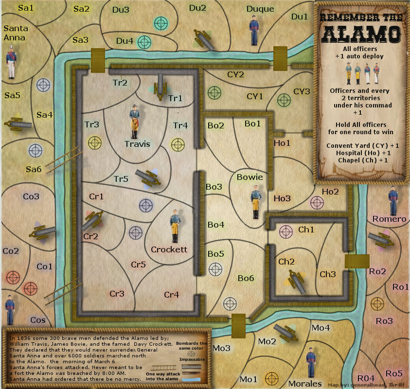
Postby generalhead on Sat Nov 17, 2012 12:49 am

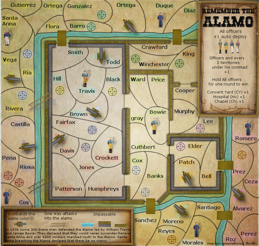
Added names
Move bottom legend around
Played with colored hues
Moved cannon per Tk
If you want your last name added to the map let me know
re-sized officers, shadows and cannons
Click image to enlarge.
image
Sergeant generalhead
 
Posts: 806
Joined: Mon Apr 26, 2010 10:09 pm

Re: Alamo map [11/16/12] Pg8

Postby koontz1973 on Sat Nov 17, 2012 1:01 am

What is with the different texts for the names? If it is all the same, then that font is seriously bad. It will need changing.

GH, font is one of the worst things to find and change in gimp. It is a lot easier in photoshop but as you like me do not have it, then you will have no fun sorting this out.

Try these and see if you like any. You could use them all all over the map and see which ones players like the best.
http://www.dafont.com/western.font?fpp=50&psize=xs
http://www.dafont.com/woodcut.font?fpp=50&psize=xs
http://www.dafont.com/rustler.font?fpp=50&psize=xs
http://www.dafont.com/duality.font?fpp=50&psize=xs

And if you do not like those, go to Dafont.
Image
User avatar
Lieutenant koontz1973
 
Posts: 6960
Joined: Thu Jan 01, 2009 10:57 am

Re: Alamo map [11/16/12] Pg8

Postby tkr4lf on Sat Nov 17, 2012 1:06 am

Haha, crap, I was wrong. The cannon can't move to (what is now) Alvarez, since it causes the same problem with moving between Morales and Romero's areas. I guess moving it to Ceza is the best option.

Sorry about that, I must not have been paying enough attention.


Another thing...it's hard to tell where the Convent Yard, Hospital and Chapel are now. They're not labelled anywhere on the map anymore since you changed all the names. Maybe adding the glow you use on the map to the corresponding name in the legend would clear it up? Or maybe something else would work better.

I don't know, it might not even matter, since they all get the same +1, and likely people can figure it out since they're the only 3 areas without a commander.
User avatar
Major tkr4lf
 
Posts: 1976
Joined: Thu Nov 06, 2008 11:35 am
Location: St. Louis

PreviousNext

Return to Recycling Box

Who is online

Users browsing this forum: No registered users