CLASSIC CITIES: Moscow [Quenched]
Moderator: Cartographers
Re: CLASSIC CITIES: Moscow [15.8.12] V14-P9 GFX
Get rid of the street veins, it is making the map look really "un"cairns like. a.k.a. messy, cluttered, busy, etc. 
-
 isaiah40
- Posts: 3990
- Joined: Mon Aug 27, 2007 7:14 pm


Re: CLASSIC CITIES: Moscow [15.8.12] V14-P9 GFX
isaiah40 wrote:Get rid of the street veins, it is making the map look really "un"cairns like. a.k.a. messy, cluttered, busy, etc.
Ooooh! I thought most of my maps were cluttered

* Pearl Harbour * Waterloo * Forbidden City * Jamaica * Pot Mosbi
-

 cairnswk
- Posts: 11510
- Joined: Sat Feb 03, 2007 8:32 pm
- Location: Australia


Re: CLASSIC CITIES: Moscow [15.8.12] V14-P9 GFX
The streets do make it very difficult to work out where the borders are.
I'm looking forward to seeing what it's like with a complete mosaic. Keep in mind also that it may be difficult to work out where the Inner suburbs bonus starts and ends, as the mosaic as it is really highlights those bonuses.
I'm looking forward to seeing what it's like with a complete mosaic. Keep in mind also that it may be difficult to work out where the Inner suburbs bonus starts and ends, as the mosaic as it is really highlights those bonuses.
-
 ManBungalow
- Posts: 3431
- Joined: Sun Jan 13, 2008 7:02 am
- Location: On a giant rock orbiting a star somewhere


Re: CLASSIC CITIES: Moscow [15.8.12] V14-P9 GFX
ManBungalow wrote:The streets do make it very difficult to work out where the borders are.
maybe streets could be a little more lighter?
the bonuses look clear, but I have question for 100% patency: +13 Inner suburbs (so +8 for suburbs and +5 for Inner ring), so not +13 for Inner suburbs and +5 for Inner ring which gives +18?
Oneyed
-

 Oneyed
- Posts: 1058
- Joined: Sat Dec 10, 2011 12:29 pm


Re: CLASSIC CITIES: Moscow [15.8.12] V14-P9 GFX
Oneyed wrote:... +13 Inner suburbs (so +8 for suburbs and +5 for Inner ring)...
that's what it says

* Pearl Harbour * Waterloo * Forbidden City * Jamaica * Pot Mosbi
-

 cairnswk
- Posts: 11510
- Joined: Sat Feb 03, 2007 8:32 pm
- Location: Australia


Re: CLASSIC CITIES: Moscow [15.8.12] V14-P9 GFX
ManBungalow wrote:The streets do make it very difficult to work out where the borders are.
I'm looking forward to seeing what it's like with a complete mosaic. Keep in mind also that it may be difficult to work out where the Inner suburbs bonus starts and ends, as the mosaic as it is really highlights those bonuses.
Yes, it will take some time now to pull those layers out but perhaps the streets were the wrong direction....i wasn't 100% totally happy with them
Oneyed wrote:...
maybe streets could be a little more lighter?
...
yes they're coming out completely

* Pearl Harbour * Waterloo * Forbidden City * Jamaica * Pot Mosbi
-

 cairnswk
- Posts: 11510
- Joined: Sat Feb 03, 2007 8:32 pm
- Location: Australia


Re: CLASSIC CITIES: Moscow [19.8.12] V15-P9 GFX
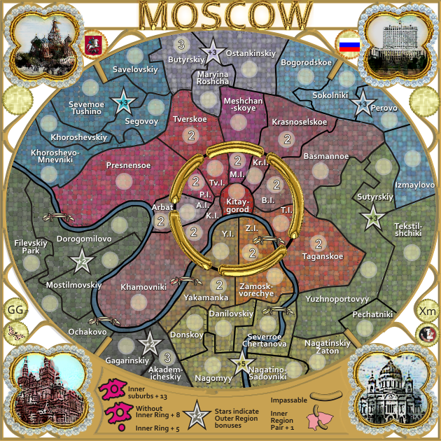
Version 15.
1. all regions in mosaic
2. text colour changed for constrast against the background
3. text size increased from 2.454 to 3pt
4. there is an 70% opacity black oval across the top of the regions to dampened down the colours
1. all regions in mosaic
2. text colour changed for constrast against the background
3. text size increased from 2.454 to 3pt
4. there is an 70% opacity black oval across the top of the regions to dampened down the colours


* Pearl Harbour * Waterloo * Forbidden City * Jamaica * Pot Mosbi
-

 cairnswk
- Posts: 11510
- Joined: Sat Feb 03, 2007 8:32 pm
- Location: Australia


Re: CLASSIC CITIES: Moscow [19.8.12] V15-P9 GFX
Very cool looking cairns.
-

 nolefan5311
- Posts: 1768
- Joined: Mon Nov 22, 2010 11:51 am
- Location: Florida


Re: CLASSIC CITIES: Moscow [19.8.12] V15-P9 GFX
nolefan5311 wrote:Very cool looking cairns.
Thank-you...
Did you see this post?
cairnswk wrote:Version 14...
Because i chose to update the map inline with the google map, the river has moved.
This caused a change in the layout of the olive regions below Yaramanka and also to the Ochakovo border.
I'm wondering if nolefan5311 will re-examine those regions to ensure to bonuses are correct, please....

* Pearl Harbour * Waterloo * Forbidden City * Jamaica * Pot Mosbi
-

 cairnswk
- Posts: 11510
- Joined: Sat Feb 03, 2007 8:32 pm
- Location: Australia


Re: CLASSIC CITIES: Moscow [19.8.12] V15-P9 GFX
very nice.
what about to do mosaic also for legend? with larger squares maybe?
Oneyed
what about to do mosaic also for legend? with larger squares maybe?
Oneyed
-

 Oneyed
- Posts: 1058
- Joined: Sat Dec 10, 2011 12:29 pm


Re: CLASSIC CITIES: Moscow [19.8.12] V15-P9 GFX
Oneyed wrote:very nice.
what about to do mosaic also for legend? with larger squares maybe?
Oneyed
Thank-you Oneyed...
which part of legend...the entire legend, background or only those parts indicating regions?
I'll keep this in mind.

* Pearl Harbour * Waterloo * Forbidden City * Jamaica * Pot Mosbi
-

 cairnswk
- Posts: 11510
- Joined: Sat Feb 03, 2007 8:32 pm
- Location: Australia


Re: CLASSIC CITIES: Moscow [19.8.12] V15-P9 GFX
cairnswk wrote:nolefan5311 wrote:Very cool looking cairns.
Thank-you...
Did you see this post?cairnswk wrote:Version 14...
Because i chose to update the map inline with the google map, the river has moved.
This caused a change in the layout of the olive regions below Yaramanka and also to the Ochakovo border.
I'm wondering if nolefan5311 will re-examine those regions to ensure to bonuses are correct, please....
I did not. I will take a look.
-

 nolefan5311
- Posts: 1768
- Joined: Mon Nov 22, 2010 11:51 am
- Location: Florida


Re: CLASSIC CITIES: Moscow [19.8.12] V15-P9 GFX
cairnswk wrote:which part of legend...the entire legend, background or only those parts indicating regions?
I'll keep this in mind.
it looks that legend want be emboss. all frame want be from metal (this is my feeling). so what about to do white background mosaic (with larger squares) and frame realy metallic? maybe as ring and title?
Oneyed
-

 Oneyed
- Posts: 1058
- Joined: Sat Dec 10, 2011 12:29 pm


Re: CLASSIC CITIES: Moscow [19.8.12] V15-P9 GFX
Oneyed wrote:cairnswk wrote:which part of legend...the entire legend, background or only those parts indicating regions?
I'll keep this in mind.
it looks that legend want be emboss. all frame want be from metal (this is my feeling). so what about to do white background mosaic (with larger squares) and frame realy metallic? maybe as ring and title?
Oneyed
Frame - metal as ring and title - yes...possible
white background - not sure where you mean here...are you talking about the areas in between the curly frame pieces and behind the title?

* Pearl Harbour * Waterloo * Forbidden City * Jamaica * Pot Mosbi
-

 cairnswk
- Posts: 11510
- Joined: Sat Feb 03, 2007 8:32 pm
- Location: Australia


Re: CLASSIC CITIES: Moscow [19.8.12] V15-P9 GFX
cairnswk wrote:Frame - metal as ring and title - yes...possible
looking forward
cairnswk wrote:white background - not sure where you mean here...are you talking about the areas in between the curly frame pieces and behind the title?
yes.
Oneyed
-

 Oneyed
- Posts: 1058
- Joined: Sat Dec 10, 2011 12:29 pm


Re: CLASSIC CITIES: Moscow [19.8.12] V15-P9 GFX
cairnswk wrote:Frame - metal as ring and title - yes...possible
Good idea, but make it look more distressed so as not to take away from the title.
white background - not sure where you mean here...are you talking about the areas in between the curly frame pieces and behind the title?
The white has to go. A couple of ideas would be to add a photo of Moscow behind the image (to simulate looking through the frame itself) or use the grey from the game page (again so you get to look behind the frame as such).
Not sure adding the tiles to this area would be a good idea. might make it look to fussy IMO, but you could always give it a go.

-

 koontz1973
- Posts: 6960
- Joined: Thu Jan 01, 2009 10:57 am


Re: CLASSIC CITIES: Moscow [19.8.12] V15-P9 GFX
koontz1973 wrote:cairnswk wrote:Frame - metal as ring and title - yes...possible
Good idea, but make it look more distressed so as not to take away from the title.white background - not sure where you mean here...are you talking about the areas in between the curly frame pieces and behind the title?
The white has to go. A couple of ideas would be to add a photo of Moscow behind the image (to simulate looking through the frame itself) or use the grey from the game page (again so you get to look behind the frame as such).
Not sure adding the tiles to this area would be a good idea. might make it look to fussy IMO, but you could always give it a go.
Oh goodness how i hate this.....to fussy....should be too fussy...when are all you guys gonna get this correct
Yes i am a spelling nazi on this one in particular, and koontz you've put me in the mood just for it.

* Pearl Harbour * Waterloo * Forbidden City * Jamaica * Pot Mosbi
-

 cairnswk
- Posts: 11510
- Joined: Sat Feb 03, 2007 8:32 pm
- Location: Australia


Re: CLASSIC CITIES: Moscow [19.8.12] V15-P9 GFX
I know it is too fussy. just typing too quickly and being too lazy to check it.

-

 koontz1973
- Posts: 6960
- Joined: Thu Jan 01, 2009 10:57 am


Re: CLASSIC CITIES: Moscow [19.8.12] V15-P9 GFX
danilovsky is on the wrong side of the river. the correct location is where u have the text of severroe chernatova, while donskoy appears to extend all the way east to the river. nagomyy ought to be nagornyy. chertanovo severnoye (not severroe chernatova) is actually off the map, well to the south of nagornyy, so it's sensible to reduce the number of regions by 1, bringing down the number of non-neutral regions to 35.
ian.
ian.
-

 iancanton
- Foundry Foreman

- Posts: 2432
- Joined: Fri Jun 01, 2007 5:40 am
- Location: europe


Re: CLASSIC CITIES: Moscow [19.8.12] V15-P9 GFX
iancanton wrote:danilovsky is on the wrong side of the river. the correct location is where u have the text of severroe chernatova, while donskoy appears to extend all the way east to the river. nagomyy ought to be nagornyy. chertanovo severnoye (not severroe chernatova) is actually off the map, well to the south of nagornyy, so it's sensible to reduce the number of regions by 1, bringing down the number of non-neutral regions to 35.
ian.
ian, where is your reference for this please, as i have them in a roughly correct place according to this map.

* Pearl Harbour * Waterloo * Forbidden City * Jamaica * Pot Mosbi
-

 cairnswk
- Posts: 11510
- Joined: Sat Feb 03, 2007 8:32 pm
- Location: Australia


Re: CLASSIC CITIES: Moscow [19.8.12] V15-P9 GFX
look here cairnswk. I can help you a little with cyrilic.
Oneyed
Oneyed
-

 Oneyed
- Posts: 1058
- Joined: Sat Dec 10, 2011 12:29 pm


Re: CLASSIC CITIES: Moscow [19.8.12] V15-P9 GFX
^^^ Oneyed. as much as i can appreciate you helping, helping me with cyrillic map is like speaking Japanese or Mandarin to me.
I cannot read it. We have already been down a cyrillic road before and i don't intend to travel that path again. So for goodness sake - get off it.
So give me some other reference please if want to assist.
I cannot read it. We have already been down a cyrillic road before and i don't intend to travel that path again. So for goodness sake - get off it.
So give me some other reference please if want to assist.

* Pearl Harbour * Waterloo * Forbidden City * Jamaica * Pot Mosbi
-

 cairnswk
- Posts: 11510
- Joined: Sat Feb 03, 2007 8:32 pm
- Location: Australia


Re: CLASSIC CITIES: Moscow [19.8.12] V15-P9 GFX
cairnswk wrote:^^^ Oneyed. as much as i can appreciate you helping, helping me with cyrillic map is like speaking Japanese or Mandarin to me.
I cannot read it. We have already been down a cyrillic road before and i don't intend to travel that path again. So for goodness sake - get off it.
So give me some other reference please if want to assist.
go here. it seems that for this is wiki accurate...
http://en.wikipedia.org/wiki/Administra ... _of_Moscow
Oneyed
-

 Oneyed
- Posts: 1058
- Joined: Sat Dec 10, 2011 12:29 pm


Re: CLASSIC CITIES: Moscow [19.8.12] V15-P9 GFX
i'm going by this map and zooming in as appropriate. use the kink in the river as a reference point to locate danilovskiy.
http://24timezones.com/mapa/moscow.php
on the yellow pages map to which u link, yellow district 10 is nagornyy, which is long and narrow from north to south. south of this is yellow district 14, which is severnoe chertanovo.
i believe that severnoe (or severnoye) means north (oneyed, is it similar in ur language?). for slavic languages, i'm unsure whether directions normally go before or after the main part of the name. we've just found out that it appears both ways on different maps of moscow.
yakamanka ought to be yakimanka.
ian.
-

 iancanton
- Foundry Foreman

- Posts: 2432
- Joined: Fri Jun 01, 2007 5:40 am
- Location: europe


Re: CLASSIC CITIES: Moscow [19.8.12] V15-P9 GFX
yes, severnoe is northern. We use latin alphabet while russians cyrillic, but our languages are a little similar. I also learn russian for ten years, but I was not good student  .
.
I am on hollydays for three days, have bad connection here and using just gf mobile phone...
I will look at names more when I will come home.
Oneyed
I am on hollydays for three days, have bad connection here and using just gf mobile phone...
I will look at names more when I will come home.
Oneyed
-

 Oneyed
- Posts: 1058
- Joined: Sat Dec 10, 2011 12:29 pm


Who is online
Users browsing this forum: No registered users


