Conquer Club

[Abandoned] Mississippi Magnolia St

Abandoned and Vacationed maps. The final resting place, unless you recycle.

Moderator: Cartographers

Forum rules
Please read the Community Guidelines before posting.

Re: Mississippi Magnolia State Map

Postby VicFontaine on Thu Apr 19, 2012 11:06 am

army of nobunaga wrote:I like the bigger than life southern images like the catfish and guitar.. It gives it a sort of cartoony doodle earth feel.. I like that... please do not change it.

Colors looking good too.


On cartoony feel: Thanks! That's not what I was thinking when I did it, but I agree. It brings a certain "energy," which is what I think you picked up.

On colors: I can dig it. Thanks!

Last thing: the little lakes in the border states will all be removed in a future update.
"It is a good day to die."
User avatar
Lieutenant VicFontaine
 
Posts: 372
Joined: Sat Oct 02, 2010 7:34 pm
Location: The Dominion

Re: Mississippi Magnolia State Map

Postby koontz1973 on Thu Apr 19, 2012 11:22 pm

VicFontaine, firstly let me say that I love your map but can I ask you to do somethings for me as I would like to see this moving forward at some point.

Thread title. Can you have the title / date of last update / page of last update.
Like this - Mississippi Magnolia State [4/4] pg 4

Right now your map is at 1024/1000. Can you get it down to normal map size of 840/800. This should be pretty easy as you have a lot of space that is dead.

I see you text saying space for images, can we get those images on the map as well.

koontz.
Image
User avatar
Lieutenant koontz1973
 
Posts: 6960
Joined: Thu Jan 01, 2009 10:57 am

Re: Mississippi Magnolia State Map

Postby VicFontaine on Fri Apr 20, 2012 9:15 am

koontz1973 wrote:VicFontaine, firstly let me say that I love your map but can I ask you to do somethings for me as I would like to see this moving forward at some point.

Thread title. Can you have the title / date of last update / page of last update.
Like this - Mississippi Magnolia State [4/4] pg 4


Sure, lemme figure out how to do that. :oops: (I hate tech.)

koontz1973 wrote:Right now your map is at 1024/1000. Can you get it down to normal map size of 840/800. This should be pretty easy as you have a lot of space that is dead.


Actually, no, I can't. Or shouldn't, rather, without damaging gameplay.

I applied for a supersized map because I believe the map does need the larger size to make it enjoyable. This map has loads of territories with lots of detail on the map itself. The smaller it gets, the worse it will be. I wonder why Trafalgar, which has very monotone colors and graphics, needed the space it gets. This one surely needs the extra space: lots of colors, lots of images that are vital to gameplay, etc. It just needs all the size it can get. Every time we reduce it, it doesn't look that great. Clarity is vital to gameplay; size grants greater clarity on a busy map.

There won't be dead space on the sides when the legend is completed and made more readable (which means the type-face needs a size increase). Readability of the legend is a constant complaint. We're increasing its size; the map needs a larger size. I was also told I would be granted the supersize stamp once a couple of changes were made. One (the Elvis) image, has already been done. We're both working full-time (and I have two jobs), so we can't get this done too quickly, but we're moving forward nonetheless. I expect, then, to have the supersize stamp pretty soon after the updates are made.

(I should just go ahead and state this: our timing for CC has been reduced. We're pretty much weekend-only map designers now. So all the ideas I can get during the week can be sent to the Designer on Friday (today) for him to develop over the weekends. Ideally, then, Monday mornings I post a new map pic. Let's hope the timing works like this.)

koontz1973 wrote:I see you text saying space for images, can we get those images on the map as well.


Yes, of course. That's on the "to-do" list fo sho.

koontz1973 wrote:koontz.
"It is a good day to die."
User avatar
Lieutenant VicFontaine
 
Posts: 372
Joined: Sat Oct 02, 2010 7:34 pm
Location: The Dominion

Re: Mississippi Magnolia State Map

Postby koontz1973 on Fri Apr 20, 2012 9:43 am

VicFontaine wrote:Sure, lemme figure out how to do that. :oops: (I hate tech.)

Easy, in the first post, just amend the title of the thread.

Actually, no, I can't. Or shouldn't, rather, without damaging gameplay.

I applied for a supersized map because I believe the map does need the larger size to make it enjoyable. This map has loads of territories with lots of detail on the map itself. The smaller it gets, the worse it will be. I wonder why Trafalgar, which has very monotone colors and graphics, needed the space it gets. This one surely needs the extra space: lots of colors, lots of images that are vital to gameplay, etc. It just needs all the size it can get. Every time we reduce it, it doesn't look that great. Clarity is vital to gameplay; size grants greater clarity on a busy map.

There won't be dead space on the sides when the legend is completed and made more readable (which means the type-face needs a size increase). Readability of the legend is a constant complaint. We're increasing its size; the map needs a larger size. I was also told I would be granted the supersize stamp once a couple of changes were made. One (the Elvis) image, has already been done. We're both working full-time (and I have two jobs), so we can't get this done too quickly, but we're moving forward nonetheless. I expect, then, to have the supersize stamp pretty soon after the updates are made.

(I should just go ahead and state this: our timing for CC has been reduced. We're pretty much weekend-only map designers now. So all the ideas I can get during the week can be sent to the Designer on Friday (today) for him to develop over the weekends. Ideally, then, Monday mornings I post a new map pic. Let's hope the timing works like this.)

Lets see how this progresses then with the size application. I believe that even with the legend pictures in, you will not need the extra space IMO. As for the map itself, you should be able to not have to shrink it (if you do, only by a few pixels) so clarity will not be the issue. But as I said, lets wait for nobodies to answer your supersize application till we see how to proceed. ;)
Yes, of course. That's on the "to-do" list fo sho.

Thanks. Would like to see this one move forward sooner rather than later.

koontz.
Image
User avatar
Lieutenant koontz1973
 
Posts: 6960
Joined: Thu Jan 01, 2009 10:57 am

Re: Mississippi Magnolia State Map

Postby VicFontaine on Fri Apr 20, 2012 9:44 am

isaiah40 wrote:I've looked over this a few times now to figure out the best way to rearrange things so you won't need to go so big. Right now you can crop the height down from the 1024 to 1000. So if you can do that and update your supersize application with what sizes you are looking - both small and large- then I will take another look and go from there.

On a side note, I don't think you can use that Elvis image, as it looks like it is either Trademarked, Registered Trademark, or Copy-written.


Here's the previous message on the Supersize discussion. I know the supersize app. page has been LOCKED for now, but I hope the original plan will be allowed since I got in my application prior to the discussion about a new policy, and as we're working hard to make the change above.
"It is a good day to die."
User avatar
Lieutenant VicFontaine
 
Posts: 372
Joined: Sat Oct 02, 2010 7:34 pm
Location: The Dominion

Re: Mississippi Magnolia State Map

Postby koontz1973 on Fri Apr 20, 2012 9:47 am

VicFontaine wrote:
isaiah40 wrote:I've looked over this a few times now to figure out the best way to rearrange things so you won't need to go so big. Right now you can crop the height down from the 1024 to 1000. So if you can do that and update your supersize application with what sizes you are looking - both small and large- then I will take another look and go from there.

On a side note, I don't think you can use that Elvis image, as it looks like it is either Trademarked, Registered Trademark, or Copy-written.


Here's the previous message on the Supersize discussion. I know the supersize app. page has been LOCKED for now, but I hope the original plan will be allowed since I got in my application prior to the discussion about a new policy, and as we're working hard to make the change above.

Even isaiah wants it shrunk a tad. When you speak to your graphics guy today, see what he can do without spoiling the map. Then you should be in with a better chance of getting it as it is still the sizes quoted.

Ask to see if he can maybe get it down to 840 without spoiling the image. Then if you post that image and it looks like crap, then you have a better chance.
Image
User avatar
Lieutenant koontz1973
 
Posts: 6960
Joined: Thu Jan 01, 2009 10:57 am

Re: Mississippi Magnolia State Map - [April 17, '12] - Page

Postby koontz1973 on Sat Apr 21, 2012 11:33 am

VicFontaine, been looking at this map some more, we spoke about the size issue. Can I please get you to ask your graphics guy to do the image at the 840 height by 800 width. Then post that image for me please.
Image
User avatar
Lieutenant koontz1973
 
Posts: 6960
Joined: Thu Jan 01, 2009 10:57 am

Re: Mississippi Magnolia State Map - [April 22, '12] - Page

Postby VicFontaine on Sun Apr 22, 2012 10:13 pm

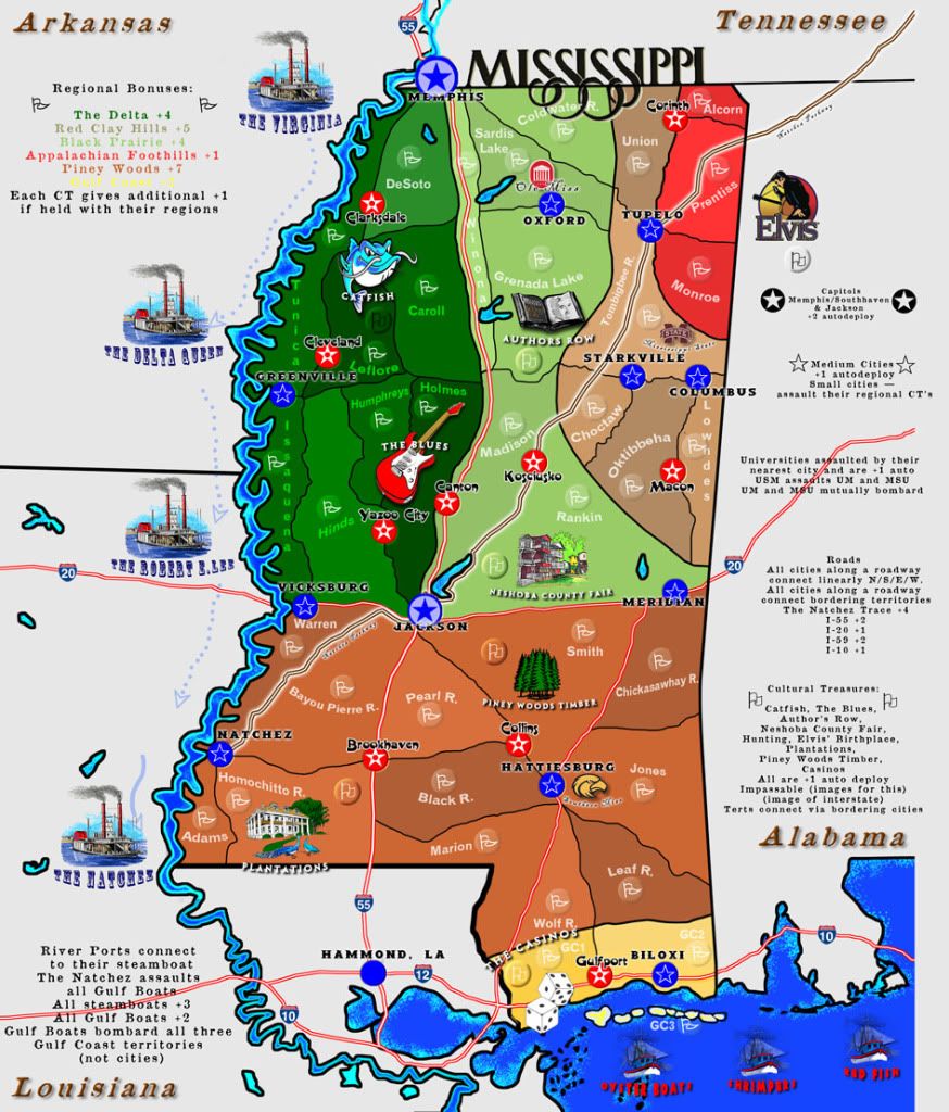
Map Name: Mississippi Magnolia
Mapmaker(s): Vicfontaine, "Deep Throat" Game Designer wants to be anonymous for now! lol :oops:
Number of Territories: 78
Special Features: multi-level bonuses (multiple regions, autodeploys, additional bonuses within regions, etc.), culture-specific to Mississippi
What Makes This Map Worthy of Being Made: There are no unique Deep South (USA) maps and this one provides that as well as detail into some Mississippi history; gameplay is easy but multi-dimensional with bonuses, attacks, defensive positions, etc.

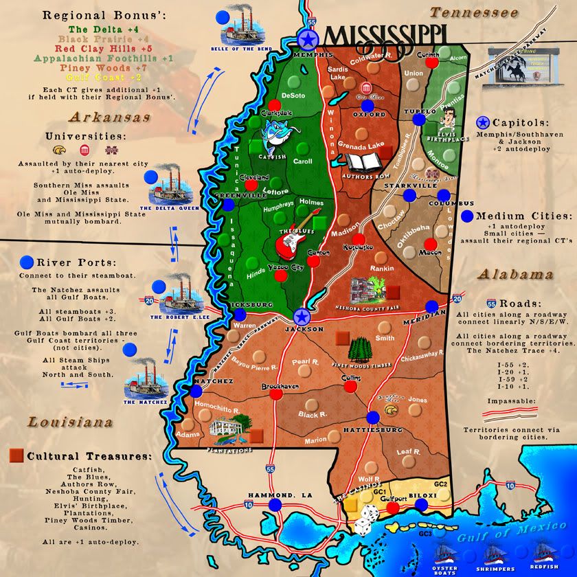
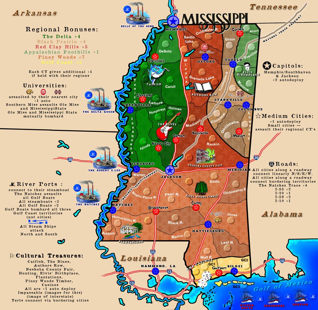
UPDATE AS OF APRIL 22, 2012. This is the 840x840 size as requested by Koontz. Based on this image size, I request again my original supersize stamp. Picture this size with 150 troops on a spot. It'll get pretty crowded very quickly. Plus, it looks a bit too intimidating and crowded in this smaller size.
Image

WHAT STILL MUST BE DONE:
1) Continue cleaning fonts
2) Alter (perhaps) the ghosted images, though we're quite satisfied with them as is. They are very faint in both areas: the regional bonuses in the gameplay area and in the non-gameplay, surrounding states area.
3) The possibility of an objective win: I like this. Don't know what it would be, but perhaps holding the Universities or all the Cultural treasures, plus the Capitol of Jackson.

(Older Version:)
(update #3)
Image
(update #2)
Image

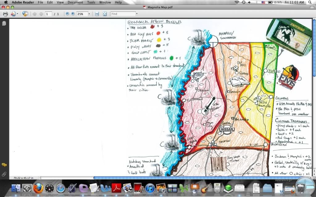
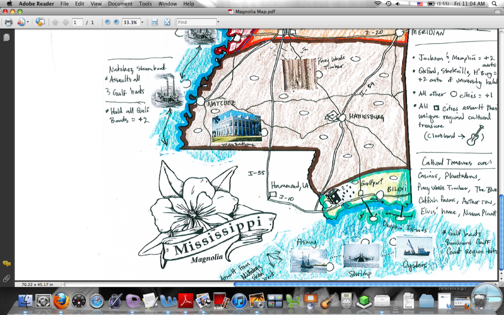
ORIGINALS (hand-drawn):
Click image to enlarge.
image

Click image to enlarge.
image


The territories are created by the infrastructure (Interstates, state highways, and the historic "Natchez Trace" roadway). The map includes unique cultural icons of Mississippi (history, major tourist attractions), and bonuses are plenty and varied and are based on cultural treasures, waterways, ecological regions, and major, medium, and small cities. Attack routes are "whatever is adjacent to" with, again, all roads serving as dividing lines. Attacks are made over impassables through cities. Thus, cities sitting on I-55 connect their adjoining terts.

Universities (Ole Miss, Mississippi State [MSU], University of Southern Mississippi [USM] are accessed via their adjoining cities (so: Oxford gets to Ole Miss, Starkville gets to MSU, and Hattiesburg gets to USM).

Would enjoy some feedback, and would love to see such a versatile map like this join the other terrific CC maps.

http://s1154.photobucket.com/albums/p537/vicfontaine1/?action=view&current=MagnoliaMap.jpg
"It is a good day to die."
User avatar
Lieutenant VicFontaine
 
Posts: 372
Joined: Sat Oct 02, 2010 7:34 pm
Location: The Dominion

Re: Mississippi Magnolia State Map - [April 22, '12] - Page

Postby koontz1973 on Sun Apr 22, 2012 11:43 pm

Vic, firstly let me say thanks for giving the smaller version a go. It does look great. =D> I have added some of the army numbers onto it so you can see the size does work. All it is going to take is to shuffle around some of the names in the tighter regions. But this is starting to look very nice.

Click image to enlarge.
image


Encase you have not found them, here they are.Image
Can I ask you to post your images in [BigImg] [/BigImg] tags please. ;)
Image
User avatar
Lieutenant koontz1973
 
Posts: 6960
Joined: Thu Jan 01, 2009 10:57 am

Re: Mississippi Magnolia State Map - [April 22, '12] - Page

Postby VicFontaine on Mon Apr 23, 2012 9:16 am

koontz1973 wrote:Vic, firstly let me say thanks for giving the smaller version a go. It does look great. =D> I have added some of the army numbers onto it so you can see the size does work. All it is going to take is to shuffle around some of the names in the tighter regions. But this is starting to look very nice.


I'm not sure I agree. Imagine when a game gets into round 100 and there's 200, 1,000, or whatever larger armies on the map. I would have to eliminate whole areas of this map where the jumble really gets going. Perhaps I will have to put army markers in every territory for you to see it. But I would still like for the original grant for supersize to be given, seeing as how I've fulfilled the original request before I was told, "Do A and B and you'll get the stamp" or such. Maybe I misunderstood. I'm unsure how a map like Trafalgar, which has no complexity to it whatsover, gets the stamp, but this one, which has all kinds of complexity and that complexity is compounded by a small size, can't....?

Click image to enlarge.
image


koontz1973 wrote:Encase you have not found them, here they are.Image
Can I ask you to post your images in [BigImg] [/BigImg] tags please. ;)


You may ask, but whether or not I can figure it out is another thing. It took me a week just to figure out how to use photobucket lol. I'll do my best, bud!
"It is a good day to die."
User avatar
Lieutenant VicFontaine
 
Posts: 372
Joined: Sat Oct 02, 2010 7:34 pm
Location: The Dominion

Re: Mississippi Magnolia State Map - [April 22, '12] - Page

Postby Gillipig on Mon Apr 23, 2012 10:06 am

Looking a lot better than when I last checked it. I like the background image. The previous was hard to look at. It's quite big though. A lot of needless space in the legend. Some things aren't clear, like how the boats and the island are connected to the rest of the map. Which territs they border.
AoG for President of the World!!
I promise he will put George W. Bush to shame!
User avatar
Lieutenant Gillipig
 
Posts: 3565
Joined: Fri Jan 09, 2009 1:24 pm

Re: Mississippi Magnolia State Map - [April 22, '12] - Page

Postby VicFontaine on Mon Apr 23, 2012 10:24 am

Gillipig wrote:Looking a lot better than when I last checked it.


Thanks.

Gillipig wrote:I like the background image.


Thanks.

Gillipig wrote:The previous was hard to look at.


Yes, it was never our intention to leave as is. Glad you like it!

Gillipig wrote:It's quite big though. A lot of needless space in the legend.


I don't agree. The instructions have to be clear. If we bunch them back up together, people won't play it because it will be difficult to read. We need to keep spaces. It's already crammed together more than I like, and even though it's my own map, I have to squint a bit to read it at the current smaller size.

Gillipig wrote:Some things aren't clear, like how the boats and the island are connected to the rest of the map.


We can make this clearer, though I don't think it's hard to figure out as is. Just a review: "Riverports: Connect to their steamboats." That's clear. Steamboats attack North and South at one another. That's clear. "The Natchez" steamboat assaults the Gulf Fishing boats. That's clearly written (though there needs to be a one-way arrow indicating The Natchez one-way assaults those boats. As currently drawn, it's a two-way assault.).

What I would like to clarify is the Riverports: they are a +1 autodeploy (as all solid blue cities are), but they should, perhaps, be identified with an anchor image, or a dock, or something nautical like a big wheel as they used on the steamboats back in the day. This would clarify what a "Riverport" is beyond attestation.

Gillipig wrote:Which territs they (the Gulf islands and boats) border.

We definitely need a line connecting the Mississippi Islands in the Gulf to the mainland. We forgot. But the boats in the Mississippi River and the Boats in the Gulf are clearly identified as to how they operate.

We also left off one "impassable" image: the solid, thick black lines are all impassable. There are only 2 of these in the actual gameplay map in the NE of the map; both of these divide separate regions.

The goal here is to force movement within a bonus region between terts as standard gameplay has it on many maps, but to force players to move and contest the CITIES that sit between regions and interstates and The Natchez Trace (called "The Trace" by residents) when attempting regional expansion.

Thanks for your comments, G.
"It is a good day to die."
User avatar
Lieutenant VicFontaine
 
Posts: 372
Joined: Sat Oct 02, 2010 7:34 pm
Location: The Dominion

Re: Mississippi Magnolia State Map - [April 22, '12] - Page

Postby koontz1973 on Mon Apr 23, 2012 10:59 am

Vic, the amount of games that gets into the hundreds is rare so no need to worry about that. The only requirement is for you to be able to place 888 on the map clearly. And right now, your smaller version allows that. As for Trafalgar, it is a pretty complicated map and large but it was made at a time before now and we cannot compare the two. As of now, thanks for the small version.
Image
User avatar
Lieutenant koontz1973
 
Posts: 6960
Joined: Thu Jan 01, 2009 10:57 am

Re: Mississippi Magnolia State Map - [April 22, '12] - Page

Postby isaiah40 on Mon Apr 23, 2012 12:38 pm

I've revisited this, and after seeing your 840x840 version, I believe that you can cut it down to the 840x800 size easily. For the left legend area, you can move everything down and crop it to the appropriate height of 800px. Concerning the other state names Tennessee, Alabama, etc should be subdued a bit so that you can barely see them. I say this because if you look at Arkansas and Louisiana,, they look as if they are part of the legend when they shouldn't be. When you crop it down, move Tennessee down and to the right a bit. Below is my version with the 888's on. You have a problem with the army circles as the like colored 888's will be very hard to see. Please make sure that the university logos are free from copyright, or if you can get permission to use them then provide prove that you have permission. As for the dancing Elvis is that image in Public Domain? The islands next to the oyster boat, remove them and move those boats to the left so the 888's on the redfish boat stay on the map.

The text in the legend areas, you can increase the size up a couple, as you have plenty of room.
Image
Lieutenant isaiah40
 
Posts: 3990
Joined: Mon Aug 27, 2007 7:14 pm

Re: Mississippi Magnolia State Map - [April 22, '12] - Page

Postby VicFontaine on Mon Apr 23, 2012 9:06 pm

isaiah40 wrote:I've revisited this, and after seeing your 840x840 version, I believe that you can cut it down to the 840x800 size easily. For the left legend area, you can move everything down and crop it to the appropriate height of 800px. Concerning the other state names Tennessee, Alabama, etc should be subdued a bit so that you can barely see them. I say this because if you look at Arkansas and Louisiana,, they look as if they are part of the legend when they shouldn't be. When you crop it down, move Tennessee down and to the right a bit. Below is my version with the 888's on. You have a problem with the army circles as the like colored 888's will be very hard to see. Please make sure that the university logos are free from copyright, or if you can get permission to use them then provide prove that you have permission. As for the dancing Elvis is that image in Public Domain? The islands next to the oyster boat, remove them and move those boats to the left so the 888's on the redfish boat stay on the map.

The text in the legend areas, you can increase the size up a couple, as you have plenty of room.
Image


I don't know. Maybe it'll work. It's just so hard to make sense of it all when small.
"It is a good day to die."
User avatar
Lieutenant VicFontaine
 
Posts: 372
Joined: Sat Oct 02, 2010 7:34 pm
Location: The Dominion

Re: Mississippi Magnolia State Map - [April 22, '12] - Page

Postby army of nobunaga on Tue Apr 24, 2012 11:41 pm

are we in game play yet.. thats all i know lol


If so I think the river needs a bigger part

mississippis history and life is all about the river.

the river may need boats that can attack all up and down or something.. I dunno.
Maps Maps Maps!


Take part in this survey and possibly win an upgrade -->
https://docs.google.com/spreadsheet/embeddedform?formkey=dGg4a0VxUzJLb1NGNUFwZHBuOHRFZnc6MQ
User avatar
Cadet army of nobunaga
 
Posts: 1989
Joined: Sat Oct 13, 2007 10:06 pm
Location: www.facebook.com/armyofnobu and Houston.

Re: Mississippi Magnolia State Map - [April 22, '12] - Page

Postby VicFontaine on Tue Apr 24, 2012 11:43 pm

army of nobunaga wrote:are we in game play yet.. thats all i know lol


If so I think the river needs a bigger part

mississippis history and life is all about the river.

the river may need boats that can attack all up and down or something.. I dunno.


@ River Boats: You mean...besides the Steamboats? They are accessed via the nearest port (so: Memphis, Greenville, Vicksburg, Natchez). Besides that, the river was/is economical (shipping and travel).

I wish we had room to add some flatboats, but we don't.
"It is a good day to die."
User avatar
Lieutenant VicFontaine
 
Posts: 372
Joined: Sat Oct 02, 2010 7:34 pm
Location: The Dominion

Re: Mississippi Magnolia State Map - [April 22, '12] - Page

Postby army of nobunaga on Tue Apr 24, 2012 11:51 pm

Oh shit, I am an idiot.. I did not realize those boats were in play.. I need to relook at ALL of this now.

sorry and thanks
Maps Maps Maps!


Take part in this survey and possibly win an upgrade -->
https://docs.google.com/spreadsheet/embeddedform?formkey=dGg4a0VxUzJLb1NGNUFwZHBuOHRFZnc6MQ
User avatar
Cadet army of nobunaga
 
Posts: 1989
Joined: Sat Oct 13, 2007 10:06 pm
Location: www.facebook.com/armyofnobu and Houston.

Re: Mississippi Magnolia State Map - [April 22, '12] - Page

Postby army of nobunaga on Tue Apr 24, 2012 11:53 pm

Ill relook at this.. but get those boats more away from the words..

I HATE the baseball map because of this.

I should have read more I guess... but those boats look like parts of decoration.


Sorry again... it probably is only an issue with me and everyone else got it.
Maps Maps Maps!


Take part in this survey and possibly win an upgrade -->
https://docs.google.com/spreadsheet/embeddedform?formkey=dGg4a0VxUzJLb1NGNUFwZHBuOHRFZnc6MQ
User avatar
Cadet army of nobunaga
 
Posts: 1989
Joined: Sat Oct 13, 2007 10:06 pm
Location: www.facebook.com/armyofnobu and Houston.

Re: Mississippi Magnolia State Map - [April 22, '12] - Page

Postby VicFontaine on Wed Apr 25, 2012 12:04 am

army of nobunaga wrote:Ill relook at this.. but get those boats more away from the words..

I HATE the baseball map because of this.

I should have read more I guess... but those boats look like parts of decoration.

Sorry again... it probably is only an issue with me and everyone else got it.


Because of the smaller size, it's an easy mistake. I have consistently said the size of the legend should be enough to grant this map a larger size. Moreover, the multiple facets of gameplay—complexity—should also be enough to grant it a larger size. Originally, I was told no problem, but now I'm limited to the 800 size. I do not want to reduce tert count (currently at 78) or alter gameplay. It's great as it is, able to be played right now as is (of course, it can always be tweaked, and I'm sure it will be...).

You can see that the legend is already cutting words from the right hand side (because of the smaller size). Sure, I can move things around, but that doesn't change anything: the map's details are too close together to make it easily readable and inviting to even the simplest of players.

I do not see how this can be overcome, especially if an objective win was added: just where in the legend would THAT go? We had it big for these reasons: room to expand. Now we're having to reduce it. Sad. What can you do.
"It is a good day to die."
User avatar
Lieutenant VicFontaine
 
Posts: 372
Joined: Sat Oct 02, 2010 7:34 pm
Location: The Dominion

Re: Mississippi Magnolia State Map - [April 22, '12] - Page

Postby VicFontaine on Wed Apr 25, 2012 12:06 am

It's worth adding to anyone still reading this thread (and I suspect few): Mississippi isn't Kansas. It's VERTICAL, not HORIZONTAL. That means any map of Mississippi with any real gameplay and design detail will, of necessity, be an awkward-sized map. In other words, yeah, you'll have to scroll a bit.

That can't be helped. I can't make MS a square or horizontal rectangle. That's just be Rhode Island...and what's fun with that? ;) :lol:
"It is a good day to die."
User avatar
Lieutenant VicFontaine
 
Posts: 372
Joined: Sat Oct 02, 2010 7:34 pm
Location: The Dominion

Re: Mississippi Magnolia State Map - [April 22, '12] - Page

Postby army of nobunaga on Wed Apr 25, 2012 12:23 am

been looking.. , its looking a lot better man... cheers... sorry for the miss. I didnt see the 888 at the very top boat.

I like the southern graphics a lot like I mentioned... I think the game play is average to above average... Ill keep looking and try to offer constructive criticism.. its better than any map I ever dreamed could be of mississp
Maps Maps Maps!


Take part in this survey and possibly win an upgrade -->
https://docs.google.com/spreadsheet/embeddedform?formkey=dGg4a0VxUzJLb1NGNUFwZHBuOHRFZnc6MQ
User avatar
Cadet army of nobunaga
 
Posts: 1989
Joined: Sat Oct 13, 2007 10:06 pm
Location: www.facebook.com/armyofnobu and Houston.

Re: Mississippi Magnolia State Map - [April 22, '12] - Page

Postby VicFontaine on Wed Apr 25, 2012 9:34 am

army of nobunaga wrote:been looking.. , its looking a lot better man... cheers... sorry for the miss. I didnt see the 888 at the very top boat.

I like the southern graphics a lot like I mentioned... I think the game play is average to above average... Ill keep looking and try to offer constructive criticism.. its better than any map I ever dreamed could be of mississp


=D>
"It is a good day to die."
User avatar
Lieutenant VicFontaine
 
Posts: 372
Joined: Sat Oct 02, 2010 7:34 pm
Location: The Dominion

Re: Mississippi Magnolia State Map - [April 22, '12] - Page

Postby happy2seeyou on Thu Apr 26, 2012 1:41 pm

Just curious but why the over load of beige and tans then two random greens and a yellow. Is there a way to make this easier on the eyes? Also I saw you said you didn't want to change the legends contents, ok but can you make them look better? Thsy kind of look like a few columns with the "center" typing option on them.
User avatar
Captain happy2seeyou
 
Posts: 4021
Joined: Mon Jan 22, 2007 2:59 pm
Location: A state that is in the shape of a mitten!

Re: Mississippi Magnolia State Map - [April 22, '12] - Page

Postby VicFontaine on Thu Apr 26, 2012 1:45 pm

happy2seeyou wrote:Just curious but why the over load of beige and tans then two random greens and a yellow. Is there a way to make this easier on the eyes? Also I saw you said you didn't want to change the legends contents, ok but can you make them look better? Thsy kind of look like a few columns with the "center" typing option on them.


1. Interior gameplay colors: we've been trying to find good colors for 2 months. We're still working on it.
2. More from #1. The Delta is a farming region: green. Piney Woods is timber: brown. The other regions are woods-y and increasingly hilly to the NE. Unsure on what colors could match the geography and make it look good. We're working on it. The Gulf is beach: yellow.
3. Having them justified may be the only other option. As is, pushing the Western Legend all the way "left" doesn't look good, and Eastern Legend all the way "right" doesn't look good. "Center" is the best option we have for the space available.

Thanks for posting. Keep following.
"It is a good day to die."
User avatar
Lieutenant VicFontaine
 
Posts: 372
Joined: Sat Oct 02, 2010 7:34 pm
Location: The Dominion

PreviousNext

Return to Recycling Box

Who is online

Users browsing this forum: No registered users