Conquer Club

Slovakia - V12 - Pg 1&14

Abandoned and Vacationed maps. The final resting place, unless you recycle.

Moderator: Cartographers

Forum rules
Please read the Community Guidelines before posting.

Re: Slovakia [06.02.12] - V8 - P1&8

Postby isaiah40 on Sat Mar 10, 2012 12:39 pm

DiM wrote:
tokle wrote:Would you consider giving up on the idea of using the current administrative divisions as your bonus structure?
It doesn't really work that well on top of the traditional regions anyway.

You could find something more arbitrary for your bonuses.


i'd rather go with starting positions since that will provide a fair but still random drop.

Agreed!!
Lieutenant isaiah40
 
Posts: 3990
Joined: Mon Aug 27, 2007 7:14 pm

Re: Slovakia [30.01.12] - V7 - P1&6

Postby Victor Sullivan on Tue Mar 13, 2012 6:57 pm

Click image to enlarge.
image


I would rather like to see Zilina bumped up to a +4, as it doesn't seem worth the investment to try and take for such a small map - 3 borders, 5 regions, no great expansion opportunities, really. This is debatable, however, since it technically meets the standards of a +3 bonus. I just think in the context of a small map, it could stand to be valued at a slightly higher 'price'.

As far as starting positions go, would something like this work?

Code: Select all
<positions max="1">
     <position>
          <territory>Ponitrie</territory>
          <territory>Zahorie</territory>
     </position>
     <position>
          <territory>Stredue Povazie</territory>
          <territory>Tekov</territory>
     </position>
     <position>
          <territory>Abov</territory>
          <territory>Hont</territory>
     </position>
     <position>
          <territory>Dolny Zemplin</territory>
          <territory>Pohronie</territory>
     </position>
</positions>

One downside is it would leave 4 extra neutrals in 1v1s. Alternatively you could go this route (with Ponitrie as a neutral 2):

Code: Select all
<positions>
     <position>
          <territory>Stredue Povazie</territory>
          <territory>Tekov</territory>
     </position>
     <position>
          <territory>Abov</territory>
          <territory>Hont</territory>
     </position>
     <position>
          <territory>Dolny Zemplin</territory>
          <territory>Pohronie</territory>
     </position>
</positions>

That would leave 3 extra neutrals in 1v1s. I'd have to figure out how this affects the drop numbers. Naturally, both of these options create a lot of neutrals for 5+ player games.

-Sully
User avatar
Corporal Victor Sullivan
 
Posts: 6010
Joined: Mon Feb 08, 2010 8:17 pm
Location: Columbus, OH

Re: Slovakia [06.02.12] - V8 - P1&8

Postby DiM on Thu Mar 15, 2012 3:13 pm

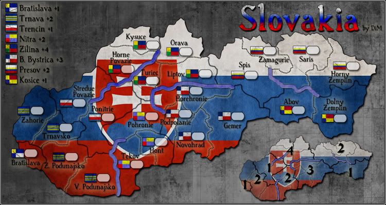
V9:
*bumped zilina to +4
*made impassables blue

Click image to enlarge.
image
“In the beginning God said, the four-dimensional divergence of an antisymmetric, second rank tensor equals zero, and there was light, and it was good. And on the seventh day he rested.”- Michio Kaku
User avatar
Major DiM
 
Posts: 10415
Joined: Wed Feb 14, 2007 6:20 pm
Location: making maps for scooby snacks

Re: Slovakia [06.02.12] - V8 - P1&8

Postby Oneyed on Fri Mar 16, 2012 4:54 am

DiM wrote:*made impassables blue


but they don´t look like rivers.

Oneyed
User avatar
Private 1st Class Oneyed
 
Posts: 1058
Joined: Sat Dec 10, 2011 12:29 pm

Re: Slovakia [15.03.12] - V9 - P1&9

Postby natty dread on Fri Mar 16, 2012 8:10 am

I have to say, now that I look at this map again... I wonder if the flag background of the map makes it a bit too busy. Maybe if you made the red & blue parts of the map lighter it would be a bit easier to follow...
Image
User avatar
Sergeant 1st Class natty dread
 
Posts: 12877
Joined: Fri Feb 08, 2008 8:58 pm
Location: just plain fucked

Re: Slovakia [15.03.12] - V9 - P1&9

Postby AndyDufresne on Fri Mar 16, 2012 8:24 am

The strength of the background could be an issue, since you have army shadow icons, flag icons...and the flag icons are with various colorations as well...

Best of luck.


--Andy
User avatar
Corporal 1st Class AndyDufresne
 
Posts: 24935
Joined: Fri Mar 03, 2006 8:22 pm
Location: A Banana Palm in Zihuatanejo

Re: Slovakia [06.02.12] - V8 - P1&8

Postby DiM on Fri Mar 16, 2012 8:30 am

Oneyed wrote:
DiM wrote:*made impassables blue


but they don´t look like rivers.

Oneyed


they don't need to. considering the style of the map is not one about realistic landscape, but something abstract, then the impassables must also be represented in an abstract style.
“In the beginning God said, the four-dimensional divergence of an antisymmetric, second rank tensor equals zero, and there was light, and it was good. And on the seventh day he rested.”- Michio Kaku
User avatar
Major DiM
 
Posts: 10415
Joined: Wed Feb 14, 2007 6:20 pm
Location: making maps for scooby snacks

Re: Slovakia [15.03.12] - V9 - P1&9

Postby DiM on Fri Mar 16, 2012 8:30 am

natty dread wrote:I have to say, now that I look at this map again... I wonder if the flag background of the map makes it a bit too busy. Maybe if you made the red & blue parts of the map lighter it would be a bit easier to follow...


something like the minimap?
“In the beginning God said, the four-dimensional divergence of an antisymmetric, second rank tensor equals zero, and there was light, and it was good. And on the seventh day he rested.”- Michio Kaku
User avatar
Major DiM
 
Posts: 10415
Joined: Wed Feb 14, 2007 6:20 pm
Location: making maps for scooby snacks

Re: Slovakia [15.03.12] - V9 - P1&9

Postby DiM on Fri Mar 16, 2012 8:31 am

AndyDufresne wrote:The strength of the background could be an issue, since you have army shadow icons, flag icons...and the flag icons are with various colorations as well...

Best of luck.


--Andy


the grey background or the flag background?
“In the beginning God said, the four-dimensional divergence of an antisymmetric, second rank tensor equals zero, and there was light, and it was good. And on the seventh day he rested.”- Michio Kaku
User avatar
Major DiM
 
Posts: 10415
Joined: Wed Feb 14, 2007 6:20 pm
Location: making maps for scooby snacks

Re: Slovakia [15.03.12] - V9 - P1&9

Postby natty dread on Fri Mar 16, 2012 8:38 am

DiM wrote:
natty dread wrote:I have to say, now that I look at this map again... I wonder if the flag background of the map makes it a bit too busy. Maybe if you made the red & blue parts of the map lighter it would be a bit easier to follow...


something like the minimap?


Maybe even slightly lighter...
Image
User avatar
Sergeant 1st Class natty dread
 
Posts: 12877
Joined: Fri Feb 08, 2008 8:58 pm
Location: just plain fucked

Re: Slovakia [15.03.12] - V9 - P1&9

Postby AndyDufresne on Fri Mar 16, 2012 8:47 am

natty dread wrote:
DiM wrote:
natty dread wrote:I have to say, now that I look at this map again... I wonder if the flag background of the map makes it a bit too busy. Maybe if you made the red & blue parts of the map lighter it would be a bit easier to follow...


something like the minimap?


Maybe even slightly lighter...

This is what I was referring to, mostly in agreement with natty dread.


--Andy
User avatar
Corporal 1st Class AndyDufresne
 
Posts: 24935
Joined: Fri Mar 03, 2006 8:22 pm
Location: A Banana Palm in Zihuatanejo

Re: Slovakia [15.03.12] - V9 - P1&9

Postby DiM on Fri Mar 16, 2012 8:51 am

natty dread wrote:
DiM wrote:
natty dread wrote:I have to say, now that I look at this map again... I wonder if the flag background of the map makes it a bit too busy. Maybe if you made the red & blue parts of the map lighter it would be a bit easier to follow...


something like the minimap?


Maybe even slightly lighter...


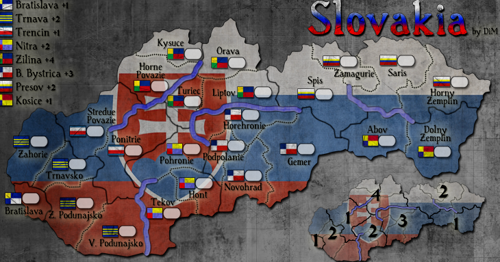
i tweaked both the minimap as well as the main map:
something like this perhaps...
Image
“In the beginning God said, the four-dimensional divergence of an antisymmetric, second rank tensor equals zero, and there was light, and it was good. And on the seventh day he rested.”- Michio Kaku
User avatar
Major DiM
 
Posts: 10415
Joined: Wed Feb 14, 2007 6:20 pm
Location: making maps for scooby snacks

Re: Slovakia [15.03.12] - V9 - P1&9

Postby natty dread on Fri Mar 16, 2012 9:40 am

The left side still looks really dark there...
Image
User avatar
Sergeant 1st Class natty dread
 
Posts: 12877
Joined: Fri Feb 08, 2008 8:58 pm
Location: just plain fucked

Re: Slovakia [15.03.12] - V9 - P1&9

Postby DiM on Fri Mar 16, 2012 9:47 am

natty dread wrote:The left side still looks really dark there...


not just the left side, there's a bit of variation throughout the map. i don't want it identical all over.
“In the beginning God said, the four-dimensional divergence of an antisymmetric, second rank tensor equals zero, and there was light, and it was good. And on the seventh day he rested.”- Michio Kaku
User avatar
Major DiM
 
Posts: 10415
Joined: Wed Feb 14, 2007 6:20 pm
Location: making maps for scooby snacks

Re: Slovakia [15.Mar.12] - V9 - P1&9

Postby jsnyder748 on Tue Apr 03, 2012 11:35 pm

I think that making the legend in the bottom right easier to read (I.E no background flag) would help users get used to how the regions are laid out because their is so much going on in the left side of the map.....plus when we add in troop spots it will make the regions more clear. Just some thoughts :D
User avatar
Colonel jsnyder748
 
Posts: 795
Joined: Sat Jul 18, 2009 5:56 pm
Location: University Of Nebraska

Re: Slovakia [30.01.12] - V7 - P1&6

Postby iancanton on Sun Apr 08, 2012 7:52 am

Victor Sullivan wrote:As far as starting positions go, would something like this work?

Code: Select all
<positions max="1">
     <position>
          <territory>Ponitrie</territory>
          <territory>Zahorie</territory>
     </position>
     <position>
          <territory>Stredue Povazie</territory>
          <territory>Tekov</territory>
     </position>
     <position>
          <territory>Abov</territory>
          <territory>Hont</territory>
     </position>
     <position>
          <territory>Dolny Zemplin</territory>
          <territory>Pohronie</territory>
     </position>
</positions>

this doesn't work in 1v1 because, 33% of the time, both players drop a bonus, following which player 1 uses his bonus against that of player 2.

Victor Sullivan wrote:Alternatively you could go this route (with Ponitrie as a neutral 2):

Code: Select all
<positions>
     <position>
          <territory>Stredue Povazie</territory>
          <territory>Tekov</territory>
     </position>
     <position>
          <territory>Abov</territory>
          <territory>Hont</territory>
     </position>
     <position>
          <territory>Dolny Zemplin</territory>
          <territory>Pohronie</territory>
     </position>
</positions>

That would leave 3 extra neutrals in 1v1s. I'd have to figure out how this affects the drop numbers. Naturally, both of these options create a lot of neutrals for 5+ player games.

this doesn't work either in 1v1: if player 1 drops abov and hont and player 2 drops stredue povazie and tekov, then dolny zemplin and pohronie are put back into the pot for random allocation to player 1, player 2 or neutral, which results in a roughly one-third chance that dolny zemplin ends up with player 1; this means a 22% chance of player 1 starting with a bonus.

to reduce player 1's drop advantage, we need a neutral on one region of each of the 2-region bonuses. to restore the number of random-start regions to 24, i suggest adding bratislava airport region and kosice airport region as a way to connect slovakia's two largest cities and let someone capture the bratislava bonus without going through trnava. since the map is long and thin, perhaps the airports can be represented simply as two aeroplanes with troop circles below the main map, connected to each other and to their cities as dotted lines.

i also echo the call for the flag to be lighter. it's too distracting.

ian. :)
Image
User avatar
Brigadier iancanton
Foundry Foreman
Foundry Foreman
 
Posts: 2431
Joined: Fri Jun 01, 2007 5:40 am
Location: europe

Re: Slovakia [15.Mar.12] - V9 - P1&9

Postby DiM on Sun Apr 08, 2012 2:17 pm

V10:
*made the flag lighter on the map and even lighter on the minimap
*added 2 terits (airports)

Click image to enlarge.
image
“In the beginning God said, the four-dimensional divergence of an antisymmetric, second rank tensor equals zero, and there was light, and it was good. And on the seventh day he rested.”- Michio Kaku
User avatar
Major DiM
 
Posts: 10415
Joined: Wed Feb 14, 2007 6:20 pm
Location: making maps for scooby snacks

Re: Slovakia [15.Mar.12] - V9 - P1&9

Postby iancanton on Wed Apr 11, 2012 4:43 pm

sorry for the delay, DiM. we're discussing ur map behind the scenes prior to js stamping it. please can u show us where the neutral-starting regions will be (one region of each of the 2-region bonuses) and whether u prefer them to start with 2 or 3 neutral troops? we might tweak one or two of ur bonuses, though the majority are spot-on. i personally believe that the basic layout is good and that u won't need to change any borders. perhaps put an airport symbol beside the airport regions, to emphasise that they're not part of a flag bonus.

ian. :)
Image
User avatar
Brigadier iancanton
Foundry Foreman
Foundry Foreman
 
Posts: 2431
Joined: Fri Jun 01, 2007 5:40 am
Location: europe

Re: Slovakia [08.Apr.12] - V10 - P1&10

Postby DiM on Wed Apr 11, 2012 5:27 pm

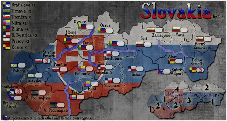
here you go ian.
V11:
*added airplane icon
*moved the airplane explanation
*added neutrals
*corrected terit names
Click image to enlarge.
image
Last edited by DiM on Thu Apr 12, 2012 9:15 am, edited 1 time in total.
“In the beginning God said, the four-dimensional divergence of an antisymmetric, second rank tensor equals zero, and there was light, and it was good. And on the seventh day he rested.”- Michio Kaku
User avatar
Major DiM
 
Posts: 10415
Joined: Wed Feb 14, 2007 6:20 pm
Location: making maps for scooby snacks

Re: Slovakia [12.Apr.12] - V11 - P1&10

Postby Oneyed on Thu Apr 12, 2012 12:46 am

I found one mistake in text:

Stredue Povazie - Stredne Povazie

what about ˇ´ - when I look at the Slovak names without these they looks peliculiar...

maybe you should use for airports slovak names - letisko: Letisko Kosice, Letisko Bratislava.

Oneyed
User avatar
Private 1st Class Oneyed
 
Posts: 1058
Joined: Sat Dec 10, 2011 12:29 pm

Re: Slovakia [12.Apr.12] - V11 - P1&10

Postby DiM on Thu Apr 12, 2012 7:23 am

Oneyed wrote:I found one mistake in text:

Stredue Povazie - Stredne Povazie


will correct in the next update.

Oneyed wrote:what about ˇ´ - when I look at the Slovak names without these they looks peliculiar...


if you can tell me the correct names i'll be glad to change them.
i've only found a few like Prešov, Žilina, Trenčín, Košice
but i'm sure there are more.

Oneyed wrote:maybe you should use for airports slovak names - letisko: Letisko Kosice, Letisko Bratislava.

Oneyed


letisko means airport. i could use it but then the explanation would be in english so it would be weird.
“In the beginning God said, the four-dimensional divergence of an antisymmetric, second rank tensor equals zero, and there was light, and it was good. And on the seventh day he rested.”- Michio Kaku
User avatar
Major DiM
 
Posts: 10415
Joined: Wed Feb 14, 2007 6:20 pm
Location: making maps for scooby snacks

Re: Slovakia [12.Apr.12] - V11 - P1&10

Postby Oneyed on Thu Apr 12, 2012 8:32 am

here are correct slovak names:

Záhorie
Stredné Považie
Horné Považie
Podpoľanie
Spiš
Šariš
Horný Zemplín
Dolný Zemplín

Košice Airport

for airport/letisko, it is only my slovak view - when I see all Slovak names I would like also these in Slovak language... ;)

Oneyed
User avatar
Private 1st Class Oneyed
 
Posts: 1058
Joined: Sat Dec 10, 2011 12:29 pm

Re: Slovakia [12.Apr.12] - V11 - P1&10

Postby DiM on Thu Apr 12, 2012 9:16 am

thanks Oneyed.
i've corrected the names and replaced the image in the post above. click refresh and check it out.
“In the beginning God said, the four-dimensional divergence of an antisymmetric, second rank tensor equals zero, and there was light, and it was good. And on the seventh day he rested.”- Michio Kaku
User avatar
Major DiM
 
Posts: 10415
Joined: Wed Feb 14, 2007 6:20 pm
Location: making maps for scooby snacks

Re: Slovakia [12.Apr.12] - V11 - P1&10

Postby ManBungalow on Thu Apr 12, 2012 11:57 am

Why is this map thread a sticky ?
Image
Colonel ManBungalow
 
Posts: 3431
Joined: Sun Jan 13, 2008 7:02 am
Location: On a giant rock orbiting a star somewhere

Re: Slovakia [12.Apr.12] - V11 - P1&10

Postby koontz1973 on Thu Apr 12, 2012 12:21 pm

ManBungalow wrote:Why is this map thread a sticky ?

Because he is waiting for the game play stamp. As soon as he gets it, he loses it untill graphics are done. :roll:
Image
User avatar
Lieutenant koontz1973
 
Posts: 6960
Joined: Thu Jan 01, 2009 10:57 am

PreviousNext

Return to Recycling Box

Who is online

Users browsing this forum: No registered users