[Abandoned] Research & Conquer
Moderator: Cartographers
Re: Research & Conquer [Development Suspended]
Here is V17!
Changes:
- tweaked the pipes a little
- Added in bends and 'T' 's to the pipes
Changes:
- tweaked the pipes a little
- Added in bends and 'T' 's to the pipes
-
 isaiah40
- Posts: 3990
- Joined: Mon Aug 27, 2007 7:14 pm


Re: Research & Conquer [13 Feb 2012] V17 pg82
You know, I think it might be better to start over with entirely new graphics... If Tacktix isn't working on this anymore.

-

 natty dread
- Posts: 12877
- Joined: Fri Feb 08, 2008 8:58 pm
- Location: just plain fucked


Re: Research & Conquer [13 Feb 2012] V17 pg82
natty dread wrote:You know, I think it might be better to start over with entirely new graphics... If Tacktix isn't working on this anymore.
i agree. you can keep the layout as it seems pretty well ironed out but i think starting over might actually be easier than fixing bits and pieces.
if you go for the fixing route in the end you might work more and achieve less.
“In the beginning God said, the four-dimensional divergence of an antisymmetric, second rank tensor equals zero, and there was light, and it was good. And on the seventh day he rested.”- Michio Kaku
-

 DiM
DiM
- Posts: 10415
- Joined: Wed Feb 14, 2007 6:20 pm
- Location: making maps for scooby snacks


Re: Research & Conquer [13 Feb 2012] V17 pg82
That, and also it's hard to take over the graphics someone else has made, if there's more than just minor changes to do - it easily ends up looking like a mish-mash of clashing styles...

-

 natty dread
- Posts: 12877
- Joined: Fri Feb 08, 2008 8:58 pm
- Location: just plain fucked


Re: Research & Conquer [13 Feb 2012] V17 pg82
So what do others say? Start from scratch or continue with this one?? I'm okay with it either way.
-
 isaiah40
- Posts: 3990
- Joined: Mon Aug 27, 2007 7:14 pm


Re: Research & Conquer [13 Feb 2012] V17 pg82
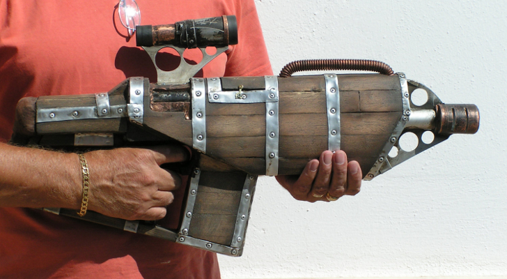
Here's a stylistic suggestion to you - it may seem like an odd image to take inspiration from, but whatever:


-

 natty dread
- Posts: 12877
- Joined: Fri Feb 08, 2008 8:58 pm
- Location: just plain fucked


Re: Research & Conquer [2 Aug 2011] (Version 12 in P1 & P72)
“In the beginning God said, the four-dimensional divergence of an antisymmetric, second rank tensor equals zero, and there was light, and it was good. And on the seventh day he rested.”- Michio Kaku
-

 DiM
DiM
- Posts: 10415
- Joined: Wed Feb 14, 2007 6:20 pm
- Location: making maps for scooby snacks


Re: Research & Conquer [13 Feb 2012] V17 pg82
isaiah40 wrote:So what do others say? Start from scratch or continue with this one?? I'm okay with it either way.
Well, if you are okay with it either way (not that there's anything wrong with that
-

 ender516
- Posts: 4455
- Joined: Wed Dec 17, 2008 6:07 pm
- Location: Waterloo, Ontario


Re: Research & Conquer
TaCktiX wrote:I've done a lot of thinking about this map and my ability to do the necessary improvements over the past several days. I can't do it. My drive to do anything in Photoshop or on this site is essentially negative at this point. I go to work every day and get paid to do that, and I enjoy it. I do not get paid anything to be on this site and I'm not enjoying it at this point. So I am terminating my involvement with Research & Conquer at this point.
However, I still want to see the map reach play one day for the simple fact that Oliver had a great idea and it's one that deserves to see the light of day. I have given Industrial Helix the link to all of my source PSDs. Whoever is willing to take it forward can contact him for them.
As for me, I'm done. Once my final game on CC is concluded, I will not be logging back in. I wish I could say it was fun, but the past year has been anything but.
I'm sorry to see you leave, TaCKtiX, and I do hope that you will return at some point to enjoy all of the hard work that you've put into the map. Thank you for all the work you've put into the map over the last two years, it's very much appreciated.
-

 -=- Tanarri -=-
- Posts: 884
- Joined: Wed Jul 08, 2009 2:02 pm
- Location: The Underworld


Re: Research & Conquer
-=- Tanarri -=- wrote:TaCktiX wrote:I've done a lot of thinking about this map and my ability to do the necessary improvements over the past several days. I can't do it. My drive to do anything in Photoshop or on this site is essentially negative at this point. I go to work every day and get paid to do that, and I enjoy it. I do not get paid anything to be on this site and I'm not enjoying it at this point. So I am terminating my involvement with Research & Conquer at this point.
However, I still want to see the map reach play one day for the simple fact that Oliver had a great idea and it's one that deserves to see the light of day. I have given Industrial Helix the link to all of my source PSDs. Whoever is willing to take it forward can contact him for them.
As for me, I'm done. Once my final game on CC is concluded, I will not be logging back in. I wish I could say it was fun, but the past year has been anything but.
I'm sorry to see you leave, TaCKtiX, and I do hope that you will return at some point to enjoy all of the hard work that you've put into the map. Thank you for all the work you've put into the map over the last two years, it's very much appreciated.
I just noticed that I failed to express my regrets over the departure of TaCktiX. Tanarri has said it very well.
I suspect that I let this slip initially as I was in a mood which came too close to agreeing with TaCktiX. I am not at the point of packing it all in here at CC, but it does seem more of a chore sometimes that it has in the past.
-

 ender516
- Posts: 4455
- Joined: Wed Dec 17, 2008 6:07 pm
- Location: Waterloo, Ontario


Re: Research & Conquer [13 Feb 2012] V17 pg82
Just to comment on the start over vs. use TaCKtiX's design, I think that it depends on how much everyone feels would need to be done to the map to make the majority happy with it. If there's a fair bit left to do, then perhaps as someone mentioned it would be better to start from scratch rather than risk clashing of styles. I personally like TaCKtiX's version and think with a few tweak it would be good for a graphics stamp. That being said, I'm always interested to seeing other designs, suggestions, etc. as well.
-

 -=- Tanarri -=-
- Posts: 884
- Joined: Wed Jul 08, 2009 2:02 pm
- Location: The Underworld


Re: Research & Conquer [13 Feb 2012] V17 pg82
Bit more steampunk would be most ideal. But whatever you think, but yeah total revamp in your own hand isaiah .
I can't blame ya Tack, good luck, and thank you.
I can't blame ya Tack, good luck, and thank you.


-

 RedBaron0
- Posts: 2657
- Joined: Sun Aug 19, 2007 12:59 pm
- Location: Pennsylvania


Re: Research & Conquer [13 Feb 2012] V17 pg82
Temporarily on [Vacation] as requested by Isaiah40. Give him some time to read throught the pages and see what needs to be done.
Isaiah let me know when you want this one moved back!
Nobodies
Isaiah let me know when you want this one moved back!
Nobodies
-

 thenobodies80
- Posts: 5400
- Joined: Wed Sep 05, 2007 4:30 am
- Location: Milan


Re: [Vacation - valid untill Aug 2012] - Research & Conquer
I look forward to seeing this get back on track whenever Isaiah finishes getting through the messages in the thread.
Since this is going on vacation and there's been 4-5 pages of stuff since I posted this last, the following are some notes for Oliver regarding the XML that should be fixed. I'm not sure if he got them the first time around and I want to make sure they don't get lost and cause problems later on down the road when this gets to beta
----------------
- The mines need to have all 40 included in the code, since it's possible to have 40 mines and not own 75% of the board
- Override tags should be included within the 'Mines with Mining' continents to override the 'Mines' continents so that it shows in BOB cleaner. Likewise, Deep Mining continents should include 'Mines with Mining' continents as requirements and override them as well, providing the full +4 per mine bonus instead of stacking two +2 bonuses. This would add a bit of bulk to the XML so I think it's an optional touch for the time being, but should be added after the XML update if nothing else.
- Zeppelin Strikes need to be renamed to Sabotage
- The borders on the tech territories should be removed except for the basic techs which need to attack their advanced techs. This needs to be fixed to prevent forting from occuring from the techs back to the laboratory. This is especially important for TSFs and Doomsday, as those autodeploys shouldn't be able to be used to directly research techs.
-

 -=- Tanarri -=-
- Posts: 884
- Joined: Wed Jul 08, 2009 2:02 pm
- Location: The Underworld


Re: [Vacation - valid untill Aug 2012] - Research & Conquer
Here's what I have come up with so far.
Ignore the mountains, they have a long way to go as they look like plastic pieces of poop.
1 - Enlarged the map.
2. Added dials/selector knobs and gauges
3. Removed the pipes
4. Added in the directional "SW" and such in each gauge and around each dial/selector knob
5. Added a forest to the playable area
6. Placed the playable area into a TV like screen thingy.
7. Redrew all the territories to make everything fit better and for clarity.
To do:
1. Add back in the instructions
2. Redo the mountains
3. Add in if there is room an inspection window (view of gears, tubes, wires etc.)
-
 isaiah40
- Posts: 3990
- Joined: Mon Aug 27, 2007 7:14 pm


Re: Research & Conquer Version 18 [20 March 2012] pg 83
Hi Isaiah,
I don't have much time to properly respond, but thought I'd give a few first impressions.
As far as the map area goes, I think it's improved a fair bit. While I liked the theme that TaCKtiX had going and thought it fit a bit better with the steampunk concept, his map area graphics were limited because of it. So great work with that part
For my own preferences, the grey and bronze texture could use some work. I think they appear rather pixelated and while I like the general concept, I think it could use a different texture. The bright purple / pink colour for conscriptions seems really out of place and I think it should be a different colour.
The last major thing I think that needs to be rethought about this design is the size of the map. Even at a pretty decent screen resolution on a wide screen monitor the map runs nearly all the way to the right, making it so that you would need to scroll right just to see the list of players, clock, etc. on the right side of the map. I think the current design of the map doesn't use space very efficiently. It almost looks like you chose the maximum supersize resolution to start and then tried to think of how to fill in the space. I think the previous layout which was used for the labratories which had everything arranged in rows would work better than the dials. The current sections that are arranged like that already could be shrunk down and I think that would clear up some space. It may also be possible to stick one or two of the researches underneath the map, depending on how much space the instructions need. That would help reduce some of the vertical space.
I think that covers it for now. All in all I think it's a really good start to a redesign, it just needs some tweaking and size reduction.
Good job
-

 -=- Tanarri -=-
- Posts: 884
- Joined: Wed Jul 08, 2009 2:02 pm
- Location: The Underworld


Re: Research & Conquer Version 18 [20 March 2012] pg 83
-=- Tanarri -=- wrote:Hi Isaiah,
I don't have much time to properly respond, but thought I'd give a few first impressions.
As far as the map area goes, I think it's improved a fair bit. While I liked the theme that TaCKtiX had going and thought it fit a bit better with the steampunk concept, his map area graphics were limited because of it. So great work with that part
Thank you!
For my own preferences, the grey and bronze texture could use some work. I think they appear rather pixelated and while I like the general concept, I think it could use a different texture. The bright purple / pink colour for conscriptions seems really out of place and I think it should be a different colour.
You are talking about the background correct? Yea I just threw the color there so people can still see the connection so it will be changed.
The last major thing I think that needs to be rethought about this design is the size of the map. Even at a pretty decent screen resolution on a wide screen monitor the map runs nearly all the way to the right, making it so that you would need to scroll right just to see the list of players, clock, etc. on the right side of the map. I think the current design of the map doesn't use space very efficiently. It almost looks like you chose the maximum supersize resolution to start and then tried to think of how to fill in the space. I think the previous layout which was used for the labratories which had everything arranged in rows would work better than the dials. The current sections that are arranged like that already could be shrunk down and I think that would clear up some space. It may also be possible to stick one or two of the researches underneath the map, depending on how much space the instructions need. That would help reduce some of the vertical space.
Actually I tried doing it at the original size and kept upsizing from there. My main concern/goal was to make the TV area clear and uncluttered which I believe I accomplished. The dials are at the smallest size possible to fit in the 888's - yes I shrunk them down to make sure. As for everything else, I think we can agree that the gauges can stay. I'm partial to the dials, but they can be changed. i could have the Laboratories as a dial instead and go back to the gauges for everything. Once I get the instructions finished then we can go from there on rearranging everything and get this smaller.
[quoteI think that covers it for now. All in all I think it's a really good start to a redesign, it just needs some tweaking and size reduction.
Good job
And thank you again!
-
 isaiah40
- Posts: 3990
- Joined: Mon Aug 27, 2007 7:14 pm


Re: Research & Conquer Version 18 [20 March 2012] pg 83
Oh boy, a big change for sure!! I like the green playing field. Gives it some familiarity. The previous playing field was a little too "alien"  . In total I think it's an improvement although I see quite a lot of things that needs to be changed.
I agree with Tanarri that the map is bigger than necessary, lots of spare room. The map image isn't centered. I think you should dress the legend around the map just like in the previous version. The pink/purple legend text is hard to look at and doesn't fit in very well.
Maybe you could give the title some moss to give it an overgrown and forgotten feel!? When I think of it you could frame the entire map with moss like vegetation. It would go well with the green playing field.
AoG for President of the World!!
I promise he will put George W. Bush to shame!
I promise he will put George W. Bush to shame!
-

 Gillipig
- Posts: 3565
- Joined: Fri Jan 09, 2009 1:24 pm


Re: Research & Conquer Version 18 [20 March 2012] pg 83
Ok, first of all, there's way too much wasted space, the playable area is way too small compared to the surroundings.
The image composition is not balanced. The colours clash, the bright green playable area looks out of place in middle of all those grey/brown hues, and in general all the elements of the map just don't seem to match each other.
Lastly, the textures are really blurry, and the text looks pasted on, like it doesn't belong to the image...

-

 natty dread
- Posts: 12877
- Joined: Fri Feb 08, 2008 8:58 pm
- Location: just plain fucked


Re: Research & Conquer Version 18 [20 March 2012] pg 83
natty dread wrote:Ok, first of all, there's way too much wasted space, the playable area is way too small compared to the surroundings.
The image composition is not balanced. The colours clash, the bright green playable area looks out of place in middle of all those grey/brown hues, and in general all the elements of the map just don't seem to match each other.
Lastly, the textures are really blurry, and the text looks pasted on, like it doesn't belong to the image...
Having a bad day natty
AoG for President of the World!!
I promise he will put George W. Bush to shame!
I promise he will put George W. Bush to shame!
-

 Gillipig
- Posts: 3565
- Joined: Fri Jan 09, 2009 1:24 pm


Re: Research & Conquer Version 18 [20 March 2012] pg 83
Gillipig wrote:natty dread wrote:Ok, first of all, there's way too much wasted space, the playable area is way too small compared to the surroundings.
The image composition is not balanced. The colours clash, the bright green playable area looks out of place in middle of all those grey/brown hues, and in general all the elements of the map just don't seem to match each other.
Lastly, the textures are really blurry, and the text looks pasted on, like it doesn't belong to the image...
Having a bad day natty?
I wasn't until I saw you. How about you post something useful for once?

-

 natty dread
- Posts: 12877
- Joined: Fri Feb 08, 2008 8:58 pm
- Location: just plain fucked


Re: Research & Conquer Version 18 [20 March 2012] pg 83
Sorry folks, but I just don't have the mojo to continue this for the time being. I request that this is placed on vacation.
-
 isaiah40
- Posts: 3990
- Joined: Mon Aug 27, 2007 7:14 pm


Re: Research & Conquer Version 18 [20 March 2012] pg 83
By mapmakers request, this map is placed on vacation. [Moved]
Please contact any available CA to have this moved back to the Main Foundry, once an update has been made. Gameplay may be reevaluated at that time to conform to current Foundry standards and the GP stamp stripped if the map is found to be deficient in any way.
Please contact any available CA to have this moved back to the Main Foundry, once an update has been made. Gameplay may be reevaluated at that time to conform to current Foundry standards and the GP stamp stripped if the map is found to be deficient in any way.


-

 RedBaron0
- Posts: 2657
- Joined: Sun Aug 19, 2007 12:59 pm
- Location: Pennsylvania


Re: Research & Conquer Version 18 [20 March 2012] pg 83
isaiah40 wrote:Sorry folks, but I just don't have the mojo to continue this for the time being. I request that this is placed on vacation.
A shame
AoG for President of the World!!
I promise he will put George W. Bush to shame!
I promise he will put George W. Bush to shame!
-

 Gillipig
- Posts: 3565
- Joined: Fri Jan 09, 2009 1:24 pm


Who is online
Users browsing this forum: No registered users


