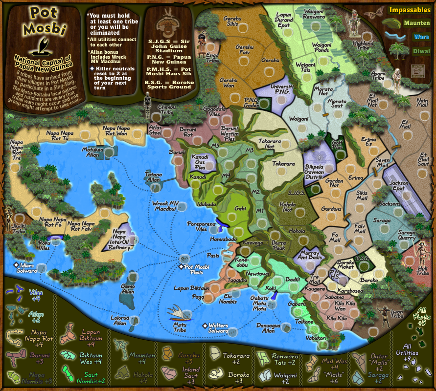
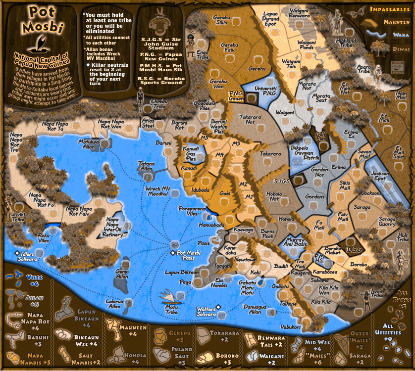
Gillipig wrote:...
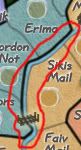
Did most people really prefer the bold font?? It's almost impossible to read. Example, "Et Mail Not" is clearly readable without bold. With bold it looks like "Et Mall Not"!
RedBaron0 wrote:Let's hear a few more opinion, I like the font and I can read it and can tell the "I" and "L" apart.... but then again I grew up with English.
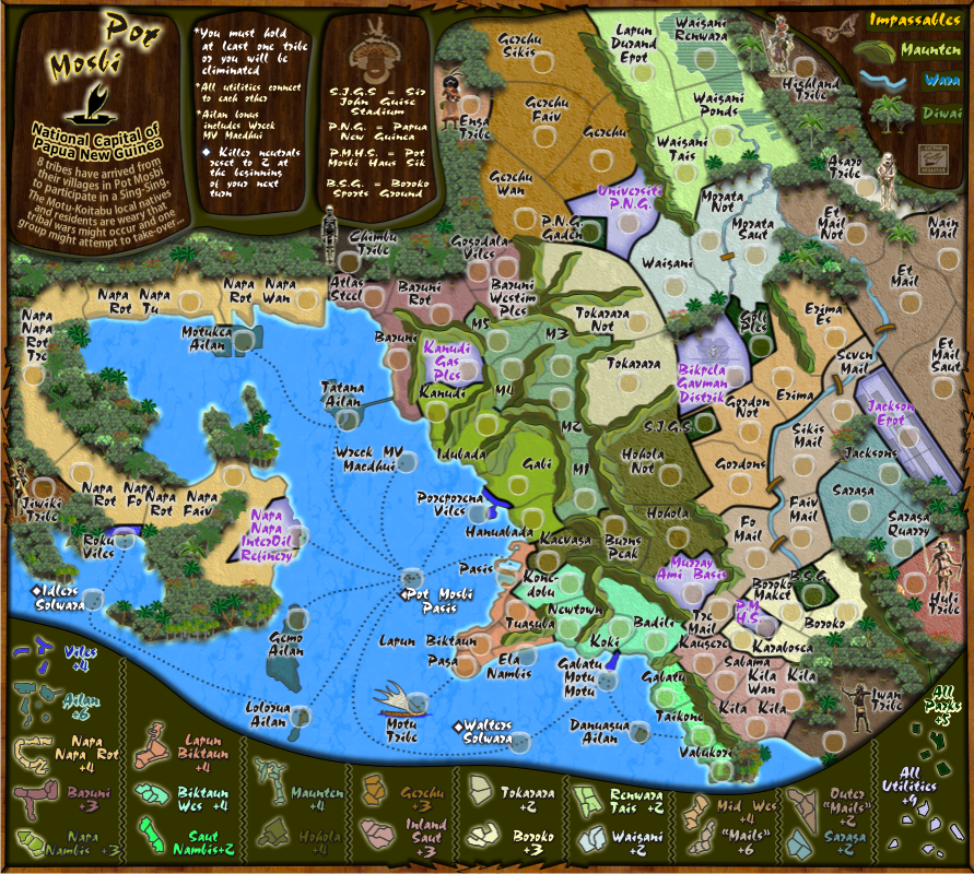
Guys, a pologise for this, but the bottom image that is showing on Gillpig's above post is out of size for some reason, I have tried to delete and reload on photoboucket but for me it keeps coming back the same size.
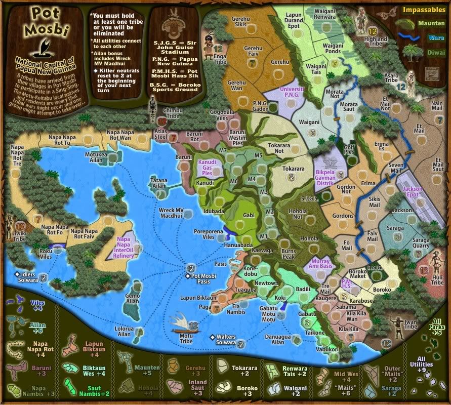
The normal size should be 892x800 but this image
http://i155.photobucket.com/albums/s282 ... V11Scd.png
insists on displaying at 838x750.
If this is happening for you...please let me know.
Gillipig, can you place that bottom image with this one please
http://i155.photobucket.com/albums/s282 ... V12Scd.png
I am not sure that this might not be contronuting to the difficulty that gillpig is having with legibility of the Quillscript bold font

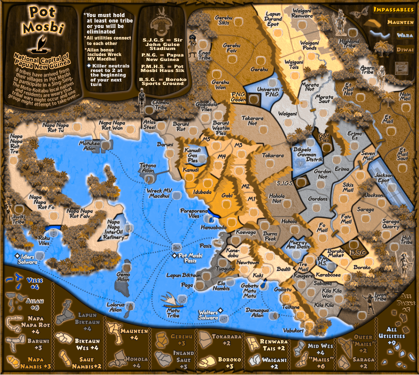
Is it me or is the glow around SJGS brighter than any of the other territory names?
Not you RB0...it is indeed a different glow and i have amended it, fixed for next version. i was mucking around with glows.
he black border next to the river between Mid Wes (incidentally is that supposed to be "Wes" or "West?") and "Mails" and why is that in quotes?
Wes is toki pisin for west...
Mails was in quote because i thought it deserved quotes, but no biggy, i cxan remove them if you feel not necessary

...and what about the black border...you never got there

Do all the "NapaNapa" territories need "NapaNapa" in the their names? Seems kinda redundant... especially for the huge territory name for the Oil refinery. Can say for the "Mails."
well, that is the name of the road that leads out to the Napa Napa Oil Refinery. I've simply divided it into sections...check google if you like

. i understand what you are saying, but i don't think it is redundant when that is the name of a feature of the map.
Sorry but i don't understand the last section.... Can say for the "Mails."...what are u trying to say here?

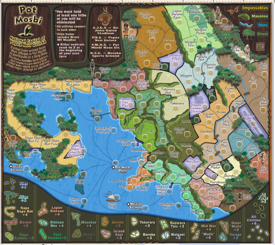
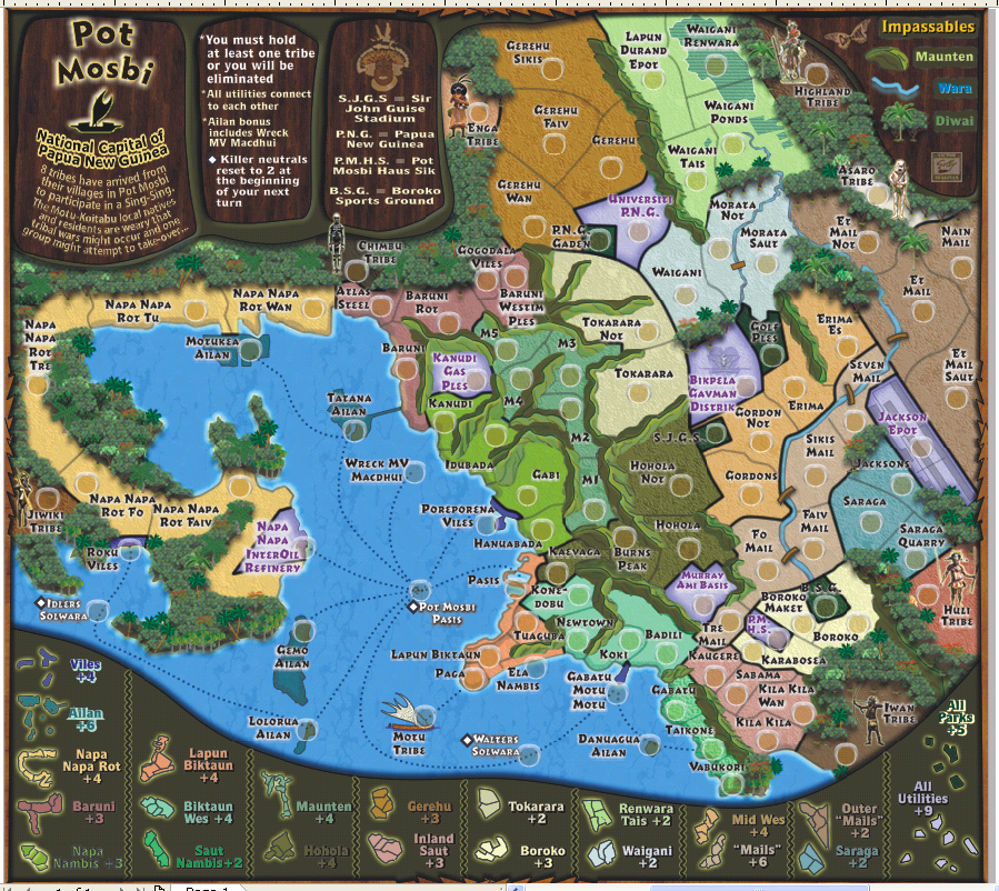


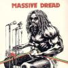

 doesn't need to be so bold right next to the river.
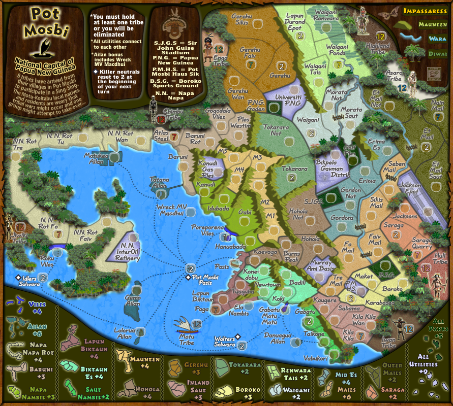