

ian.
Classic Cities :Pot Mosbi [Quenched]
Moderator: Cartographers
Forum rules
Please read the Community Guidelines before posting.
Please read the Community Guidelines before posting.
Re: Classic Cities :Pot Mosbi [17.2.12] V10/P10 CB Test adde
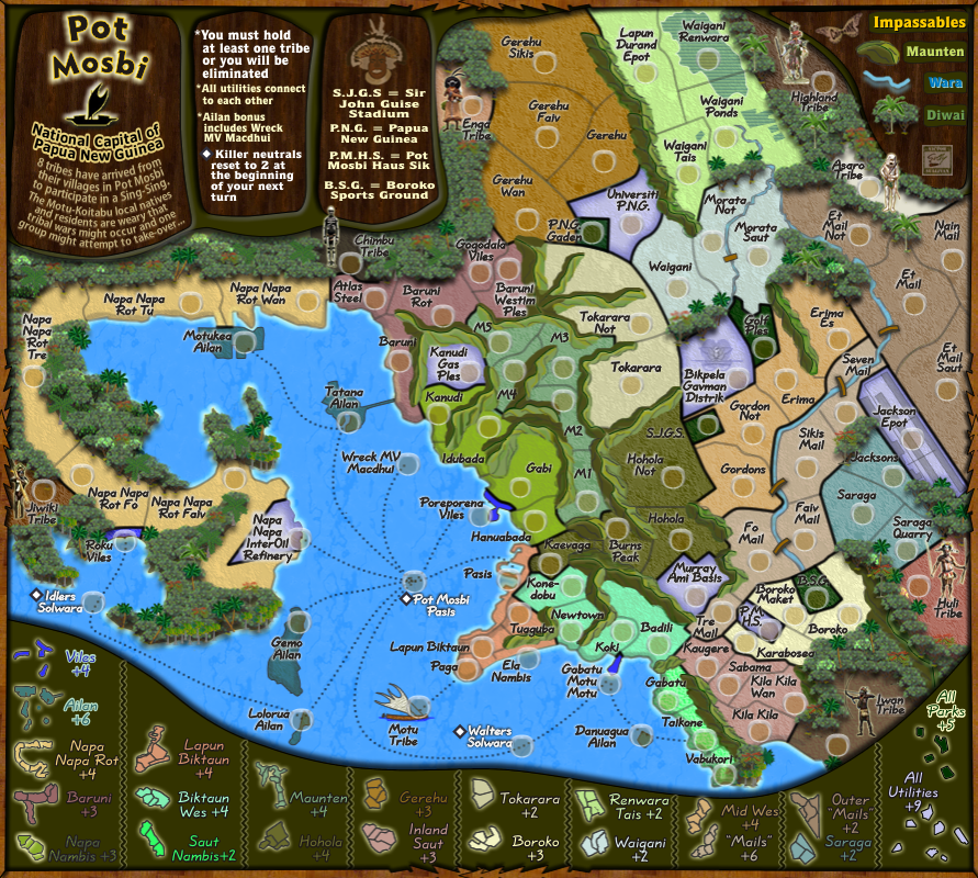
something i haven't noticed before: gerehu, renwara tais, outer mails and inland saut are effectively 3-region bonuses for purposes of calculating bonus drop probabilities in 1v1 games. if u put 3 neutrals on one region of each of these bonuses and also on one of the viles regions (another 3-region bonus), then the starting regions will be 32 for 1v1, 22 for 2v2, 14 for 3v3 and 11 for 4v4, better than the current 15 for 3v3 and no worse for the others.
ian.
ian.


Re: Classic Cities :Pot Mosbi [17.2.12] V10/P10 Graphics?


* Pearl Harbour * Waterloo * Forbidden City * Jamaica * Pot Mosbi
Re: Classic Cities :Pot Mosbi [17.2.12] V10/P10 CB Test adde
ian, I can understand everything but the viles region. Since they are quite seperate, why would you do this to viles?iancanton wrote:something i haven't noticed before: gerehu, renwara tais, outer mails and inland saut are effectively 3-region bonuses for purposes of calculating bonus drop probabilities in 1v1 games. if u put 3 neutrals on one region of each of these bonuses and also on on e of the viles regions (another 3-region bonus), then the starting regions will be 32 for 1v1, 22 for 2v2, 14 for 3v3 and 11 for 4v4, better than the current 15 for 3v3 and no worse for the others.
ian.
and if viles was left out of this new neutral deployment, would it still make a difference to those calcuations you did?
* Pearl Harbour * Waterloo * Forbidden City * Jamaica * Pot Mosbi
Re: Classic Cities :Pot Mosbi [17.2.12] V10/P10 CB Test adde
viles is a 3-region bonus and, in 1v1 and 3-player games, has a 7% and 10% chance respectively of all 3 regions dropping to the same player (over 3% to player 1). if viles is left out, then there are 33 starting regions for 1v1 and 3-player games, which is not a good number, with the other types mentioned above being unchanged; the calculation is based on 75 normal non-neutral regions plus 16 covered by the 8 start positions. i have no objection if u make the viles neutral a single-troop neutral, as long as there is a neutral of some sort.
is there a reason why the tokarara neutral is only n2, while all of the others are n3? we ought to be consistent here.
the baruni bonus looks as if it ought to be worth more, instead of less, than napa napa rot because of the extra border and more central location: +5 instead of +3. napa nambis also can do with an extra +1 because of its 4 borders and large number of neighbouring enemy bonuses: +4 instead of +3. good job with the bonuses otherwise!
ian.
Re: Classic Cities :Pot Mosbi [17.2.12] V10/P10 CB Test adde
ian, the current neutrals i count are:
2 - solwara
1 - PM pasis
1 - Tokara
1 - Waigani
1 - Bigpela Gavman Distrik
1 - Saraga
1 - Karabosea
1- Gabatu
totals = 9
you want to add 4 more
1 - Waigani Tais
1- Gerehu
1- Et Mail
1- Kila Kila Wan
- 13.
104 - 13 = 91.
If we add
1 - MV Macdhui (shipwreck)
1 - M7
* (making it an obstacle into the mountains from the north for the tribes invading)
* (i really don't want to make any Viles neutrals because they are already fronted by killer neutrals which makes them even harder to get from the sea)
we can get an 89 golden number - good for all except 5 and 7.
Tokarara was made a 2 as the only token neutral at the intial stage.
I think tokarara should only be n2 as it is +2 with 6 borders.

I must also acknowledge Sully for his initial help with the bonuses.
I'll await your answer to the above questions before updating the image.
2 - solwara
1 - PM pasis
1 - Tokara
1 - Waigani
1 - Bigpela Gavman Distrik
1 - Saraga
1 - Karabosea
1- Gabatu
totals = 9
you want to add 4 more
1 - Waigani Tais
1- Gerehu
1- Et Mail
1- Kila Kila Wan
- 13.
104 - 13 = 91.
If we add
1 - MV Macdhui (shipwreck)
1 - M7
* (making it an obstacle into the mountains from the north for the tribes invading)
* (i really don't want to make any Viles neutrals because they are already fronted by killer neutrals which makes them even harder to get from the sea)
we can get an 89 golden number - good for all except 5 and 7.
Yes. the salwara and pasis are killers and we thought 2 would have been big enough to overcome on these for attacking the sea routes.iancanton wrote:...
is there a reason why the tokarara neutral is only n2, while all of the others are n3? we ought to be consistent here.
Tokarara was made a 2 as the only token neutral at the intial stage.
I think tokarara should only be n2 as it is +2 with 6 borders.
OK, I understand, if M7 is made a neutral, will that still require Baruni to be +5?the baruni bonus looks as if it ought to be worth more, instead of less, than napa napa rot because of the extra border and more central location: +5 instead of +3.
OK i can agree to that.napa nambis also can do with an extra +1 because of its 4 borders and large number of neighbouring enemy bonuses: +4 instead of +3.
Thank you too - for the perserverence with these bonuses, they are not easy to strike some potential balance with.good job with the bonuses otherwise!
ian.
I must also acknowledge Sully for his initial help with the bonuses.
I'll await your answer to the above questions before updating the image.
* Pearl Harbour * Waterloo * Forbidden City * Jamaica * Pot Mosbi

Re: Classic Cities :Pot Mosbi [17.2.12] V10/P10 CB Test adde
Alright cairns, lets hash out these graphics, you're really gonna need to put some more work into this. There is a ton of awful looking stuff here.
The mountains aren't constant with their light source you got lighter sides where it should be dark and dark sides where it should be light. There is a line on some of the tops that should be some sort of ridge?
The tribe markers are a mix of decent to just terrible, Motu is just blurry and the Asaro one looks like a stormtrooper from Star Wars. Maybe its the glow, too bright/too wide/too yellow
You should add more different jungle trees to break up the monotony of the rest, its just the same background tree copied over and over in nice neat straight lines.
The thinner territories borders are too thin, they are pixely and jagged especially noticeable on lighter regions such as Napa Napa.
Why is the river water darker than the ocean?
Some territory names are getting lost, especially on the dark green of the parks.
I don't know if the shadow around the border of the map is necessary, it at least needs to be toned down it really seems bothersome when in contact with the playing surface.


Re: Classic Cities :Pot Mosbi [17.2.12] V10/P10 CB Test adde
GoodRedBaron0 wrote:Alright cairns, lets hash out these graphics,..
i realise this needs more work, but i didn't think it was that awfulyou're really gonna need to put some more work into this. There is a ton of awful looking stuff here.
Oh! the light source is from the ESE.The mountains aren't constant with their light source you got lighter sides where it should be dark and dark sides where it should be light.
So with that knowledge please advise where you think the changes should be made.
Please advise on this also, and how do you know that that area you're looking at should be some sort of ridge?There is a line on some of the tops that should be some sort of ridge?
Before i comment on these below, the map is exported to .jpg not .png so there is going to be some issues with a bit of bluriness.
Also, the minimum line thickness in this maps' software is 1 px. There are no decimals.
Some are reasonable .pngs, some others i have to re-draw.The tribe markers are a mix of decent to just terrible...
Yes, i plaved this in a bitmap rather than as a vector group...here is the original size...and it is reduced down to map size...fixed next versionMotu is just blurry
OK, here is the Asaro natives (your version of storm troopers - perhaps that's where Lucas got the idea from... and the Asaro one looks like a stormtrooper from Star Wars. Maybe its the glow, too bright/too wide/too yellow
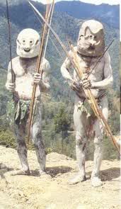
and this is my take on it...(40x120px) and reduced down to fit on the map

..yes there is a yellow glow which i will look at reducing
all tribes glow has been reduced from 5px to 2 px.
That is an easy fix, time consuming but easyYou should add more different jungle trees to break up the monotony of the rest, its just the same background tree copied over and over in nice neat straight lines.
You've mentioned Napa Napa, but what the others do you think need fixing?The thinner territories borders are too thin, they are pixely and jagged especially noticeable on lighter regions such as Napa Napa.
- the inner borders are 1px #333333 soft line 100% edge
- between regions borders are 3 px #333333 soft rounded 50% edge
Is there are rule that says rivers can't be darked than the ocean? I am simply curiousWhy is the river water darker than the ocean?
Please clarfiy so i know which ones to correctSome territory names are getting lost, especially on the dark green of the parks.
i'd like to retain it and yes maybe it needs toning downI don't know if the shadow around the border of the map is necessary, it at least needs to be toned down
oh! is that a personal preference? Et Mail and Nain Mail can be moved west to avoid this border....it really seems bothersome when in contact with the playing surface.
Thanks for the input, and i look forward to hearing those other areas you think need fixing
* Pearl Harbour * Waterloo * Forbidden City * Jamaica * Pot Mosbi
Re: Classic Cities :Pot Mosbi [17.2.12] V10/P10 GFX?
- Click image to enlarge.
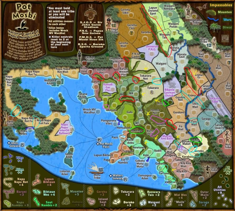
red circles - issues I see with lighting of the mountains you say ESE for the light source, in many cases your mountains that are being lit are facing eNe and should have much of any sunlight on them. I'm assuming the light is emanating from about the spot the Huli tribe is.
The bit of mountains you have between Iwan and Huli I think can just be covered over with trees they're already there and cover most of those mountains anyways.
yellow arrows - the odd line mountain ridges they really just seem too dark and pronounced to me in most cases. If this is just a transfer issue, ok, but that ridge line just looks odd, perhaps changing the color of those lines will help, like a dark green perhaps?
teal circles - borders that seem a little pixelly. I just hate a 1px border cuz I think its those on any kinda straight angle have the appearance of jagged steps, and it especially shows when on top of lighter backgrounds.
lime circles - territory names getting lost in background colors. On the subject of territory names... I've seen you use this particular font quite a few times across your menagerie of maps and think it'd a good idea to try something different.
pinkish circles - just a couple territory borders that are funny to me. They are all blending into the background and could cause a bit of confusion as to where territories begin and end, on the 2 shorter ones, a shift one direction or another to clear this up.
For the color of the ocean/rivers, I just am looking for consistency in impassibles ocean/rivers=water and should be a similar color. I'm not saying they have to be the exact same color, just a bit closer in hue. Yes I know from river to ocean water can range wildly in color, especially river water, BUT on a map water, no matter its form, river/ocean/lake they will be represented by a similar shade of blue generally.
You answered my other questions, so I'll have to live with the stormtrooper I guess.
Re: Classic Cities :Pot Mosbi [17.2.12] V10/P10 GFX?
Thanks RB0, i'll look at those sometime in the near future...
on the font issue, i'd like to keep this font, given that the names are in toki pisin, i'd prefer to retain a simple font rather than anything fancy, as i have a big belief in legibility on these maps as part of the overall process that i was taught.
Yes it looks same same to some extent across the range, but clear fonts create fewer problems for players reading them.
Having said that, i will do some exploring to see if anything is suitable as a replacement.
* Pearl Harbour * Waterloo * Forbidden City * Jamaica * Pot Mosbi
Re: Classic Cities :Pot Mosbi [17.2.12] V10/P10 CB Test adde
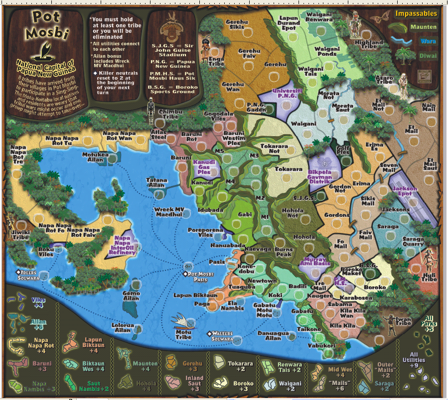
91 regions, less 16 regions used by start positions, is 75. none of the viles regions are dead-ends, but are each adjacent to 2 non-viles regions. the fact that an additional killer neutral is also adjacent to each actually increases their connectedness compared with, for example, the existing gabatu and tokarara neutrals. starting one of the viles regions as n1 stops the +4 viles bonus from being dropped, while letting someone occupy that viles region with minimal resistance. i'm not keen on a macdhui neutral, since ailan is already fairly hard to conquer.cairnswk wrote:104 - 13 = 91.
If we add
1 - MV Macdhui (shipwreck)
1 - M7
* (making it an obstacle into the mountains from the north for the tribes invading)
* (i really don't want to make any Viles neutrals because they are already fronted by killer neutrals which makes them even harder to get from the sea)
we can get an 89 golden number - good for all except 5 and 7.
i agree with n2 for the killer neutrals. does tokarara have 6 borders? i think it's only 5, so something must be unclear. anyway, the same argument applies even more to boroko and utilities, so why not consistently n2 (except for n1 on one viles region)? after all, they're there only to prevent dropped bonuses.cairnswk wrote:Yes. the salwara and pasis are killers and we thought 2 would have been big enough to overcome on these for attacking the sea routes.iancanton wrote:is there a reason why the tokarara neutral is only n2, while all of the others are n3? we ought to be consistent here.
Tokarara was made a 2 as the only token neutral at the intial stage.
I think tokarara should only be n2 as it is +2 with 6 borders.
however u look at it, baruni is more difficult than napa napa rot. i like the way the maunten area restricts access from east and west except at the m1, m5 and m6 points. however, the internal arrangement of maunten is too much of rail pot mosbi. instead of making m7 start neutral, why not merge away two maunten regions (m1 with m2 and m3 with m4) to a total of 5, obviously with a reduced bonus? combined with the viles n1, this gives 88 starting regions, which is also a golden number.cairnswk wrote:OK, I understand, if M7 is made a neutral, will that still require Baruni to be +5?iancanton wrote:the baruni bonus looks as if it ought to be worth more, instead of less, than napa napa rot because of the extra border and more central location: +5 instead of +3.
the zone bonus borders can be made thinner without loss of clarity. i initially thought that kanudi gas ples was not adjacent to kanudi because the thick dark green border looks as if its part of the mountain ridge that surrounds much of gas ples.
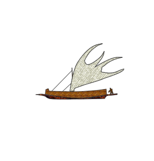
to preserve more detail of their costumes, does increasing the size of the tribesmen work, perhaps just head and upper body if there isn't enough space? of course, that leaves the question of where their legs have gone...
ian.
Re: Classic Cities :Pot Mosbi [17.2.12] V10/P10 CB Test adde
OK. we'll leave macdhui as is.iancanton wrote:91 regions, less 16 regions used by start positions, is 75. none of the viles regions are dead-ends, but are each adjacent to 2 non-viles regions. the fact that an additional killer neutral is also adjacent to each actually increases their connectedness compared with, for example, the existing gabatu and tokarara neutrals. starting one of the viles regions as n1 stops the +4 viles bonus from being dropped, while letting someone occupy that viles region with minimal resistance. i'm not keen on a macdhui neutral, since ailan is already fairly hard to conquer.cairnswk wrote:104 - 13 = 91.
If we add
1 - MV Macdhui (shipwreck)
1 - M7
* (making it an obstacle into the mountains from the north for the tribes invading)
* (i really don't want to make any Viles neutrals because they are already fronted by killer neutrals which makes them even harder to get from the sea)
we can get an 89 golden number - good for all except 5 and 7.
6 borders for tokara, one is with M5i agree with n2 for the killer neutrals. does tokarara have 6 borders?cairnswk wrote:Yes. the salwara and pasis are killers and we thought 2 would have been big enough to overcome on these for attacking the sea routes.iancanton wrote:is there a reason why the tokarara neutral is only n2, while all of the others are n3? we ought to be consistent here.
Tokarara was made a 2 as the only token neutral at the intial stage.
I think tokarara should only be n2 as it is +2 with 6 borders.
i think it's only 5, so something must be unclear. anyway, the same argument applies even more to boroko and utilities, so why not consistently n2 (except for n1 on one viles region)? after all, they're there only to prevent dropped bonuses.
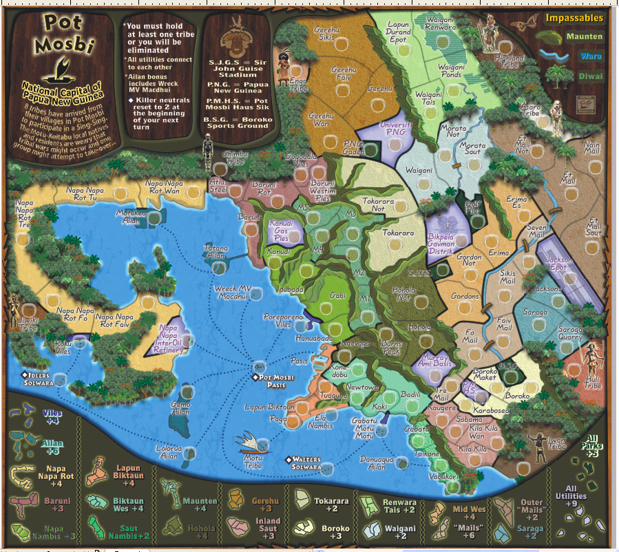
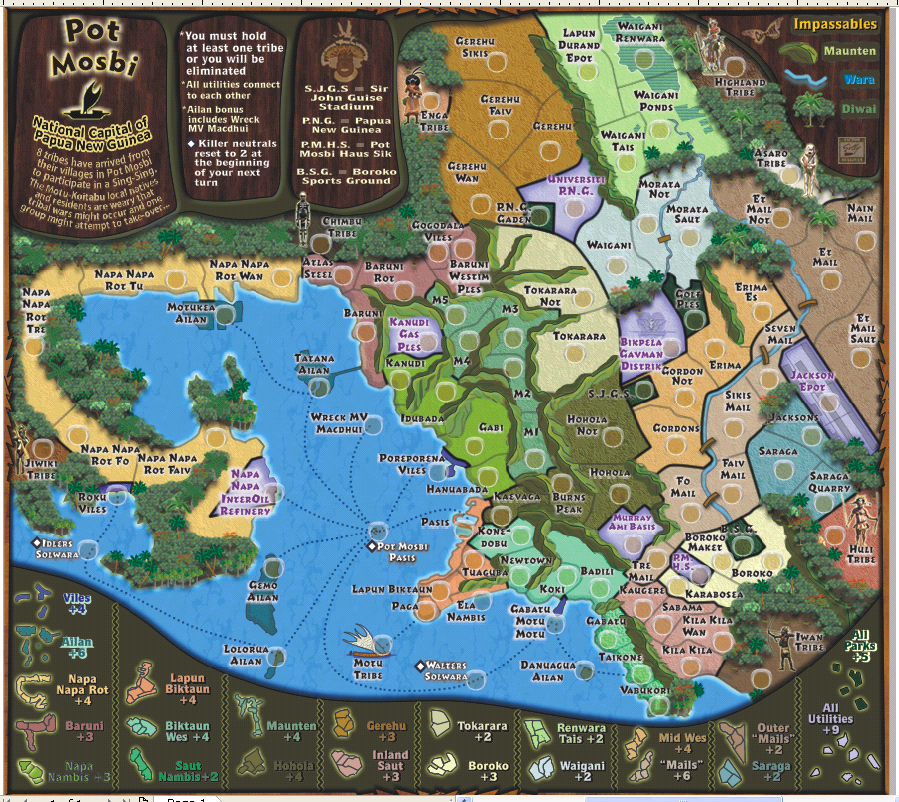
n2s placed across the board. next version.
i've made the Porepoena Viles the n1
Done, with Maunten reduced to +4however u look at it, baruni is more difficult than napa napa rot. i like the way the maunten area restricts access from east and west except at the m1, m5 and m6 points. however, the internal arrangement of maunten is too much of rail pot mosbi. instead of making m7 start neutral, why not merge away two maunten regions (m1 with m2 and m3 with m4) to a total of 5, obviously with a reduced bonus? combined with the viles n1, this gives 88 starting regions, which is also a golden number.cairnswk wrote:OK, I understand, if M7 is made a neutral, will that still require Baruni to be +5?iancanton wrote:the baruni bonus looks as if it ought to be worth more, instead of less, than napa napa rot because of the extra border and more central location: +5 instead of +3.
OK, i'll reeduced them from 3px to 2 px, and might even change the colour slightly for clarification.the zone bonus borders can be made thinner without loss of clarity. i initially thought that kanudi gas ples was not adjacent to kanudi because the thick dark green border looks as if its part of the mountain ridge that surrounds much of gas ples.
Mmmm. i think they're OK, i wouldn't want to lose their legs.to preserve more detail of their costumes, does increasing the size of the tribesmen work, perhaps just head and upper body if there isn't enough space? of course, that leaves the question of where their legs have gone...
ian.
* Pearl Harbour * Waterloo * Forbidden City * Jamaica * Pot Mosbi
Re: Classic Cities :Pot Mosbi [17.2.12] V10/P10 GFX?
RB0, i take it from this you think that borders should be 2 px ?RedBaron0 wrote:...
teal circles - borders that seem a little pixelly. I just hate a 1px border cuz I think its those on any kinda straight angle have the appearance of jagged steps, and it especially shows when on top of lighter backgrounds.
...
* Pearl Harbour * Waterloo * Forbidden City * Jamaica * Pot Mosbi
Re: Classic Cities :Pot Mosbi [17.2.12] V10/P10 GFX?
Assuming that works for you, then yes. Mainly as long as you can tell the difference between a normal territory border and the bonus borders, you'll be good to go.
Re: Classic Cities :Pot Mosbi [17.2.12] V10/P10 GFX?
Done!cairnswk wrote:..yes there is a yellow glow which i will look at reducing
all tribes glow has been reduced from 5px to 2 px.
teal circles - borders that seem a little pixelly. I just hate a 1px border cuz I think its those on any kinda straight angle have the appearance of jagged steps, and it especially shows when on top of lighter backgrounds.
pinkish circles - just a couple territory borders that are funny to me. They are all blending into the background and could cause a bit of confusion as to where territories begin and end, on the 2 shorter ones, a shift one direction or another to clear this up.
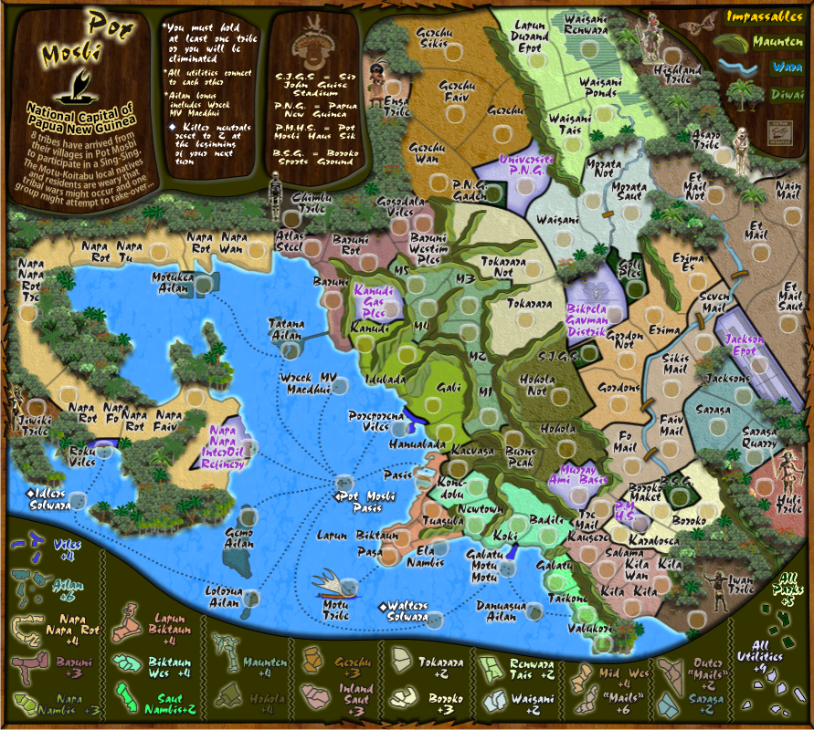
Borders are been completey re-done and above areas moved.RedBaron0 wrote:Assuming that works for you, then yes. Mainly as long as you can tell the difference between a normal territory border and the bonus borders, you'll be good to go.
On the issue of the font, i don't think i've used this font before - Kozuka Gothic Pro B (i used it for narrowness rather than Arial Narrow)...i've used Verdana a couple of times, but not this font.lime circles - territory names getting lost in background colors. On the subject of territory names... I've seen you use this particular font quite a few times across your menagerie of maps and think it'd a good idea to try something different.
I've tried a couple of "native/tribal" fonts and they simply are ghastly for me reading them, so i guess players will have problems with them, and i would like this map as stated before when using toki pisin language to have clear concise and especially legible names. I will once again continue to search for suitable alternatives, or perhaps the effect needs altering.
I have changed the colour of the river to something close to the ocean colour.For the color of the ocean/rivers, I just am looking for consistency in impassibles ocean/rivers=water and should be a similar color. I'm not saying they have to be the exact same color, just a bit closer in hue. Yes I know from river to ocean water can range wildly in color, especially river water, BUT on a map water, no matter its form, river/ocean/lake they will be represented by a similar shade of blue generally.
For trees:You should add more different jungle trees to break up the monotony of the rest, its just the same background tree copied over and over in nice neat straight lines.
1. In front of sea, there are some representations of mangrove trees
2. the trees used originally but not space well, are called shade trees, and palms/cocunuts; the originals have been re-spaced, and some have been narrowed and and heightened.
3. I have added umbralla trees (the ones with the red on top; and some sparesley lime green trees for some contrast, and also some fern trees.
I have reduced the size of the border shadow from 5 pixels to 3 pixels.cairnswk wrote:i'd like to retain it and yes maybe it needs toning downRedBarron0 wrote: I don't know if the shadow around the border of the map is necessary, it at least needs to be toned down
I still have the moutains and natives to attend to.
* Pearl Harbour * Waterloo * Forbidden City * Jamaica * Pot Mosbi
Re: Classic Cities :Pot Mosbi [8.3.12] P11 Font Choices
Re the font:
I've played around with woodstick, and other types of this nature, and while they are appropriate, they're too small on the map to show their details and thus are lost.
So from the below are some options...
Which do you think is suitable...or the original on V10
Quoraum Blk BT - original
Quillscript
Quillscript - outline enhanced at 1 px.
Market
Cezanne
Romulus
Last edited by cairnswk on Fri Mar 09, 2012 3:00 pm, edited 1 time in total.
* Pearl Harbour * Waterloo * Forbidden City * Jamaica * Pot Mosbi
-
AndyDufresne

- Posts: 24919
- Joined: Fri Mar 03, 2006 8:22 pm
- Location: A Banana Palm in Zihuatanejo
- Contact:
Re: Classic Cities :Pot Mosbi [8.3.12] P11 - Font Choices
I like Romulus or the original, most for clarity reasons.
--Andy
--Andy
Re: Classic Cities :Pot Mosbi [8.3.12] P11 - Font Choices
I like Romulus too
Market would be great if it wasn't quite as bold.
Market would be great if it wasn't quite as bold.
-
Victor Sullivan

- Posts: 6010
- Joined: Mon Feb 08, 2010 8:17 pm
- Gender: Male
- Location: Columbus, OH
- Contact:
Re: Classic Cities :Pot Mosbi [8.3.12] P11 - Font Choices
I rather liked Quillscript myself, though I suppose Romulus would likely be my second choice.
-Sully
-Sully
Beckytheblondie: "Don't give us the dispatch, give us a mustache ride."
Scaling back on my CC involvement...
Scaling back on my CC involvement...
-
natty dread

- Posts: 12876
- Joined: Fri Feb 08, 2008 8:58 pm
- Location: just plain fucked
Re: Classic Cities :Pot Mosbi [8.3.12] P11 - Font Choices
Romulus is not a good text font, it's a bit too complex and some letters, for example the e:s, look messy at that size...
Quillscript would be ok if it weren't so thin, is there a bold version of that font available?
Quillscript would be ok if it weren't so thin, is there a bold version of that font available?

Re: Classic Cities :Pot Mosbi [8.3.12] P11 - Font Choices
I echo this. I think it would be a good font if it can be bolded.natty dread wrote:Quillscript would be ok if it weren't so thin, is there a bold version of that font available?
Re: Classic Cities :Pot Mosbi [8.3.12] P11 - Font Choices
natty, guys, i couldn't find one. but in Coreldraw you can add an outline to the text and i've done this for 1 px blk.natty dread wrote:Romulus is not a good text font, it's a bit too complex and some letters, for example the e:s, look messy at that size...
Quillscript would be ok if it weren't so thin, is there a bold version of that font available?
if anything less than 100% blk is used the text starts to become lost on some of those backgrounds.
...included in the choices previous page.
Last edited by cairnswk on Fri Mar 09, 2012 4:19 pm, edited 1 time in total.
* Pearl Harbour * Waterloo * Forbidden City * Jamaica * Pot Mosbi
-
natty dread
- Posts: 12876
- Joined: Fri Feb 08, 2008 8:58 pm
- Location: just plain fucked
-
AndyDufresne
- Posts: 24919
- Joined: Fri Mar 03, 2006 8:22 pm
- Location: A Banana Palm in Zihuatanejo
- Contact:
Re: Classic Cities :Pot Mosbi [8.3.12] P11 - Font Choices
Yep, the bold version of it looks pretty good I think.natty dread wrote:Yeah looks good to me.
--Andy
Re: Classic Cities :Pot Mosbi [8.3.12] P11 - Font Choices
I also checked out a font by the name of Pigeon Street, kinda looked suitable but...no!
* Pearl Harbour * Waterloo * Forbidden City * Jamaica * Pot Mosbi
-
natty dread
- Posts: 12876
- Joined: Fri Feb 08, 2008 8:58 pm
- Location: just plain fucked
Re: Classic Cities :Pot Mosbi [8.3.12] P11 - Font Choices
Yeah, that font's license doesn't allow for commercial use, so no go for that... too bad, it looked nice.cairnswk wrote:I also checked out a font by the name of Pigeon Street, kinda looked suitable but...no!