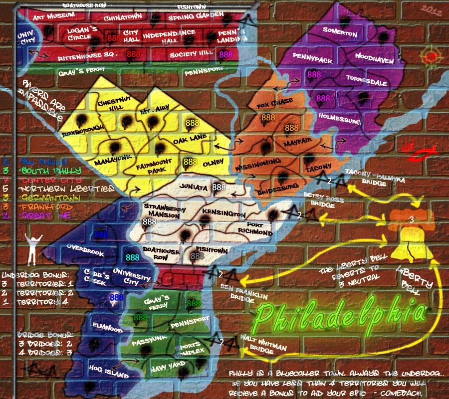
Philadelphia [Quenched]
Moderator: Cartographers
Re: Philadelphia - [29 Jan 2012] pg 28 -Revamped, again
Redbaron0, you are like Rocky for sticking with this map.
When it finishes, you can get the full Eye of the Tiger treatment.
--Andy
When it finishes, you can get the full Eye of the Tiger treatment.
--Andy
-

 AndyDufresne
- Posts: 24935
- Joined: Fri Mar 03, 2006 8:22 pm
- Location: A Banana Palm in Zihuatanejo


Re: Philadelphia - [29 Jan 2012] pg 28 -Revamped, again
Sorry for the long delay on your supersize application RB0. After discussing this with tnb80, we have agreed to alow you the extra width for readability reasons. 700x622 for the small, and 900x800 for the large!


-
 isaiah40
- Posts: 3990
- Joined: Mon Aug 27, 2007 7:14 pm


Re: Philadelphia - [29 Jan 2012] pg 28 -Revamped, again
So why the supersize now? Just wondering.
Highest Rank: 26 Highest Score: 3480


-

 Bruceswar
- Posts: 9713
- Joined: Sun Dec 23, 2007 12:36 am
- Location: Cow Pastures


Re: Philadelphia - [29 Jan 2012] pg 28 -Revamped, again
Just some additional space for some of the legend stuff. Update a-coming - cross my heart hope to die stick an apple in my eye. (Pinkie promise. LOL)


-

 RedBaron0
- Posts: 2657
- Joined: Sun Aug 19, 2007 12:59 pm
- Location: Pennsylvania


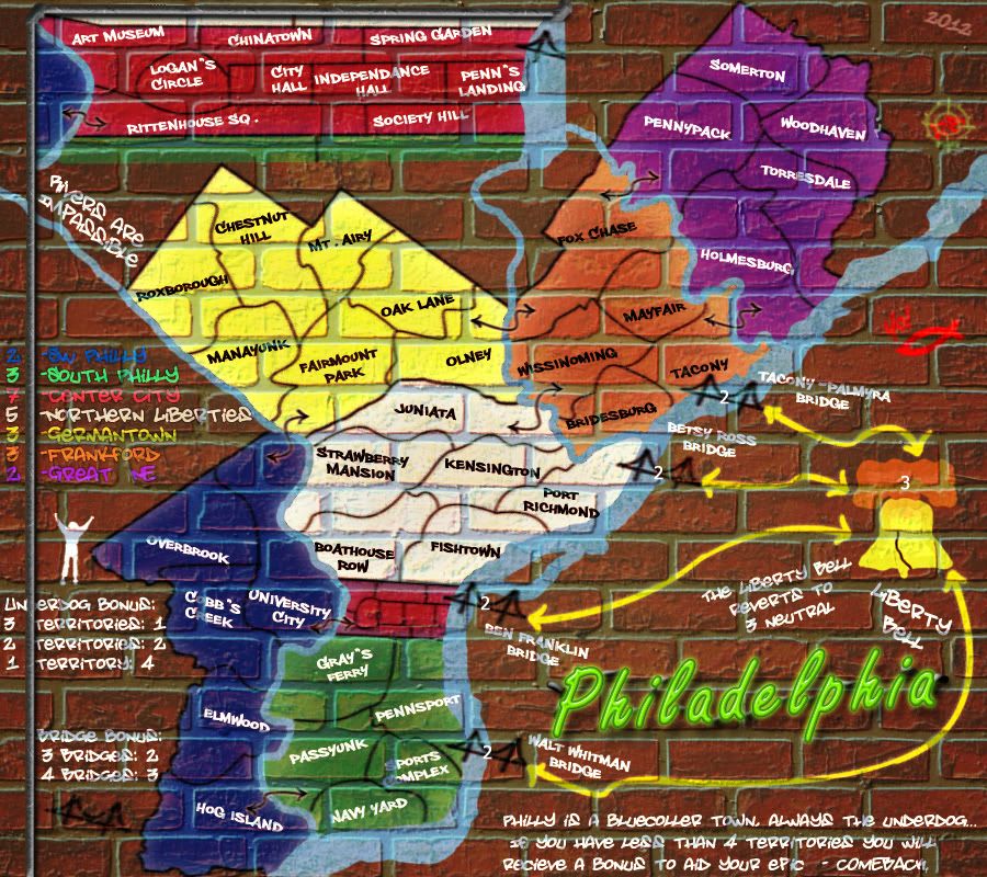
Re: Philadelphia - [29 Feb 2012] pg 29 -All the good stuff
Image size: 900x800
And the slow progress continues... LOL
reordered a couple things signatures and such
added a pipe, yes I know it covers the "D" in underdog debating leaving it that way or writing it over the pipe, and warping it to the curvature of the pipe and blending it on to the surface.
Extended the inset down a bit for clarity.
green in south Philly changed a little for color blindness, will post that image up later.
made my title glow like a real neon sign, and wired it to the wall. The wires are going into the grout. Remember a neon sign is glass and is a rigid object that won't sag. I just realized that the sign shouldn't be casting a shadow, but throwing off light... I'll fix that.
I really-REALLY think I've got the depth of the grout figured out now.
I'll check on army number color clashes and decide on army circles upcoming, plus any issues forthwith.... eventually.


-

 RedBaron0
- Posts: 2657
- Joined: Sun Aug 19, 2007 12:59 pm
- Location: Pennsylvania


Re: Philadelphia - [29 Feb 2012] pg 29 -All the good stuff
I'm worried that the blue bonus area may be a bit dark... can we see how blue numbers look on top of it?

-

 natty dread
- Posts: 12877
- Joined: Fri Feb 08, 2008 8:58 pm
- Location: just plain fucked


Re: Philadelphia - [29 Feb 2012] pg 29 -All the good stuff
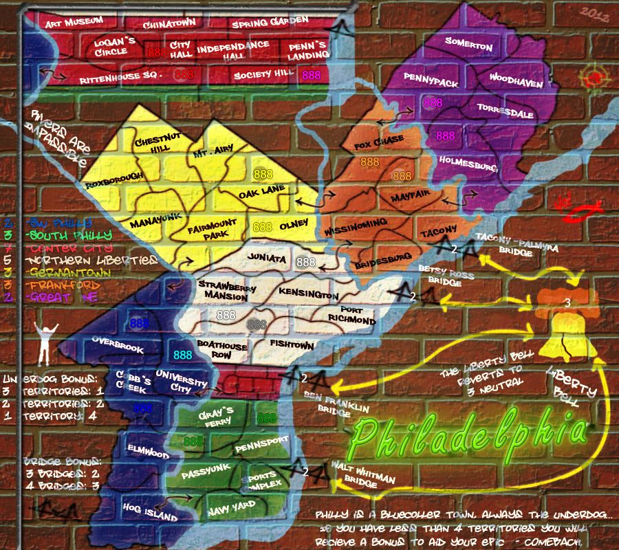
888 test:
Vischeck:
They are just ok, blue, green, yellow and white are really close. For clarity's sake I'd either have to alter the colors or go with army circles.
And I'll likely have to switch south Philly for another color, it's too close under vischeck to Center City.
I certainly like this range of colors, dark/bold than going to a pastel or soft color scheme, they just aren't Philly. I'd lean towards army circles at this point.
SW Philly's blue might have to be lighter still at any rate the borders are barely visible too.


-

 RedBaron0
- Posts: 2657
- Joined: Sun Aug 19, 2007 12:59 pm
- Location: Pennsylvania


Re: Philadelphia - [29 Feb 2012] pg 29 -All the good stuff
Hm, hm. There's no chance you'd make the blue area a bit lighter? I don't think there's a problem with the other colours, the blue is the only one I can see potentially causing problems...

-

 natty dread
- Posts: 12877
- Joined: Fri Feb 08, 2008 8:58 pm
- Location: just plain fucked


Re: Philadelphia - [29 Feb 2012] pg 29 -All the good stuff
You need army circles...
Highest Rank: 26 Highest Score: 3480


-

 Bruceswar
- Posts: 9713
- Joined: Sun Dec 23, 2007 12:36 am
- Location: Cow Pastures


Re: Philadelphia - [29 Feb 2012] pg 29 -All the good stuff
RedBaron0 wrote:SW Philly's blue might have to be lighter still at any rate the borders are barely visible too.
Um... Yes.
I'm leaning towards the circles, which would mean I wouldn't have to alter the blue. But there would be issues with grey on grey army circles.... UGH.... I'll lighten the blue and switch the yellow and green and go from there.


-

 RedBaron0
- Posts: 2657
- Joined: Sun Aug 19, 2007 12:59 pm
- Location: Pennsylvania


Re: Philadelphia - [29 Feb 2012] pg 29 -All the good stuff
This map is starting to grow on me a little bit, just because it looks so different compared to other maps.
Keep it up.
--Andy
Keep it up.
--Andy
-

 AndyDufresne
- Posts: 24935
- Joined: Fri Mar 03, 2006 8:22 pm
- Location: A Banana Palm in Zihuatanejo


Re: Philadelphia - [29 Feb 2012] pg 29 -All the good stuff
I'm not sure how much I like the colors and graphics. I like the concept and having it be like graffiti, but it seems like it's going to be difficult to see many of the numbers.
Aside from that, it's a little confusing to me that the Center City is at the top. It seems like the cutout should be closer to the actual center city of the map. I know there isn't really room for it over there with the bridges and the bell, but it's not the clearest.
And label the terts from the other continents in the cutout as well.
-
 chapcrap
- Posts: 9686
- Joined: Sun Feb 03, 2008 12:46 am
- Location: Kansas City


Re: Philadelphia - [29 Feb 2012] pg 29 -All the good stuff
chapcrap wrote:I'm not sure how much I like the colors and graphics. I like the concept and having it be like graffiti, but it seems like it's going to be difficult to see many of the numbers.
Aside from that, it's a little confusing to me that the Center City is at the top. It seems like the cutout should be closer to the actual center city of the map. I know there isn't really room for it over there with the bridges and the bell, but it's not the clearest.
And label the terts from the other continents in the cutout as well.
I can put on army circles, and I am thinking I will do that, that'll clear up the army numbers issues.
That space just afforded me the most room for the inset. With addition of the Liberty Bell and the Title on the Jersey side of the river its currently the best solution. The addition of the territory names to the other territories will help clarify where it is on the playing surface.


-

 RedBaron0
- Posts: 2657
- Joined: Sun Aug 19, 2007 12:59 pm
- Location: Pennsylvania


Re: Philadelphia - [29 Feb 2012] pg 29 -All the good stuff
If you add army circles, make them look like they're part of the graffiti.

-

 natty dread
- Posts: 12877
- Joined: Fri Feb 08, 2008 8:58 pm
- Location: just plain fucked


Re: Philadelphia - [29 Feb 2012] pg 29 -All the good stuff
natty dread wrote:If you add army circles, make them look like they're part of the graffiti.
I would have to agree. If there were army circles on the map, which seems like a must at this point, it will detract from what the map is trying to look like.
-
 chapcrap
- Posts: 9686
- Joined: Sun Feb 03, 2008 12:46 am
- Location: Kansas City


Re: Philadelphia - [29 Feb 2012] pg 29 -All the good stuff
I will no worries guys, I got how they'll look in my head, just have to put it down on the image and see how it looks, and it'll add to the overall image/theme too I think. I just have to get on it. I'm behind on a couple other art obligations and wanna get that done before I swing back at this full force. 


-

 RedBaron0
- Posts: 2657
- Joined: Sun Aug 19, 2007 12:59 pm
- Location: Pennsylvania


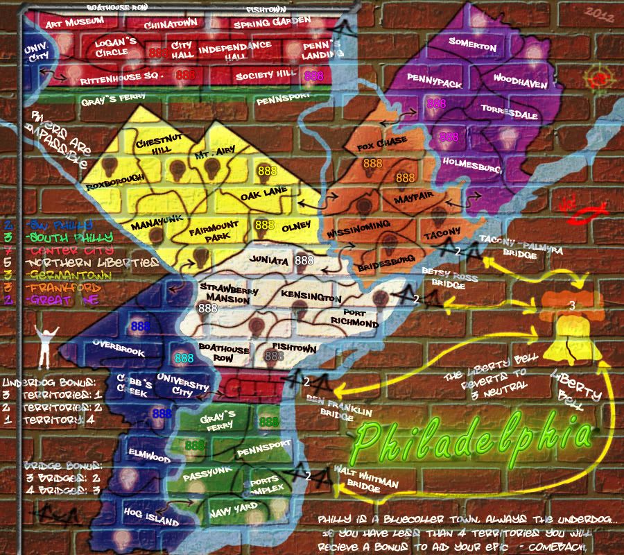
Re: Philadelphia - [28 March 2012] pg 30 -army circles
Image size: 900x800
And onto the obligatory monthly update...
Army circles modeled on looking like a dot of spray paint, likely will need to work on it more, mainly the dripping paint. The white looks better than the black I think.... but of course I can't use the white on Northern Liberties.

Text added to the inset to connecting territories and the "D" in underdog readded curved to make it seem like it's pained on the pipe.
May need to put in the legend that Univ. City = University City


-

 RedBaron0
- Posts: 2657
- Joined: Sun Aug 19, 2007 12:59 pm
- Location: Pennsylvania


Re: Philadelphia - [28 March 2012] pg 30 -army circles
I like the army shadow idea. Here are some thumbs of mine.
--Andy
--Andy
-

 AndyDufresne
- Posts: 24935
- Joined: Fri Mar 03, 2006 8:22 pm
- Location: A Banana Palm in Zihuatanejo


Re: Philadelphia - [29 March 2012] pg 30 -army circles
Image size: 900x800
These army circles should be be worlds better. All black for the moment, tried a white one on Cobb's Creek in SW Philly.
Thanks Andy! The more thumbs up you give the more banana's you get...


-

 RedBaron0
- Posts: 2657
- Joined: Sun Aug 19, 2007 12:59 pm
- Location: Pennsylvania


Re: Philadelphia - [29 March 2012] pg 30 -army circles
Why not make them all white? A lot of numbers, mainly blue ones, show very poorly on dark colours.
Also, the borders are hard to see in the blue area.
Also, the borders are hard to see in the blue area.

-

 natty dread
- Posts: 12877
- Joined: Fri Feb 08, 2008 8:58 pm
- Location: just plain fucked


Re: Philadelphia - [29 March 2012] pg 30 -army circles
The black look better to me, perhaps I should adjust the bonus color for SW Philly to more of a teal or a different shade of purple. I can't use all white, Northern Liberties is white.


-

 RedBaron0
- Posts: 2657
- Joined: Sun Aug 19, 2007 12:59 pm
- Location: Pennsylvania


Re: Philadelphia - [29 March 2012] pg 30 -army circles
Does it matter? Just leave out the circles from the white area, or change it to another colour... point is, black army circles are crappy, they're really hard to see blue numbers on - just search some games on Ancient Greece or Tamriel...
Also, why do you have drips on the army circles, when you have no dripping anywhere else? Looks a bit weird - and also, as the army circles are identical everywhere, makes them look kinda copy-pasted...
Also, why do you have drips on the army circles, when you have no dripping anywhere else? Looks a bit weird - and also, as the army circles are identical everywhere, makes them look kinda copy-pasted...

-

 natty dread
- Posts: 12877
- Joined: Fri Feb 08, 2008 8:58 pm
- Location: just plain fucked


Re: Philadelphia - [29 March 2012] pg 30 -army circles
Black is the most common spray paint graffiti color, and honestly I like the look. Sigh... I will try all white.
I can add more drips, I figured out how to make them look good with the army circles and I can apply it to everything else. Still a work in progress afterall. I may end up redrawing all the borders, bridges, and connectors using this technique.
I can add more drips, I figured out how to make them look good with the army circles and I can apply it to everything else. Still a work in progress afterall. I may end up redrawing all the borders, bridges, and connectors using this technique.


-

 RedBaron0
- Posts: 2657
- Joined: Sun Aug 19, 2007 12:59 pm
- Location: Pennsylvania


Who is online
Users browsing this forum: No registered users

