Conquer Club

Age of Merchants - [Quenched]

Care to peruse completed maps? Take a stroll through the Atlas.

Moderator: Cartographers

Forum rules
Please read the Community Guidelines before posting.

Postby Molacole on Thu Apr 19, 2007 7:07 am

DiM wrote:
Molacole wrote:I don't like how the instructions font run into each other.


i don't quite follow you here. what runs into what?
do you mean the y or the p is too long and it runs into the line below?
if this is what you mean i don't think it's such a problem. i write exactly the same, plus they touch only 1 pixel in a few areas. it is very clear to read. this is how the font is made i dod not change any parameters.


It's definitely legible, but just looks sloppy and kind of like a cluster of letters. It's a "stylish" type of font and I don't think it's being used to it's advantage being so crammed together. If you keep it great if not great was just pointing it out is all.
User avatar
Lieutenant Molacole
 
Posts: 552
Joined: Fri Jun 23, 2006 8:19 am
Location: W 2.0 map by ZIM

Postby DiM on Thu Apr 19, 2007 7:21 am

Molacole wrote:
DiM wrote:
Molacole wrote:I don't like how the instructions font run into each other.


i don't quite follow you here. what runs into what?
do you mean the y or the p is too long and it runs into the line below?
if this is what you mean i don't think it's such a problem. i write exactly the same, plus they touch only 1 pixel in a few areas. it is very clear to read. this is how the font is made i dod not change any parameters.


It's definitely legible, but just looks sloppy and kind of like a cluster of letters. It's a "stylish" type of font and I don't think it's being used to it's advantage being so crammed together. If you keep it great if not great was just pointing it out is all.


i did not alter the font parameters. it being a bit crammed with some overlapping is how it was designed to be. as far as it is legible and it contributes to the overall feeling i'm fine with it. remember this is an old map, it should be really hard to read and with sloppy writting. but for gameplay reasons i chose a font that kinda keeps the overall aspect whilst it is very readable. so as long as aspect and readability are ok. why change it? i could increase the space between the lines to avoid the overlapping but that would mean i have to decrease the font size and thus make it less readable.

plus this is how many text were written long ago.

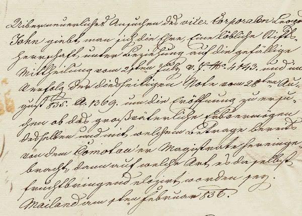
something along these lines is probably what you could have encountered on an old map.
Image
“In the beginning God said, the four-dimensional divergence of an antisymmetric, second rank tensor equals zero, and there was light, and it was good. And on the seventh day he rested.”- Michio Kaku
User avatar
Major DiM
 
Posts: 10415
Joined: Wed Feb 14, 2007 6:20 pm
Location: making maps for scooby snacks

Postby yeti_c on Thu Apr 19, 2007 7:23 am

DiM wrote:
yeti_c wrote:
DiM wrote:i'll keep the pirate cove to avoid confusion and to mantain the legend simetry on 3 rows.


I also made the point that the X marks the spot isn't referenced anywhere - you could change Pirate Cove to that in the key instead of removing it...

C.


X marks the spot is gone because now the pirate cove gives bonus for owning harbours. so i have nothing to reference.


DOH!! Missed that modification!!

C.
Image
Highest score : 2297
User avatar
Lieutenant yeti_c
 
Posts: 9624
Joined: Thu Jan 04, 2007 9:02 am

Postby Guiscard on Thu Apr 19, 2007 7:30 am

If I were you I'd add the harbour icon to the legend as I guarantee there will be endless noob posts about it if you don't.

Also, your factory icon is different in the legend to that shown in the map itself.

Finally, the last line of your legend is a little confusing. I'm assuming it works like I think it does, and if so it would be less confusing to write:

To transport resources locally you must own a resource pair sited within the same landmass and also the local market. To transport resources to a foreign market you must also control a market and a harbour on another landmass as well as the local harbour

That's in line with the current system. However, it might be an idea to do simple bonus rundown as follows:

+1 Harbour and a Pirate Cove
+1 A resource pair and market on the same landmass
+2 A resource pair, market and harbour on the same landmass and a harbour and market on a foreign landmass

All in all this is very complicated map... I'm sure I'd give it a go, but I'm not 100% sure it won't turn into a 'crossword' type gimmicky map... But then again, KotM and checkers are doing OK...

My problem is that with such low bonuses, its a bit of an effort to pursue them. You may well see people ignoring the complicated neccessities and just playing it as if there were no bonuses at all, as its gonna be hard to co-ordinate all that. Nevertheless, its graphically pretty nice so crack on.
qwert wrote:Can i ask you something?What is porpose for you to open these Political topic in ConquerClub? Why you mix politic with Risk? Why you not open topic like HOT AND SEXY,or something like that.
User avatar
Private 1st Class Guiscard
 
Posts: 4103
Joined: Fri Dec 08, 2006 7:27 pm
Location: In the bar... With my head on the bar

Postby DiM on Thu Apr 19, 2007 7:56 am

Guiscard wrote:If I were you I'd add the harbour icon to the legend as I guarantee there will be endless noob posts about it if you don't.


i don't think anybody is that stupid. i mean i have an anchor (used in other maps also) plus all the harbours have Puerto in their name which is spanish for harbour. if you see Puerto Grazio has an anchor on it and in the lagend it says you must own harbours, do you start a thread asking where the harbours are? on your mongol map you have mountains and desert and those are impassable, do you think people will start thinking they are passable because you did not specify in the legen they are impassable?

Guiscard wrote:Also, your factory icon is different in the legend to that shown in the map itself.


yes that's on purpose. mibi did not like the factory i used so i replaced it on the map but left it in the legend for comparison reasons. i wrote this in a previous post. which one do you like?

Guiscard wrote:Finally, the last line of your legend is a little confusing. I'm assuming it works like I think it does, and if so it would be less confusing to write:

To transport resources locally you must own a resource pair sited within the same landmass and also the local market. To transport resources to a foreign market you must also control a market and a harbour on another landmass as well as the local harbour


that's exactly how the bonus system works. i like your suggestion to an extent. you say "you must own a resource pair sited within the same landmass". this is not necessary because the resource pairs are in the same land mass. each land mass has it's own pair so you can't form a pair from 2 resources in separate landmasses. the second phrase is good.

Guiscard wrote:That's in line with the current system. However, it might be an idea to do simple bonus rundown as follows:

+1 Harbour and a Pirate Cove
+1 A resource pair and market on the same landmass
+2 A resource pair, market and harbour on the same landmass and a harbour and market on a foreign landmass


i like this one better allthough it does not suggest trading, it merely suggests owning some pieces of land. it's easy to understand but lacks the feeling i'm looking for. i'll think about it though.

Guiscard wrote:All in all this is very complicated map... I'm sure I'd give it a go, but I'm not 100% sure it won't turn into a 'crossword' type gimmicky map... But then again, KotM and checkers are doing OK...


it's not that complicated. i'm sure after the first game you'll realise it's not half as complicated as you think. ofcourse this is normal to happen to all new ideas. i'm sure when jota introduced the dual ownership territories people were confused (some still are) but it was a great gimmick that enhanced gameplay.

Guiscard wrote:My problem is that with such low bonuses, its a bit of an effort to pursue them. You may well see people ignoring the complicated neccessities and just playing it as if there were no bonuses at all, as its gonna be hard to co-ordinate all that. Nevertheless, its graphically pretty nice so crack on.


the bonuses aren't that low but aren't big either.
but with carefull planning you can get quite an impressive amount of armies. imagine owning 2 resource pairs and the markets on their landmasses plus 2 harbours to connect them. you get +6 that's not too bad. but the real trick here is that you almost always have a backup solution.

let's take the above example. someone comes and takes one of your resources. you still have +3 or he takes one of your harbours, still +2. see what i mean? on any other map if you lose one teritory you lose the whole bonus. and all of a sudden he has the upper hand.

on this map there are all sorts of ways to get bonuses, all sorts of backups and with so many ports and ocen routes the map is very open thus moving around and rethinking your tactic is fairly easy. i want to make this map more dependant on strategy than on luck.

let's take the classic map. sound strategy allows you to conquer N. America for a 5 troops bonus. 9 territories 3 borders. you set your troops to defend and some lucky guy comes with 5 troops and breaches your 10 army border. you lose your bonus. get only the minimum 3 armies and have almost no chance of taking it back because your other troops are in the other borders and it's ajacent fortif.
“In the beginning God said, the four-dimensional divergence of an antisymmetric, second rank tensor equals zero, and there was light, and it was good. And on the seventh day he rested.”- Michio Kaku
User avatar
Major DiM
 
Posts: 10415
Joined: Wed Feb 14, 2007 6:20 pm
Location: making maps for scooby snacks

Postby Enigma on Thu Apr 19, 2007 8:47 am

Guiscard wrote:Also, your factory icon is different in the legend to that shown in the map itself.

yeah he said it was.
i like the new one much better :)
Do you need an excuse to have a war? I mean, who for? Can't you just say "You got lots of cash and land, but I've got a big sword, so divy up right now, chop chop."
Terry Pratchet
User avatar
Lieutenant Enigma
 
Posts: 367
Joined: Mon Jul 03, 2006 10:23 pm
Location: Classified

Postby DiM on Thu Apr 19, 2007 8:52 am

Enigma wrote:
Guiscard wrote:Also, your factory icon is different in the legend to that shown in the map itself.

yeah he said it was.
i like the new one much better :)


who am i to argue? :roll: :lol:
“In the beginning God said, the four-dimensional divergence of an antisymmetric, second rank tensor equals zero, and there was light, and it was good. And on the seventh day he rested.”- Michio Kaku
User avatar
Major DiM
 
Posts: 10415
Joined: Wed Feb 14, 2007 6:20 pm
Location: making maps for scooby snacks

Postby Enigma on Thu Apr 19, 2007 10:34 am

DiM wrote:
Enigma wrote:
Guiscard wrote:Also, your factory icon is different in the legend to that shown in the map itself.

yeah he said it was.
i like the new one much better :)


who am i to argue? :roll: :lol:

lol sry- u post 2 fast :P
Do you need an excuse to have a war? I mean, who for? Can't you just say "You got lots of cash and land, but I've got a big sword, so divy up right now, chop chop."
Terry Pratchet
User avatar
Lieutenant Enigma
 
Posts: 367
Joined: Mon Jul 03, 2006 10:23 pm
Location: Classified

Postby DiM on Thu Apr 19, 2007 10:52 am

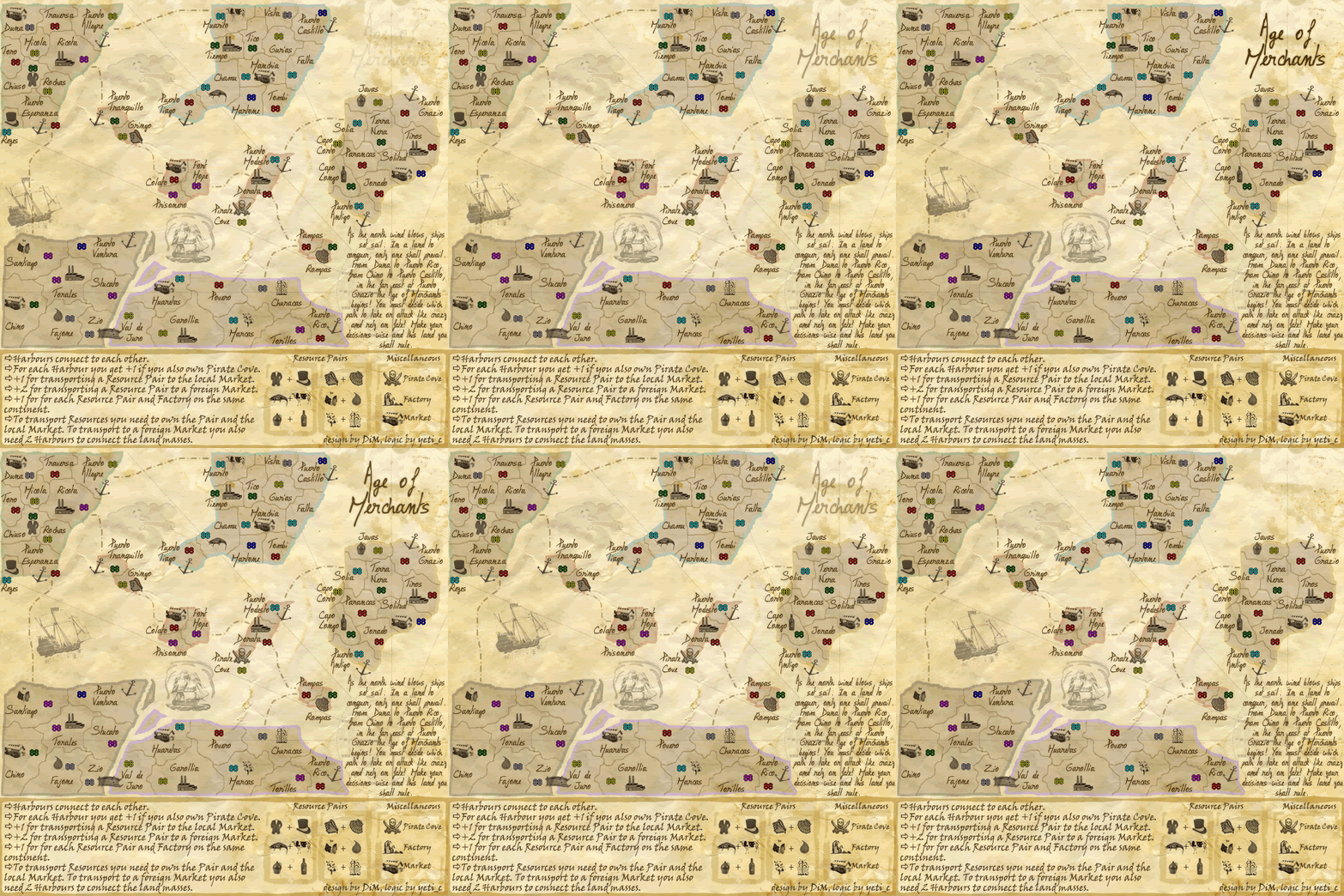
i got bored so i animated the map. like it?
it's my first animation ever so don't be too picky. :lol:
i did it because i wanted to learn how to do an animation and exercise my skills.
more difficult animations can be done like marching troops explosions etc. it would be nice if we had like 3 maps: small large and animated.
edit// it seems on some conections it could be slow.
:roll:


Image
“In the beginning God said, the four-dimensional divergence of an antisymmetric, second rank tensor equals zero, and there was light, and it was good. And on the seventh day he rested.”- Michio Kaku
User avatar
Major DiM
 
Posts: 10415
Joined: Wed Feb 14, 2007 6:20 pm
Location: making maps for scooby snacks

Postby Enigma on Thu Apr 19, 2007 11:07 am

lol 5 mins and all ive gotten are the top 10 pxls #-o
o wait! just had to refresh :roll: love the ship sailing
Do you need an excuse to have a war? I mean, who for? Can't you just say "You got lots of cash and land, but I've got a big sword, so divy up right now, chop chop."
Terry Pratchet
User avatar
Lieutenant Enigma
 
Posts: 367
Joined: Mon Jul 03, 2006 10:23 pm
Location: Classified

Postby freezie on Thu Apr 19, 2007 11:11 am

I like the old factory better :P


Animations...yup it slows down my comp.
Image
User avatar
Corporal 1st Class freezie
 
Posts: 3901
Joined: Fri Apr 06, 2007 12:18 pm
Location: Somewhere between here and there.

Postby DiM on Thu Apr 19, 2007 11:14 am

so would it be worth the trouble to add various other animations like waves splashing, smoke coming out of the factory, etc?

the problem is i have very crude animation skills, and at the moment the only method i found, using fireworks is to draw each frame and then put them together.

but the real problem is that i can't do any modifications to the image because it works with jpgs not pngs so i can't edit them properly. for example i forgot the army numbers and i can't remove them. i have to go to the original png, remove the army numbers then redo all the frames once again. well i guess animations could be added at the end, when the map is really really final.
“In the beginning God said, the four-dimensional divergence of an antisymmetric, second rank tensor equals zero, and there was light, and it was good. And on the seventh day he rested.”- Michio Kaku
User avatar
Major DiM
 
Posts: 10415
Joined: Wed Feb 14, 2007 6:20 pm
Location: making maps for scooby snacks

Postby DiM on Thu Apr 19, 2007 11:15 am

freezie wrote:I like the old factory better :P


Animations...yup it slows down my comp.


i said it might slow down the computer. but it would be nice to have them along with the option to disable them.
“In the beginning God said, the four-dimensional divergence of an antisymmetric, second rank tensor equals zero, and there was light, and it was good. And on the seventh day he rested.”- Michio Kaku
User avatar
Major DiM
 
Posts: 10415
Joined: Wed Feb 14, 2007 6:20 pm
Location: making maps for scooby snacks

Postby DiM on Thu Apr 19, 2007 12:13 pm

does anybody have any idea how i can save the gif and still have all the layers in each frame? i'm using fireworks

at the moment despite the fact that i have thousands of layers scattered in 20 frames, when i save it as gif all the frames are automatically transformet to jpgs. all the layers are flattened automaticaly :(
“In the beginning God said, the four-dimensional divergence of an antisymmetric, second rank tensor equals zero, and there was light, and it was good. And on the seventh day he rested.”- Michio Kaku
User avatar
Major DiM
 
Posts: 10415
Joined: Wed Feb 14, 2007 6:20 pm
Location: making maps for scooby snacks

Postby Contrickster on Thu Apr 19, 2007 12:20 pm

My firefox will crash when I play too many CC turns in succession. Animated map probably won't make it better.

Don't waste your effort on it. Looks to me like this map is complete bar the approval of from above for the final forge.

Specifically the map size issue needs to be discussed. It's no good leaving it to the last moment, you need to know now because there's a lot of text/design riding on the decision.
Corporal 1st Class Contrickster
 
Posts: 261
Joined: Tue Jan 23, 2007 7:24 pm

Postby DiM on Thu Apr 19, 2007 12:41 pm

Contrickster wrote:My firefox will crash when I play too many CC turns in succession. Animated map probably won't make it better.

Don't waste your effort on it. Looks to me like this map is complete bar the approval of from above for the final forge.

Specifically the map size issue needs to be discussed. It's no good leaving it to the last moment, you need to know now because there's a lot of text/design riding on the decision.


it could be useful for those with good connections. i'd love an animated map but only as an option.
small large & animated.

i know the size is too big but unfortunately there's nothing i can do. i need the space to explain the complex bonus system. at most i could take the height down to 750.
“In the beginning God said, the four-dimensional divergence of an antisymmetric, second rank tensor equals zero, and there was light, and it was good. And on the seventh day he rested.”- Michio Kaku
User avatar
Major DiM
 
Posts: 10415
Joined: Wed Feb 14, 2007 6:20 pm
Location: making maps for scooby snacks

Postby Guiscard on Thu Apr 19, 2007 12:57 pm

Well in other threads the maximum height has been listed as 510px for the small map.

It is an absolutely huge map at the moment, and I'm almost 100% sure you will be asked to scale it down so you better get thinking to be honest...

You could easily squash a lot of the islands closer together. There's a lot of 'dead' sea space which, whilst taken up currently by nice graphics, isn't entirely necessary. All the continents could be vertically much closer together without much effort whilst still leaving room for the title and legend.
qwert wrote:Can i ask you something?What is porpose for you to open these Political topic in ConquerClub? Why you mix politic with Risk? Why you not open topic like HOT AND SEXY,or something like that.
User avatar
Private 1st Class Guiscard
 
Posts: 4103
Joined: Fri Dec 08, 2006 7:27 pm
Location: In the bar... With my head on the bar

Postby DiM on Thu Apr 19, 2007 3:54 pm

Guiscard wrote:Well in other threads the maximum height has been listed as 510px for the small map.

It is an absolutely huge map at the moment, and I'm almost 100% sure you will be asked to scale it down so you better get thinking to be honest...

You could easily squash a lot of the islands closer together. There's a lot of 'dead' sea space which, whilst taken up currently by nice graphics, isn't entirely necessary. All the continents could be vertically much closer together without much effort whilst still leaving room for the title and legend.


the small world 2.1 is 700*610px. my small map is 600*600 so i am within these limits.
why should i take out some design elements and make the map smaller and more cramped?
“In the beginning God said, the four-dimensional divergence of an antisymmetric, second rank tensor equals zero, and there was light, and it was good. And on the seventh day he rested.”- Michio Kaku
User avatar
Major DiM
 
Posts: 10415
Joined: Wed Feb 14, 2007 6:20 pm
Location: making maps for scooby snacks

Postby KEYOGI on Thu Apr 19, 2007 5:18 pm

Do you like my new avatar?

yes it looks just like you
9% [ 7 ]
no (boring answer)
36% [ 26 ]
who the heck beat you up?
15% [ 11 ]
are those stitches on your mouth?
8% [ 6 ]
ughh...hmmm...what the...crap...
29% [ 21 ]

Total Votes : 71

Can we keep polls on topic next time DiM. :wink:
Sergeant 1st Class KEYOGI
 
Posts: 1632
Joined: Tue Oct 10, 2006 6:09 am

Postby DiM on Thu Apr 19, 2007 5:19 pm

KEYOGI wrote:Do you like my new avatar?

yes it looks just like you
9% [ 7 ]
no (boring answer)
36% [ 26 ]
who the heck beat you up?
15% [ 11 ]
are those stitches on your mouth?
8% [ 6 ]
ughh...hmmm...what the...crap...
29% [ 21 ]

Total Votes : 71

Can we keep polls on topic next time DiM. :wink:


i was bored and had nothing to improve on the map :P
“In the beginning God said, the four-dimensional divergence of an antisymmetric, second rank tensor equals zero, and there was light, and it was good. And on the seventh day he rested.”- Michio Kaku
User avatar
Major DiM
 
Posts: 10415
Joined: Wed Feb 14, 2007 6:20 pm
Location: making maps for scooby snacks

Postby Samus on Thu Apr 19, 2007 5:22 pm

KEYOGI wrote:Do you like my new avatar?

yes it looks just like you
9% [ 7 ]
no (boring answer)
36% [ 26 ]
who the heck beat you up?
15% [ 11 ]
are those stitches on your mouth?
8% [ 6 ]
ughh...hmmm...what the...crap...
29% [ 21 ]

Total Votes : 71

Can we keep polls on topic next time DiM. :wink:


So, with these results, are you going to change your avatar? :)
User avatar
Major Samus
 
Posts: 372
Joined: Mon Jan 01, 2007 12:33 pm

Postby DiM on Thu Apr 19, 2007 5:24 pm

Samus wrote:
KEYOGI wrote:Do you like my new avatar?

yes it looks just like you
9% [ 7 ]
no (boring answer)
36% [ 26 ]
who the heck beat you up?
15% [ 11 ]
are those stitches on your mouth?
8% [ 6 ]
ughh...hmmm...what the...crap...
29% [ 21 ]

Total Votes : 71

Can we keep polls on topic next time DiM. :wink:


So, with these results, are you going to change your avatar? :)


maybe :roll:


PS: new poll is up
“In the beginning God said, the four-dimensional divergence of an antisymmetric, second rank tensor equals zero, and there was light, and it was good. And on the seventh day he rested.”- Michio Kaku
User avatar
Major DiM
 
Posts: 10415
Joined: Wed Feb 14, 2007 6:20 pm
Location: making maps for scooby snacks

Postby KEYOGI on Thu Apr 19, 2007 5:32 pm

I voted no because I don't think it suits this map. I wouldn't mind seeing it as an option for maps in the future, but it would have to be really well done.
Sergeant 1st Class KEYOGI
 
Posts: 1632
Joined: Tue Oct 10, 2006 6:09 am

Postby DiM on Thu Apr 19, 2007 5:42 pm

KEYOGI wrote:I voted no because I don't think it suits this map. I wouldn't mind seeing it as an option for maps in the future, but it would have to be really well done.


i'm not specifically talking about this map.

the question is:
Would you like to have an animated map as a third option? (besides small and large) (see page 34)


so it's a general question to see if animated maps could be a viable option.

ofcourse the animations should be done really really good. and yes they don't quite suit this map because it has the old map feeling. no animation on old maps. but i'd really like to see the palm trees in cairns coral coast moving in the wind, the rivers flowing and the waves hitting the shores. that's the king of map that is best suited for animation. discrete small things that enhance the feeling.
“In the beginning God said, the four-dimensional divergence of an antisymmetric, second rank tensor equals zero, and there was light, and it was good. And on the seventh day he rested.”- Michio Kaku
User avatar
Major DiM
 
Posts: 10415
Joined: Wed Feb 14, 2007 6:20 pm
Location: making maps for scooby snacks

Postby DiM on Thu Apr 19, 2007 6:35 pm

Samus wrote:
So, with these results, are you going to change your avatar? :)


changed it.
do you like it?
“In the beginning God said, the four-dimensional divergence of an antisymmetric, second rank tensor equals zero, and there was light, and it was good. And on the seventh day he rested.”- Michio Kaku
User avatar
Major DiM
 
Posts: 10415
Joined: Wed Feb 14, 2007 6:20 pm
Location: making maps for scooby snacks

PreviousNext

Return to The Atlas

Who is online

Users browsing this forum: No registered users