[Abandoned] - Second Indochina War
Moderator: Cartographers
Forum rules
Please read the Community Guidelines before posting.
Please read the Community Guidelines before posting.
- DiM
- Posts: 10415
- Joined: Wed Feb 14, 2007 6:20 pm
- Gender: Male
- Location: making maps for scooby snacks
Re: The Second Indochina War [21 May 2011]
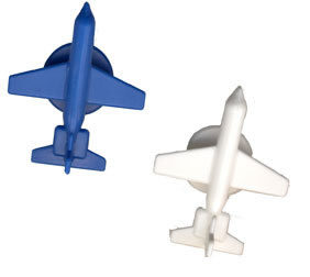
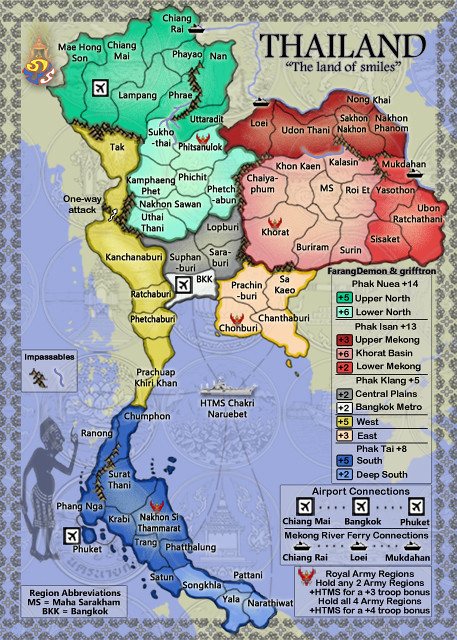
i think the map is an amalgam of styles that don't fit very well together. you have monochrome realistic photos, realistically hand - drawn images (bamboo), stylized images (electricity, airplanes), 3d-like brightly coloured forests, hand drawn flat mountains, 2 blue shades in a vast mass of grey tones.
taken one by one you actually have some well executed elements. but put together i don't think they fit. i don't "feel" this map.
taken one by one you actually have some well executed elements. but put together i don't think they fit. i don't "feel" this map.
“In the beginning God said, the four-dimensional divergence of an antisymmetric, second rank tensor equals zero, and there was light, and it was good. And on the seventh day he rested.”- Michio Kaku
Re: The Second Indochina War [21 May 2011]
Me either, that is why I am brainstorming, I know it looks like crap graphically at the moment, i am just waiting for something to inspire me, or someone to leave a good idea drop that will get this thing going again.Thoughts?DiM wrote:i think the map is an amalgam of styles that don't fit very well together. you have monochrome realistic photos, realistically hand - drawn images (bamboo), stylized images (electricity, airplanes), 3d-like brightly coloured forests, hand drawn flat mountains, 2 blue shades in a vast mass of grey tones.
taken one by one you actually have some well executed elements. but put together i don't think they fit. i don't "feel" this map.
-griff

- Victor Sullivan
- Posts: 6010
- Joined: Mon Feb 08, 2010 8:17 pm
- Gender: Male
- Location: Columbus, OH
- Contact:
Re: The Second Indochina War [21 May 2011]
Big pink overalls that got a syrup stain on them, because someone was overzealous with the pancakes this morning... There's your inspiration. Let it inspire you to make this a masterpiece...
Jk. Perhaps do a modified version of Thailand? Experiment with textures and various techniques. Idk - knock yourself out!
-Sully
Jk. Perhaps do a modified version of Thailand? Experiment with textures and various techniques. Idk - knock yourself out!
-Sully
Beckytheblondie: "Don't give us the dispatch, give us a mustache ride."
Scaling back on my CC involvement...
Scaling back on my CC involvement...
Re: The Second Indochina War [21 May 2011]
I was hoping to move away from the Thailand map style... i have seen many map makers stay with the same graphics map after map... i wouldn't want to be one of those map makers, i want to make a map that is different from anything i have done in the past.Victor Sullivan wrote:Big pink overalls that got a syrup stain on them, because someone was overzealous with the pancakes this morning... There's your inspiration. Let it inspire you to make this a masterpiece...
Jk. Perhaps do a modified version of Thailand? Experiment with textures and various techniques. Idk - knock yourself out!
-Sully
-griff

- Victor Sullivan
- Posts: 6010
- Joined: Mon Feb 08, 2010 8:17 pm
- Gender: Male
- Location: Columbus, OH
- Contact:
Re: The Second Indochina War [21 May 2011]
Well, it's not a crime to refer to your previous creation:
Besides the faded background design, there isn't an good, coarse texture (which, I must say, works for this map, but perhaps including it in this map would work well). You could also go with a more muted, or color-specific color scheme. Just a couple thoughts 
-Sully
-Sully
Beckytheblondie: "Don't give us the dispatch, give us a mustache ride."
Scaling back on my CC involvement...
Scaling back on my CC involvement...
- AndyDufresne
- Posts: 24932
- Joined: Fri Mar 03, 2006 8:22 pm
- Location: A Banana Palm in Zihuatanejo
- Contact:
Re: The Second Indochina War [21 May 2011]
Thumbs up. I like it when I see cartographers pushing out of their aesthetic boundaries. Good luck.grifftron wrote: I was hoping to move away from the Thailand map style... i have seen many map makers stay with the same graphics map after map... i wouldn't want to be one of those map makers, i want to make a map that is different from anything i have done in the past.
-griff
--Andy
Re: The Second Indochina War [21 May 2011]
Well as DiM said, i do understand things do not fit together at the moment, at first I was thinking of a black & white type them, mix in some grays and what not, but i am not sure it would work or not... those pictures of the leaders must stay i think, and for the rest of the map to fit together they have to go along with those pictures IMO.
-griff
-griff

- FarangDemon
- Posts: 700
- Joined: Wed Apr 23, 2008 1:36 am
- Contact:
Re: The Second Indochina War [21 May 2011]
Some ideas:

One idea, you could make it look like a military map that has been laid out on a table, i.e. putting creases in it like on the map above.
The photos of leaders could be arranged in a similar fashion, like you could add wear to some of the photos, make the corners turn up, place them slightly askew, as if the photos were placed atop the map by a human hand which is not perfect.
Maybe put contemporaneous weapons or equipment on the table as well (if they are small enough to fit).
"He came dancin across the water.... FarangDemon, FarangDemon.... mmmhh....what a killer..."
Re: The Second Indochina War [21 May 2011]
great FD, inspiring... only thing i was trying to go away from was putting it on a table, this has already been done by many CC map makers and how many maps on tables can we get? ... maybe pinned up on a door? ill have to think about it, but i like the first "red" themed map you posted, if i can get something going like that, it would be great.
-griff
-griff

- RedBaron0
- Posts: 2657
- Joined: Sun Aug 19, 2007 12:59 pm
- Gender: Male
- Location: Pennsylvania
- Contact:
Re: The Second Indochina War [21 May 2011]
[Moved]
It would appear that development of this map has stalled. If the mapmaker wants to continue with the map, then one of the Foundry Moderators will be able to help put the thread back into the Foundry system, after an update has been made.
It would appear that development of this map has stalled. If the mapmaker wants to continue with the map, then one of the Foundry Moderators will be able to help put the thread back into the Foundry system, after an update has been made.


Re: The Second Indochina War [21 May 2011]
Thats fine for now, just honestly haven't had the time needed to sit down and mess with it yet.RedBaron0 wrote:[Moved]
It would appear that development of this map has stalled. If the mapmaker wants to continue with the map, then one of the Foundry Moderators will be able to help put the thread back into the Foundry system, after an update has been made.
-griff

- FarangDemon
- Posts: 700
- Joined: Wed Apr 23, 2008 1:36 am
- Contact:
Re: The Second Indochina War [21 May 2011]
I got a new idea:grifftron wrote:great FD, inspiring... only thing i was trying to go away from was putting it on a table, this has already been done by many CC map makers and how many maps on tables can we get? ... maybe pinned up on a door? ill have to think about it, but i like the first "red" themed map you posted, if i can get something going like that, it would be great.
-griff
You could make whatever symbols we have appear to be 3-dimensional pieces resting on top of the map.

Instead of just a map on the table, you could make it look like the extremely large tabletop models that military leaders use to view their troops - like in the scene from We Were Soldiers.
If you do it this way, it makes sense to make the portraits look like photos of those leaders, they can be bent and arranged not exactly at 90 degree angles (unless that looks crappy).
"He came dancin across the water.... FarangDemon, FarangDemon.... mmmhh....what a killer..."
- thenobodies80
- Posts: 5400
- Joined: Wed Sep 05, 2007 4:30 am
- Gender: Male
- Location: Milan
Re: [Abandoned] - Second Indochina War
The six months of vacation has expired, for this reason this topic is now labeled as [Abandoned]. If the original mapmaker wants to continue this map project it's fine but an update must provided. From this moment anyone else is free to take this project without the original mapmaker permission, but it has to be started from the scratch.
- FarangDemon
- Posts: 700
- Joined: Wed Apr 23, 2008 1:36 am
- Contact:
Re: [Abandoned] - Second Indochina War
Too bad nobody liked this idea enough to pick it up again / promote it. I'd gladly trade the medal I recently acquired for my work on the Algorithm of 400, and all my other medals and score and bird, just to see that all the time I spent on this project was not wasted. So if anyone in the community would like to repay me, this is how you can do it. I am happy to do XML and can answer questions about once a week if you'd like my guidance in terms of game play, which I can't remember, but I think we passed that hoop. Yes, I did read it has to start from scratch.
I think the way it is currently designed is fine, but an alternative idea could be to emulate the gameplay of Battle for Iraq.
If anyone picks it up, I hope we keep the photos of the faction leaders / generals so as not to diminish the historical information conveyed about this defining conflict in our recent history and human tragedy.
Last edited by FarangDemon on Sat Oct 06, 2012 9:54 pm, edited 1 time in total.
"He came dancin across the water.... FarangDemon, FarangDemon.... mmmhh....what a killer..."
- IcePack
- Multi Hunter

- Posts: 16855
- Joined: Wed Aug 04, 2010 6:42 pm
- Gender: Male
- Location: California
Re: [Abandoned] - Second Indochina War
Interesting map  I like the concept, hopefully this gets picked up again soon

fac vitam incredibilem memento vivere
Knowledge Weighs Nothing, Carry All You Can


