
I would if I only knew it myselfcairnswk wrote:Gillipig...can you expand on what part you like about rail Europe so i can know what it isGillipig wrote:I like Rail Europe but not the others. So please try to make it like Rail Europe!
Re: RAIL ASIA [1.11.12] QUENCHED
Moderator: Cartographers
Forum rules
Please read the Community Guidelines before posting.
Please read the Community Guidelines before posting.
Re: RAIL ASIA [16.10.11] V17-P12 GFX stations?

Re: RAIL ASIA [16.10.11] V17-P12 GFX stations?
for you, you obviously have preferences, unidentified as they areGillipig wrote:I would if I only knew it myselfcairnswk wrote:Gillipig...can you expand on what part you like about rail Europe so i can know what it isGillipig wrote:I like Rail Europe but not the others. So please try to make it like Rail Europe. I'll try. It can't be graphics because they are fairly similar in that sense. And theme and gameplay is also very alike. Bonus system also similar yet I still only like one of them. Maybe it is graphics after all. I don't know you should probably ignore my comment
.

* Pearl Harbour * Waterloo * Forbidden City * Jamaica * Pot Mosbi
Re: RAIL ASIA [16.10.11] V17-P12 GFX stations?
This is still Version 17.
these have been done, along with stations in Kazakhstan (there is some really great artchitecture going on in that country - check this railway station out in Astana)isaiah40 wrote:Don't know about ender, but I think the Russian and the Arabian ones could use some extra loving.
the cupolas are still to be done - i might even change that whole design...so hang in there, but there is texture on the land and sea, Natty.natty_dread wrote:The graphical thing that could use the most attention would be the legend I think... It just doesn't seem to be up to the cairnswk standards, you know? Those buildings with the cupolas look kinda shoddy, I don't know if it's the patterns but they look kinda like late 80:s EGA graphics...
The map itself looks ok, if maybe a bit simplistic... maybe some subtle texturing on the land & sea might not be a bad idea?
- Click image to enlarge.
* Pearl Harbour * Waterloo * Forbidden City * Jamaica * Pot Mosbi
-
natty dread

- Posts: 12876
- Joined: Fri Feb 08, 2008 8:58 pm
- Location: just plain fucked
Re: RAIL ASIA [5.11.11] V17-P12 GFX stations?
Yeah, so there is... it's just so subtle I didn't notice it.
Maybe you could increase the shading on the land edges, make it pop up just a tiny bit more?
Maybe you could increase the shading on the land edges, make it pop up just a tiny bit more?


Re: RAIL ASIA [5.11.11] V17-P12 GFX stations?
I think the land looks wonderful and easily could stand alone by itself, but this is a rail map after all... lol I do have a concern that since the countries are colored that they may be misconstrued as bonus regions, thus changing them to a uniform color may be necessary for clarity, hate to do it though, it looks quite good the way it is.
I understand this is your small image cairns and there is some sqashidness going on, but however I see much in the way of pixelness that is really noticeable. The 2 onion domes with banded blue in them, look awful. The tracks have a slight pixelly look, but that may be a condition of it size. as well as the black line borders around the main city hubs. The bricks in the legend also look pixelated and flat, there isn't any depth to the mortar. (did I just say that? lol)
I understand this is your small image cairns and there is some sqashidness going on, but however I see much in the way of pixelness that is really noticeable. The 2 onion domes with banded blue in them, look awful. The tracks have a slight pixelly look, but that may be a condition of it size. as well as the black line borders around the main city hubs. The bricks in the legend also look pixelated and flat, there isn't any depth to the mortar. (did I just say that? lol)


Re: RAIL ASIA [5.11.11] V17-P12 GFX stations?
Then i think it should remain as it is if it looks good, besides that's what the regional coding on stations is all about.RedBaron0 wrote:I think the land looks wonderful and easily could stand alone by itself, but this is a rail map after all... lol I do have a concern that since the countries are colored that they may be misconstrued as bonus regions, thus changing them to a uniform color may be necessary for clarity, hate to do it though, it looks quite good the way it is.
Yeah, i'm aware of the onion domes, but right now i am trying to get other projects in here underway again, as well as get my new 'puter up and running properly, plus play trains on RuleTheRails (computer model railway)...lots going on but i'm aware of most of it.I understand this is your small image cairns and there is some sqashidness going on, but however I see much in the way of pixelness that is really noticeable. The 2 onion domes with banded blue in them, look awful. The tracks have a slight pixelly look, but that may be a condition of it size. as well as the black line borders around the main city hubs. The bricks in the legend also look pixelated and flat, there isn't any depth to the mortar. (did I just say that? lol)
Thanks for commenting though
* Pearl Harbour * Waterloo * Forbidden City * Jamaica * Pot Mosbi


Re: RAIL ASIA [5.11.11] V17-P12 GFX stations?
how about giving more imaginative names to the three chinese railways, such as mandarin for northern, silk road for western and pearl river for southern?
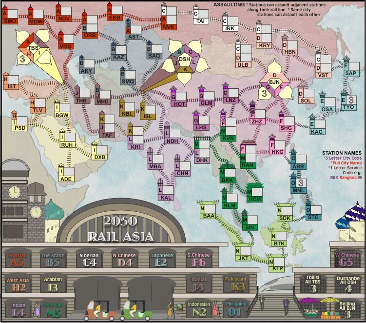
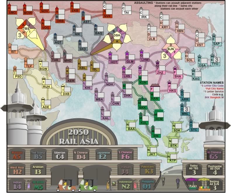
what cities are AKY, KAZ, BAQ, TAF, KRY and HOT? i suggest replacing BAQ by ALA almaty (kazakhstan's largest city and former capital), HOT by URC urumqi (xinjiang's largest city) and SMQ by TAS tashkent (uzbekistan's largest city and capital).
can u use SHA for shanghai and KUL for kuala lumpur to align them with their well-known airport codes? i don't especially like LNZ for lanzhou, since LNZ is linz (in austria). perhaps change it to LHU?
i was going to suggest using kuala lumpur railway station as inspiration for its troop box design, but it seems to have been turned into a hotel now!
http://hotels.lonelyplanet.com/malaysia ... -p1034972/
ian.

Re: RAIL ASIA [5.11.11] V17-P12 GFX stations?
Thanks for your comments ian.iancanton wrote:how about giving more imaginative names to the three chinese railways, such as mandarin for northern, silk road for western and pearl river for southern?
I think these are great suggestions, but when i went in to change the texts, i had another thought...would most players know where to look (apart from any colour association) for the Mandarin or Pearl Lines? You and I might know but...
so i'd like to hear from others on this issue and more discussion.
1. AKY is meant to be Aktay but that seems to have changed since i last looked a few weeks ago and is now Aqtau, so it will become AQT (does not have a 3 letter code)what cities are AKY, KAZ, BAQ, TAF, KRY and HOT? i suggest replacing BAQ by almaty (kazakhstan's largest city and former capital), HOT by URC urumqi (xinjiang's largest city) and SMQ by TAS tashkent (uzbekistan's largest city and capital).
2. KAZ - my oops - I've placed Kazakhstan in there instead of Nikolskiy, so it will change to NIK
3. BAQ = Balqash (on Lake Balqash) - while i recognise the significance of Almaty, it is too close to the border for representation and would interfere with DSH graphic.
4. TAF - Taft (why i chose that, i can't remember), but since Kerman appears to be the regional city in that area, it is now KER.
5. KRY = Karymskoye (Karaymskaya) this is the start of the Trans-Manchurian line junction.
6. HOT - Hotan - used since this is more geographically placed for representation rather than Urumqi (which is much further north east and sits under the DSH graphic)
7. SMQ = Samarkand - i used that coz i wanted to have that link with the old Silk Road, I'm not really in favour of changing that, but will change it's code to SKD
Sure. Lanzhou is now LHW (its code)can u use SHA for shanghai and KUL for kuala lumpur to align them with their well-known airport codes? i don't especially like LNZ for lanzhou, since LNZ is linz (in austria). perhaps change it to LHU?
Mmmm. not sure where you were going with this one.i was going to suggest using kuala lumpur railway station as inspiration for its troop box design, but it seems to have been turned into a hotel now!
http://hotels.lonelyplanet.com/malaysia ... -p1034972/
ian.
* Pearl Harbour * Waterloo * Forbidden City * Jamaica * Pot Mosbi
Re: RAIL ASIA [17.12.11] V18-P12 Domes?
I think i know now where you were going with that.iancanton wrote:...
i was going to suggest using kuala lumpur railway station as inspiration for its troop box design, but it seems to have been turned into a hotel now!
http://hotels.lonelyplanet.com/malaysia ... -p1034972/
ian.
I have considered replacing the current design with that design, but then read it's architecture was based on Moorish design and meh!...but am still considering it.
Last edited by cairnswk on Fri Dec 16, 2011 9:47 pm, edited 1 time in total.
* Pearl Harbour * Waterloo * Forbidden City * Jamaica * Pot Mosbi
Re: RAIL ASIA [17.12.11] V18-P12 Domes?
I think i know now where you were going with that.iancanton wrote:...
i was going to suggest using kuala lumpur railway station as inspiration for its troop box design, but it seems to have been turned into a hotel now!
http://hotels.lonelyplanet.com/malaysia ... -p1034972/
ian.
I have considered replacing the current design with that design, but then read it's architecture was based on Moorish design and meh!...but am still considering it.
Part of the considering was my doubt of ability to re-produce...
So in response to ian's suggestion above, would this look more appealing with these domes if i were to incorporate that pattern from the Kuala Lumpur Station into the station design?
For consideration...part of version V17...of course the edges will be trimmed
- Click image to enlarge.
* Pearl Harbour * Waterloo * Forbidden City * Jamaica * Pot Mosbi

Re: RAIL ASIA [17.12.11] V18-P12 Domes?
Those domes are dramatic, but the 3D shading would have to be used throughout the legend, and I'm okay with the style you already have.
-
natty dread
- Posts: 12876
- Joined: Fri Feb 08, 2008 8:58 pm
- Location: just plain fucked
Re: RAIL ASIA [17.12.11] V18-P12 Domes?
If you made the rest of the legend in the same style, those would look neat.
Re: RAIL ASIA [17.12.11] V18-P12 Domes?
ender516 wrote:Those domes are dramatic, but the 3D shading would have to be used throughout the legend, and I'm okay with the style you already have.
Thanks for commenting guys.natty_dread wrote:If you made the rest of the legend in the same style, those would look neat.
I've been pondering over this...while i like the domes, having all that black, white and gray on the map, would pose a challenge.
so i propose to keep the domes, but colour them to match the overall effect of the rest of the legend.
I think that will conquer this.
* Pearl Harbour * Waterloo * Forbidden City * Jamaica * Pot Mosbi
-
natty dread
- Posts: 12876
- Joined: Fri Feb 08, 2008 8:58 pm
- Location: just plain fucked
Re: RAIL ASIA [17.12.11] V18-P12 Domes?
Partially, but it's not just about the colour. You should apply the same shading effects on the rest of the legend, as what you have on the towers. You know, otherwise it'll just look like the legend is a cardboard cutout in front of actual towers...cairnswk wrote:so i propose to keep the domes, but colour them to match the overall effect of the rest of the legend.
I think that will conquer this.
Re: RAIL ASIA [17.12.11] V18-P12 Domes?
Right. Natty picked up on what I was trying to say.
Re: RAIL ASIA [17.12.11] V18-P12 Domes?
I understand, and naturally there will be some shading...shading increases the higher one looks from the ground level.ender516 wrote:Right. Natty picked up on what I was trying to say.
* Pearl Harbour * Waterloo * Forbidden City * Jamaica * Pot Mosbi
Re: RAIL ASIA [17.12.11] V18-P12 Domes?
nice! the bulge in the middle where u have the title looks very flat now. u're planning for all of the buildings to have a gold-brown colour?
ian.
ian.
Re: RAIL ASIA [17.12.11] V18-P12 Domes?
yes ian. i think that is best, well at least tones taken from the station image.iancanton wrote:nice! the bulge in the middle where u have the title looks very flat now. u're planning for all of the buildings to have a gold-brown colour?
ian.
* Pearl Harbour * Waterloo * Forbidden City * Jamaica * Pot Mosbi
Re: RAIL ASIA [5.1.12] V20-P12 Stn GFX?
Version 20. Is this heading in the right direction?

* Pearl Harbour * Waterloo * Forbidden City * Jamaica * Pot Mosbi
-
natty dread
- Posts: 12876
- Joined: Fri Feb 08, 2008 8:58 pm
- Location: just plain fucked
Re: RAIL ASIA [5.1.12] V20-P12 Stn GFX?
Yes. Now if you just do the shading on the rest of the legend it'll look great.
Re: RAIL ASIA [5.1.12] V20-P12 Stn GFX?
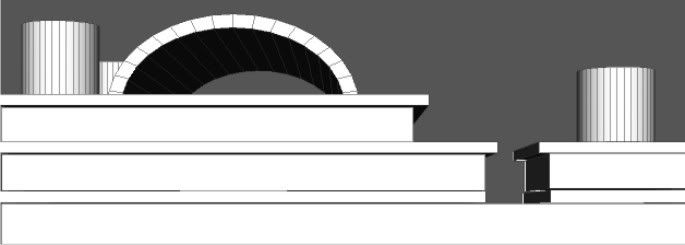
Looking better, on the flip side you have this:

which makes it look like the roof is going up, or the wall is going down depending on how you look at it.
which makes it look like the roof is going up, or the wall is going down depending on how you look at it.
Re: RAIL ASIA [5.1.12] V20-P12 Stn GFX?
OK, i can identify only a couple of places where shading is needed, so what areas are you referring to natty that you think need doing?natty_dread wrote:Yes. Now if you just do the shading on the rest of the legend it'll look great.
* Pearl Harbour * Waterloo * Forbidden City * Jamaica * Pot Mosbi
-
natty dread
- Posts: 12876
- Joined: Fri Feb 08, 2008 8:58 pm
- Location: just plain fucked
Re: RAIL ASIA [5.1.12] V20-P12 Stn GFX?
Ok: The windows where you have the bonus numbers - these could use some depth.
The curved thing behind the title text could use similar shading as the towers.
Then the people, the small 3-wheel vehicles, umbrellas etc. These all look kinda like they could use some attention - they seem a bit simplistic.
The train in the background could use a bit of a shine to it.
The curved thing behind the title text could use similar shading as the towers.
Then the people, the small 3-wheel vehicles, umbrellas etc. These all look kinda like they could use some attention - they seem a bit simplistic.
The train in the background could use a bit of a shine to it.
Re: RAIL ASIA [5.1.12] V20-P12 Stn GFX?
Version 20. Just bumping the map...below
Last edited by cairnswk on Fri Jan 06, 2012 8:46 pm, edited 2 times in total.
* Pearl Harbour * Waterloo * Forbidden City * Jamaica * Pot Mosbi
Re: RAIL ASIA [6.1.12] V20-P12 Stn GFX?
In order to get the perspective correct, i modelled the station in AC3D and then imposed the 3D model into the image in order get the lines correct.
The image above has been changed to a .png and updated thus far...
I haven't finished the update yet, as there are still some more things to do, but will continue tomorrow after my eyes have recovered.
The image above has been changed to a .png and updated thus far...
I haven't finished the update yet, as there are still some more things to do, but will continue tomorrow after my eyes have recovered.
* Pearl Harbour * Waterloo * Forbidden City * Jamaica * Pot Mosbi