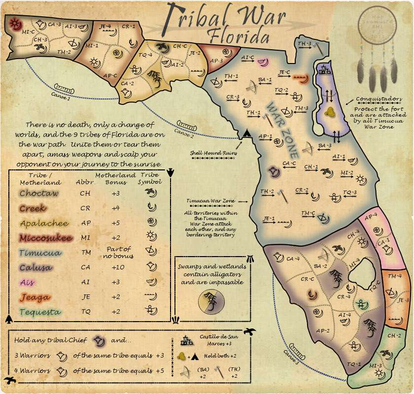
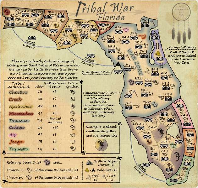
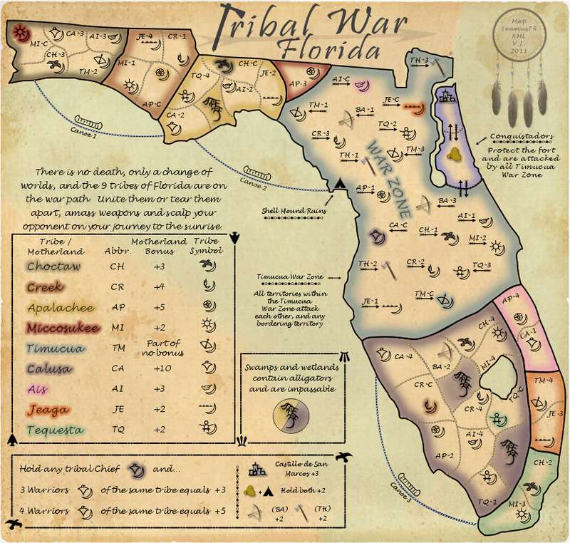
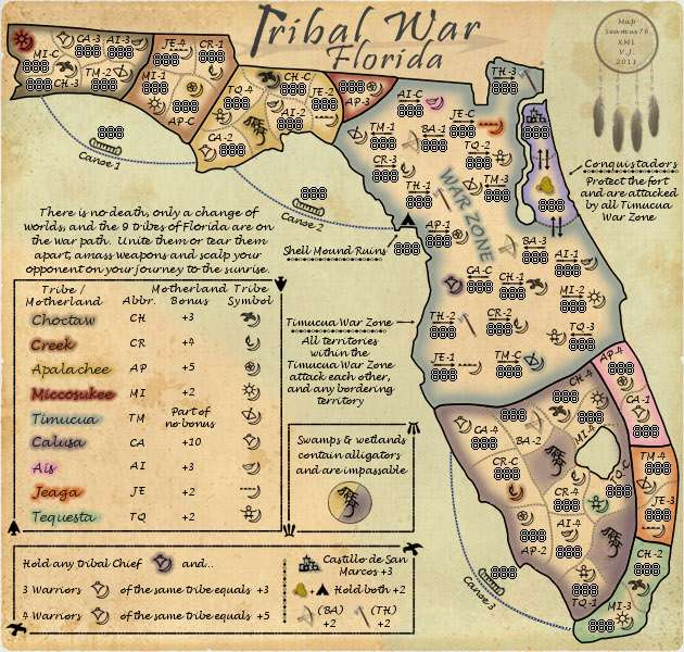
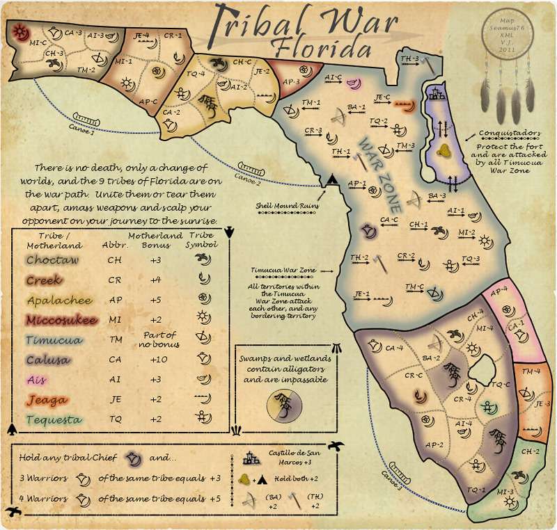
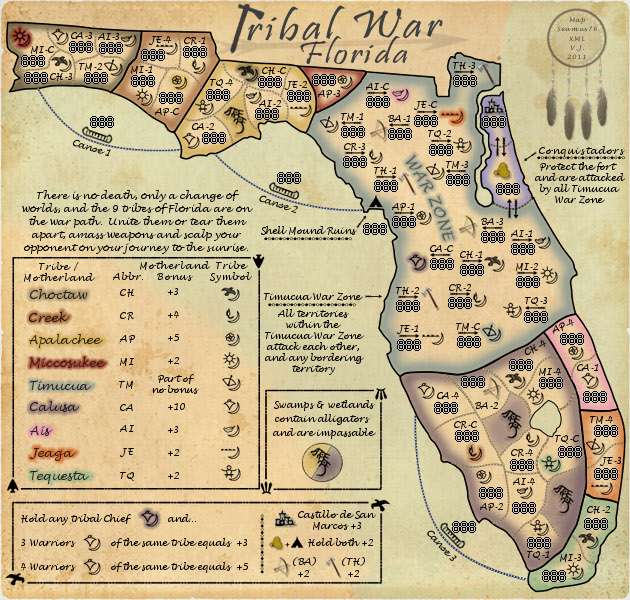
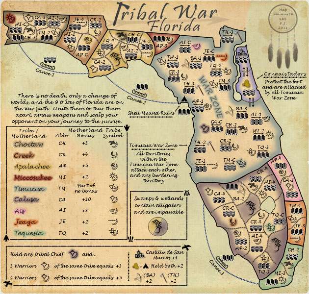
Tribal War - Florida v14.2 [31 Jan 2012] pg27
Moderator: Cartographers
Forum rules
Please read the Community Guidelines before posting.
Please read the Community Guidelines before posting.
- koontz1973
- Posts: 6960
- Joined: Thu Jan 01, 2009 10:57 am
Re: Tribal War - Florida v10.0 [05 Sep 2011] pg15
Well, your playing around is really getting results. Another thing just occurred to me, can you see what it would look like with Florida just below the map, so the bottom bit is cut off like the axe if you go in that direction. If it looks crap, no worries.

Re: Tribal War - Florida v10.0 [05 Sep 2011] pg15
Will do, that's a good thought. Might be a way for me to get the text a little larger.
- koontz1973
- Posts: 6960
- Joined: Thu Jan 01, 2009 10:57 am
Re: Tribal War - Florida v10.0 [05 Sep 2011] pg15
CURRENT UPDATE INFO-2011-09-06:
- Played with the title a little. This version has a more gray color, and removes the red stroke. I centered it, and made each part larger(edit: and larger again) within it's own area. I tried lengthening the tomahawk handle, but it didn't look right coming from under the map. I also tried some other enhancements like adding some red satin, and some other things, but I couldn't get anything to look better than just the clean text. I know someone can help me with some thoughts, and maybe a quick tutorial, etc.
- I added the dream catcher to the right side which now incorporates the signatures.
CURRENT MAP VERSION:
v10.1 - Large (840x800) v10.1 - Small (630x600)
Last edited by Seamus76 on Tue Sep 06, 2011 9:28 pm, edited 2 times in total.
- gimil
- Posts: 8599
- Joined: Sat Mar 03, 2007 12:42 pm
- Gender: Male
- Location: United Kingdom (Scotland)
Re: Tribal War - Florida v10.1 [06 Sep 2011] pg16
Wonderful work seamus. I think that if you spread the title a little more to use more of the space available then it would be perfect.
What do you know about map making, bitch?
Top Score:2403natty_dread wrote:I was wrong
Re: Tribal War - Florida v10.1 [06 Sep 2011] pg16
Thanks gimil. I did spread the text a little more from that last version and updated the images on each post, but not the version number etc. I may be able to go a little, tiny but larger, but it didn't seem that would help, and might make things a little too cramped up there.
- natty dread
- Posts: 12877
- Joined: Fri Feb 08, 2008 8:58 pm
- Location: just plain fucked
Re: Tribal War - Florida v10.1 [06 Sep 2011] pg16
If you convert the text to a path, it's easy to scale it so that you can make it wider. I usually do this with large text like titles and stuff.

Re: Tribal War - Florida v10.1 [06 Sep 2011] pg16
CURRENT UPDATE INFO-2011-09-06:
- Used natty's tip to scale the title text and made it wider.
CURRENT MAP VERSION:
v10.2 - Large (840x800) v10.2 - Small (630x600)
- Used natty's tip to scale the title text and made it wider.
CURRENT MAP VERSION:
v10.2 - Large (840x800) v10.2 - Small (630x600)
- gimil
- Posts: 8599
- Joined: Sat Mar 03, 2007 12:42 pm
- Gender: Male
- Location: United Kingdom (Scotland)
Re: Tribal War - Florida v10.2 [06 Sep 2011] pg16
Excellent work seamus. I think your map is just about finished, graphically speaking. I am going to sticky this map.
If no more genuine concerns are brought up in the next or so I will come back and stamp his one!
If no more genuine concerns are brought up in the next or so I will come back and stamp his one!
What do you know about map making, bitch?
Top Score:2403natty_dread wrote:I was wrong
- natty dread
- Posts: 12877
- Joined: Fri Feb 08, 2008 8:58 pm
- Location: just plain fucked
Re: Tribal War - Florida v10.2 [06 Sep 2011] pg16
Sorry to say this at this point, but I think you should make your territory borders a bit darker... in lots of places they fade away into the bonus colours, which hurts gameplay clarity - especially with the army numbers on the map.

Re: Tribal War - Florida v10.2 [06 Sep 2011] pg16
This problem is worst in Calusa, and the MI-4/TQ-C border that cairnswk still had concerns about on the previous page is probably still the worst offender.natty_dread wrote:Sorry to say this at this point, but I think you should make your territory borders a bit darker... in lots of places they fade away into the bonus colours, which hurts gameplay clarity - especially with the army numbers on the map.
- koontz1973
- Posts: 6960
- Joined: Thu Jan 01, 2009 10:57 am
Re: Tribal War - Florida v10.2 [06 Sep 2011] pg16
I think what might help here, especially for the area cairnswk noticed is the water, make that 25% small and this should clear up any doubts about that border. With the borders though, bring that layer out some more is you can.
EDIT: Congrats on the sticky. Well deserved.
EDIT: Congrats on the sticky. Well deserved.

Re: Tribal War - Florida v10.2 [06 Sep 2011] pg16
CURRENT UPDATE INFO-2011-09-07:
- Thanks for all the feedback everyone. Great call Koontz, I took your advice and scaled the Calusa lake down. It not only allowed for the border in question to be completely clear, but it gave me a little more room for some the other pieces that were tight.
-Moved the title around a little so the spacing between the title text, and the arrow in the background was a little more spaced out.
-Thanks for the sticky!!
CURRENT MAP VERSION:
v11.0 - Large (840x800) v11.0 - Small (630x600)
Last edited by Seamus76 on Wed Sep 07, 2011 12:35 pm, edited 2 times in total.
- koontz1973
- Posts: 6960
- Joined: Thu Jan 01, 2009 10:57 am
Re: Tribal War - Florida v11.0 [07 Sep 2011] pg16
Great work, you can really see the improvement. 
I am starting to like the dream catcher.
Just noticed you have Tribal War running along the arrow shaft, some of the letters seem to be touching while others are not, can you just check to make sure all are at the same spacing.
I am starting to like the dream catcher.
Just noticed you have Tribal War running along the arrow shaft, some of the letters seem to be touching while others are not, can you just check to make sure all are at the same spacing.

Re: Tribal War - Florida v11.0 [07 Sep 2011] pg16
Yeah me too.by koontz1973 on Wed Sep 07, 2011 1:13 pm
I am starting to like the dream catcher
I moved the title around a bit to give it a little more space. Should be better now.Just noticed you have Tribal War running along the arrow shaft, some of the letters seem to be touching while others are not, can you just check to make sure all are at the same spacing.
- natty dread
- Posts: 12877
- Joined: Fri Feb 08, 2008 8:58 pm
- Location: just plain fucked
Re: Tribal War - Florida v11.0 [07 Sep 2011] pg16
Right now I have a brown dirt layer with a gray'ish dot on top, to look like trails spreading around. I could certainly make them black, or try a darker brown. Not to discount your statement but is anyone else noticing a problem?by natty_dread on Wed Sep 07, 2011 2:15 pm
The borders still need to be darker, I'm afraid.
- koontz1973
- Posts: 6960
- Joined: Thu Jan 01, 2009 10:57 am
Re: Tribal War - Florida v11.0 [07 Sep 2011] pg16
Not noticed that they need to be darker, but they do need to become more uniform. They seem to get thinker and thinner, darker and lighter.Seamus76 wrote:Right now I have a brown dirt layer with a gray'ish dot on top, to look like trails spreading around. I could certainly make them black, or try a darker brown. Not to discount your statement but is anyone else noticing a problem?by natty_dread on Wed Sep 07, 2011 2:15 pm
The borders still need to be darker, I'm afraid.

Re: Tribal War - Florida v11.0 [07 Sep 2011] pg16
CURRENT UPDATE INFO-2011-09-08:
-I redrew all of the territory borders, using a darker base brown. I think they look a lot better now.
CURRENT MAP VERSION:
v12.0 - Large (840x800) v12.0 - Small (630x600)
-I redrew all of the territory borders, using a darker base brown. I think they look a lot better now.
CURRENT MAP VERSION:
v12.0 - Large (840x800) v12.0 - Small (630x600)
Re: Tribal War - Florida v12.0 [08 Sep 2011] pg17
The borders are much better! Thanks!
- koontz1973
- Posts: 6960
- Joined: Thu Jan 01, 2009 10:57 am
Re: Tribal War - Florida v12.0 [08 Sep 2011] pg17
Well done on the borders and the title spacing. I have only two other points to make and one is purely down to you as it is a judgement call.
Can you make the shaft of the arrow in the title loner so the A and R in war are not on the arrow head.
Small map - JE-2 touches the border. Can you double check the rest as well. After that, I think you are pretty much done.
Can you make the shaft of the arrow in the title loner so the A and R in war are not on the arrow head.
Small map - JE-2 touches the border. Can you double check the rest as well. After that, I think you are pretty much done.

Re: Tribal War - Florida v12.0 [08 Sep 2011] pg17
On it my man.Can you make the shaft of the arrow in the title loner so the A and R in war are not on the arrow head.
Small map - JE-2 touches the border. Can you double check the rest as well. After that, I think you are pretty much done.
Re: Tribal War - Florida v12.0 [08 Sep 2011] pg17
To that point do you like how the end of the arrow is under CR-1? Or adjust it so that it's not?Can you make the shaft of the arrow in the title loner so the A and R in war are not on the arrow head.
- natty dread
- Posts: 12877
- Joined: Fri Feb 08, 2008 8:58 pm
- Location: just plain fucked

