Philadelphia [Quenched]
Moderator: Cartographers
Re: Philadelphia - [15 Aug 2011] pg 21
Yeah.... I've been busy moving and a couple things hopefully the next couple days, I'm just stuck. :/


-

 RedBaron0
- Posts: 2657
- Joined: Sun Aug 19, 2007 12:59 pm
- Location: Pennsylvania


Re: Philadelphia - [15 Aug 2011] pg 21
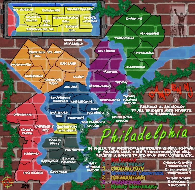
RBO...Me thinks you need to move the city insert map into the actual city at size and then construct the suburbs around that.
The liberty bell needs to be map centre.
The underdog status i beleive has long been associated with the liberty bell, so are there suburbs where historical event took place that are outside of the city area. you could tie these for a bonus structure.
The bell was also associated with public meetings and proclomations. so are there any parks/meeting places that people gather to protest/rally about issues.
it was adapted as a symbol for abolitionists...are there any underdog areas in the suburbs that could be used as an associative bonus.
Hope this helps, even if it is to jog your thoughts to an area outside the box you have sts.

* Pearl Harbour * Waterloo * Forbidden City * Jamaica * Pot Mosbi
-

 cairnswk
- Posts: 11510
- Joined: Sat Feb 03, 2007 8:32 pm
- Location: Australia


Re: Philadelphia - [15 Aug 2011] pg 21
This all the city of Philadelphia cairns, the burbs are around this map area. Center City is just that, the central area of the Philadelphia, the skyscrapers and majority of the well known historic areas. Philadelphia is more than it's center, a collection of communities incorporated together, a mentality more than anything else. f you want to get completely technical, this is a map of Philadelphia COUNTY, which completely encompasses the CITY of Philadelphia, and the city takes up the entirety of the county. (Kinda like the "city/county/state of New York" as they say)
The people really seems to be the way to kinda pull this all together, and not even the famous people, just the people We love our town, our teams, our status... most of the country thinks we threw snowballs and Santa, but if you lived here you'd understand, and get more than annoyed when it gets brought up by media outlets from afar that don't know jack about us, yet ignore far worse atrocities in other cities.
It's a pride and a feeling which is just difficult to put into just 1 image...


-

 RedBaron0
- Posts: 2657
- Joined: Sun Aug 19, 2007 12:59 pm
- Location: Pennsylvania


Re: Philadelphia - [15 Aug 2011] pg 21
no probs rbo, just thought i might help twig your thought process. i understand where your community is...

* Pearl Harbour * Waterloo * Forbidden City * Jamaica * Pot Mosbi
-

 cairnswk
- Posts: 11510
- Joined: Sat Feb 03, 2007 8:32 pm
- Location: Australia


Re: Philadelphia - [15 Aug 2011] pg 21
I concur with all the sentiments. Underdog sounds awesome, but the city regions also do seem a bit bland. The other background stuff with the bell stuff is fine, but the zones...
-

 Leehar
- Posts: 5488
- Joined: Fri Mar 06, 2009 12:12 pm
- Location: Johannesburg


Re: Philadelphia - [15 Aug 2011] pg 21
I'd argue against the underdog image as the central theme, but that's because I'm older than Sylvester Stallone. When I look at the "I Love Phily" poster Ironsij0287 posted, the elements that most scream Phily to me (and I've spent many weeks there) are the stars in the letters of the name. Phily is most famous for being where the USA got its start. The Declaration of Independence was penned and issued there; the Constitution was negotiated and written there; it's where the first two Congresses met, including during most of the Revolutionary War.
I'm not suggesting that William Penn or Rocky be ignored, but that stars and bars be added. Whatever else you do, add more patriotic elements, such as bunting. Consider its value as the primary theme: design flexibility. You can make use of almost any size/shape space.
As a highly imperfect test of this theme idea I offer this graphic and ask: when you see this, what city comes to mind? Now obviously, in the context of this thread, there's a bias. But maybe Boston or even NYC come to mind first. Both are larger than Philly and get more TV time on July 4th. But if Phily fits in there for you then my suggestion might hold some water.

PS: I'm surprised there's no scrolled parchment and quill in that Phily poster. That image is firmly in my gray matter when I think of Phily.
I'm not suggesting that William Penn or Rocky be ignored, but that stars and bars be added. Whatever else you do, add more patriotic elements, such as bunting. Consider its value as the primary theme: design flexibility. You can make use of almost any size/shape space.
As a highly imperfect test of this theme idea I offer this graphic and ask: when you see this, what city comes to mind? Now obviously, in the context of this thread, there's a bias. But maybe Boston or even NYC come to mind first. Both are larger than Philly and get more TV time on July 4th. But if Phily fits in there for you then my suggestion might hold some water.

PS: I'm surprised there's no scrolled parchment and quill in that Phily poster. That image is firmly in my gray matter when I think of Phily.
-

 Minister X
- Posts: 424
- Joined: Tue Nov 11, 2008 4:45 pm


Re: Philadelphia - [15 Aug 2011] pg 21
That has some merit, I kinda went down that road previously, but it wasn't well received, and perhaps a different direction in that path might be something to think about. cairns brings up that Center City might be better off as the where it's supposed to be and then the rest of the map tweeked around it.... my issue with that is that the boxed inset is rather large and would very much blow up this map well into super-sized status if that were true. This could be explored of course, idk if I personally can make a map that looks that good to warrant super-sized status at this point though. I honestly like the way this map looks, problem is it needs a theme and something that ties it all together.
The map I generally look at to kinda guide me though all this is Charleston, but for the life of me I don't see a lot of difference in what I have versus what Rj came up with.
The map I generally look at to kinda guide me though all this is Charleston, but for the life of me I don't see a lot of difference in what I have versus what Rj came up with.


-

 RedBaron0
- Posts: 2657
- Joined: Sun Aug 19, 2007 12:59 pm
- Location: Pennsylvania


Re: Philadelphia - [15 Sept 2011] pg 23
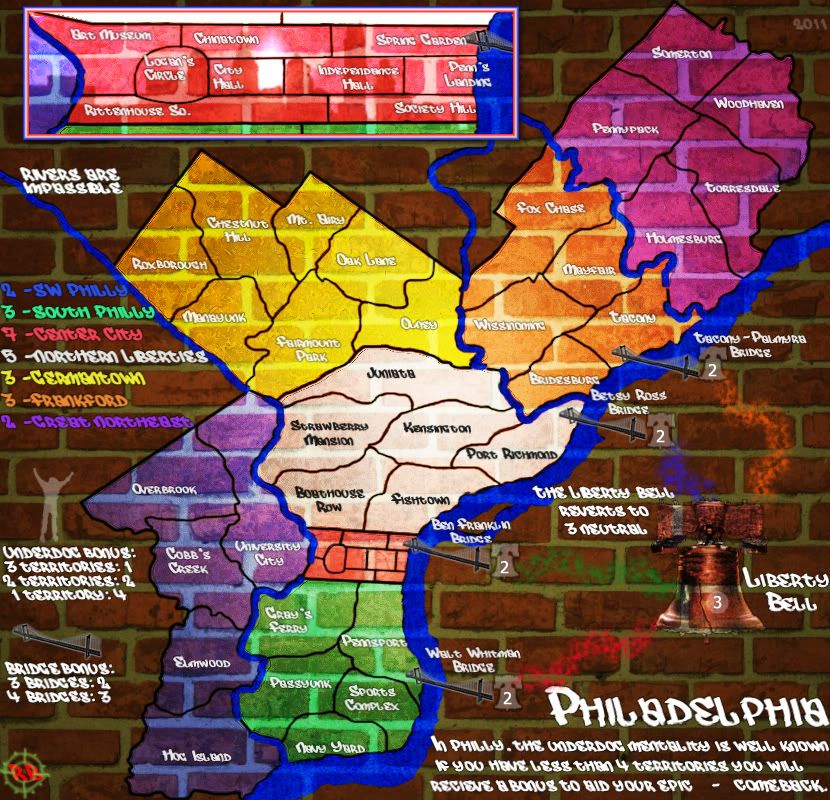
Well there's still work to do, but I wanted to get a long overdue update up.... I hate to backtrack, but seems the brick/graffiti may have had some legs and I'll give it another go. And I know issues with the indenting, still trying to figure that out, and the liberty bell at this point could be more graffito-tag like. The font can be better too. other than that, is this a good direction?


-

 RedBaron0
- Posts: 2657
- Joined: Sun Aug 19, 2007 12:59 pm
- Location: Pennsylvania


Re: Philadelphia - [15 Sept 2011] pg 23
I can't see the image  It just gives me a blue square with a white question mark.
-Sully
-Sully
Beckytheblondie: "Don't give us the dispatch, give us a mustache ride."
Scaling back on my CC involvement...
Scaling back on my CC involvement...
-

 Victor Sullivan
- Posts: 6010
- Joined: Mon Feb 08, 2010 8:17 pm
- Location: Columbus, OH


Re: Philadelphia - [15 Sept 2011] pg 23
Fixed - there was no "h" in "http" LOL!
-
 isaiah40
- Posts: 3990
- Joined: Mon Aug 27, 2007 7:14 pm


Re: Philadelphia - [15 Sept 2011] pg 23
Lol, thanks, isaiah.
I must say, this version certainly has a higher score on the Sullian Swagger Scale than the last.
-Sully
I must say, this version certainly has a higher score on the Sullian Swagger Scale than the last.
-Sully
Beckytheblondie: "Don't give us the dispatch, give us a mustache ride."
Scaling back on my CC involvement...
Scaling back on my CC involvement...
-

 Victor Sullivan
- Posts: 6010
- Joined: Mon Feb 08, 2010 8:17 pm
- Location: Columbus, OH


Re: Philadelphia - [15 Sept 2011] pg 23
the old graffiti map looked better than this one. right now the colours don't even look like paint.
this was better:
this was better:
“In the beginning God said, the four-dimensional divergence of an antisymmetric, second rank tensor equals zero, and there was light, and it was good. And on the seventh day he rested.”- Michio Kaku
-

 DiM
DiM
- Posts: 10415
- Joined: Wed Feb 14, 2007 6:20 pm
- Location: making maps for scooby snacks


Re: Philadelphia - [15 Sept 2011] pg 23
I think the newer version is going in a better direction, though. I think just a few tweaks could make it look much better than that one. I am particularly fond of the lighting effects on this new one.
-Sully
-Sully
Beckytheblondie: "Don't give us the dispatch, give us a mustache ride."
Scaling back on my CC involvement...
Scaling back on my CC involvement...
-

 Victor Sullivan
- Posts: 6010
- Joined: Mon Feb 08, 2010 8:17 pm
- Location: Columbus, OH


Re: Philadelphia - [15 Sept 2011] pg 23
Read some tutorials mate. Here is a good list I came across (they are for photoshop
http://smashinghub.com/photoshop-graffiti-tutorial.htm
I personally like this one:
http://www.photochopz.com/forum/member- ... orial.html
I don't know if you are using photoshop or not, but at least reading photoshop articles can give you an idea of how to go about getting what you want.
http://smashinghub.com/photoshop-graffiti-tutorial.htm
I personally like this one:
http://www.photochopz.com/forum/member- ... orial.html
I don't know if you are using photoshop or not, but at least reading photoshop articles can give you an idea of how to go about getting what you want.
What do you know about map making, bitch?
Top Score:2403
natty_dread wrote:I was wrong
Top Score:2403
-

 gimil
gimil
- Posts: 8599
- Joined: Sat Mar 03, 2007 12:42 pm
- Location: United Kingdom (Scotland)


Re: Philadelphia - [15 Sept 2011] pg 23
I have been, a newer version that is incomplete doesn't look half bad, isaiah40 has grasiously agreed to fiddle with a couple things I've got. I'm in the process of moving and will be back sometime next week to sort it all out 


-

 RedBaron0
- Posts: 2657
- Joined: Sun Aug 19, 2007 12:59 pm
- Location: Pennsylvania


Re: Philadelphia - [8 Oct 2011] pg 23
Thanks to isaiah, I'm thinking the indent of the paint into the brick wall has been properly achieved. Just have the large updated for the moment, lets work a couple kinks out here then I should be good to go to complete the small version and get this thing up and running


-

 RedBaron0
- Posts: 2657
- Joined: Sun Aug 19, 2007 12:59 pm
- Location: Pennsylvania


Re: Philadelphia - [8 Oct 2011] pg 23
Looks good, but I think you can increase the opacity of that wall layer a little more to give the paint a little more of a "thicker" appearance. The wall texture is a little too much on the playable area.
-
 isaiah40
- Posts: 3990
- Joined: Mon Aug 27, 2007 7:14 pm


Re: Philadelphia - [10 Oct 2011] pg 23
Nice! Just a few things:

-Sully
- The red paint stroke from Walt Whitman to Liberty Bell doesn't seem to be integrated into the wall as the other paint strokes are (I hope I'm making sense here - it's a bit early here).
- Would it look too weird if you perhaps gave the Liberty Bell a black outline or something? It kind of blends in with the brick wall a bit.
- The word "COMEBACK" is a bit close to the edge of the map for my liking.
-Sully
Beckytheblondie: "Don't give us the dispatch, give us a mustache ride."
Scaling back on my CC involvement...
Scaling back on my CC involvement...
-

 Victor Sullivan
- Posts: 6010
- Joined: Mon Feb 08, 2010 8:17 pm
- Location: Columbus, OH


Re: Philadelphia - [10 Oct 2011] pg 23
I think it could use some more, at the same time the territory borders would seem to 'not' flow into the cracks and such. That being said it looks good. The bridges are out of place with the rest of the map the way they are, as they are not "painted" on like the Liberty Bell is. Can you do something with them, maybe even just do the paint brush stroke like you did to and from the Liberty Bell? Or paint them like the Liberty Bell.
-
 isaiah40
- Posts: 3990
- Joined: Mon Aug 27, 2007 7:14 pm


Re: Philadelphia - [11 Oct 2011] pg 23
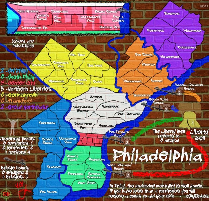
This should address the previous issues that have been brought up. It's amazing how much the basic circle brush looks like spray paint.
Bridges changed
"COMEBACK." pushed away from the corner
the Liberty Bell I tried with black, but the white looks better imo
the red paint path should mesh better now, although the painted paths may need a tweek
and gave isaiah a better credit icon


-

 RedBaron0
- Posts: 2657
- Joined: Sun Aug 19, 2007 12:59 pm
- Location: Pennsylvania


Re: Philadelphia - [11 Oct 2011] pg 24
Looks good!  I like how the 40! looks like YO!
  And you might want to consider making isaiah's sig mesh with the brick as well.
-Sully
-Sully
Beckytheblondie: "Don't give us the dispatch, give us a mustache ride."
Scaling back on my CC involvement...
Scaling back on my CC involvement...
-

 Victor Sullivan
- Posts: 6010
- Joined: Mon Feb 08, 2010 8:17 pm
- Location: Columbus, OH


Re: Philadelphia - [11 Oct 2011] pg 24
Looking much better overall, but the connections with the Liberty Bell (which looks better too) and the bridges are too messy... a player wouldn't necessarily figure out that those colored lines are attack routes. And they aren't labeled as such anywhere in the legend, although even if they were I still think that they look too messy, even for a grafitti theme.
-

 MarshalNey
- Posts: 781
- Joined: Mon Sep 28, 2009 9:02 pm
- Location: St. Louis, MO


Re: Philadelphia - [11 Oct 2011] pg 24
Well now I really wasn't expecting this, thanks red!! Though I think the fish and 40 should be reversed, or just put it all in the font you have. This is now really looking great!
-
 isaiah40
- Posts: 3990
- Joined: Mon Aug 27, 2007 7:14 pm


Re: Philadelphia - [11 Oct 2011] pg 24
LOL that actually is "YO!" it just looks like a "40" too.
I'll fiddle with the paths a little bit make them mesh better, long kinda spray paint lines with maybe some drips? And I think I'll go with a uniform color instead multicolored. And get the small map up to speed and then hopefully we're down to the nitpicks
I'll fiddle with the paths a little bit make them mesh better, long kinda spray paint lines with maybe some drips? And I think I'll go with a uniform color instead multicolored. And get the small map up to speed and then hopefully we're down to the nitpicks


-

 RedBaron0
- Posts: 2657
- Joined: Sun Aug 19, 2007 12:59 pm
- Location: Pennsylvania


Who is online
Users browsing this forum: No registered users


