Conquer Club

[Abandoned] Research & Conquer

Abandoned and Vacationed maps. The final resting place, unless you recycle.

Moderator: Cartographers

Forum rules
Please read the Community Guidelines before posting.

Re: Research & Conquer [16 Aug 2011] (Version 14 in P1 & P76

Postby ender516 on Wed Aug 17, 2011 12:05 am

-=- Tanarri -=- wrote:Nar = N homeland. Though the more I think about it, the more I wonder if the homeland names should be done away with or otherwise added to the map. I could see how, even with the capitalization of the letters that are present on the map, that it could be confusing.

Regarding the names for the territories, regardless of what the territories are named, as long as the name of the tech is included in the name, the name will be clear and there will be no confusion. This is due to there only being one starting spot per person and hence only one option that will ever be present for someone to attack or fort to.

I agree that if the names are to be used in the XML, then they should appear on the map somewhere. Perhaps in large print, but faded, like the names of the bonus zones on Napoleonic Europe.
User avatar
Sergeant 1st Class ender516
 
Posts: 4455
Joined: Wed Dec 17, 2008 6:07 pm
Location: Waterloo, Ontario

Re: Research & Conquer [16 Aug 2011] (Version 14 in P1 & P76

Postby natty dread on Wed Aug 17, 2011 6:06 am

The land looks way too dark now.

Also, I forget how the gameplay ended up... is there now no way to hold more than one laboratory, or can you attack other labs from somewhere? The national pride research gives bonus for "homeland + matching lab" but if you can only have one lab, it doesn't make much sense...
Image
User avatar
Sergeant 1st Class natty dread
 
Posts: 12877
Joined: Fri Feb 08, 2008 8:58 pm
Location: just plain fucked

Re: Research & Conquer [16 Aug 2011] (Version 14 in P1 & P76

Postby carlpgoodrich on Wed Aug 17, 2011 8:11 am

natty_dread wrote:The land looks way too dark now.

Also, I forget how the gameplay ended up... is there now no way to hold more than one laboratory, or can you attack other labs from somewhere? The national pride research gives bonus for "homeland + matching lab" but if you can only have one lab, it doesn't make much sense...


You can only ever hold one lab. That is exactly why the national pride research includes the matching lab, to ensure you can only ever get the bonus for holding your starting homeland. That decision was made for both gameplay and thematic reasons.
Lieutenant carlpgoodrich
 
Posts: 408
Joined: Tue Aug 04, 2009 2:12 pm

Re: Research & Conquer [16 Aug 2011] (Version 14 in P1 & P76

Postby TaCktiX on Wed Aug 17, 2011 8:27 am

If the homeland names will be a confusion, we can just axe them. I wanted to offer a differentiator from neutral countries (NC, SG, etc.) by giving them names. I will say that a name not fully being on the map but on the XML is not without precedent. I seem to recall several maps of qwert's being this way, as well as a cairns map or two.

And in any case, I believe I covered the "possible confusion" of tech name territories in feedback to the previous version. It's pretty much impossible to mistake what is attackable the second you have an assault dropdown. Furthermore, the territories employ a grid-like structure, with the cardinal directions below Laboratories (and following on down), and the name of the research being above the territories (so N Standing Army, SW Secret Conscription). To add names to the territories would look ridiculous and would veritably insult anyone playing the map.

So here's the punchlist I'm seeing for me personally before I crank out another version:
- Lighten the brown of SC/OC
- Add "Researches attack nothing unless otherwise stated" to the legend, replacing the "Researches can only be gained once" verbiage I axed in Version 14
- Reshadow the bridges to WSW
- Capitalize "Bombards" in the Sabotage description
User avatar
Corporal 1st Class TaCktiX
 
Posts: 2392
Joined: Mon Dec 17, 2007 8:24 pm
Location: Rapid City, SD

Re: Research & Conquer [16 Aug 2011] (Version 14 in P1 & P76

Postby -=- Tanarri -=- on Wed Aug 17, 2011 7:54 pm

natty_dread wrote:The land looks way too dark now.

Also, I forget how the gameplay ended up... is there now no way to hold more than one laboratory, or can you attack other labs from somewhere? The national pride research gives bonus for "homeland + matching lab" but if you can only have one lab, it doesn't make much sense...


I would agree with natty. After taking a look at the previous version and the new version, it can be much more difficult to read a lot of the territory names on the Conquer map now. I do like the new effects that were added though, as they add further texture to the map. I wonder if it would be possible to keep the effects but make the entire Conquer map a few shades lighter? That, or is there something that can be done with the territory names on the map to make them more visible on the background?
User avatar
Captain -=- Tanarri -=-
 
Posts: 884
Joined: Wed Jul 08, 2009 2:02 pm
Location: The Underworld

Re: Research & Conquer [16 Aug 2011] (Version 14 in P1 & P76

Postby -=- Tanarri -=- on Wed Aug 17, 2011 8:08 pm

TaCktiX wrote:If the homeland names will be a confusion, we can just axe them. I wanted to offer a differentiator from neutral countries (NC, SG, etc.) by giving them names. I will say that a name not fully being on the map but on the XML is not without precedent. I seem to recall several maps of qwert's being this way, as well as a cairns map or two.

And in any case, I believe I covered the "possible confusion" of tech name territories in feedback to the previous version. It's pretty much impossible to mistake what is attackable the second you have an assault dropdown. Furthermore, the territories employ a grid-like structure, with the cardinal directions below Laboratories (and following on down), and the name of the research being above the territories (so N Standing Army, SW Secret Conscription). To add names to the territories would look ridiculous and would veritably insult anyone playing the map.

So here's the punchlist I'm seeing for me personally before I crank out another version:
- Lighten the brown of SC/OC
- Add "Researches attack nothing unless otherwise stated" to the legend, replacing the "Researches can only be gained once" verbiage I axed in Version 14
- Reshadow the bridges to WSW
- Capitalize "Bombards" in the Sabotage description


In regards to the homeland names, I wonder if it would work if we renamed the map homeland territories to something like 'NC - Nar Capital', 'N1 - Nar 1', 'NM - Nar Mine', etc or perhaps '[N]ar Capital', '[N]ar 1', '[N]ar Mine', etc. If the second example were used, then the same kind of idea could be used for research territories as well. This way we could keep the flavour of having the homelands named (which I like) and still be able to make it clearer for others. I believe these short of naming conventions have been used on other maps as well.

After giving a bit more thought to the two options above, I think the first one would work the best, from a dropdown menu perspective, because I could see people looking in the dropdown menu for the name of the territory and having difficulty finding it because it wouldn't be in the N area of the list, but at the top instead. I'm also not sure how XML code reacts to [] and () brackets.
User avatar
Captain -=- Tanarri -=-
 
Posts: 884
Joined: Wed Jul 08, 2009 2:02 pm
Location: The Underworld

Re: Research & Conquer [16 Aug 2011] (Version 14 in P1 & P76

Postby Minister X on Wed Aug 17, 2011 9:09 pm

My first comment on this thread - my first impression of the map: I hate to be negative but I can't read the territory names. I'm 55 and wear glasses, but my vision is good. I have an excellent monitor (HP ZR24w). In order to read the large map I have to get very close to my screen and squint. Everything else about this game will be lost to me because, being unable to read the map, I'm not going to look into other parts of this in any depth. I assume it's a good game, but...

I'm sorry.
User avatar
Major Minister X
 
Posts: 424
Joined: Tue Nov 11, 2008 4:45 pm

Re: Research & Conquer [16 Aug 2011] (Version 14 in P1 & P76

Postby -=- Tanarri -=- on Wed Aug 17, 2011 10:26 pm

Minister X wrote:My first comment on this thread - my first impression of the map: I hate to be negative but I can't read the territory names. I'm 55 and wear glasses, but my vision is good. I have an excellent monitor (HP ZR24w). In order to read the large map I have to get very close to my screen and squint. Everything else about this game will be lost to me because, being unable to read the map, I'm not going to look into other parts of this in any depth. I assume it's a good game, but...

I'm sorry.


It's good to get feedback from others, so thanks for the feedback :)

I think that part of the problem is with the darker map not providing as much contrast for the territory names.

If you happen to come back, can you go to page 73 and take a look at version 13 and let us know if that's easier for you to read?

Thanks!
User avatar
Captain -=- Tanarri -=-
 
Posts: 884
Joined: Wed Jul 08, 2009 2:02 pm
Location: The Underworld

Re: Research & Conquer [16 Aug 2011] (Version 14 in P1 & P76

Postby -=- Tanarri -=- on Thu Aug 18, 2011 4:44 am

A few other thoughts after looking through the XML file:

For TaCKtiX -- The standard territory bonus needs to be added to the map somewhere, since it's done by each 6 territories. I'm not sure how it can be made to fit in or what the best wording is, but it's definitely something that needs to be figured out if the standard bonus of +1 per 3 territories is going to be altered.

For Oliver / the XML:

- The mines need to have all 40 included in the code, since it's possible to have 40 mines and not own 75% of the board
- Override tags should be included within the 'Mines with Mining' continents to override the 'Mines' continents so that it shows in BOB cleaner. Likewise, Deep Mining continents should include 'Mines with Mining' continents as requirements and override them as well, providing the full +4 per mine bonus instead of stacking two +2 bonuses. This would add a bit of bulk to the XML so I think it's an optional touch for the time being, but should be added after the XML update if nothing else.

- Zeppelin Strikes need to be renamed to Sabotage

- The borders on the tech territories should be removed except for the basic techs which need to attack their advanced techs. This needs to be fixed to prevent forting from occuring from the techs back to the laboratory. This is especially important for TSFs and Doomsday, as those autodeploys shouldn't be able to be used to directly research techs.

I think that covers it for now... sorry for creating extra work for you guys :(
User avatar
Captain -=- Tanarri -=-
 
Posts: 884
Joined: Wed Jul 08, 2009 2:02 pm
Location: The Underworld

Re: Research & Conquer [16 Aug 2011] (Version 14 in P1 & P76

Postby Victor Sullivan on Thu Aug 18, 2011 5:00 am

I'm wondering if perhaps the original "Industrial Sabotage" could still be used in the XML? Or do you suppose that would cause confusion?

On a side note, Minister X gets a high five from a fellow senior ;)

-Sully
User avatar
Corporal Victor Sullivan
 
Posts: 6010
Joined: Mon Feb 08, 2010 8:17 pm
Location: Columbus, OH

Re: Research & Conquer [16 Aug 2011] (Version 14 in P1 & P76

Postby Minister X on Thu Aug 18, 2011 6:59 am

Victor Sullivan wrote:On a side note, Minister X gets a high five from a fellow senior ;)

-Sully

Let's form a lobby. :D

ADDITIONAL comment: Tamari asked me to look at version 13 on page 73. It is indeed much easier to read, but still far from ideal. The main problem is one I see on many new maps and stems from a failure to respect some basic rules of typography. Fonts that are stylized and distinctive, designed to communicate more than the words alone, and are known as "display", "decorative", "thematic" or "title" fonts, should be reserved for limited use in large sizes as titling/heading. "Text" fonts, which are designed for legibility, should be used for the great bulk of set type, especially whatever is set at text (i.e. small) sizes. On this map that rule (and it is a rule, not just a guideline) is reversed. A text font is used for the heads and the heavily stylized font is used at tiny sizes. (My comments have been about the large map. The small version: don't ask.)

After so many versions of this map have been made I feel like a true a-hat coming in here this late and essentially suggesting that all the type be re-set, but that would be the solution, if one were desired, to the problem I (and apparently at least one other) have.
User avatar
Major Minister X
 
Posts: 424
Joined: Tue Nov 11, 2008 4:45 pm

Re: Research & Conquer [16 Aug 2011] (Version 14 in P1 & P76

Postby TaCktiX on Thu Aug 18, 2011 8:38 am

Have you had a chance to look at Version 12? 13 itself is a little bit on the dark side.

And Tanarri, the standard territory bonus hasn't been changed as far as I'm aware, it's still +1 per 3. SC/OC were done by per 6 because that's how we could create the effect of +1 per 2 and +1 per 1.
User avatar
Corporal 1st Class TaCktiX
 
Posts: 2392
Joined: Mon Dec 17, 2007 8:24 pm
Location: Rapid City, SD

Re: Research & Conquer [16 Aug 2011] (Version 14 in P1 & P76

Postby Minister X on Thu Aug 18, 2011 9:00 am

TaCktiX wrote:Have you had a chance to look at Version 12? 13 itself is a little bit on the dark side.

Yup, 12's a bit easier to read than 13, but the font is still a problem.
User avatar
Major Minister X
 
Posts: 424
Joined: Tue Nov 11, 2008 4:45 pm

Re: Research & Conquer [16 Aug 2011] (Version 14 in P1 & P76

Postby -=- Tanarri -=- on Thu Aug 18, 2011 9:47 am

TaCktiX wrote:Have you had a chance to look at Version 12? 13 itself is a little bit on the dark side.

And Tanarri, the standard territory bonus hasn't been changed as far as I'm aware, it's still +1 per 3. SC/OC were done by per 6 because that's how we could create the effect of +1 per 2 and +1 per 1.


I just did a quick check and it appears that the initial setup for the reinforcements is set up that way, which is great from graphical standpoint since we don't need to find space for the aforementioned note.

That being said, here's another one for Oliver to fix:

- The bonuses amounts on all territory bonus groups (6 territories, 12 territories, etc) should be set to 0. As with my mining suggestion, it would be cleaner to have the techs provide the full amount of bonus and override its predecessor. The overrides are optional for the time being if we're trying to keep the bulk down, but that changing the base bonuses to 0 is critical, as it's giving double bonus for the standard bonus right now.
User avatar
Captain -=- Tanarri -=-
 
Posts: 884
Joined: Wed Jul 08, 2009 2:02 pm
Location: The Underworld

Re: Research & Conquer [16 Aug 2011] (Version 14 in P1 & P76

Postby TaCktiX on Sun Aug 21, 2011 8:16 am

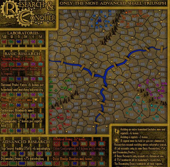
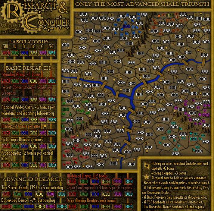
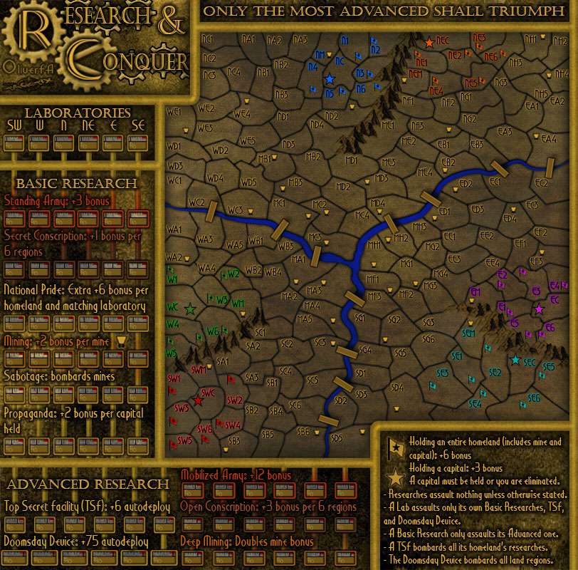
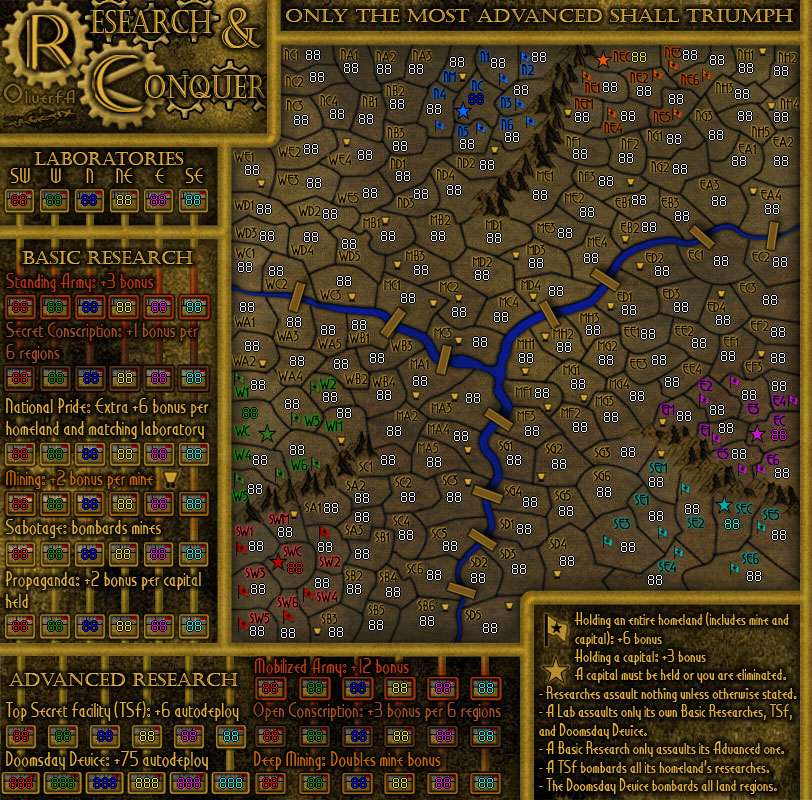
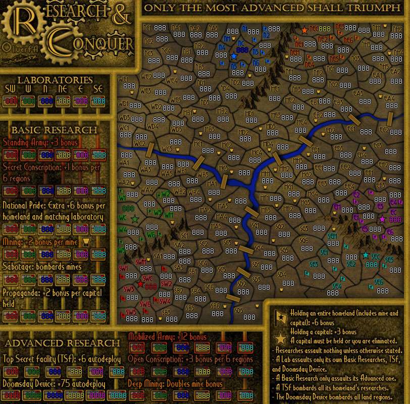
Version 15

Updates:
- Lightened the SC/OC text color to a lighter shade of brown
- Added a note about researches assaulting in the legend
- Altered the bridge shadow to be more in line with the mountain shadow (consequently the west-side bridges are practically invisible shadow-wise)
- Altered the territory font to one more readable (I hope)

Small
Blank
Click image to enlarge.
image

88's
Click image to enlarge.
image

888's
Click image to enlarge.
image

Large
Blank
Click image to enlarge.
image

88's
Click image to enlarge.
image

888's
Click image to enlarge.
image
User avatar
Corporal 1st Class TaCktiX
 
Posts: 2392
Joined: Mon Dec 17, 2007 8:24 pm
Location: Rapid City, SD

Re: Research & Conquer [21 Aug 2011] (Version 15 in P1 & P78

Postby natty dread on Sun Aug 21, 2011 8:34 am

The land area is still too dark.
Image
User avatar
Sergeant 1st Class natty dread
 
Posts: 12877
Joined: Fri Feb 08, 2008 8:58 pm
Location: just plain fucked

Re: Research & Conquer [21 Aug 2011] (Version 15 in P1 & P78

Postby DiM on Sun Aug 21, 2011 8:35 am

DiM wrote:still no names on the map? would it really be such an impossible task to add names for the tech terits?


DiM wrote:with or without the vertical lines the names are still important simply because in the current state you have 2 choices to tell what terit is what:
1. memorize the sequence SW, W, N, NE, E, SE so that you always know the 4th terit in a line is for NE
2. constantly look back and forth from the terit to the SW, W, N, NE, E, SE series to remind yourself what's the correct sequence.

in my opinion, any map that forces you to remember names or that makes you look in other places for a name does not have an optimal layout.
and no, i don't care clickable maps exist. all i know is that if i want to play this the old fashioned way i'm going to have difficulties doing it and the process of attacking/reinforcing/planning something in the tech tree will be hugely hindered by the lack of terit names.
getting a few extra pixels for the height of the map would provide plenty of space for some shortened names to be placed on the map.

oh and the new legend with vertical lines is just as confusing as before. right now i can clearly assume that any lab can attack any standing army.
some fancy new legend borders were promised at some point to replace the very confusing ones that exist now.
on top of that, the vertical lines almost fade away in some areas. for example just below the word Open in Open conscription there doesn;t seem to be a vertical line. or the first vertical line in propaganda is missing completely.

PS: is this the complete terrain overhaul that was promised? i see the same terrain only a lot darker with only minor 5 minute changes to a few borders.


:roll:
“In the beginning God said, the four-dimensional divergence of an antisymmetric, second rank tensor equals zero, and there was light, and it was good. And on the seventh day he rested.”- Michio Kaku
User avatar
Major DiM
 
Posts: 10415
Joined: Wed Feb 14, 2007 6:20 pm
Location: making maps for scooby snacks

Re: Research & Conquer [21 Aug 2011] (Version 15 in P1 & P78

Postby TaCktiX on Sun Aug 21, 2011 11:44 am

DiM wrote:still no names on the map? would it really be such an impossible task to add names for the tech terits?


Already refuted twice over, there is absolutely no need to do this, and if it WERE done it would look ridiculous.
DiM wrote:on top of that, the vertical lines almost fade away in some areas. for example just below the word Open in Open conscription there doesn;t seem to be a vertical line. or the first vertical line in propaganda is missing completely.

No lines are missing, but some lines are obscured by necessary and critical information to play the map. The lines aren't even meant to denote attackability, just to ground the research territories to the map so they're not floating in space. They were switched to vertical to avoid the assumption that each research could attack each copy's. The attack rules are even MORE clearly laid out in the legend, which completely tosses your complaints about confusion right out the window.

PS: is this the complete terrain overhaul that was promised? i see the same terrain only a lot darker with only minor 5 minute changes to a few borders.[/u][/b]

Everyone else other than you has been fine with the changes. I stated pages ago that you and I have a different idea for the execution of this map. For the sake of readability I'm not going to rehaul the territories to look like a graphical tour-de-force, because that would be a nasty case of Completely Missing the Point.
User avatar
Corporal 1st Class TaCktiX
 
Posts: 2392
Joined: Mon Dec 17, 2007 8:24 pm
Location: Rapid City, SD

Re: Research & Conquer [21 Aug 2011] (Version 15 in P1 & P78

Postby natty dread on Sun Aug 21, 2011 12:06 pm

natty_dread wrote:The land area is still too dark.


Also, I think the pipes could use more shading. Something like this:

Image

You know, to make them pop a bit more, and look more round.
Image
User avatar
Sergeant 1st Class natty dread
 
Posts: 12877
Joined: Fri Feb 08, 2008 8:58 pm
Location: just plain fucked

Re: Research & Conquer [21 Aug 2011] (Version 15 in P1 & P78

Postby DiM on Sun Aug 21, 2011 12:20 pm

it's the 3rd or 4th time that i post something and you either don't respond at all or respond to just some parts of my message and delete what you wish to ignore.

A+ for attitude and setting an example.

the excuse of the attack lines being obstructed by the names is the crappiest one i've ever heard so far. i had the exact same issue in the drafting room and i had to fix it. attack lines are very important and NOTHING should obstruct them.

terit names on the research tree would not look ridiculous at all if you were willing to actually do some work to make them fit nicely. of course if you just squeeze them in right now they'll look bad but increase the map size by a few px in each direction and you'll have plenty of space for simple names like SC-N for Secret Conscription North.
but hey ever since the first draft no update ever required more than 10-15 minutes of work so it's obvious you won't strain so hard now and actually do something about it. you can apply as many adjustment layers as you want, you can lighten or darken the image as you please but a turd no matter how much you polish it will still be a turd.

and you are very wrong, not everybody is happy how the map looks. in fact only the die hard fans that have been with this map from the start are saying it's ok. most of the other people want improvements which you constantly fail to deliver as you're always hiding behind poor excuses.
“In the beginning God said, the four-dimensional divergence of an antisymmetric, second rank tensor equals zero, and there was light, and it was good. And on the seventh day he rested.”- Michio Kaku
User avatar
Major DiM
 
Posts: 10415
Joined: Wed Feb 14, 2007 6:20 pm
Location: making maps for scooby snacks

Re: Research & Conquer [21 Aug 2011] (Version 15 in P1 & P78

Postby TaCktiX on Sun Aug 21, 2011 12:42 pm

DiM wrote:it's the 3rd or 4th time that i post something and you either don't respond at all or respond to just some parts of my message and delete what you wish to ignore.

A+ for attitude and setting an example.

I quoted the major points. To be honest, since it was a repost I skimmed it to find this out, and I might have missed something.

the excuse of the attack lines being obstructed by the names is the crappiest one i've ever heard so far. i had the exact same issue in the drafting room and i had to fix it. attack lines are very important and NOTHING should obstruct them.

Are you serious? What about THIS quote that I JUST made says they are attack lines?
TaCktiX wrote:The lines aren't even meant to denote attackability, just to ground the research territories to the map so they're not floating in space.

The legend explains what attacks what, and right now with minimal chance of confusion. I'd love to totally axe the lines, as apparently they are only going to cause people to think the legend in the bottom right, something written in plain English, is wrong and some lines are right.

terit names on the research tree would not look ridiculous at all if you were willing to actually do some work to make them fit nicely. of course if you just squeeze them in right now they'll look bad but increase the map size by a few px in each direction and you'll have plenty of space for simple names like SC-N for Secret Conscription North.

But those territory names would still have to be directly below the research name with its full description, as well as below a straight line pointing straight up to the origin lab. If people can't read a 300-pixel line and correlate, then how on earth are maps that use pure (and big) grids. Or how about maps that don't explicitly note each and every territory name? Chinese Checkers doesn't, it assumes people can understand the Color region is part of the name, as well as that the middle section is the Center. Do you see people clamoring about how unclear this is? Or how about Conquer 4? It's got a grid layout very similar to R&C's, it's just R&C's grid is shifted for the rows to be directly in line with the columns. Do you see people complaining about the fact they didn't understand where G5 was? Granted those are the only grid-based maps I can find that don't have explicit territory names on them all, but there are no complaints about being unable to tell which territory is what, period.

but hey ever since the first draft no update ever required more than 10-15 minutes of work so it's obvious you won't strain so hard now and actually do something about it. you can apply as many adjustment layers as you want, you can lighten or darken the image as you please but a turd no matter how much you polish it will still be a turd.

and you are very wrong, not everybody is happy how the map looks. in fact only the die hard fans that have been with this map from the start are saying it's ok. most of the other people want improvements which you constantly fail to deliver as you're always hiding behind poor excuses.

Personal attacks, yay! Because obviously, since YOU could do it in 10-15 minutes, EVERYONE can. I just am astonished at the logic of that, I never realized. And of course everyone else has been vehemently nay-saying anything I change just like you have. It's a total loss, a complete waste of everyone's time. Quite a shame, I should just go out back and shoot myself in the head and be done with it all.

I said before, and I'll say again: if you're only going to retread your ground and assume that your opinion is God's Gift to the Foundry I will begin ignoring your posts. So far I have been kind enough not to, and there are a lot of people who would've a long time ago.
User avatar
Corporal 1st Class TaCktiX
 
Posts: 2392
Joined: Mon Dec 17, 2007 8:24 pm
Location: Rapid City, SD

Re: Research & Conquer [21 Aug 2011] (Version 15 in P1 & P78

Postby DiM on Sun Aug 21, 2011 1:10 pm

TaCktiX wrote:
DiM wrote:it's the 3rd or 4th time that i post something and you either don't respond at all or respond to just some parts of my message and delete what you wish to ignore.

A+ for attitude and setting an example.

I quoted the major points. To be honest, since it was a repost I skimmed it to find this out, and I might have missed something.


and the fact that i had bolded and underlined some parts didn't make you think those parts were important so you just decided to skip responding to some of them. and not just once but several times now. interesting.

TaCktiX wrote:
the excuse of the attack lines being obstructed by the names is the crappiest one i've ever heard so far. i had the exact same issue in the drafting room and i had to fix it. attack lines are very important and NOTHING should obstruct them.

Are you serious? What about THIS quote that I JUST made says they are attack lines?
TaCktiX wrote:The lines aren't even meant to denote attackability, just to ground the research territories to the map so they're not floating in space.

The legend explains what attacks what, and right now with minimal chance of confusion. I'd love to totally axe the lines, as apparently they are only going to cause people to think the legend in the bottom right, something written in plain English, is wrong and some lines are right.


so the vertical lines aren't attack lines? if i see 2 terits with a clear line connecting them i assume that's an attack line. i'm not going to stop and read the legend everytime i want to attack or reinforce something i'll just look at the map and if i see a line or an arrow i'll assume that's a connection. if one can't figure out easy connections just by looking at the map then that map is not optimised.

TaCktiX wrote:
terit names on the research tree would not look ridiculous at all if you were willing to actually do some work to make them fit nicely. of course if you just squeeze them in right now they'll look bad but increase the map size by a few px in each direction and you'll have plenty of space for simple names like SC-N for Secret Conscription North.

But those territory names would still have to be directly below the research name with its full description, as well as below a straight line pointing straight up to the origin lab. If people can't read a 300-pixel line and correlate, then how on earth are maps that use pure (and big) grids. Or how about maps that don't explicitly note each and every territory name? Chinese Checkers doesn't, it assumes people can understand the Color region is part of the name, as well as that the middle section is the Center. Do you see people clamoring about how unclear this is? Or how about Conquer 4? It's got a grid layout very similar to R&C's, it's just R&C's grid is shifted for the rows to be directly in line with the columns. Do you see people complaining about the fact they didn't understand where G5 was? Granted those are the only grid-based maps I can find that don't have explicit territory names on them all, but there are no complaints about being unable to tell which territory is what, period.


chinese checkers has all the terits named exactly as i want you to name your terits here. it takes the least amount of space while maintaining perfect understandability. chinese checkers has the continent name (Purple, Blue, Green etc) and each terit is named as A, B, C, D etc and in the drop down menu they apear as Purple A, Purple B and so on. do something similar and i'll be extremely pleased.
and conquer 4 has a perfect grid and it's a very easy to recognise game that everybody finds familiar. your map isn't familiar and it doesn't have a perfect grid.
so just make the map a bit larger and add some names chinese checkers style or using the shortened terit names i suggested a few times now.

TaCktiX wrote:
but hey ever since the first draft no update ever required more than 10-15 minutes of work so it's obvious you won't strain so hard now and actually do something about it. you can apply as many adjustment layers as you want, you can lighten or darken the image as you please but a turd no matter how much you polish it will still be a turd.

and you are very wrong, not everybody is happy how the map looks. in fact only the die hard fans that have been with this map from the start are saying it's ok. most of the other people want improvements which you constantly fail to deliver as you're always hiding behind poor excuses.


Personal attacks, yay! Because obviously, since YOU could do it in 10-15 minutes, EVERYONE can. I just am astonished at the logic of that, I never realized. And of course everyone else has been vehemently nay-saying anything I change just like you have. It's a total loss, a complete waste of everyone's time. Quite a shame, I should just go out back and shoot myself in the head and be done with it all.

I said before, and I'll say again: if you're only going to retread your ground and assume that your opinion is God's Gift to the Foundry I will begin ignoring your posts. So far I have been kind enough not to, and there are a lot of people who would've a long time ago.


wow you'll begin ignoring my posts. you mean like you've done until now? or will it get worse?
and i don't really care how much it takes you to make that update. if it's a poor update i don't care if you worked 10 days or 10 minutes on it.
you said you will make some new fancier pipes instead of the plain ones you have now as borders. that was a long time ago and still nothing.
you said you're going to overhaul the terrain (your own words) and yet you only darkened it and tweaked some borders.
you said you'll do those things and you didn't and now that i call you on your promise i'm the bad guy with personal attacks.
maybe next time you shouldn't promise overhauls when you just plan on simply darkening your image.
“In the beginning God said, the four-dimensional divergence of an antisymmetric, second rank tensor equals zero, and there was light, and it was good. And on the seventh day he rested.”- Michio Kaku
User avatar
Major DiM
 
Posts: 10415
Joined: Wed Feb 14, 2007 6:20 pm
Location: making maps for scooby snacks

Re: Research & Conquer [21 Aug 2011] (Version 15 in P1 & P78

Postby natty dread on Sun Aug 21, 2011 1:35 pm

Guys, stop fighting. It's not constructive.

Dim, I get what you're going after, but the way you're presenting your ideas isn't very diplomatic. You can't force someone to make changes to his map, you can only offer the best advice you can... if a mapmaker doesn't take it it's not your loss. You're making some good points, but if you present them in a way that antagonizes the mapmaker he's less likely to take your advice and more likely to simply get defensive and not consider your feedback on it's merits.

Tacktix, while Dim may not be presenting his ideas in the most cordial manner, he does make some good points that should at least be considered. Not everyone can have great social / diplomatic skills (I should know, I'm often quite an asshole myself).

Can you both just take a step backwards, breathe, calm down and try to look for constructive solutions? Before this shit escalates into a full-on flame war that benefits neither party.
Image
User avatar
Sergeant 1st Class natty dread
 
Posts: 12877
Joined: Fri Feb 08, 2008 8:58 pm
Location: just plain fucked

Re: Research & Conquer [21 Aug 2011] (Version 15 in P1 & P78

Postby DiM on Sun Aug 21, 2011 2:27 pm

you're right. tacktix, please understand i do not have anything personal against you and my diplomatic skills aren't the best. i certainly mean no offence with my posts, all i want is to see the map be the best that it can be.
“In the beginning God said, the four-dimensional divergence of an antisymmetric, second rank tensor equals zero, and there was light, and it was good. And on the seventh day he rested.”- Michio Kaku
User avatar
Major DiM
 
Posts: 10415
Joined: Wed Feb 14, 2007 6:20 pm
Location: making maps for scooby snacks

Re: Research & Conquer [21 Aug 2011] (Version 15 in P1 & P78

Postby cookie0117 on Sun Aug 21, 2011 3:38 pm

I think the map on page 73 is perfectly readable. The real test will be in the playing, which will show up any problems pretty quick. Also you can only give so much explination, I have played with some people on WWII Poland and given the information on the map and team chat discussion they still dont get it.
User avatar
Private cookie0117
 
Posts: 566
Joined: Mon Jan 19, 2009 7:54 am

PreviousNext

Return to Recycling Box

Who is online

Users browsing this forum: No registered users