Conquer Club

Philadelphia [Quenched]

Care to peruse completed maps? Take a stroll through the Atlas.

Moderator: Cartographers

Forum rules
Please read the Community Guidelines before posting.

Re: Philadelphia - [2 Aug 2011] pg 20

Postby RedBaron0 on Tue Aug 02, 2011 2:07 pm

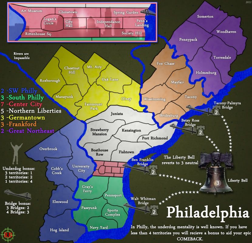
Click image to enlarge.
image


Whatever drives the creative juices... :twisted:

Alright here's what's new...

Went back to the multicolor bonus regions. (instead of reddish/whiteish/blueish)
Stronger textures and gradients for both playable and non-playable surface.
Font changed (although I was kinda partial to monotype corsica :P )
Drop shadow somewhat stronger around the Liberty Bell
icons added near the legend for the minor bonuses. (bridges and underdog)
Stronger texture with the rivers and slightly brighter color.
ImageImage
User avatar
Sergeant 1st Class RedBaron0
 
Posts: 2657
Joined: Sun Aug 19, 2007 12:59 pm
Location: Pennsylvania

Re: Philadelphia - [2 Aug 2011] pg 21

Postby DiM on Tue Aug 02, 2011 3:59 pm

why would the liberty bell attack the bridges?
it's not even connected to them and its location should be near the independence hall.
“In the beginning God said, the four-dimensional divergence of an antisymmetric, second rank tensor equals zero, and there was light, and it was good. And on the seventh day he rested.”- Michio Kaku
User avatar
Major DiM
 
Posts: 10415
Joined: Wed Feb 14, 2007 6:20 pm
Location: making maps for scooby snacks

Re: Philadelphia - [2 Aug 2011] pg 21

Postby natty dread on Tue Aug 02, 2011 9:52 pm

The new look is really nice, I like how you're used gradient overlays there. This is starting to shape up. I'll comment more in detail later...
Image
User avatar
Sergeant 1st Class natty dread
 
Posts: 12877
Joined: Fri Feb 08, 2008 8:58 pm
Location: just plain fucked

Re: Philadelphia - [2 Aug 2011] pg 21

Postby RedBaron0 on Wed Aug 03, 2011 2:06 am

It's just an icon, DiM, it doesn't represent the Liberty Bell's 'true' location. I've been trying and trying to work the bridge connection through New Jersey for a while and nothing I did ever seemed to work out. Toll booths, signs, states, ivy paths...

My thoughts are that the Liberty Bell is a well known Philadelphia icon and attraction that I'm using as a gameplay device.
ImageImage
User avatar
Sergeant 1st Class RedBaron0
 
Posts: 2657
Joined: Sun Aug 19, 2007 12:59 pm
Location: Pennsylvania

Re: Philadelphia - [2 Aug 2011] pg 21

Postby DiM on Wed Aug 03, 2011 8:28 am

RedBaron0 wrote:It's just an icon, DiM, it doesn't represent the Liberty Bell's 'true' location. I've been trying and trying to work the bridge connection through New Jersey for a while and nothing I did ever seemed to work out. Toll booths, signs, states, ivy paths...

My thoughts are that the Liberty Bell is a well known Philadelphia icon and attraction that I'm using as a gameplay device.


and the obvious question is: why?
do you really need the bridges to connect? what would that bring to the gameplay?
all the continents already have enough borders and they don't need any more. in fact 3/4 bridges are placed on terits that are already borders so they're naturally guarded. the only nely created border is port richmond. but the white continent already has 3 borders in 6 terits. it doesn't need a 4th.
“In the beginning God said, the four-dimensional divergence of an antisymmetric, second rank tensor equals zero, and there was light, and it was good. And on the seventh day he rested.”- Michio Kaku
User avatar
Major DiM
 
Posts: 10415
Joined: Wed Feb 14, 2007 6:20 pm
Location: making maps for scooby snacks

Re: Philadelphia - [2 Aug 2011] pg 21

Postby RedBaron0 on Wed Aug 03, 2011 2:21 pm

It creates a shortcut connection from the northern sections of the map to the southern parts. The bridges are starting as neutrals and well as having a protected step from the killer neutral on the Liberty Bell itself. There is protection with these neutrals for the start of the game building bonuses. The bridges also hold a bonus should you wish to pursue it early with the starting value being only 2.
ImageImage
User avatar
Sergeant 1st Class RedBaron0
 
Posts: 2657
Joined: Sun Aug 19, 2007 12:59 pm
Location: Pennsylvania

Re: Philadelphia - [2 Aug 2011] pg 21

Postby Amateil on Wed Aug 10, 2011 2:17 am

looking good!! :)
Corporal Amateil
 
Posts: 104
Joined: Sat Jan 15, 2011 8:30 pm
Location: Noneya

Re: Philadelphia - [2 Aug 2011] pg 21

Postby natty dread on Wed Aug 10, 2011 3:35 am

How about adding a slight drop shadow to the land area, and masking it only to the water area? This would separate the land from the water a bit more... Just make it subtle, so it doesn't look unnatural.
Image
User avatar
Sergeant 1st Class natty dread
 
Posts: 12877
Joined: Fri Feb 08, 2008 8:58 pm
Location: just plain fucked

Re: Philadelphia - [12 Aug 2011] pg 21

Postby RedBaron0 on Fri Aug 12, 2011 3:08 am

Click image to enlarge.
image


Click image to enlarge.
image


Added the drop shadow, and got the small map put together :)
ImageImage
User avatar
Sergeant 1st Class RedBaron0
 
Posts: 2657
Joined: Sun Aug 19, 2007 12:59 pm
Location: Pennsylvania

Re: Philadelphia - [12 Aug 2011] pg 21

Postby natty dread on Fri Aug 12, 2011 2:15 pm

You misunderstood me... you masked the drop shadow backwards. It was supposed to be visible only on water, not on land... And make the drop shadow for all land area, not just playable land. So the water sort of has an "inner drop shadow".

Also, only make it 1-2 pixels wide, so it'll look good on the rivers too.
Image
User avatar
Sergeant 1st Class natty dread
 
Posts: 12877
Joined: Fri Feb 08, 2008 8:58 pm
Location: just plain fucked

Re: Philadelphia - [12 Aug 2011] pg 21

Postby Victor Sullivan on Fri Aug 12, 2011 2:16 pm

1 quick fix: "1 territories: 4" should, of course, be "1 territory: 4", though perhaps "region" may be a more Conquer Club term?

I definitely want to say I absolutely love what you've done with the inset - I just wish the main map was more like that. Despite the effects and such, it still looks rather plain. I feel like it could benefit from a sort of "shadow" image like you have in the inset. It certainly needs something, and I don't think textures would necessarily fit the style.

-Sully
User avatar
Corporal Victor Sullivan
 
Posts: 6010
Joined: Mon Feb 08, 2010 8:17 pm
Location: Columbus, OH

Re: Philadelphia - [15 Aug 2011] pg 21

Postby RedBaron0 on Mon Aug 15, 2011 2:07 pm

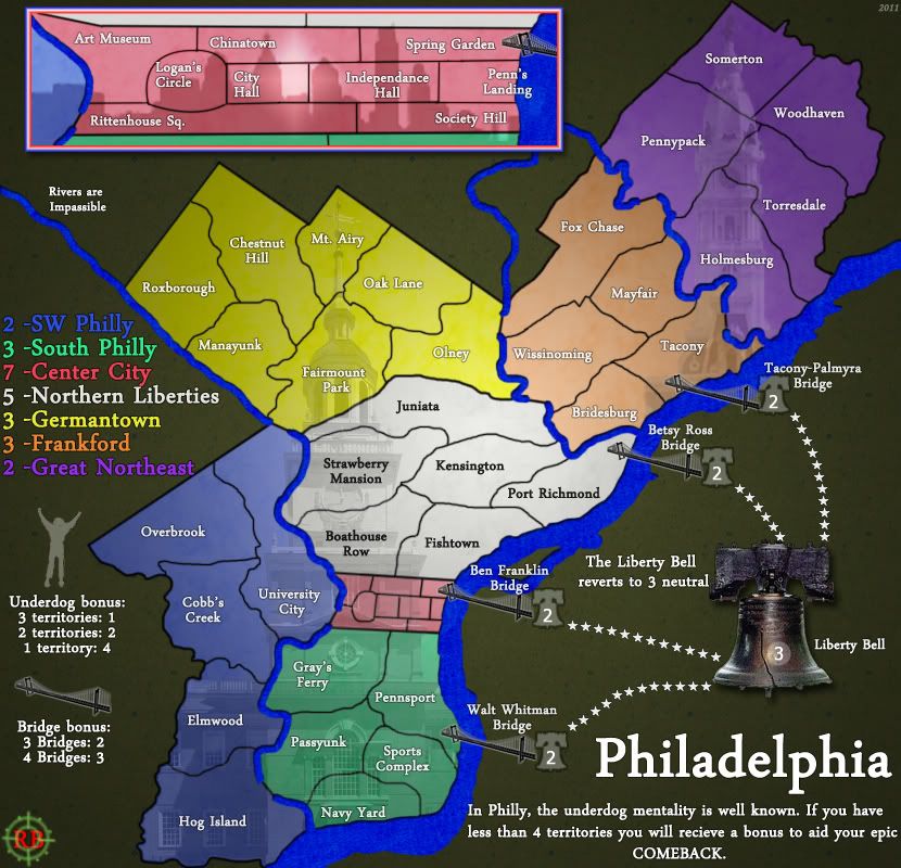
Click image to enlarge.
image

Image size: 830x800
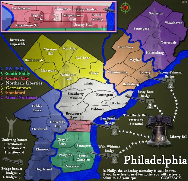
Click image to enlarge.
image

Image size: 622x600

Alright changed the shadow over to the river, and added some background images for the land surface.
ImageImage
User avatar
Sergeant 1st Class RedBaron0
 
Posts: 2657
Joined: Sun Aug 19, 2007 12:59 pm
Location: Pennsylvania

Re: Philadelphia - [15 Aug 2011] pg 21

Postby Victor Sullivan on Mon Aug 15, 2011 3:08 pm

It's at least a step in the right direction, to be sure! Not quite sure how I feel about it yet, though. I imagine the graphics gurus will have better feedback :P

-Sully
User avatar
Corporal Victor Sullivan
 
Posts: 6010
Joined: Mon Feb 08, 2010 8:17 pm
Location: Columbus, OH

Re: Philadelphia - [15 Aug 2011] pg 21

Postby natty dread on Mon Aug 15, 2011 3:49 pm

The water looks great now, however the building overlays are sort of distracting... maybe you could blur them a bit to take them out of focus.
Image
User avatar
Sergeant 1st Class natty dread
 
Posts: 12877
Joined: Fri Feb 08, 2008 8:58 pm
Location: just plain fucked

Re: Philadelphia - [15 Aug 2011] pg 21

Postby TaCktiX on Sat Aug 20, 2011 1:41 am

My first impression is I'm not impressed. I had to look really hard to see proof that this map wasn't made 4 years ago alongside the original versions of Montreal and Canada. Sounds harsh, but aside from the building overlays (Great Lakes), it's extremely plain and doesn't grab the eye. This is compounded by the near-solid dark green background.

On a semi-related note, a lot of the Central City territory borders aren't clean, particularly Logan's Circle.
User avatar
Corporal 1st Class TaCktiX
 
Posts: 2392
Joined: Mon Dec 17, 2007 8:24 pm
Location: Rapid City, SD

Re: Philadelphia - [15 Aug 2011] pg 21

Postby MarshalNey on Sun Aug 21, 2011 1:24 am

Ughhh, I wish I was worth a damn when it comes to graphics advice... this is probably my most-anticipated map in the Foundry right now, and I feel that I can offer little other than encouragement. Don't despair, RB, although I may not be commenting, I'm certainly following along.

The makeover is a lot more readable than the grafitti version, but I guess as everyone else is observing, it is a bit plain. Victor is right that the Central City skyline is the most appealing part of the map (to me anyway).

The thing is, perhaps I can't give specific computer graphics advice, but I think the map is still searching for a thematic style, and I might be able to help in that regard...

Right now, you've got the famous buildings, the Liberty Bell, suspension bridges and the underdog figure. Except for the last, there's a common element there of city architecture, which if you really ran with it might work out well.

However, that last element, the Underdog with upraised arms, intrigues me the most. What if the map themed itself around the people of Philly rather than the monuments and buildings? Helix mentioned an angry New Jerseyian instead of the Liberty Bell, and while that may be a little strange, maybe a gruff New Jersey toll keeper would fit? The 'people' theme doesn't have to be fun-loving, though, it could be serious too- using famous people born in the various bonus areas of the map as a background instead of a building, for instance.

I guess, to me the Underdog bonus is what makes this map really special and unique, and at its heart that idea is about people. I think it could be nice to see the graphics built around that idea.

-- Marshal Ney
User avatar
Captain MarshalNey
 
Posts: 781
Joined: Mon Sep 28, 2009 9:02 pm
Location: St. Louis, MO

Re: Philadelphia - [15 Aug 2011] pg 21

Postby gimil on Wed Aug 24, 2011 7:14 pm

I think MarshalNey is right, now need a theme to pull this together. Everytime I look at this map I struggle to see any direction. I actually think you have moved backwards since you overhaul from the graffiti theme. I though that maybe you were struggling with graphics, until I realised you made the Japan map. One of the most beautiful maps I have seem. Seriously how did you go from Japan to this?

I think the best course of action mate is to take a step back think of the theme and direction you want this map to go and try again. If you can produce a piece of art like Japan, you can certainly produce a better attempt at phili than this! Good luck, pal.
What do you know about map making, bitch?

natty_dread wrote:I was wrong


Top Score:2403
User avatar
Corporal 1st Class gimil
 
Posts: 8599
Joined: Sat Mar 03, 2007 12:42 pm
Location: United Kingdom (Scotland)

Re: Philadelphia - [15 Aug 2011] pg 21

Postby RedBaron0 on Thu Aug 25, 2011 12:17 pm

I know, its the theme that kills me. I've been struggling to figure out something that really captures Philly. The graffiti was nice, but I really felt it wasn't working in a way that I wanted it to.

You'd figure with such a colorful city like Philly this would be easy to figure out.... but it just hasn't been so far. :|
ImageImage
User avatar
Sergeant 1st Class RedBaron0
 
Posts: 2657
Joined: Sun Aug 19, 2007 12:59 pm
Location: Pennsylvania

Re: Philadelphia - [15 Aug 2011] pg 21

Postby ironsij0287 on Thu Aug 25, 2011 12:45 pm

Has anyone mentioned this for possible theme inspiration?

Image

It's a piece of art entitled "I Love Philadelphia". The artist's name is William Ressler.
User avatar
Sergeant 1st Class ironsij0287
 
Posts: 379
Joined: Tue Nov 09, 2010 2:30 pm
Location: Dubuque

Re: Philadelphia - [15 Aug 2011] pg 21

Postby RjBeals on Thu Aug 25, 2011 7:27 pm

how about this as a theme:

Image

just kidding :)
Image
User avatar
Private RjBeals
 
Posts: 2506
Joined: Mon Nov 20, 2006 5:17 pm
Location: South Carolina, USA

Re: Philadelphia - [15 Aug 2011] pg 21

Postby DiM on Thu Aug 25, 2011 7:34 pm

wtf is that? it's bread with meat inside. that i recognize, but are those macaroni? and what's the gooey orange stuff?
“In the beginning God said, the four-dimensional divergence of an antisymmetric, second rank tensor equals zero, and there was light, and it was good. And on the seventh day he rested.”- Michio Kaku
User avatar
Major DiM
 
Posts: 10415
Joined: Wed Feb 14, 2007 6:20 pm
Location: making maps for scooby snacks

Re: Philadelphia - [15 Aug 2011] pg 21

Postby isaiah40 on Thu Aug 25, 2011 7:38 pm

DiM wrote:wtf is that? it's bread with meat inside. that i recognize, but are those macaroni? and what's the gooey orange stuff?


It's what people from Philadelphia eat. Philly Cheese Steak. And those are onions.
Lieutenant isaiah40
 
Posts: 3990
Joined: Mon Aug 27, 2007 7:14 pm

Re: Philadelphia - [15 Aug 2011] pg 21

Postby DiM on Thu Aug 25, 2011 7:43 pm

isaiah40 wrote:
DiM wrote:wtf is that? it's bread with meat inside. that i recognize, but are those macaroni? and what's the gooey orange stuff?


It's what people from Philadelphia eat. Philly Cheese Steak. And those are onions.


that looks absolutely horrible and i bet it tastes delicious :lol:
i'm hungry.
“In the beginning God said, the four-dimensional divergence of an antisymmetric, second rank tensor equals zero, and there was light, and it was good. And on the seventh day he rested.”- Michio Kaku
User avatar
Major DiM
 
Posts: 10415
Joined: Wed Feb 14, 2007 6:20 pm
Location: making maps for scooby snacks

Re: Philadelphia - [15 Aug 2011] pg 21

Postby chapcrap on Wed Aug 31, 2011 10:42 pm

First time I looked at this map. I love the underdog bonus.
Lieutenant chapcrap
 
Posts: 9686
Joined: Sun Feb 03, 2008 12:46 am
Location: Kansas City

Re: Philadelphia - [15 Aug 2011] pg 21

Postby gimil on Thu Sep 01, 2011 11:52 am

RedBaron0 can we expect to see any updates anytime soon?
What do you know about map making, bitch?

natty_dread wrote:I was wrong


Top Score:2403
User avatar
Corporal 1st Class gimil
 
Posts: 8599
Joined: Sat Mar 03, 2007 12:42 pm
Location: United Kingdom (Scotland)

PreviousNext

Return to The Atlas

Who is online

Users browsing this forum: No registered users