Philadelphia [Quenched]
Moderator: Cartographers
Re: Philadelphia - updated 5/30 pg 17
![]() by RedBaron0 on Sun Jun 19, 2011 1:51 am
by RedBaron0 on Sun Jun 19, 2011 1:51 am
ugh, the wavelet part is really kick'n my ass, just trying to get a filter for either gimp or PS is killing me.


-

 RedBaron0
- Posts: 2657
- Joined: Sun Aug 19, 2007 12:59 pm
- Location: Pennsylvania


Re: Philadelphia - updated 5/30 pg 17
![]() by natty dread on Sun Jun 19, 2011 2:32 am
by natty dread on Sun Jun 19, 2011 2:32 am
The GIMP plugin can be downloaded here: http://registry.gimp.org/node/11742 the page should also have instructions for installing.
Although, if you want you can send me the brick layer you have and I can separate it to wavelet scales for you.
Although, if you want you can send me the brick layer you have and I can separate it to wavelet scales for you.

-

natty dread
- Posts: 12877
- Joined: Fri Feb 08, 2008 8:58 pm
- Location: just plain fucked


-
natty dread
- Posts: 12877
- Joined: Fri Feb 08, 2008 8:58 pm
- Location: just plain fucked
Re: Philadelphia - updated 5/30 pg 17
![]() by RedBaron0 on Sun Jun 19, 2011 3:03 am
by RedBaron0 on Sun Jun 19, 2011 3:03 am
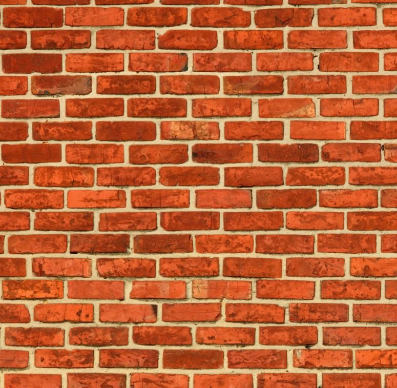
I'll take ya up on that natty, here's the brick layer jpg
Many thanks in advance natty!
- Click image to enlarge.
Many thanks in advance natty!
-
RedBaron0
- Posts: 2657
- Joined: Sun Aug 19, 2007 12:59 pm
- Location: Pennsylvania
Re: Philadelphia - updated 5/30 pg 17
![]() by natty dread on Sun Jun 19, 2011 4:43 am
by natty dread on Sun Jun 19, 2011 4:43 am
Ok, here they are...
Residual (set as background)
http://img220.imageshack.us/img220/3860/brickres.png
Wavelet scales (set on top with "Grain Merge" layer mode)
http://img43.imageshack.us/img43/480/bricks1.png
http://img69.imageshack.us/img69/3552/bricks2.png
Now a slight disclaimer: the wavelet scales are made to work with GIMP's grain merge mode, and I'm not sure if PS has a layer mode that is exactly similar, so the resulting image may not be exactly the same as original in PS.
-
natty dread
- Posts: 12877
- Joined: Fri Feb 08, 2008 8:58 pm
- Location: just plain fucked
Re: Philadelphia - updated 5/30 pg 17
![]() by DiM on Sun Jun 19, 2011 6:30 am
by DiM on Sun Jun 19, 2011 6:30 am
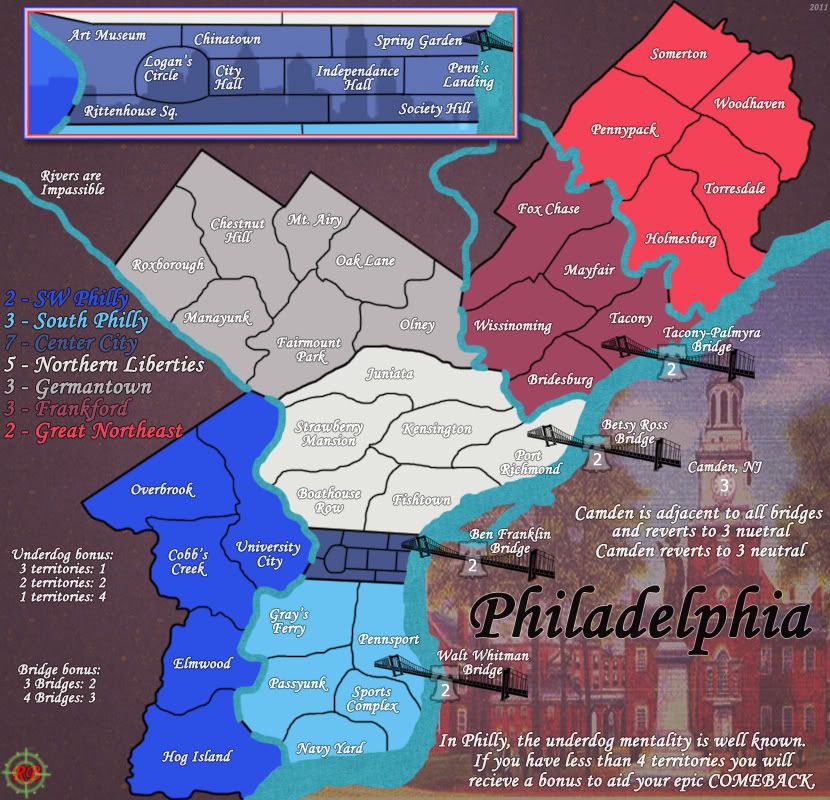
i'm not totally sold on the brick-wall/graffiti idea. at the moment it all looks a bit artificial.
1. i have a beef with the opacity of the territories layers. perhaps making them more/completely opaque would make the territories appear more like paint on a wall. also having a few places where the paint drips (like in the camden font) would really help.
2. the top right image looks out of place. perhaps take that statue (?) and put it on a poster. something like this: http://farm4.static.flickr.com/3443/3835718657_4f636a653a.jpg and i think it would fit better with the general image
3. the center city pipe frame is skewed. the left/right pipes are very wide compared to the top/bottom ones
4. i'm not a fan of the writing overlapping the leaves. while i do understand that some places are cramped and space is tight others (like the legend) could be rearranged to avoid this overlapping
5. the title looks out of place because of the shadow. either make it as graffiti or make it as a neon sign http://zeppsignsandbanners.com/wp-content/uploads/2010/09/neon_signs_02.jpg or even as a street sign http://wwwdelivery.superstock.com/WI/223/1598/PreviewComp/SuperStock_1598R-76015.jpg
“In the beginning God said, the four-dimensional divergence of an antisymmetric, second rank tensor equals zero, and there was light, and it was good. And on the seventh day he rested.”- Michio Kaku
-

DiM
- Posts: 10415
- Joined: Wed Feb 14, 2007 6:20 pm
- Location: making maps for scooby snacks


Re: Philadelphia - updated 5/30 pg 17
![]() by RedBaron0 on Sun Jun 19, 2011 11:36 am
by RedBaron0 on Sun Jun 19, 2011 11:36 am
Grrrrrr..... appropriate your help natty, I like this theme, but I think I really am over doing the whole thing trying to get a "theme." I'm going go back to the drawing board on this, start simple, and work my way back up.
-
RedBaron0
- Posts: 2657
- Joined: Sun Aug 19, 2007 12:59 pm
- Location: Pennsylvania
Re: Philadelphia - updated 5/30 pg 17
![]() by Bruceswar on Mon Jun 20, 2011 10:46 pm
by Bruceswar on Mon Jun 20, 2011 10:46 pm
Good luck with a redraw!
Highest Rank: 26 Highest Score: 3480

-

Bruceswar
- Posts: 9713
- Joined: Sun Dec 23, 2007 12:36 am
- Location: Cow Pastures


Re: Philadelphia - updated 5/30 pg 17
![]() by RedBaron0 on Sun Jul 03, 2011 3:48 am
by RedBaron0 on Sun Jul 03, 2011 3:48 am
Thanks, I'm getting there, kinda stuck again on a frame for the inset, and bridges I like, but I'm getting there!
-
RedBaron0
- Posts: 2657
- Joined: Sun Aug 19, 2007 12:59 pm
- Location: Pennsylvania
Re: Philadelphia - updated 7/6 pg 19
![]() by RedBaron0 on Wed Jul 06, 2011 1:29 am
by RedBaron0 on Wed Jul 06, 2011 1:29 am
- Click image to enlarge.
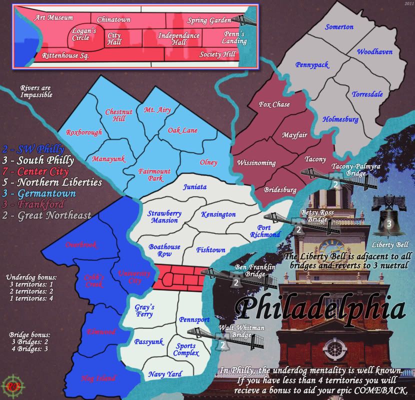
Alright redrawn, image is a bit larger, but still within normal standards.
So much to mention, so just paruse and see see what you think!!
-
RedBaron0
- Posts: 2657
- Joined: Sun Aug 19, 2007 12:59 pm
- Location: Pennsylvania
Re: Philadelphia - updated 7/6 pg 19
![]() by natty dread on Wed Jul 06, 2011 3:00 am
by natty dread on Wed Jul 06, 2011 3:00 am
Well...
I'm really not a fan of the new colour scheme. Also, the painting looks nice, but I'm not sure how well it integrates with the rest of the map. The style of the map seems too different from the style of the painting...
I guess, there's lots of nice elements here, but none of them really come together well, you know?
-
natty dread
- Posts: 12877
- Joined: Fri Feb 08, 2008 8:58 pm
- Location: just plain fucked
Re: Philadelphia - updated 7/6 pg 19
![]() by Evil DIMwit on Wed Jul 06, 2011 11:37 am
by Evil DIMwit on Wed Jul 06, 2011 11:37 am
I think the graffiti was going in a nice direction, but this works too.
You must change the colors. For example, why not the blue-yellow-blue of Philadelphia's city flag?
If you must go with the Red, White, and Blue, I'd arrange it so only Germantown and withe SW Philly or Northern Liberties are blue with white font, and the rest alternate between red with white font and white with red font. This is all so we don't get confused with Luxembourg.


-

Evil DIMwit
- Posts: 1616
- Joined: Thu Mar 22, 2007 1:47 pm
- Location: Philadelphia, NJ


Re: Philadelphia - [6 Jul 2011] pg 19
![]() by RedBaron0 on Wed Jul 06, 2011 12:26 pm
by RedBaron0 on Wed Jul 06, 2011 12:26 pm
I could go with the blue/yellow/blue of the Philly flag, but no one really knows that flag, unless you're from Philly, even IF you're from Philly. lol
Red/white/blue is instantly identifiable with Philly and it's historical connections to the USA. I can alternate the colors up a bit, and the text colors too. The way its setup now passed through the color blindness test though.
I can try a modern picture of Independence hall see how that works out.
-
RedBaron0
- Posts: 2657
- Joined: Sun Aug 19, 2007 12:59 pm
- Location: Pennsylvania
Re: Philadelphia - [15 Jul 2011] pg 20
![]() by RedBaron0 on Fri Jul 15, 2011 1:20 pm
by RedBaron0 on Fri Jul 15, 2011 1:20 pm
- Click image to enlarge.
Ok couple things:
Alternated the colors with colored texts.
I kinda took out the reference to NJ, and replaced it with the Liberty Bell. It fits since the army circles for the bridges are little bells. Overall it puts everything to just Philly, nothing extra.
Changed the image of Independence Hall, a little more photographic.
-
RedBaron0
- Posts: 2657
- Joined: Sun Aug 19, 2007 12:59 pm
- Location: Pennsylvania
Re: Philadelphia - [15 Jul 2011] pg 20
![]() by natty dread on Fri Jul 15, 2011 3:03 pm
by natty dread on Fri Jul 15, 2011 3:03 pm
The red text on blue doesn't work too well. White would be better there.
I'd also advise making the water darker, and maybe adding an outline to it.
The playable area could use some light texture. Something smooth, not overly strong, perhaps something similar to the Quad Cities map? The plain, solid colour seems too simplistic, especially compared to the photorealistic image on the right.
Speaking of the photorealistic image... I'm not too keen on it. The bridges, the liberty bell, texts - all seem to drown into the image, sort of getting lost there. Perhaps you could convert the picture into grayscale and overlay it on the background texture?
Still, you're getting closer, the map is starting to shape up. Keep up the good work.
-
natty dread
- Posts: 12877
- Joined: Fri Feb 08, 2008 8:58 pm
- Location: just plain fucked
Re: Philadelphia - [15 Jul 2011] pg 20
![]() by shakeycat on Sun Jul 17, 2011 2:49 pm
by shakeycat on Sun Jul 17, 2011 2:49 pm
As natty says, the photo with the text on top is too much.
Another option for changing it might be to redraw it in vectors and make it flatter that way. I'm thinking like what I did with Vancouver between: http://www.atomation.com/~thazzard/fun/gva/mar3.jpg and http://www.atomation.com/~thazzard/fun/gva/june18.jpg
It will remove a lot of the detail, and give you quick options for changing colour, size, and transparency at will. Experiment
Current Map Project: Tokyo
-

shakeycat
- Posts: 390
- Joined: Sun Mar 11, 2007 5:13 am
- Location: Vancouver


Re: Philadelphia - [15 Jul 2011] pg 20
![]() by RedBaron0 on Sun Jul 17, 2011 2:56 pm
by RedBaron0 on Sun Jul 17, 2011 2:56 pm
Agreed that does look good shaky. I have just completed an update, so I'll post that up soon, and then see if that might be a good direction to go.
-
RedBaron0
- Posts: 2657
- Joined: Sun Aug 19, 2007 12:59 pm
- Location: Pennsylvania
Re: Philadelphia - [17 Jul 2011] pg 20
![]() by RedBaron0 on Sun Jul 17, 2011 6:15 pm
by RedBaron0 on Sun Jul 17, 2011 6:15 pm
- Click image to enlarge.
I knew I forgot something.... the texture on the playable surface.
Ugh, oh well, next update, other than that though, wheremiat kids?
-
RedBaron0
- Posts: 2657
- Joined: Sun Aug 19, 2007 12:59 pm
- Location: Pennsylvania
Re: Philadelphia - [17 Jul 2011] pg 20
![]() by Industrial Helix on Sun Jul 17, 2011 7:29 pm
by Industrial Helix on Sun Jul 17, 2011 7:29 pm
I think the Independence hall photo clashes with the bridges and makes that area a little messy. In fact, I really wish the bridges connected to something on the map, rather than the floating liberty bell or a floating new Jersey turnpike sign. If you took that space and made it a playable, visibly connected part of the map, then this map would be much clearer in my opinion. Use that space to visibly connect the New Jersey turn pike... have roads going off to a common turnpike booth with an angry New Jerseyian or something. Then, condense your rules and whatnot to the remaining space and enclose them in a box.
Sketchblog [Update 07/25/11]: http://indyhelixsketch.blogspot.com/
Living in Japan [Update 07/17/11]: http://mirrorcountryih.blogspot.com/
Russian Revolution map for ConquerClub [07/20/11]: viewtopic.php?f=241&t=116575
Living in Japan [Update 07/17/11]: http://mirrorcountryih.blogspot.com/
Russian Revolution map for ConquerClub [07/20/11]: viewtopic.php?f=241&t=116575
-

Industrial Helix
- Posts: 3462
- Joined: Mon Jul 14, 2008 6:49 pm
- Location: Ohio


Re: Philadelphia - [30 Jul 2011] pg 20
![]() by RedBaron0 on Sat Jul 30, 2011 1:36 pm
by RedBaron0 on Sat Jul 30, 2011 1:36 pm
- Click image to enlarge.

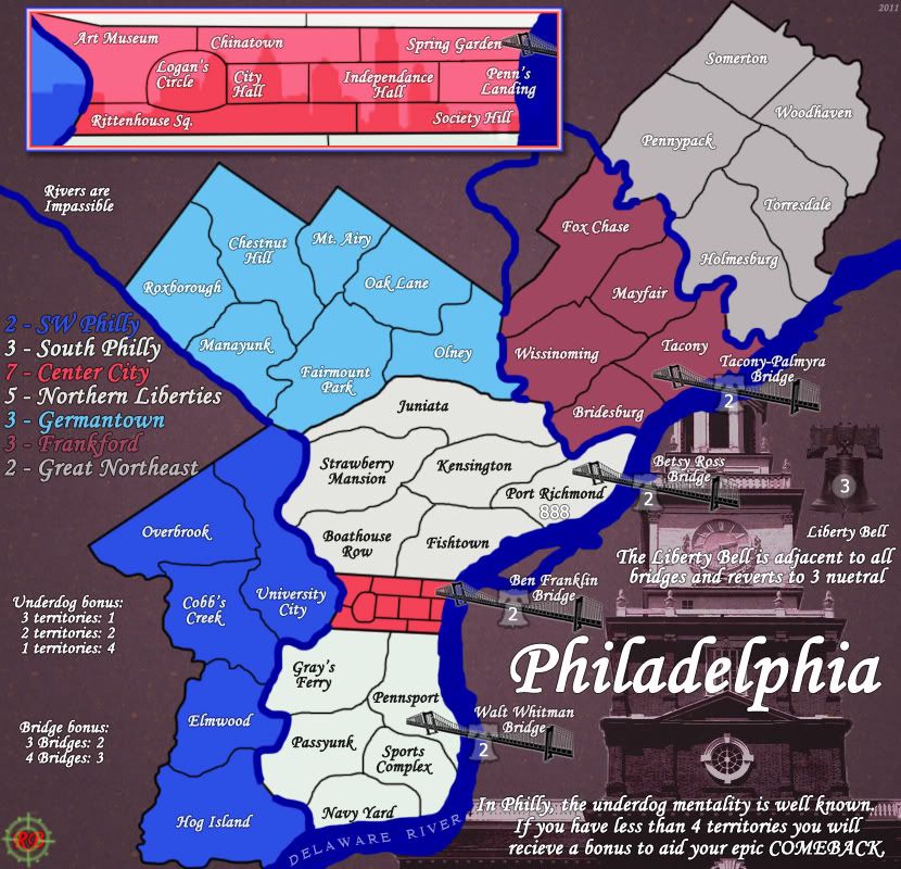
Ok so the ginormaious Independence Hall is out, down to just the Liberty Bell more connected to the map. small Americanish stars connecting the bridges to the Bell. The bridges are smaller and less domineering. The Liberty Bell 'army circles' make a direct and logical connection from the end of the bridges to the Liberty Bell killer neutral. (think of it as, "freedom isn't free...")
Added a subtle texture to the playable surface.
Depends now on where you guys see this. I know this passes vischeck, will post those up as soon as we're good to go on the large map, and get the small map in place soon after.
Need to check and see if army circles are a necessity, hopefully not, just gotta check and see if army colors blend in too much on certain bonus zones.
-
RedBaron0
- Posts: 2657
- Joined: Sun Aug 19, 2007 12:59 pm
- Location: Pennsylvania
Re: Philadelphia - [30 Jul 2011] pg 20
![]() by natty dread on Sat Jul 30, 2011 2:20 pm
by natty dread on Sat Jul 30, 2011 2:20 pm
South Philly & Northern Liberties are almost identical in colour...
-
natty dread
- Posts: 12877
- Joined: Fri Feb 08, 2008 8:58 pm
- Location: just plain fucked
Re: Philadelphia - [30 Jul 2011] pg 20
![]() by Victor Sullivan on Sat Jul 30, 2011 6:06 pm
by Victor Sullivan on Sat Jul 30, 2011 6:06 pm
Hey, RedBaron0. I'm not too much of a graphics buff, but... I am simply not feeling this. There seems to be a complete lack of character - a lack of Philadelphia, and a lack of RedBaron0 in this map. I think this:
is leagues above what you have now. I can see the styles of both Philly, and more importantly, you in this version. Your current edition just looks dull and flat...
I apologize for my bluntness, but surely you understand what I mean?
-Sully
- Click image to enlarge.
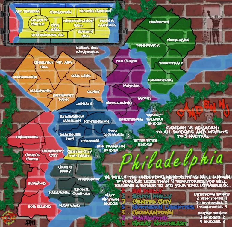
is leagues above what you have now. I can see the styles of both Philly, and more importantly, you in this version. Your current edition just looks dull and flat...
I apologize for my bluntness, but surely you understand what I mean?
-Sully
Beckytheblondie: "Don't give us the dispatch, give us a mustache ride."
Scaling back on my CC involvement...
Scaling back on my CC involvement...
-

Victor Sullivan
- Posts: 6010
- Joined: Mon Feb 08, 2010 8:17 pm
- Location: Columbus, OH


Re: Philadelphia - [30 Jul 2011] pg 20
![]() by RedBaron0 on Sun Jul 31, 2011 2:59 am
by RedBaron0 on Sun Jul 31, 2011 2:59 am
I work with those colors for N Liberties and South Philly. There is a slight greenish tinge to South Philly atm, but I guess it isn't enough.
Sully.... don't take this the wrong way, but who know MY style better than I do? Who among us know Philly better than I do? Look maybe there is room to improve, but MY feeling is the graffiti version is tacky and NOT Philadelphia. Every city has graffiti, just because it gives off an urban 'feel' doesn't mean it's Philadelphia.
I understand what you mean, but understand what I mean.... I DON'T LIKE THE GRAFFITI THEME. I'll have ZERO desire to continue this map IF I MUST continue within that style.
And since I don't.... I won't.
I'm not trying to be standoffish and scare off one of the few that is making comments, I'm just in a foul mood, and I seriously just don't like the graffiti. Simple as that.
-
RedBaron0
- Posts: 2657
- Joined: Sun Aug 19, 2007 12:59 pm
- Location: Pennsylvania
Re: Philadelphia - [30 Jul 2011] pg 20
![]() by Victor Sullivan on Sun Jul 31, 2011 4:01 am
by Victor Sullivan on Sun Jul 31, 2011 4:01 am
I didn't mean specifically the graffiti theme, I'm just saying it felt like that draft had a bit more...character, if you will. You do make a fair point that you know Philly and yourself better than I do, but at the same time, everybody's in my boat. I don't doubt that you can work with your current draft to make it more than beautiful, but as it stands, this seems like one that will fade into the background after it's quenched. Right now you've just got a textureless play area on one-dimensionally textured background. This isn't to say that there aren't any good things about this map. The background in the inset is very neat, and the Liberty Bell/bridge section is intriguing to say the least. I just feel like there's a striking lack of "oomph" - the one thing that really makes this map stand out graphically.
-Sully
-Sully
Beckytheblondie: "Don't give us the dispatch, give us a mustache ride."
Scaling back on my CC involvement...
Scaling back on my CC involvement...
-
Victor Sullivan
- Posts: 6010
- Joined: Mon Feb 08, 2010 8:17 pm
- Location: Columbus, OH
Re: Philadelphia - [30 Jul 2011] pg 20
![]() by natty dread on Sun Jul 31, 2011 4:32 am
by natty dread on Sun Jul 31, 2011 4:32 am
Temper, temper.....
Rb0, Victor makes a good point - the old version, despite having it's flaws, had a certain graphical flair that the current map is missing. It had this sort of vibrancy, like how the map pops out and has some graphical intensity... I'm just pulling adjectives out of my ass here, but I can't really explain it better.
Let me try to pinpoint the things that bother me in the current version...
Firstly, the background: it creates a sort of drab, asphalt-like, flat look on the map. I think part is due to the texture being so weak, and part is the hue - it seems to have a sort of reddish-brown tint to it, which doesn't really work too well at that saturation level, IMO. The colour of the background makes me think of sadness and depression, apathy. What I think you could do to improve this is: increase the contrast of the texture, not overly much, but noticeably, then adjust the hue - either make it totally gray, or take it to contrast the playable area better - the playable area is mostly cold colours (cold red, blue, white/grey) so you could give a warm tone to the background for contrast - I think that alone would go a long way giving this map some intensity and feeling.
Also, a slight gradient could also help - making the edges darker, which would highlight the actual map and bring it to focus better. That way you could also make the map colours a bit darker, they wouldn't have to be so bright...
Secondly, the font. I'm not a huge fan of that font or style of fonts, as Bison King can probably testify... so it may be a bit of personal bias, but I still think you could do better for the font selection. This font that looks suspiciously like Monotype Corsiva has the flaw that it's half-way between an ornamental/script font, and a regular serif font... I think you'd do better with a dignified-looking serif font, something with a little grit to it...
Third... the water. It doesn't quite look right... I think it's the solid colour of it, it looks too pasted on, like it doesn't belong on the map. I'd suggest giving it some depth, lowering the saturation a bit, maybe giving it some gradient or texture, to make it less uniform... bring it alive, you know?
Then, things I like: the silhouette of the city on the inset is a nice touch. The liberty bell looks nice, although it could have a stronger drop shadow to it, to pop it up a bit more, and the bridges and bell icons also look nice.
One more thing, which is totally unrelated to my other suggestions... have you considered taking influence from RJ's Charleston map? I think the style of that map could work quite well for this one. Just an idea that popped in my head - you've already rehauled the graphics once so I don't expect you to go through with this... although I think it could work, and maybe you could keep it in mind as a second option...
-
natty dread
- Posts: 12877
- Joined: Fri Feb 08, 2008 8:58 pm
- Location: just plain fucked
Who is online
Users browsing this forum: No registered users
|
|||||||
| Conquer Club is not associated with RISK online in any way. Copyright © 2006-2024 by Big Wham LLC | |||||||