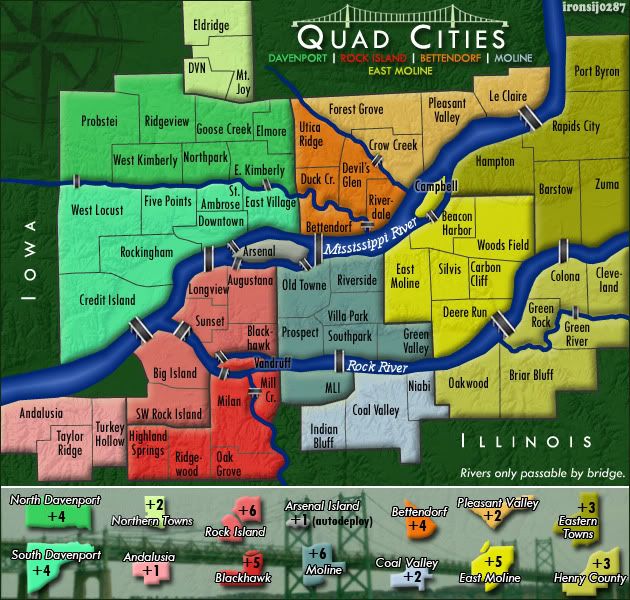
ironsij0287 wrote:Nah. I've already taken snobby posts like yours personally and moved on. My map has been approved through this point and while I've made plenty of efforts to touch it up, this is pretty much where its at now. I'm sorry it doesn't meet your elitist graphical standards, and I'm sorry I don't have some wacky gameplay which seems to be a free pass for crappy graphics.
snobby post. don't make me laugh. just because i demand that your map meets at least the same quality standard as the other maps now in final forge does not make me a snob. if anything i believe this is a decent request. i did not ask your map to be the best, heck, i didn't even ask it to be great. all it needed was to be at least at the same level as the other maps that are now in final forge. can you honestly compare your map with Golfe Du St. Laurent or Austro-Hungarian Empire or Baltic Crusades or any of the other maps in final forge?
you claim to have made plenty of efforts to touch it up? HA. you've made almost no improvements from this version: http://i11.photobucket.com/albums/a193/ ... isk630.png
and that was 8 months ago. my god man in 8 months you can develop enough photoshop/gimp/fireworks skills to seriously improve this map. what you did was simply add some horrible bevel and change the background.
people with much more experience than you have scraped their whole work and started from scratch when the community reasonably demanded it.
i looked a few pages back and i saw foundry veterans complaining about the poor graphics on this map. what was your response? nothing. you simply ignored them. heck, back in the day this map would have never left the drafting subforum especially with a map maker that has your attitude.
but hey, it seems like any crap goes nowadays if you're patient enough and keep on ignoring what you don't like.
ironsij0287 wrote:This was my first map. I've taken note of posts similar to yours and will consider them on my next project. Once this goes Beta I invite you to give it a play if you're not too put off or agitated by its mediocrity.
Come slumming on the inadequate Quad Cities Map!
i don't care if this is your map. ignoring valid comments just because you're too lazy or you don't have the skill to implement what people request is intolerable. especially since this is your first project you should pay more attention to other people say especially when they're more experienced than you.
as for me playing this map...god forbid. when i have ~180 maps that look better and play better, why would i bother with this?
by all means, prove me wrong, turn this map around and create a beautiful and interesting map and i'll be the first to play it and congratulate you. but until then all i can hope is that andy won't be insane enough to quench this. afterall maps of this quality were standard in 2006. it's been 5 years since then.


