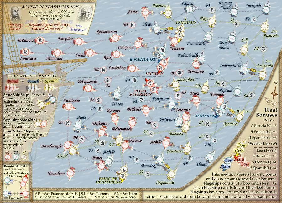
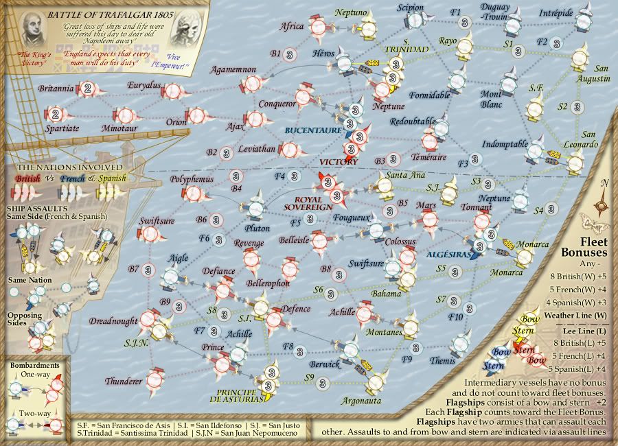
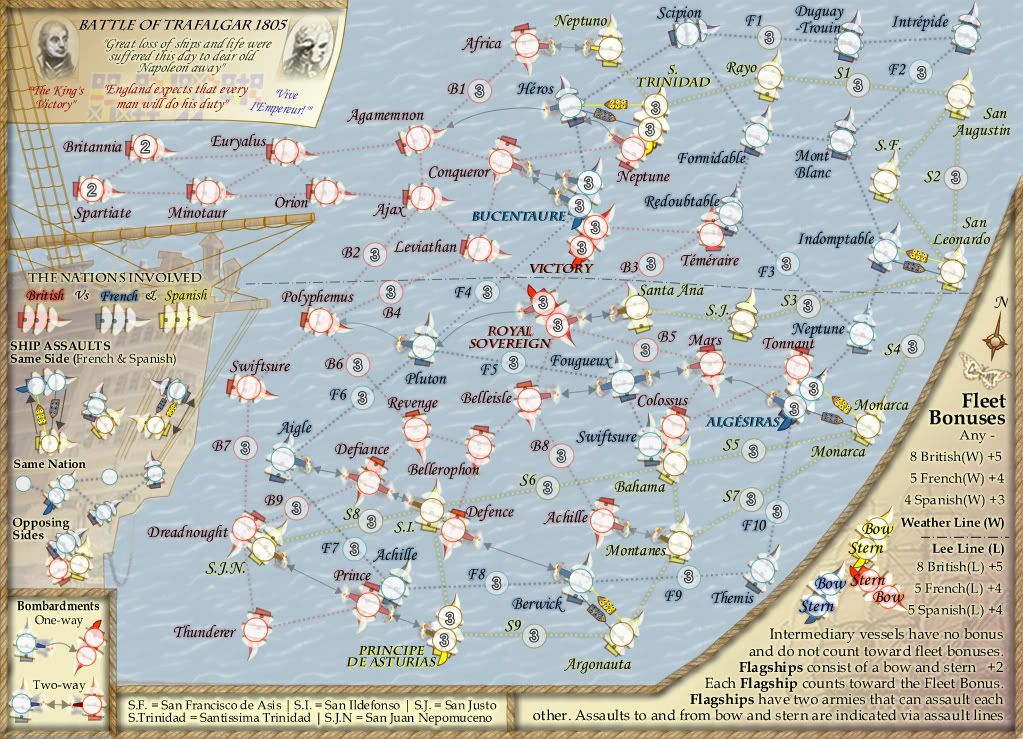
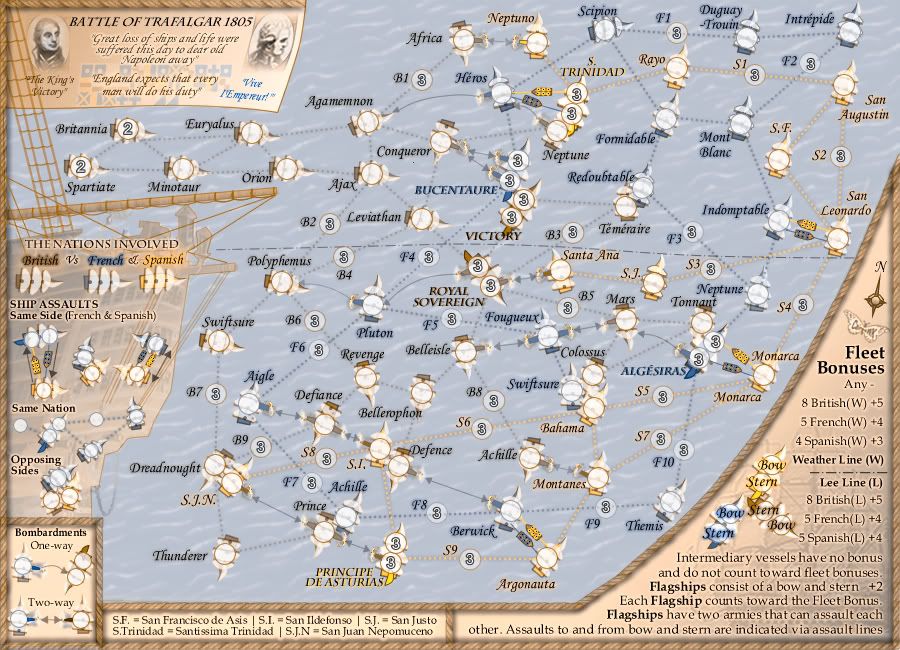
DiM wrote:great job. they are just the right opacity. not too intrusive but nut too faded either. perfect.
just a couple of minor tweaks:
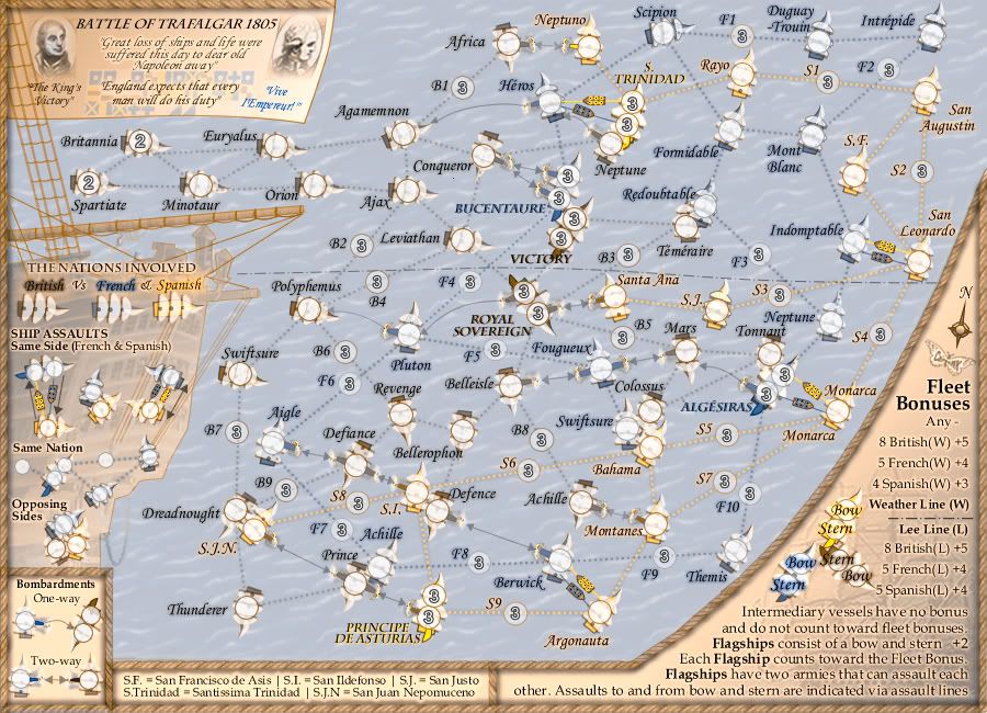
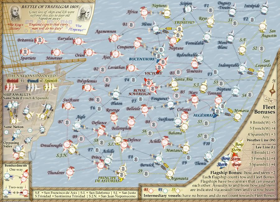
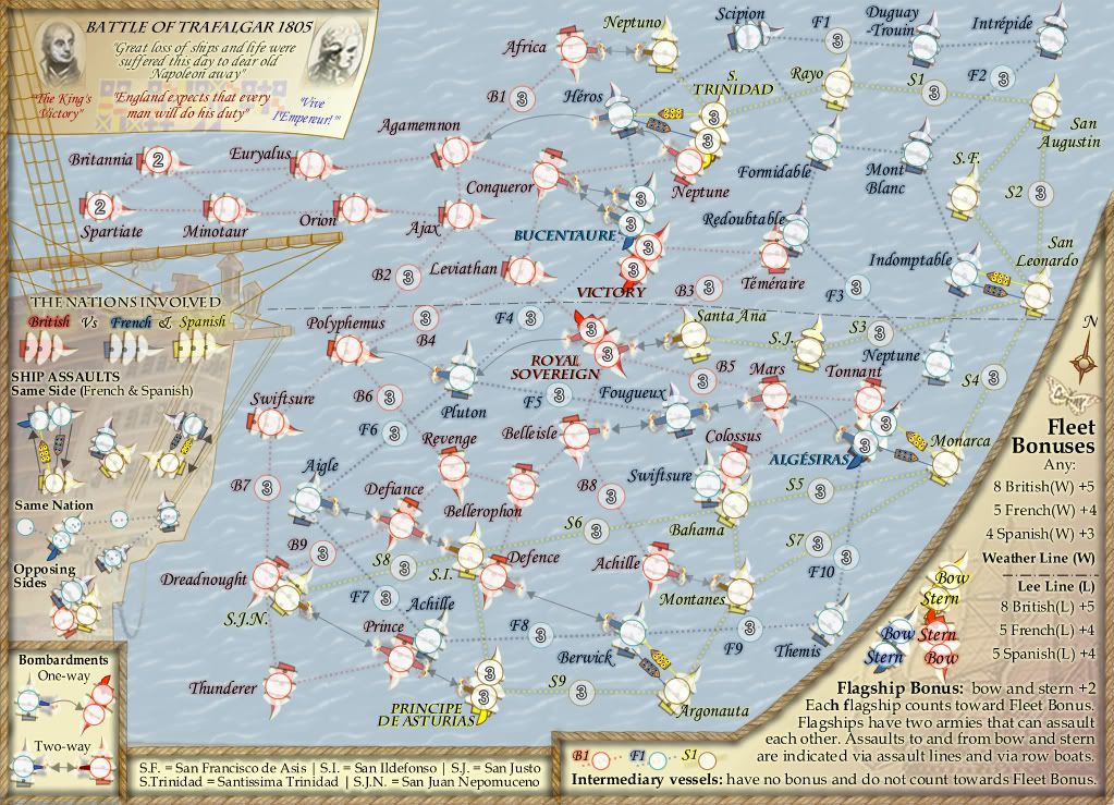
1. some of the arrows are pixelated and some aren't. for example berwick <-> defence is pixelated while prince<->sjn is perfect.
2. also some arrows are turquoise instead of grey (ie mars<->fougueux or africa <-> neptuno)
other than that i think the arrows are great and if this turns out to be the general consensus then they should definitely stay.
PS: i was just thinking that this map really cries out cairnswk. you do have a style of your own and you've managed to keep it after all these years. well done mate.
Dim, i've updated those V46 above, the arrows are now a lot clearer i hope and the mis-colouraton gone.
I've also moved some more territories to allow more eye-space between them, and highlighted the bombardment area more so that instructions are clearer.
Thanks for your feedback.


