Philadelphia [Quenched]
Moderator: Cartographers
Re: Philadelphia - updated 5/30 pg 17
Hi RedBaron0,
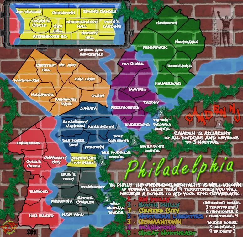
Just taking a look over your map. I have to be honest though nothing on your map seems to be pulling together to make some kind of consistent theme.
You have some text that sort of looks like graffiti on the wall (sort of), then you have the ivy which don't really seem to have any relevance to the theme you are going for at all, then there is the title which looks like pretty good graffiti but it floats above the wall rather than being painted on it.
I don't want to sound like an ass but I think what is being done here needs a little rethink and redoing to create something a little more consistent towards what you are doing.
Do you get what I am saying?
gimil
What do you know about map making, bitch?
Top Score:2403
natty_dread wrote:I was wrong
Top Score:2403
-

 gimil
gimil
- Posts: 8599
- Joined: Sat Mar 03, 2007 12:42 pm
- Location: United Kingdom (Scotland)


Re: Philadelphia - updated 5/30 pg 17
from philly - like the map
only thing i dont like is the Rocky statue. personally id rather have some reference to the US constitution of the declaration of indepence; something about history instead of the overdone rocky movie references
btw - lived in the Somerton territory during the latter half of grade school and then high school
parents then moved to s jersey/ ive lived in Roxborough, now live near villanova
originally lived it Levittown
id like to see a map of the entire Delaware Valley (s jersey, PA suburbs and philly) but that would probably be too difficult
-

 gannable
- Posts: 943
- Joined: Mon Dec 24, 2007 11:31 pm
- Location: not of this world


Re: Philadelphia - updated 5/30 pg 17
I like the ivy, and at the same time IMHO it makes the map way too busy. Not too up on having the pipes there either.
- Reduce the opacity on the playing area some so the bricks aren't as visible.
- Change the font you are using for Camden NJ to the same you are using for the bonus names.
- For the neon sign, do you think you can place a green glow underneath to make it look like it is reflecting off the wall?
That is it for now, will look back later.
-
 isaiah40
- Posts: 3990
- Joined: Mon Aug 27, 2007 7:14 pm


Re: Philadelphia - updated 5/30 pg 17
still dont like the grout on the playable area .. it adds clutter and confusion
-
 danfrank
- Posts: 611
- Joined: Mon Dec 24, 2007 1:19 am


Re: Philadelphia - updated 5/30 pg 17
I think the map still looks too cluttered. Sorry for being blunt, but I don't know how else to say it... You could try making the playable area "pop out" from the background more, maybe by making the paint more opaque (less transparent).

-

 natty dread
- Posts: 12877
- Joined: Fri Feb 08, 2008 8:58 pm
- Location: just plain fucked


Re: Philadelphia - updated 5/30 pg 17
This map has taken a turn for the worse.
I say get rid of the brick all together. It just doesn't work.

-

 RjBeals
- Posts: 2506
- Joined: Mon Nov 20, 2006 5:17 pm
- Location: South Carolina, USA


Re: Philadelphia - updated 5/30 pg 17
Yeah, I'm starting to agree, might be time for that overhaul...


-

 RedBaron0
- Posts: 2657
- Joined: Sun Aug 19, 2007 12:59 pm
- Location: Pennsylvania


Re: Philadelphia - updated 5/30 pg 17
I like the bricks but the problem is that it is a textured surface, and having a flat image on top of that doesn't work. Maybe this is the type of thing where the only good way to do it is to actually go to a brick wall with some spray paint, draw the map, and take a picture 
-
 carlpgoodrich
- Posts: 408
- Joined: Tue Aug 04, 2009 2:12 pm


Re: Philadelphia - updated 5/30 pg 17
there's ways to make the brick work - you just have to work at it if thats what you really want to do.

-

 RjBeals
- Posts: 2506
- Joined: Mon Nov 20, 2006 5:17 pm
- Location: South Carolina, USA


Re: Philadelphia - updated 5/30 pg 17
I find the font used on the regions hard to read. Though the one used in Redbaron´s signature graphic of Philadelphia is easy to read.
"He came dancin across the water.... FarangDemon, FarangDemon.... mmmhh....what a killer..."
-
 FarangDemon
- Posts: 700
- Joined: Wed Apr 23, 2008 1:36 am


Re: Philadelphia - updated 5/30 pg 17
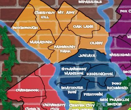
I had an idea to address the problem of the graffiti lacking depth on the brick wall. I tried it on a portion of the map. Here's how it came out.
BEFORE
AFTER

Obviously you have multiple layers to work with but by just using the single JPEG I took it into PS and created a duplicate layer of it. Then I took the duplicate layer on top of the original and added an inner bevel. Then with that set I took a 6px eraser to that beveled layer and just erased along the mortar lines on the brick wall. The layer then will bevel at the parts you've erased and BOOM, depth.
I know, it's kind of tedious but you have to agree it does look better, right? Perhaps there's an easier way, but this is just one I thought might work.
BEFORE

AFTER

Obviously you have multiple layers to work with but by just using the single JPEG I took it into PS and created a duplicate layer of it. Then I took the duplicate layer on top of the original and added an inner bevel. Then with that set I took a 6px eraser to that beveled layer and just erased along the mortar lines on the brick wall. The layer then will bevel at the parts you've erased and BOOM, depth.
I know, it's kind of tedious but you have to agree it does look better, right? Perhaps there's an easier way, but this is just one I thought might work.
-

 ironsij0287
- Posts: 379
- Joined: Tue Nov 09, 2010 2:30 pm
- Location: Dubuque


Re: Philadelphia - updated 5/30 pg 17
RjBeals wrote:thats a nice method - it defiantly looks better.
Defiantly?

But yes, it does look better.
-Sully
Beckytheblondie: "Don't give us the dispatch, give us a mustache ride."
Scaling back on my CC involvement...
Scaling back on my CC involvement...
-

 Victor Sullivan
- Posts: 6010
- Joined: Mon Feb 08, 2010 8:17 pm
- Location: Columbus, OH


Re: Philadelphia - updated 5/30 pg 17
Heil Webster?
-Sully
-Sully
Beckytheblondie: "Don't give us the dispatch, give us a mustache ride."
Scaling back on my CC involvement...
Scaling back on my CC involvement...
-

 Victor Sullivan
- Posts: 6010
- Joined: Mon Feb 08, 2010 8:17 pm
- Location: Columbus, OH


Re: Philadelphia - updated 5/30 pg 17
I'll give it a little more of a go with this method, if I can't get something I lik out of the brick wall version here, I might just scrap it and go in a new direction. I do wanna move on this, I've been busy and distracted though... I also got projects in mined down the road, and I wanna move on them, but I don't have the energy to do 2 maps at once.


-

 RedBaron0
- Posts: 2657
- Joined: Sun Aug 19, 2007 12:59 pm
- Location: Pennsylvania


Re: Philadelphia - updated 5/30 pg 17
One thing about the brick wall that looks off, currently:
The mortar is lighter only because it is of lighter colour. When you paint over the brick and mortar, with paint, the mortar should not be lighter on the painted-over areas - it should be slightly darker instead, to give it a sense of depth, and a bevel-type shading would also help.
You should try to separate the brick background into two separate layers: one with the colour and one with the grain. You could use a wavelet decompose function (I'm not sure what it's called in photoshop but it's a kind of filter that separates an image into layers where one is the "residue" layer that contains all the colour, and the other layers are the grain layers of varying frequencies (called wavelets, hence the name)). Separate the brick layer into colour layer and one grain layer, then put the colour layer under the map elements, and put the grain layer on top of everything. Then set the opacity of all the elements in between to 100%, because the background colour doesn't need to show through, the grain on top of it will give it the depth aspect. This way the background will stay the same as it is on non-painted areas, but it should look more natural on painted areas.
If my explanation doesn't make sense (highly likely) just let me know, I can try to doodle up a visual example.

-

 natty dread
- Posts: 12877
- Joined: Fri Feb 08, 2008 8:58 pm
- Location: just plain fucked


Re: Philadelphia - updated 5/30 pg 17
Actually, here's a little visual example of the technique:
Result image:

Screenshot of layers:
What I did here was take a brick wall image and paste it as a new image (the pasted layer, non-visible one) then applied the wavelet decompose on it, with 2 wavelet scales (one would be enough, but using more gives the opportunity to increase the "opacity" (or, simulated thickness) of the paint by moving layers higher so that fewer grain layers are on top of it) then made the graffiti doodles in between as the "colour" layers.
Here, the brick background is not of the best quality - it's the first one that came up on google images - but this method would probably work quite well with the background you have currently.
Result image:

Screenshot of layers:
What I did here was take a brick wall image and paste it as a new image (the pasted layer, non-visible one) then applied the wavelet decompose on it, with 2 wavelet scales (one would be enough, but using more gives the opportunity to increase the "opacity" (or, simulated thickness) of the paint by moving layers higher so that fewer grain layers are on top of it) then made the graffiti doodles in between as the "colour" layers.
Here, the brick background is not of the best quality - it's the first one that came up on google images - but this method would probably work quite well with the background you have currently.

-

 natty dread
- Posts: 12877
- Joined: Fri Feb 08, 2008 8:58 pm
- Location: just plain fucked


Re: Philadelphia - updated 5/30 pg 17
natty_dread has exactly the right idea. If you want to go with a graffiti look, what natty has done is what I would also like to see.
What do you know about map making, bitch?
Top Score:2403
natty_dread wrote:I was wrong
Top Score:2403
-

 gimil
gimil
- Posts: 8599
- Joined: Sat Mar 03, 2007 12:42 pm
- Location: United Kingdom (Scotland)


Re: Philadelphia - updated 5/30 pg 17
Wow, that looks great.
-
 carlpgoodrich
- Posts: 408
- Joined: Tue Aug 04, 2009 2:12 pm


Re: Philadelphia - updated 5/30 pg 17
I knew there had to be a better option than mine. Nicely done natty.
-

 ironsij0287
- Posts: 379
- Joined: Tue Nov 09, 2010 2:30 pm
- Location: Dubuque


Re: Philadelphia - updated 5/30 pg 17
wow natty that looks great !!... That would work on the playable area too 
-
 danfrank
- Posts: 611
- Joined: Mon Dec 24, 2007 1:19 am


Re: Philadelphia - updated 5/30 pg 17
Continuing with my example...
Let's say you wanted to add depth to the brick texture, here's what I'd do:
#1 - apply the wavelet decomposer. Make a copy of the residual layer, move it to the top, invert the colours & desaturate:

#2 - apply emboss + maybe a slight 1px blur on the copied layer

#3 - set the layer mode to grain merge and lower opacity, and voila, you have more depth:

The new layer acts as an extra layer of grain. By taking the residual (which contains only the colour information of the original brick wall image) and inverting it, we get a layer where the mortar is dark and the tiles are light, which makes for a perfect bump map for the brick wall. Then by applying emboss on it, you get a sort of bevel that follows the shapes of the brick wall perfectly, therefore increasing the depth of the wall. By setting the layer on top of all the other grain layers, it also affects the paint, therefore making the painted areas follow the depth & texture of the brick background perfectly, while showing a different colour.
Let's say you wanted to add depth to the brick texture, here's what I'd do:
#1 - apply the wavelet decomposer. Make a copy of the residual layer, move it to the top, invert the colours & desaturate:

#2 - apply emboss + maybe a slight 1px blur on the copied layer

#3 - set the layer mode to grain merge and lower opacity, and voila, you have more depth:

The new layer acts as an extra layer of grain. By taking the residual (which contains only the colour information of the original brick wall image) and inverting it, we get a layer where the mortar is dark and the tiles are light, which makes for a perfect bump map for the brick wall. Then by applying emboss on it, you get a sort of bevel that follows the shapes of the brick wall perfectly, therefore increasing the depth of the wall. By setting the layer on top of all the other grain layers, it also affects the paint, therefore making the painted areas follow the depth & texture of the brick background perfectly, while showing a different colour.

-

 natty dread
- Posts: 12877
- Joined: Fri Feb 08, 2008 8:58 pm
- Location: just plain fucked


Re: Philadelphia - updated 5/30 pg 17
Evil DIMwit wrote:Oh wow that is nice.
Yes, I absolutely agree. Nice tutorial natty_dread.
What do you know about map making, bitch?
Top Score:2403
natty_dread wrote:I was wrong
Top Score:2403
-

 gimil
gimil
- Posts: 8599
- Joined: Sat Mar 03, 2007 12:42 pm
- Location: United Kingdom (Scotland)


Who is online
Users browsing this forum: No registered users

