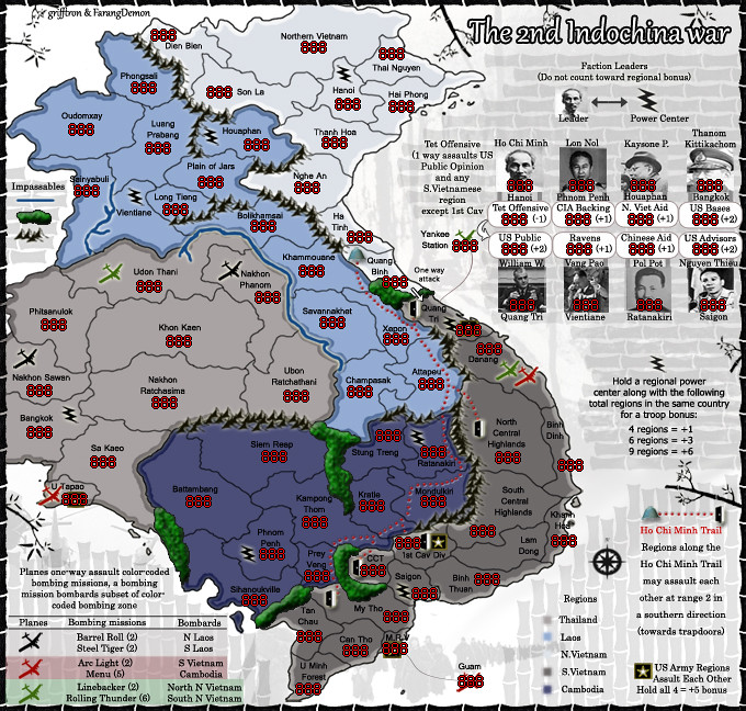
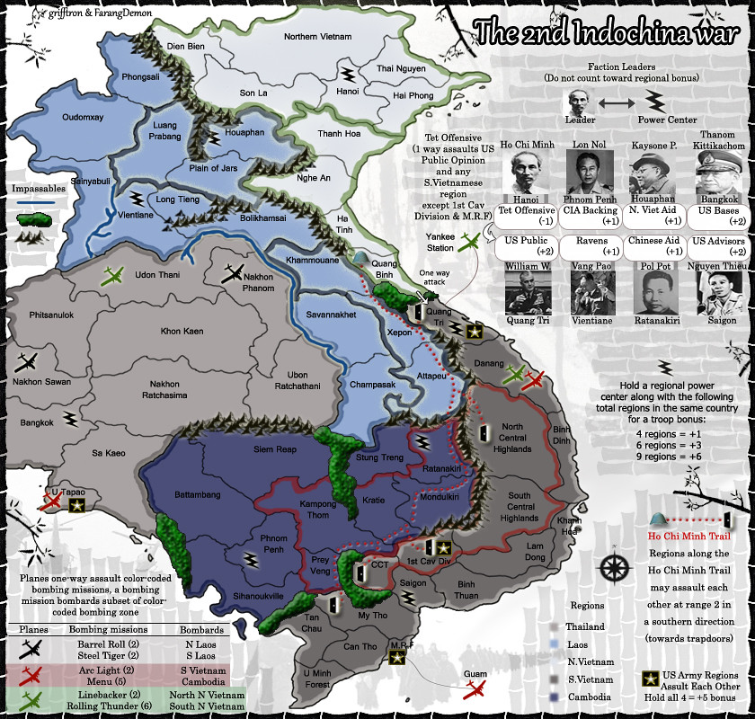
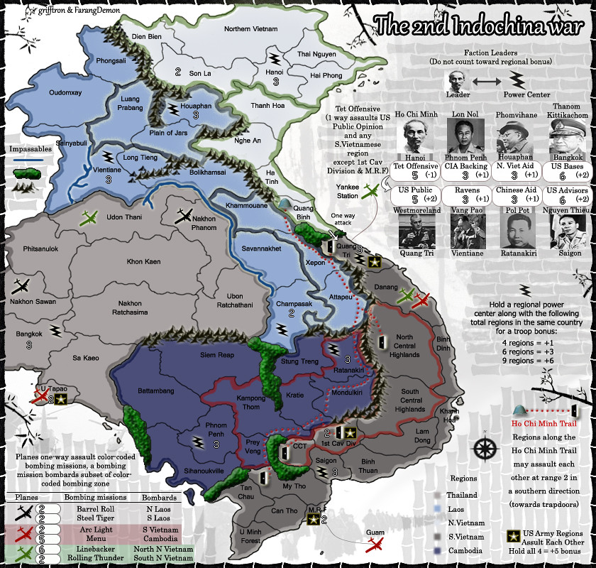
grifftron wrote:Wondering when someone will stop in and give some guidance graphic wise, color scheme or anything else that would be changed? ideas? I need something to work with here... I think this is a great GP idea that FD came up with and would love to work more on the graphics if I got some ideas going.
-griff
The black frame you have around the map is too strong and makes the map look cramped... It competes for attention with other elements - I suggest trying something smoother and lighter, maybe a dark grey thing or something...
The coloured borders around the bonus areas look sloppy, which doesn't fit the crisp style of the map - they should be even in thickness.
I also suggest moving the bombing missions under the faction leaders - that way all the extra territories are in one place and not all around the map. Swap it with the text that is under the leaders currently.


