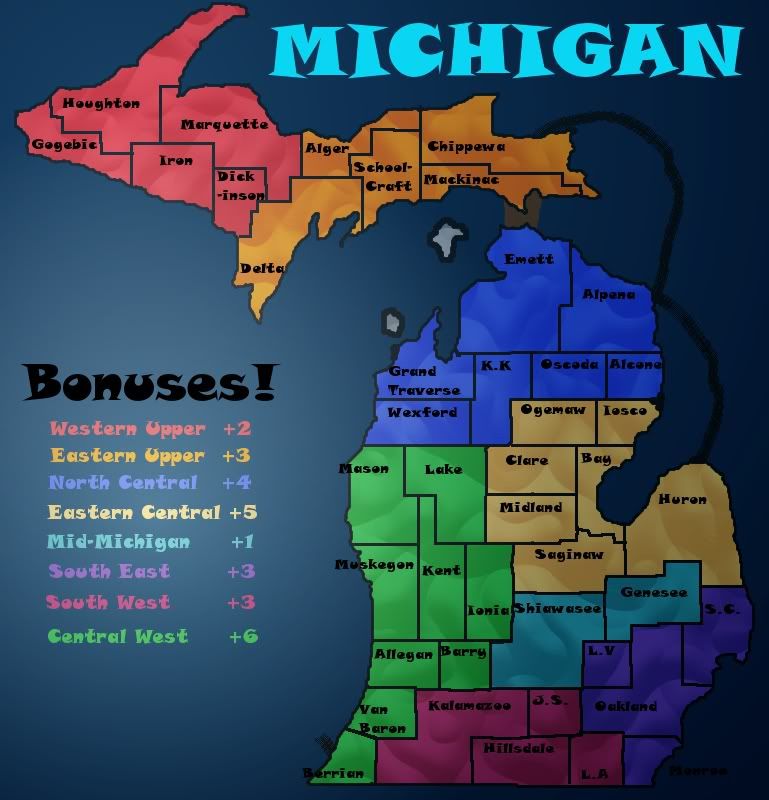
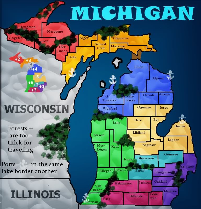
rdsrds2120 wrote:I want to make sure we can agree they're in the right place before I make them really nice, because then they'd probably be harder to edit later on.
If you follow my tutorials, and keep all the layers you create separate (except where otherwise mentioned) and don't take any shortcuts, then you will have an image file which is easy to edit and change later. This is the beauty of layer-based image-editing, you can change an element of an image any time without it affecting the rest of the image. The tutorial is designed to create a dynamic graphics file which allows easy editing.
rdsrds2120 wrote:Remember, we're not even in the gameplay section yet, so graphics isn't really necessary atm

Actually, you will be expected to get your graphics at a certain level even before gameplay. Firstly, you have to create a working draft, which is a map image that includes all elements needed to play the map. Territory names, bonus names & values, legends, title, impassables, etc. Secondly, before moving up to gameplay, the image should be of certain quality: it should have a clean look, no overly pixelated edges, no colour bleed, no blurryness or mspaint-ness.
As for the current map image... some points:
- You've overdone the gradient overlay a bit, I suggest toning it down somewhat - the areas near the map edges are hard to see, especially the lower right corner.
- That font you have... well, let me put it like this: beginning graphic designers often like to use "fun" & "whimsical" fonts like this, even when most of the time a clean, evenly kerned, easy to read font would do much better. The font you have is ok for the title, for all the other text, I suggest finding something more easy on the eyes.
- Borders... why are they grey? Also, the inner territory borders look sort of hastily made. The 2nd part of my tutorial has a section on drawing borders with the path tool. It takes some practice to learn to use the path tool, but it's well worth it in the end.


