Conquer Club

Age of Merchants - [Quenched]

Care to peruse completed maps? Take a stroll through the Atlas.

Moderator: Cartographers

Forum rules
Please read the Community Guidelines before posting.

Postby XenHu on Tue Mar 27, 2007 12:16 am

KEYOGI wrote:It's quite tall. I'd do something about that if you could. While I appreciate you skills and what you're trying to do with this map, I don't think I would play it. There's a lot of brain work to see if anyone holds a bonus.

Some of your territory lines are too long and going into the ocean and others are a bit short and don't make it all the way through the coloured highlight.


Agreed. I think this map would be a good novelty, but I can't see it getting widespread popularity. I might play it, once or twice.

-X
User avatar
Cook XenHu
 
Posts: 4307
Joined: Mon Nov 27, 2006 3:38 pm

Postby DiM on Tue Mar 27, 2007 12:20 am

KEYOGI wrote:It's quite tall. I'd do something about that if you could. While I appreciate you skills and what you're trying to do with this map, I don't think I would play it. There's a lot of brain work to see if anyone holds a bonus.

Some of your territory lines are too long and going into the ocean and others are a bit short and don't make it all the way through the coloured highlight.


teritory lines, will be sorted.

about the difficulty of the map i don't think it's that hard.

i said before i played this map with my wife and 3 friends. all i had to tell them was this:

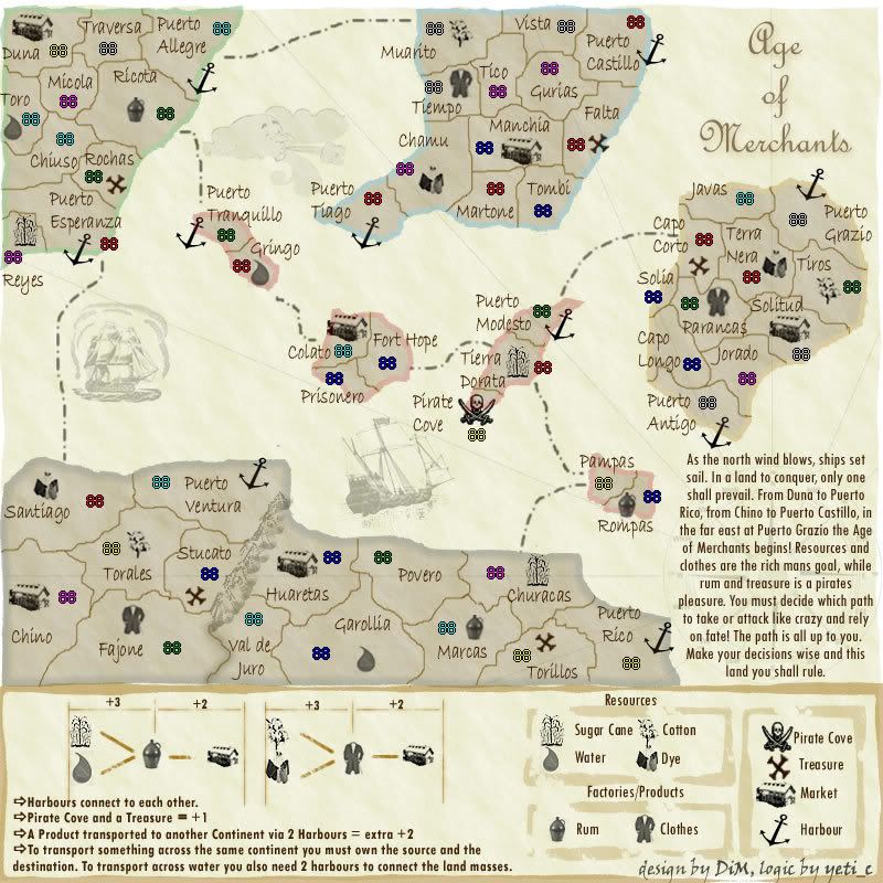
you're a merchant and you have resources (showed them the resources), products (showed them the products) and markets. you have 4 types of resources which combine in 2 pairs to give you one product. own 2 res and a product you get a bonus, own a product and a market and you get another bonus. transport a product to a foreign market by owning 2 connecting harbours and you get a further bonus. then they asked me. do we get a bonus for taking resources to the market? and i answered with a question. do you see that in the legend?? no. then you don't.
and we played and nobody had a problem in spotting the other player's bonuses.
it's easy to see them because there is a trade chain (2R>P>M) for each continent. so basicaly you look at that continent and see if he has the whole chain or just a part. then if he has harbours you look to see where they connect to see if he has a bonus for a foreign market. in 30 seconds you'll spot all the bonuses on the table.
“In the beginning God said, the four-dimensional divergence of an antisymmetric, second rank tensor equals zero, and there was light, and it was good. And on the seventh day he rested.”- Michio Kaku
User avatar
Major DiM
 
Posts: 10415
Joined: Wed Feb 14, 2007 6:20 pm
Location: making maps for scooby snacks

Postby XenHu on Tue Mar 27, 2007 12:26 am

30 seconds is a long time when you're playing Freestyle..

-X
User avatar
Cook XenHu
 
Posts: 4307
Joined: Mon Nov 27, 2006 3:38 pm

Postby DiM on Tue Mar 27, 2007 12:45 am

XenHu wrote:30 seconds is a long time when you're playing Freestyle..

-X


30 seconds for everybody :wink:

so there's no real advantage for any player, plus this will happen only in the first rounds then it should be really easy to spot all bonuses once you get used to the map.

PS: how much time does it take to see all the bonuses in world 2.1?? :wink:
“In the beginning God said, the four-dimensional divergence of an antisymmetric, second rank tensor equals zero, and there was light, and it was good. And on the seventh day he rested.”- Michio Kaku
User avatar
Major DiM
 
Posts: 10415
Joined: Wed Feb 14, 2007 6:20 pm
Location: making maps for scooby snacks

Postby KEYOGI on Tue Mar 27, 2007 1:00 am

I think it would take more than 30 seconds. Depending on the number of players, I think it could take you a couple of minutes or maybe longer. I haven't played it though, so I can't comment for sure.

The difference in World 2.1 is that bonuses are identified by groups in a region. The way I understand it, in this map you could have potential bonuses scattered all over the board. I was considering this same problem with Conquer 4, but I think in that map it's a lot easier to identify bonuses.

I like your idea, I really do... I just think it's overcomplicated and this will probably turn a lot of people off.
Sergeant 1st Class KEYOGI
 
Posts: 1632
Joined: Tue Oct 10, 2006 6:09 am

Postby DiM on Tue Mar 27, 2007 1:14 am

i don't really know what to say. it took my friends just minutes to understand the concept and seconds to identify the bonuses.

anyway i've updated the xml with the coordinates but i have a problem with testing it.

first the xml tester returns a blank page so i don't know if i have errors or not :( i've manually checked every connection and it should be fine.

second the army number generator is all screwed up because the map is taller than normal :(
“In the beginning God said, the four-dimensional divergence of an antisymmetric, second rank tensor equals zero, and there was light, and it was good. And on the seventh day he rested.”- Michio Kaku
User avatar
Major DiM
 
Posts: 10415
Joined: Wed Feb 14, 2007 6:20 pm
Location: making maps for scooby snacks

Postby DiM on Tue Mar 27, 2007 1:23 am

solved the problem with the army number generator. i forgot to add the dimensions to the xml :) but still the xml tester returns a blank page :(

put pieces of the xml in the tester it works but if i put the whole file it does nothing :( maybe the file is too damn big.


anyway here are the army numbers and i fixed the borders
Image
“In the beginning God said, the four-dimensional divergence of an antisymmetric, second rank tensor equals zero, and there was light, and it was good. And on the seventh day he rested.”- Michio Kaku
User avatar
Major DiM
 
Posts: 10415
Joined: Wed Feb 14, 2007 6:20 pm
Location: making maps for scooby snacks

Postby KEYOGI on Tue Mar 27, 2007 2:05 am

I don't think the map itself is hard to understand, I just think it will be a hassle to try and identify everyones bonuses. Not to mention time consuming. There's not much you can do about it though. What are the total number of bonus combinations for the map?

"A Product transported to another Continent via 2 Harbours = extra +2"
Could this be worded better? For starters, I don't think you need to mention the harbours as it is mentioned in the next point. I would maybe swap the order of the bottom two points though.
Sergeant 1st Class KEYOGI
 
Posts: 1632
Joined: Tue Oct 10, 2006 6:09 am

Postby DiM on Tue Mar 27, 2007 2:08 am

KEYOGI wrote:I don't think the map itself is hard to understand, I just think it will be a hassle to try and identify everyones bonuses. Not to mention time consuming. There's not much you can do about it though. What are the total number of bonus combinations for the map?

"A Product transported to another Continent via 2 Harbours = extra +2"
Could this be worded better? For starters, I don't think you need to mention the harbours as it is mentioned in the next point. I would maybe swap the order of the bottom two points though.


how can i word it better??


the order of the last 2 will be changed in the next update.
“In the beginning God said, the four-dimensional divergence of an antisymmetric, second rank tensor equals zero, and there was light, and it was good. And on the seventh day he rested.”- Michio Kaku
User avatar
Major DiM
 
Posts: 10415
Joined: Wed Feb 14, 2007 6:20 pm
Location: making maps for scooby snacks

Postby DiM on Wed Mar 28, 2007 5:00 am

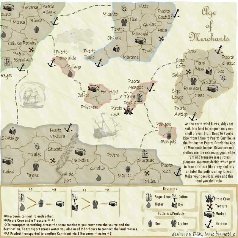
feedback needed

Image
“In the beginning God said, the four-dimensional divergence of an antisymmetric, second rank tensor equals zero, and there was light, and it was good. And on the seventh day he rested.”- Michio Kaku
User avatar
Major DiM
 
Posts: 10415
Joined: Wed Feb 14, 2007 6:20 pm
Location: making maps for scooby snacks

Postby Enigma on Wed Mar 28, 2007 9:39 am

i think my biggest problem with this map right now is that it is simply too big. as i think keyogi said earlier, a lot of brain power is going to go into this map, to see how you can manipulate your own territories to gain bonuses, and at the same time to figure out how everyone else is doing the same. it will take some time to train your eyes to see all the different possible bonuses.

since it will already take a good deal of time to think through all of this, i think it just adds annoyance to have to scroll. are you working on the small version of the map as well? because i personally wouldnt use the large one, and i know im not the only one in that boat. (lol pun not intended)

this map has to be very easy to see. it has a complicated bonus system and so to make it playable it has to be very easy to immediatly spot where everything is.

i agree with keyogi, i really like your idea. and there is no question that you are a master at graphics. the trick is to make them complement.
Do you need an excuse to have a war? I mean, who for? Can't you just say "You got lots of cash and land, but I've got a big sword, so divy up right now, chop chop."
Terry Pratchet
User avatar
Lieutenant Enigma
 
Posts: 367
Joined: Mon Jul 03, 2006 10:23 pm
Location: Classified

Postby DiM on Wed Mar 28, 2007 9:51 am

the map is currently smaller than the world2.1 map and as far as i can see many people play world 2.1 and i doubt they do it on the small version.

to make this map smaller i have to give up on the legend.
if i do that nobody will be able to play it.

i'm not currently working on the small version because i don't know weather this will ever get finalised. most people don't seem to understand the concept and think the map is too hard to play. why would i bother making a small version when nobody wants to play it :(
“In the beginning God said, the four-dimensional divergence of an antisymmetric, second rank tensor equals zero, and there was light, and it was good. And on the seventh day he rested.”- Michio Kaku
User avatar
Major DiM
 
Posts: 10415
Joined: Wed Feb 14, 2007 6:20 pm
Location: making maps for scooby snacks

Postby Enigma on Wed Mar 28, 2007 12:04 pm

DiM wrote:the map is currently smaller than the world2.1 map and as far as i can see many people play world 2.1 and i doubt they do it on the small version.

to make this map smaller i have to give up on the legend.
if i do that nobody will be able to play it.

i'm not currently working on the small version because i don't know weather this will ever get finalised. most people don't seem to understand the concept and think the map is too hard to play. why would i bother making a small version when nobody wants to play it :(

i play the small world2.1. speaking for myself, i understand the concepts and like them. i would just like to see these concepts presented clearly on the board. dont give up on it :)
Do you need an excuse to have a war? I mean, who for? Can't you just say "You got lots of cash and land, but I've got a big sword, so divy up right now, chop chop."
Terry Pratchet
User avatar
Lieutenant Enigma
 
Posts: 367
Joined: Mon Jul 03, 2006 10:23 pm
Location: Classified

Postby Enigma on Wed Mar 28, 2007 12:05 pm

DiM wrote:the map is currently smaller than the world2.1 map and as far as i can see many people play world 2.1 and i doubt they do it on the small version.

to make this map smaller i have to give up on the legend.
if i do that nobody will be able to play it.

i'm not currently working on the small version because i don't know weather this will ever get finalised. most people don't seem to understand the concept and think the map is too hard to play. why would i bother making a small version when nobody wants to play it :(

i play the small world2.1. speaking for myself, i understand the concepts and like them. i would just like to see these concepts presented clearly on the board. dont give up on it :)
Do you need an excuse to have a war? I mean, who for? Can't you just say "You got lots of cash and land, but I've got a big sword, so divy up right now, chop chop."
Terry Pratchet
User avatar
Lieutenant Enigma
 
Posts: 367
Joined: Mon Jul 03, 2006 10:23 pm
Location: Classified

Postby DiM on Wed Mar 28, 2007 12:21 pm

i have no idea how to present the concepts better. but i'm open to any suggestion.
“In the beginning God said, the four-dimensional divergence of an antisymmetric, second rank tensor equals zero, and there was light, and it was good. And on the seventh day he rested.”- Michio Kaku
User avatar
Major DiM
 
Posts: 10415
Joined: Wed Feb 14, 2007 6:20 pm
Location: making maps for scooby snacks

Postby DiM on Thu Mar 29, 2007 6:22 pm

seeing that the feedback is really scarce i'm begining to think this map is not worth it. i've put in a lot of effort in creating it but i don't regret it cause i really love to do maps. plus i printed the map and i can play on it with my friends. i wanted to bring a breeze of fresh air with a new game concept and a new style for map design. unfortunately the interest on this map seems to have faded away. so it has come to this. should i continue or not?
“In the beginning God said, the four-dimensional divergence of an antisymmetric, second rank tensor equals zero, and there was light, and it was good. And on the seventh day he rested.”- Michio Kaku
User avatar
Major DiM
 
Posts: 10415
Joined: Wed Feb 14, 2007 6:20 pm
Location: making maps for scooby snacks

Postby Bad Speler on Thu Mar 29, 2007 6:55 pm

yes, continue, its a great map!!
Highest Score: 2532
Highest Position: 69 (a long time ago)
User avatar
Sergeant 1st Class Bad Speler
 
Posts: 1027
Joined: Fri Jun 02, 2006 8:16 pm
Location: Ottawa

Postby hulmey on Thu Mar 29, 2007 9:11 pm

continue :D
[img]http://img801.imageshack.us/img801/9761/41922610151374166770386.jpg[/mg]
User avatar
Lieutenant hulmey
 
Posts: 3742
Joined: Fri Nov 03, 2006 7:33 am
Location: Las Vegas

Postby Enigma on Thu Mar 29, 2007 10:01 pm

please continue :) its such a new idea that perhaps every1 else is as in the dark on how to make it work as you feel, and that may account for the scarce feedback. but it really does look good. dont give up.
Do you need an excuse to have a war? I mean, who for? Can't you just say "You got lots of cash and land, but I've got a big sword, so divy up right now, chop chop."
Terry Pratchet
User avatar
Lieutenant Enigma
 
Posts: 367
Joined: Mon Jul 03, 2006 10:23 pm
Location: Classified

Postby Gozar on Thu Mar 29, 2007 10:30 pm

Don't stop now!
User avatar
Lieutenant Gozar
 
Posts: 2534
Joined: Wed Jan 31, 2007 3:15 pm
Location: Nova Scotia (G1)

Postby DiM on Fri Mar 30, 2007 6:39 am

thanks guys for the support but at this point the map has reached a point where i get little or no feedback. without feedback the map can't progress.
i don't know, i'm rather new to this whole map making process so maybe i this is how the foundry works, maybe things move really slow in here. this thread is only 19 days old and i already did lots of updates and improvements as quickly as i could, maybe i should just be patient and wait and wait and wait.
i really imagined things move quicker around here. i'm not saying i expected this to be quenched in 2-3 weeks but at least i expected constant feedback. i have more ideas i want to work on but i'm affraid if i start working on new maps this one will simply be forgotten and i don't want this to happen.
i have 13 votes to continue so far and 7 asking me to stop. out of these 20 votes not a single person posted to ask for improvements. let's assume the 13 persons that voted yes are satisfied with the current state of the map and don't want any improvements (which is not true) but the 7 guys that voted no should have said what they don't like, maybe their complaints can be attended to and solved. i never voted in a poll without offering some constructive criticism.
“In the beginning God said, the four-dimensional divergence of an antisymmetric, second rank tensor equals zero, and there was light, and it was good. And on the seventh day he rested.”- Michio Kaku
User avatar
Major DiM
 
Posts: 10415
Joined: Wed Feb 14, 2007 6:20 pm
Location: making maps for scooby snacks

Postby Skittles! on Fri Mar 30, 2007 7:54 am

DiM, I like this map, and how it is different from other maps.

But I don't like the font for the areas. It just seems.. Too big for it. I know you've had a hard time with the fonts, but still, I think the font is too large for the territories.

I hope you continue with this map DiM, as it has good potential.
KraphtOne wrote:when you sign up a new account one of the check boxes should be "do you want to foe colton24 (it is highly recommended) "
User avatar
Private Skittles!
 
Posts: 14574
Joined: Wed Jan 03, 2007 2:18 am

Postby mibi on Fri Mar 30, 2007 8:20 am

I'd love to play this map. Once the game play is figured out, I could really care less about fonts and lines and other visual factors as it's the game play and the players that make a game fun, for me.

This map for me is ready to go.
User avatar
Captain mibi
 
Posts: 3350
Joined: Thu Mar 01, 2007 8:19 pm
Location: The Great State of Vermont

Postby DiM on Fri Mar 30, 2007 8:33 am

Skittles! wrote:DiM, I like this map, and how it is different from other maps.

But I don't like the font for the areas. It just seems.. Too big for it. I know you've had a hard time with the fonts, but still, I think the font is too large for the territories.

I hope you continue with this map DiM, as it has good potential.


too big? huh :?
well it used to be smaller but various people complained it's too small and i made it bigger. i'm in the middle of a rt game now but as soon as that finishes i'll search for more fonts and post them.

just to get this clear. you like the font but it is too big and you want me to make it smaller? or do you also want me to change the font?
“In the beginning God said, the four-dimensional divergence of an antisymmetric, second rank tensor equals zero, and there was light, and it was good. And on the seventh day he rested.”- Michio Kaku
User avatar
Major DiM
 
Posts: 10415
Joined: Wed Feb 14, 2007 6:20 pm
Location: making maps for scooby snacks

Postby Skittles! on Fri Mar 30, 2007 8:35 am

DiM wrote:
Skittles! wrote:DiM, I like this map, and how it is different from other maps.

But I don't like the font for the areas. It just seems.. Too big for it. I know you've had a hard time with the fonts, but still, I think the font is too large for the territories.

I hope you continue with this map DiM, as it has good potential.


too big? huh :?
well it used to be smaller but various people complained it's too small and i made it bigger. i'm in the middle of a rt game now but as soon as that finishes i'll search for more fonts and post them.

just to get this clear. you like the font but it is too big and you want me to make it smaller? or do you also want me to change the font?


The font type is fine, the font size is I think too big for it.
KraphtOne wrote:when you sign up a new account one of the check boxes should be "do you want to foe colton24 (it is highly recommended) "
User avatar
Private Skittles!
 
Posts: 14574
Joined: Wed Jan 03, 2007 2:18 am

PreviousNext

Return to The Atlas

Who is online

Users browsing this forum: No registered users