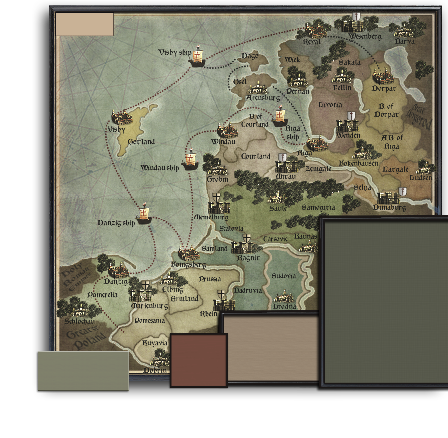
I like a blue ocean and the current set up is too graphic intensive for a nonplayable area. It totally blows out the playable map.
OK, I added some blue. I think it looks good both ways, but that blue does kick ass.
I like the "graphic intensity".

And, I think that it works exceptionally well with this map.
The cheesy powerpoint graphics effect used for Greater Poland and the other non-playable areas has got to go.
Yep, I agree. This was a last moment thing that I added before saving the file, and hitting the hay. I did not get around to polishing that up. But you can see the idea, (to differentiate from the "playable" text).
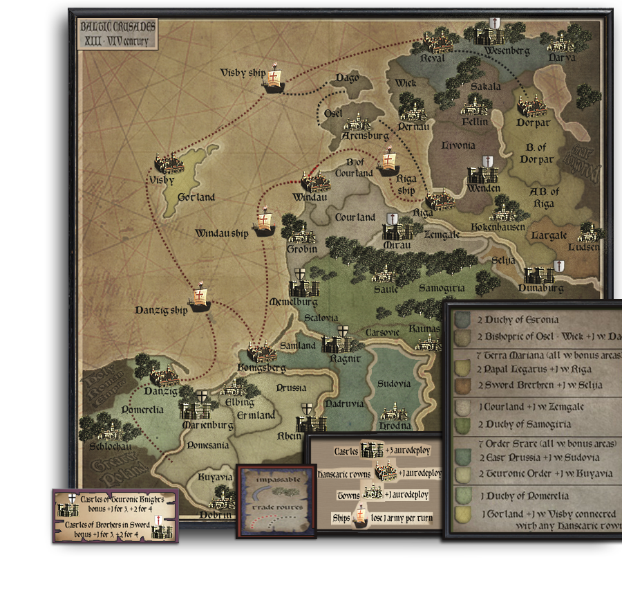
I really dislike the overlapped picture frames thing going on with the insets, ect. What's wrong with putting it all on one page?
What exactly is it that you dislike ?
There is a good reason why I chose to simulate separate "framed" pictures. It is because, well, first off, I hate insets to begin with. I feel that a map should try to have a certain amount of negative space, in the way of areas that are non-playable areas. In other words, a good map is one that does NOT cram insets into every non-playable area. You only end up with a map that is closed in, and crowded feeling.
I believe that no more than 10% of a good map should be allocated to insets. This map looks to be around 3 times the ideal 10%.
So, My idea was to give the map that needed "breathing" room. Consistently, I moved all insets to the bottom non-playable area. This allows for large swath of ocean to give the feeling of wide open space. The nautical lines helps to give interest to the area.
The reason behind the separate frames is, To help with that 30% inset problem. Having the insets on a different plain from the map is a must. It could be accomplished with big drop shadows, but I thought that the separate frames goes even a step further in creating separation from the map.
Speaking of frames, the biggest frame looks a little cheap. Perhaps a lightly patterned border is best.
The frames do need to be swapped out for better ones, but the overall theme and composition are much to my liking.