Age of Merchants - [Quenched]
Moderator: Cartographers
he's right. no continent bonuses just resources.
“In the beginning God said, the four-dimensional divergence of an antisymmetric, second rank tensor equals zero, and there was light, and it was good. And on the seventh day he rested.”- Michio Kaku
-

 DiM
DiM
- Posts: 10415
- Joined: Wed Feb 14, 2007 6:20 pm
- Location: making maps for scooby snacks


i think you should remove the names of continets as welll....They are hard to read and not really needed.
Also the bottom island there are what i think are mountains!!! Could you try something else because it looks kinda like a long blob
Apart from that map is looking very good and cant wait to play it. I also think you could have the market with a colour online...It would look nice to have just a little colour in this map
WEll done so far
[img]http://img801.imageshack.us/img801/9761/41922610151374166770386.jpg[/mg]
-

 hulmey
- Posts: 3742
- Joined: Fri Nov 03, 2006 7:33 am
- Location: Las Vegas


I can see what onbekende is saying about moving the market.
By moving the market to one of the border territories, it makes your "continent" bonus more difficult to hold. The market is the obvious target for breaking the bonus so if its on the border the bonus is more easily breached. Like if to break Africa you had to attack to congo instead of just East Africa.
I think that is why he suggests moving it.
Cheers,
Gozar
-

 Gozar
Gozar
- Posts: 2534
- Joined: Wed Jan 31, 2007 3:15 pm
- Location: Nova Scotia (G1)


Gozar wrote:I can see what onbekende is saying about moving the market.
By moving the market to one of the border territories, it makes your "continent" bonus more difficult to hold. The market is the obvious target for breaking the bonus so if its on the border the bonus is more easily breached. Like if to break Africa you had to attack to congo instead of just East Africa.
I think that is why he suggests moving it.
Cheers,
Gozar
among other things, general idea
Emperor of the Benelux
Founder of the Commonwealth of Planets
Founder and CEO of JF
Founder of the Commonwealth of Planets
Founder and CEO of JF
-

 onbekende
- Posts: 1530
- Joined: Fri Apr 14, 2006 10:19 am
- Location: Belgium


i'm leaving to a barbeque now. i'll have a look at resources and markets and i'll reposition them when i come back. keep the input flowing 
thanks for all the help.
thanks for all the help.
“In the beginning God said, the four-dimensional divergence of an antisymmetric, second rank tensor equals zero, and there was light, and it was good. And on the seventh day he rested.”- Michio Kaku
-

 DiM
DiM
- Posts: 10415
- Joined: Wed Feb 14, 2007 6:20 pm
- Location: making maps for scooby snacks


I like the idea of no continents bonuses, just resources. But the map is still confuse.
1st, why to have all those lines in the map, if ports can connect to others as teleports? Maybe you can drop the lines, or remove the ports, at least in the legend... So you could use the ports to attack the others they connect to, and still use them to connect markets, etc, for bonuses purposes.
2nd... why so many resources? Just to add appeal? Because this makes it too confuse... You have more resources than games like Pirates! Gold
Anyway, we need rethink the bonuses, or the spread can be decisive in many games... Like, +2 if you control a resource and a market on same continent? Its too much... And lets think a bit... in the south continent, if you get the second market, you will simply get doubled armies? The Pirate cove idea is also a interesting one, but will most probably give someone a good bonus from the start, again, we need think about it...

-

 Marvaddin
- Posts: 2545
- Joined: Thu Feb 09, 2006 5:06 pm
- Location: Belo Horizonte, Brazil


Marvaddin wrote:I like the idea of no continents bonuses, just resources. But the map is still confuse.
1st, why to have all those lines in the map, if ports can connect to others as teleports? Maybe you can drop the lines, or remove the ports, at least in the legend... So you could use the ports to attack the others they connect to, and still use them to connect markets, etc, for bonuses purposes.
2nd... why so many resources? Just to add appeal? Because this makes it too confuse... You have more resources than games like Pirates! Gold
Anyway, we need rethink the bonuses, or the spread can be decisive in many games... Like, +2 if you control a resource and a market on same continent? Its too much... And lets think a bit... in the south continent, if you get the second market, you will simply get doubled armies? The Pirate cove idea is also a interesting one, but will most probably give someone a good bonus from the start, again, we need think about it...
*the other routes are just to make travelling easier and to make the continents harder to hold.
*the bonuses can be halved somebody else already proposed this and i think it would be good also.
*there are more resources foe variety reasons. it gives a better feeling. i could have just put bir R's and big M's on the map to represent resources and markets but i would have gotten an artifficial feeling.
yes troop deployment in the start could give you a bonus advantage right from round one, but that's the case with every map. i've seen people hold australia or south america form the first deployment or in the recent map Chinese Checkers there was a game where someone got an entire triangle in the begining and that's 6 territories, also on the philipines map i've seen a guy that got all the naval bases from the start. things like these happen on any map but that's life some are lucky some are not. if your a good player you can deal with somebody getting an early bonus.
“In the beginning God said, the four-dimensional divergence of an antisymmetric, second rank tensor equals zero, and there was light, and it was good. And on the seventh day he rested.”- Michio Kaku
-

 DiM
DiM
- Posts: 10415
- Joined: Wed Feb 14, 2007 6:20 pm
- Location: making maps for scooby snacks


I am going to jump in and reply to what Marvaddin said with some of my thoughts.
Each continent has 2 resources, a market, a treasure and a port is my understanding. So this is balanced across the map, there are not really too many.
Getting +2 for a market and a resource on a continent is not that much, since there are no continental bonuses.
From what I understand from the key, you would need to get the market, a resource and both ports on that southern continent to get the double armies.
Maybe the key just isn't clear enough?
It looks good to me though.
-

 Gozar
Gozar
- Posts: 2534
- Joined: Wed Jan 31, 2007 3:15 pm
- Location: Nova Scotia (G1)


sorry i did not have time to do any modifications.
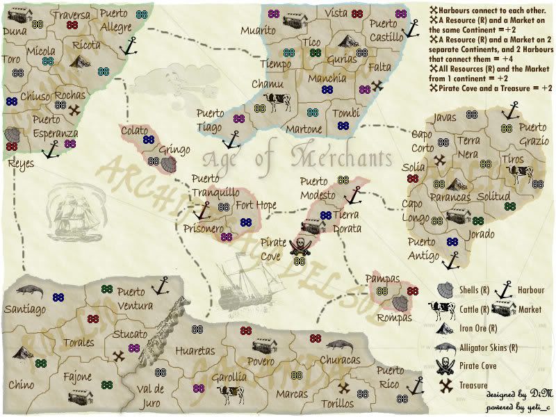
let's talk about the territories and their strategical value.
here is the current state of the continents and their important territories
Chugata Island (top left)
Market (Duna) - 1 terit distance from border
Iron Ore (R) (Ricota) - it's a border territory so hard to hold
Shells (R) (Reyes) - it's a border territory so hard to hold
Treasure (Rochas) - it's near 2 borders
Trezo Island (top center)
Market (Muarito) - it's near 1 border
Iron Ore (R) (Gurias) - it's near 1 border
Cattle (R) (Chamu) - it's near 2 borders
Treasure (Falta) - it's near 2 borders
Arlina Island (center right)
Market (Jorado) - it's near 2 borders
Iron Ore (R) (Parancas) - it's near 2 borders
Cattle (R) (Tiros) - it's near 1 border
Treasure (Capo Corto) - it's a border territory
Archipelago del Sol (center islands group)
Market (Tierra Dorata) - it's near 1 border
Shells (R) (Rompas) - it's near 1 border
Shells (R) (Gringo) - it's near 2 borders
Pirate Cove - 1 terit distance from border
Rollio (bottom left)
Market (Fajone) - it's a border territory
Iron Ore (R) (Chino) - it's near 2 borders
Alligator Skins (R) (Santiago) - it's a border territory
Treasure (Stucato) - it's a border territory
Garanda (bottom right)
Market (Povero) - it's near 2 borders
Alligator Skins (R) (Churacas) - it's a border territory
Treasure (Torillos) - it's near 2 borders
Cattle (R) (Garollia) - it's near 2 borders
here's the image.

“In the beginning God said, the four-dimensional divergence of an antisymmetric, second rank tensor equals zero, and there was light, and it was good. And on the seventh day he rested.”- Michio Kaku
-

 DiM
DiM
- Posts: 10415
- Joined: Wed Feb 14, 2007 6:20 pm
- Location: making maps for scooby snacks


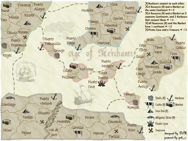
here are some changes:
* modified route from Puerto Allegre to Muarito (instead of Tiempo).
* moved Market from Fajone to Chino (bottom left)
* moved Iron Ore from Chino to Torales
* extended inpassable mountains and now Stucato is no longer a Border territory
* deleted Puerto Tranquillo to Huaretas Route
* moved Market from Povero to Huaretas (bottom right)
* removed puerto modesto to Capo Longo route
* moved colato to puerto tranquillo and vice versa (center archipelago)
* moved the market from Tierra Dorata to the new Colato. (center archipelago)
* modified route from Santiago to Puerto Esperanza (instead of Reyes)
* moved market from Jorado to Solitud (center right)
* modified route from Capo Corto to Puerto Modesto (instead of Tombi)
* moved market from Muarito to Manchia (top central)
* moved iron ore from Gurias to Muarito (top central)
now each continent has 3 borders instead of 4 and the rearrangement of resources and markets should balance the gameplay.
suggestions?

“In the beginning God said, the four-dimensional divergence of an antisymmetric, second rank tensor equals zero, and there was light, and it was good. And on the seventh day he rested.”- Michio Kaku
-

 DiM
DiM
- Posts: 10415
- Joined: Wed Feb 14, 2007 6:20 pm
- Location: making maps for scooby snacks


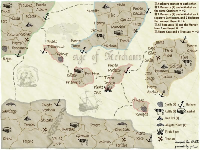
maybe because it's as bright as the resources icons?
should i make it blend with the background?
should i make it blend with the background?
“In the beginning God said, the four-dimensional divergence of an antisymmetric, second rank tensor equals zero, and there was light, and it was good. And on the seventh day he rested.”- Michio Kaku
-

 DiM
DiM
- Posts: 10415
- Joined: Wed Feb 14, 2007 6:20 pm
- Location: making maps for scooby snacks


here you go:

“In the beginning God said, the four-dimensional divergence of an antisymmetric, second rank tensor equals zero, and there was light, and it was good. And on the seventh day he rested.”- Michio Kaku
-

 DiM
DiM
- Posts: 10415
- Joined: Wed Feb 14, 2007 6:20 pm
- Location: making maps for scooby snacks


ok guys bring it on 
more feedback needed.
more feedback needed.

“In the beginning God said, the four-dimensional divergence of an antisymmetric, second rank tensor equals zero, and there was light, and it was good. And on the seventh day he rested.”- Michio Kaku
-

 DiM
DiM
- Posts: 10415
- Joined: Wed Feb 14, 2007 6:20 pm
- Location: making maps for scooby snacks


yep i like the darker older aspect but people demanded it to be lighter and lighter until i got to the current image.
“In the beginning God said, the four-dimensional divergence of an antisymmetric, second rank tensor equals zero, and there was light, and it was good. And on the seventh day he rested.”- Michio Kaku
-

 DiM
DiM
- Posts: 10415
- Joined: Wed Feb 14, 2007 6:20 pm
- Location: making maps for scooby snacks


I would like to see the continent colors a little bit thicker, as they seem awfully pale and hard to see on certain monitors... Not mine, mind you, but I'm sure people with older, faded CRTs might be screwed...
virus90 wrote: I think Anarkist is a valuable asset to any game.
-

 Anarkistsdream
- Posts: 7567
- Joined: Wed Jan 10, 2007 11:57 am


ok. i got 2 more feedbaks, if there are others that wish these changes (darker older image and thicker continent outlines) i'll implement them
“In the beginning God said, the four-dimensional divergence of an antisymmetric, second rank tensor equals zero, and there was light, and it was good. And on the seventh day he rested.”- Michio Kaku
-

 DiM
DiM
- Posts: 10415
- Joined: Wed Feb 14, 2007 6:20 pm
- Location: making maps for scooby snacks


Who is online
Users browsing this forum: No registered users


