Conquer Club

Age of Merchants - [Quenched]

Care to peruse completed maps? Take a stroll through the Atlas.

Moderator: Cartographers

Forum rules
Please read the Community Guidelines before posting.

Postby yeti_c on Fri Mar 16, 2007 4:26 pm

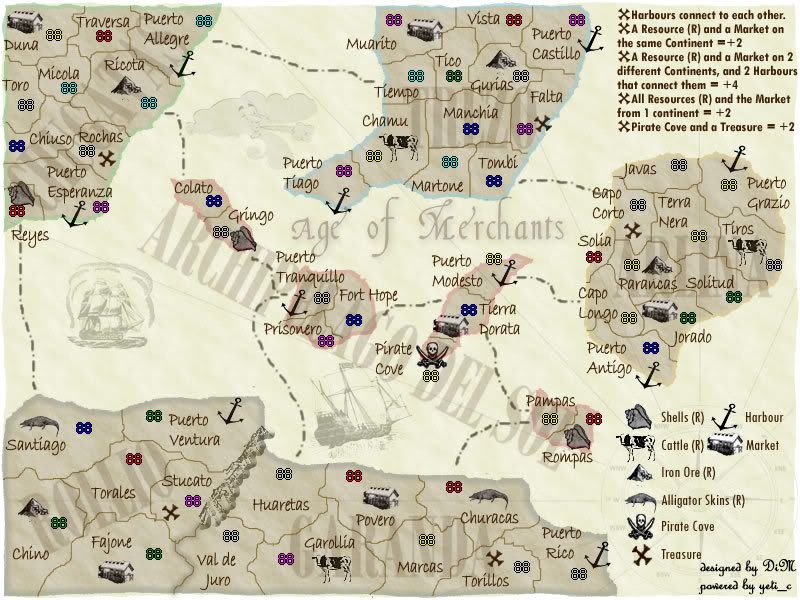
fluffybunnykins wrote:the pinkness has gone, but so has the whiteness! the cows are disappearing! Also, I was meaning lighter than the ground colour, for the island names, rather than lighter than the words themselves!
DiM, you're not only doing a fine job with the visuals & concept, but also managing to implement ideas from the forum with icredible speed... smart!


I concur - your turn around is pretty swift...

I'm starting to look forward to this map now - the excitement is building as the map gets more and more refined.

Needless to say there will be detractors to this map as people won't understand the concept but I for one am really loving it.

C.
Image
Highest score : 2297
User avatar
Lieutenant yeti_c
 
Posts: 9624
Joined: Thu Jan 04, 2007 9:02 am

Postby DiM on Fri Mar 16, 2007 4:30 pm

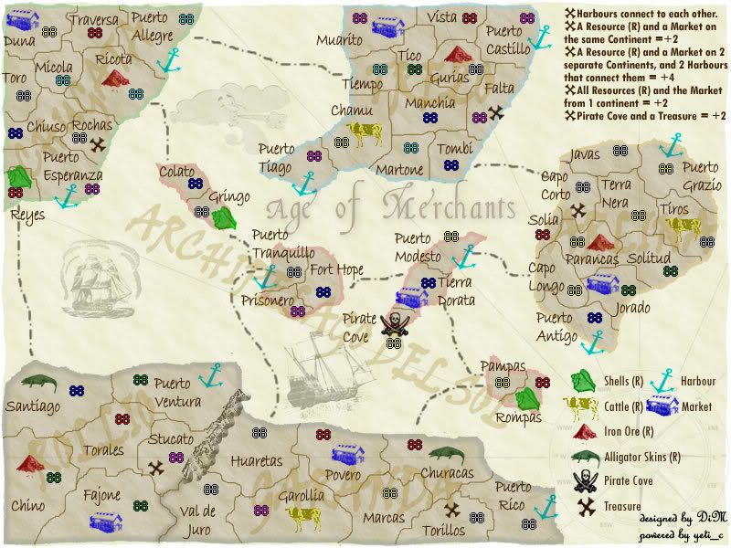
here is a more visible cow:


Image
“In the beginning God said, the four-dimensional divergence of an antisymmetric, second rank tensor equals zero, and there was light, and it was good. And on the seventh day he rested.”- Michio Kaku
User avatar
Major DiM
 
Posts: 10415
Joined: Wed Feb 14, 2007 6:20 pm
Location: making maps for scooby snacks

Postby DiM on Fri Mar 16, 2007 4:37 pm

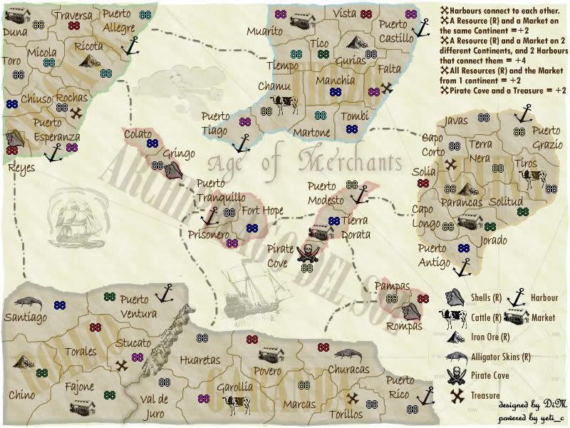
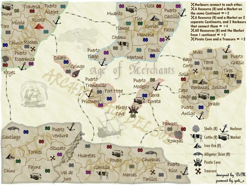
is this text ok? i left the one in the middle for comparison.

also in the previous image i removed the white from the cows and made it a bit more yellow-brownish to fit with the map, but they should be very visible.

edit// i did the same blending to the market also.

Image
“In the beginning God said, the four-dimensional divergence of an antisymmetric, second rank tensor equals zero, and there was light, and it was good. And on the seventh day he rested.”- Michio Kaku
User avatar
Major DiM
 
Posts: 10415
Joined: Wed Feb 14, 2007 6:20 pm
Location: making maps for scooby snacks

Postby yeti_c on Fri Mar 16, 2007 4:55 pm

DiM wrote:is this text ok? i left the one in the middle for comparison.

also in the previous image i removed the white from the cows and made it a bit more yellow-brownish to fit with the map, but they should be very visible.

edit// i did the same blending to the market also.

Image


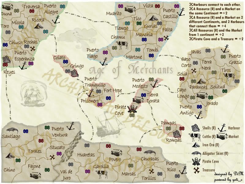
Like the colour - preferred the scripty font you used earlier - less modern looking.

C.
Image
Highest score : 2297
User avatar
Lieutenant yeti_c
 
Posts: 9624
Joined: Thu Jan 04, 2007 9:02 am

Postby DiM on Fri Mar 16, 2007 5:05 pm

here you go.
Image
“In the beginning God said, the four-dimensional divergence of an antisymmetric, second rank tensor equals zero, and there was light, and it was good. And on the seventh day he rested.”- Michio Kaku
User avatar
Major DiM
 
Posts: 10415
Joined: Wed Feb 14, 2007 6:20 pm
Location: making maps for scooby snacks

Postby AndyDufresne on Fri Mar 16, 2007 6:37 pm

Which version is better? (see them on page 10)

version A
25% [ 3 ]
Version B
75% [ 9 ]

Total Votes : 12


--Andy
User avatar
Corporal 1st Class AndyDufresne
 
Posts: 24935
Joined: Fri Mar 03, 2006 8:22 pm
Location: A Banana Palm in Zihuatanejo

Postby hulmey on Fri Mar 16, 2007 7:52 pm

its coming along nicely.....Ithink you should still have the colours around the icons!!!

Also maybe instead of a cross for the tresure you could have a treasure box!!!!
[img]http://img801.imageshack.us/img801/9761/41922610151374166770386.jpg[/mg]
User avatar
Lieutenant hulmey
 
Posts: 3742
Joined: Fri Nov 03, 2006 7:33 am
Location: Las Vegas

Postby Molacole on Fri Mar 16, 2007 8:10 pm

I like this one the best so far.

Image

If you transfer what the legend looks like onto the map I think it would look a lot better than bold black markets and such.
User avatar
Lieutenant Molacole
 
Posts: 552
Joined: Fri Jun 23, 2006 8:19 am
Location: W 2.0 map by ZIM

Postby DiM on Sat Mar 17, 2007 4:21 am

hulmey wrote:its coming along nicely.....Ithink you should still have the colours around the icons!!!

Also maybe instead of a cross for the tresure you could have a treasure box!!!!


there was a poll and most people chose no colours istead of colours around the icons. so i don't think that's going to change.

and sorry but the cross stays. X marks the spot baby :P
“In the beginning God said, the four-dimensional divergence of an antisymmetric, second rank tensor equals zero, and there was light, and it was good. And on the seventh day he rested.”- Michio Kaku
User avatar
Major DiM
 
Posts: 10415
Joined: Wed Feb 14, 2007 6:20 pm
Location: making maps for scooby snacks

Postby DiM on Sat Mar 17, 2007 4:22 am

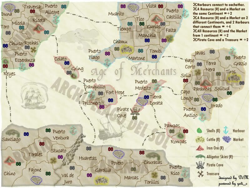
here is for you molacole:
Image

but i still prefer this one. the icons are very clear and they are very readable. if you put too many colours (like above) the map sort of loses the feeling.


Image
“In the beginning God said, the four-dimensional divergence of an antisymmetric, second rank tensor equals zero, and there was light, and it was good. And on the seventh day he rested.”- Michio Kaku
User avatar
Major DiM
 
Posts: 10415
Joined: Wed Feb 14, 2007 6:20 pm
Location: making maps for scooby snacks

Postby Captain Crash on Sat Mar 17, 2007 4:34 am

Couple of questions:

1) Seeing as one does not get bonuses for continents...what's with the brown unreadable text running across the continents? I say get rid of it, it is distracting.
2) I think you need to re-think the bonuses for resources and continents. At the moment:
- "A resource and a market on the same continent = +2"
and
- "All resources and the market from 1 continent = +2"
Same bonus!

How about:
- "A market and resources on the same continent = +1 per resource"
So
- 1 resource and 1 market = +1
- 3 resources and 1 market = +3

Holding the extra market(s) on a continent should not gain you anything...more of a means of stopping others from gaining a bonus.

I prefer the map without so much color, but I do like that a colored market stands out more, and as they seem to be the main event of this map that would probably be a good thing.

Cheers
8)
Image

Image
User avatar
Private Captain Crash
 
Posts: 252
Joined: Thu Feb 01, 2007 7:06 pm
Location: Melbourne

Postby DiM on Sat Mar 17, 2007 4:44 am

Captain Crash wrote:Couple of questions:

1) Seeing as one does not get bonuses for continents...what's with the brown unreadable text running across the continents? I say get rid of it, it is distracting.


that brown text is the name of the continents. people requested it so i put it, plus it shows clearly which are the continents


Captain Crash wrote:2) I think you need to re-think the bonuses for resources and continents. At the moment:
- "A resource and a market on the same continent = +2"
and
- "All resources and the market from 1 continent = +2"
Same bonus!

How about:
- "A market and resources on the same continent = +1 per resource"
So
- 1 resource and 1 market = +1
- 3 resources and 1 market = +3


actually each continent has 2 res and one market. if you get 1 R and 1M on the same continent you get +2 if you also get the second R you get another +2 for taking that res to the market and another +2 for holding a monopol on that continent. the bonuses and the conections are ok right now. the only thing that might change is the army quantity. maybe halved.

Captain Crash wrote:Holding the extra market(s) on a continent should not gain you anything...more of a means of stopping others from gaining a bonus.


there are no extra markets on a continent. there's only one market / continent

Captain Crash wrote:I prefer the map without so much color, but I do like that a colored market stands out more, and as they seem to be the main event of this map that would probably be a good thing.

Cheers
8)


i too prefer the colourless icons, and the market is not the main thing. actually the resources are.
“In the beginning God said, the four-dimensional divergence of an antisymmetric, second rank tensor equals zero, and there was light, and it was good. And on the seventh day he rested.”- Michio Kaku
User avatar
Major DiM
 
Posts: 10415
Joined: Wed Feb 14, 2007 6:20 pm
Location: making maps for scooby snacks

Postby JCRuffino on Sat Mar 17, 2007 9:48 am

yeti_c wrote:
fluffybunnykins wrote:DiM, you're not only doing a fine job with the visuals & concept, but also managing to implement ideas from the forum with icredible speed... smart!


I concur - your turn around is pretty swift...


I agree, just mention a change and an hour later BAM, it's done. I'm really liking the new stuff, and I'm glad everyone saw sense and voted for no colour on the icons.

I do think the continent names are distracting and hard to read, as you've coloured the continent outlines I don't see what purpose the names serve.

yeti_c wrote:I'm starting to look forward to this map now - the excitement is building as the map gets more and more refined.


Same here, I reckon me you and DiM should have a 3 player game when this is up and running.
Corporal JCRuffino
 
Posts: 29
Joined: Mon Jan 22, 2007 2:51 pm

Postby DiM on Sat Mar 17, 2007 10:12 am

the island names can be removed. it's easy.
i see some people are still not satisfied with the graphics and gameplay. i kindly ask them to post here and tell me what disturbs them. i can't make the map better without suggestions because i don't know what you guys want. any suggestion is welcome and i'll make the modifications asap. :D
“In the beginning God said, the four-dimensional divergence of an antisymmetric, second rank tensor equals zero, and there was light, and it was good. And on the seventh day he rested.”- Michio Kaku
User avatar
Major DiM
 
Posts: 10415
Joined: Wed Feb 14, 2007 6:20 pm
Location: making maps for scooby snacks

Postby onbekende on Sat Mar 17, 2007 10:17 am

seeing people want me to give advice

I give advice on map with no colours to resources. I like that one

first, get something else for Shells, perhaps even the icon used by Shell (company, think something like that is better)

Top left island:
Make route from Rochas to Colato
Switch Market with Iron Ore

Top island:
good

Left Island:
Iron Ore to Terra Nera
Delete way from Cape Longo to Puerto Modesto
make route from Puerto Antigo to Rompas

Buttom Island:
Change Treasude to Val de Juro
Close Val de Juro <=> Stucato

Islands in the middle:
note the changes in other parts


resource system is nice, but some resources are more abundant then others, perhaps delete the Iron Ore is Chino totally.


Rest is extreme good, grats
Emperor of the Benelux
Founder of the Commonwealth of Planets
Founder and CEO of JF
User avatar
Captain onbekende
 
Posts: 1530
Joined: Fri Apr 14, 2006 10:19 am
Location: Belgium

Postby JCRuffino on Sat Mar 17, 2007 10:44 am

Agree with trying out different shell icons actually.
Corporal JCRuffino
 
Posts: 29
Joined: Mon Jan 22, 2007 2:51 pm

Postby DiM on Sat Mar 17, 2007 10:48 am

onbekende wrote:seeing people want me to give advice

I give advice on map with no colours to resources. I like that one


yeah. me too.

onbekende wrote:first, get something else for Shells, perhaps even the icon used by Shell (company, think something like that is better)


i already swithced the shell to a more clear one but if more people agree to this i'll take the shell shell :P

onbekende wrote:Top left island:
Make route from Rochas to Colato
Switch Market with Iron Ore


why? i can easily do this but i want a reason.

onbekende wrote:Top island:
good


i'm glad

onbekende wrote:Left Island:
Iron Ore to Terra Nera
Delete way from Cape Longo to Puerto Modesto
make route from Puerto Antigo to Rompas


again why move the resource?
i won't do this route modification because at this moment all continents have 4 borders. if i do what you say Arlina Island will have just 3 borders while Archipelago del Sol will have 5. not good.

onbekende wrote:Buttom Island:
Change Treasude to Val de Juro
Close Val de Juro <=> Stucato


why move the treasure. i can do it but again i need a reason.
i won't close that border. see above explanations.

onbekende wrote:Islands in the middle:
note the changes in other parts


noted and answered above

onbekende wrote:resource system is nice, but some resources are more abundant then others, perhaps delete the Iron Ore is Chino totally.


it really does not matter that i have more iron mines than alligator skins. the resources are all the same regarding the importance.
and i won't delete the iron ore in Chino because each continent has 2 resources and a market to balance gameplay.

onbekende wrote:Rest is extreme good, grats


thanks.
“In the beginning God said, the four-dimensional divergence of an antisymmetric, second rank tensor equals zero, and there was light, and it was good. And on the seventh day he rested.”- Michio Kaku
User avatar
Major DiM
 
Posts: 10415
Joined: Wed Feb 14, 2007 6:20 pm
Location: making maps for scooby snacks

Postby DiM on Sat Mar 17, 2007 11:09 am

here are 4 more types of shells.

which one is better?
1. the old one
2. the one in the legend
3. Rompas
4. Gringo
5. Reyes

i like the ones in Gringo and Rompas

Image
“In the beginning God said, the four-dimensional divergence of an antisymmetric, second rank tensor equals zero, and there was light, and it was good. And on the seventh day he rested.”- Michio Kaku
User avatar
Major DiM
 
Posts: 10415
Joined: Wed Feb 14, 2007 6:20 pm
Location: making maps for scooby snacks

Postby bedplay on Sat Mar 17, 2007 11:28 am

I have to say, I wouldn't play this map nor do i like the idea of this map.

New gameplay, I do like, but If I have to sepnd 5 minutes every go checking who has what bonuses I won't be bothered to play it....
"It is fatal to enter any war without the will to win it."
- General Douglas MacArthur
User avatar
Private 1st Class bedplay
 
Posts: 171
Joined: Fri Jan 19, 2007 2:00 pm

Postby DiM on Sat Mar 17, 2007 11:30 am

bedplay wrote:I have to say, I wouldn't play this map nor do i like the idea of this map.

New gameplay, I do like, but If I have to sepnd 5 minutes every go checking who has what bonuses I won't be bothered to play it....


what's so hard? you see red has 2 resources and a market, BAM conquer his market and he's butt naked :)
“In the beginning God said, the four-dimensional divergence of an antisymmetric, second rank tensor equals zero, and there was light, and it was good. And on the seventh day he rested.”- Michio Kaku
User avatar
Major DiM
 
Posts: 10415
Joined: Wed Feb 14, 2007 6:20 pm
Location: making maps for scooby snacks

Postby Gozar on Sat Mar 17, 2007 11:39 am

Go with the Rompas shell.
User avatar
Lieutenant Gozar
 
Posts: 2534
Joined: Wed Jan 31, 2007 3:15 pm
Location: Nova Scotia (G1)

Postby JCRuffino on Sat Mar 17, 2007 11:39 am

I prefer the shell in Rompas, but a little smaller perhaps.
Corporal JCRuffino
 
Posts: 29
Joined: Mon Jan 22, 2007 2:51 pm

Postby DiM on Sat Mar 17, 2007 11:42 am

ok. in the next update there will be only rompas shells (a little smaller) :)

i won't put a picture yet. i'll wait for other things to implement.

i'll wait for more feedback.
“In the beginning God said, the four-dimensional divergence of an antisymmetric, second rank tensor equals zero, and there was light, and it was good. And on the seventh day he rested.”- Michio Kaku
User avatar
Major DiM
 
Posts: 10415
Joined: Wed Feb 14, 2007 6:20 pm
Location: making maps for scooby snacks

Postby onbekende on Sat Mar 17, 2007 11:52 am

ROMPAS

some changes in where the resources are should make some of them harder to fight over, or just a bit harder to control
Emperor of the Benelux
Founder of the Commonwealth of Planets
Founder and CEO of JF
User avatar
Captain onbekende
 
Posts: 1530
Joined: Fri Apr 14, 2006 10:19 am
Location: Belgium

Postby GreecePwns on Sat Mar 17, 2007 12:44 pm

ok i didn't take the time to read the entire thread so will there be continent bonuses?
Chariot of Fire wrote:As for GreecePwns.....yeah, what? A massive debt. Get a job you slacker.

Viceroy wrote:[The Biblical creation story] was written in a time when there was no way to confirm this fact and is in fact a statement of the facts.
User avatar
Corporal GreecePwns
 
Posts: 2656
Joined: Tue Feb 20, 2007 7:19 pm
Location: Lawn Guy Lint

PreviousNext

Return to The Atlas

Who is online

Users browsing this forum: No registered users

cron