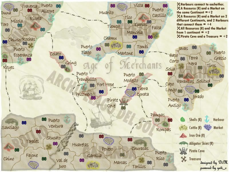
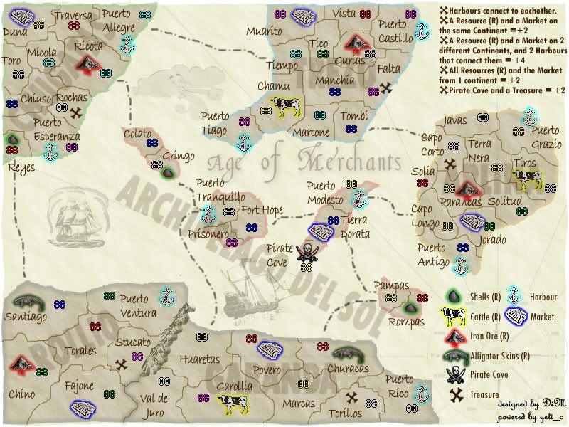
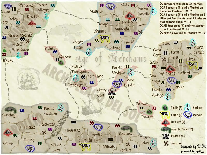
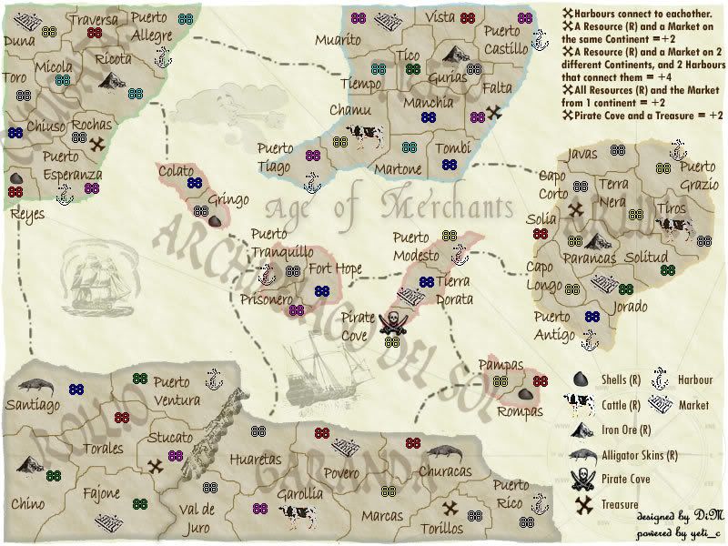
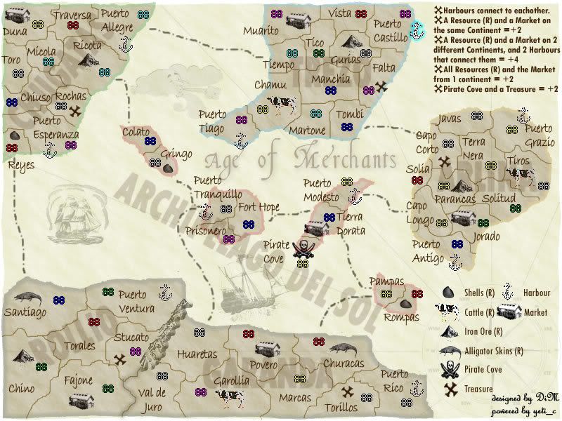
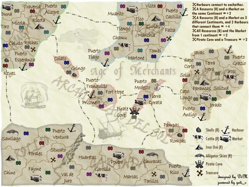
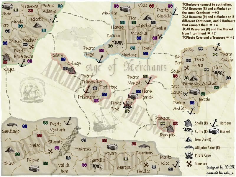
DiM wrote:Molacole wrote:Dim have you tried making the whole territory of each resource shaded? If you use really light colors and blend it from light to lighter it might look better than just the outline you've got now
i thought of doing that but after looking at various old maps i never saw this done. they either had outlines on the territories (like i have on the continents) or they had outlines on the important stuff (like i have on the resources) or they had no outlines (the way i really like it). and i only want to use one of these three options.
The way the map is now doesn't really work for me. You kind of have to search for each of the resources and such because they don't stand out enough. It seems like it might be easy to accidentally over look something that normally you wouldn't have, if each bonus spot was blatantly marked.
As far as ease of playability goes, I'm all for the verion with highlighted resources and such. In terms of looks, I much more prefer just the outlines. What if you made the actual market itself blue instead? Or again, if you could pull of making the whole terrirtory a different color, but I think that would be very tricky to get just right.


