South Africa 1885
Moderator: Cartographers
Re: S Africa 1885 - Another update p. 23 10/8
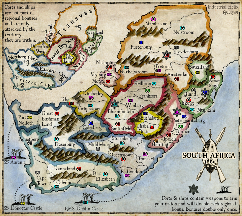
OK, here's with straight lines. I thought I'd try it on for size.
Sketchblog [Update 07/25/11]: http://indyhelixsketch.blogspot.com/
Living in Japan [Update 07/17/11]: http://mirrorcountryih.blogspot.com/
Russian Revolution map for ConquerClub [07/20/11]: viewtopic.php?f=241&t=116575
Living in Japan [Update 07/17/11]: http://mirrorcountryih.blogspot.com/
Russian Revolution map for ConquerClub [07/20/11]: viewtopic.php?f=241&t=116575
-

 Industrial Helix
- Posts: 3462
- Joined: Mon Jul 14, 2008 6:49 pm
- Location: Ohio


Re: S Africa 1885 - Another update p. 23 10/8
please keep them curved. It rocked that way.
incredible btw man.
incredible btw man.
Maps Maps Maps!
Take part in this survey and possibly win an upgrade -->
https://docs.google.com/spreadsheet/embeddedform?formkey=dGg4a0VxUzJLb1NGNUFwZHBuOHRFZnc6MQ
Take part in this survey and possibly win an upgrade -->
https://docs.google.com/spreadsheet/embeddedform?formkey=dGg4a0VxUzJLb1NGNUFwZHBuOHRFZnc6MQ
-

 army of nobunaga
- Posts: 1989
- Joined: Sat Oct 13, 2007 10:06 pm
- Location: www.facebook.com/armyofnobu and Houston.


Re: S Africa 1885 - Another update p. 23 10/8
Either way is fine. I do prefer straight though.
-

 The Bison King
- Posts: 1957
- Joined: Thu Aug 27, 2009 5:06 pm
- Location: the Mid-Westeros


Re: S Africa 1885 - Another update p. 23 10/8
one more point man... I dont know how it will play... but this will graphically be one of my favorite maps.
Maps Maps Maps!
Take part in this survey and possibly win an upgrade -->
https://docs.google.com/spreadsheet/embeddedform?formkey=dGg4a0VxUzJLb1NGNUFwZHBuOHRFZnc6MQ
Take part in this survey and possibly win an upgrade -->
https://docs.google.com/spreadsheet/embeddedform?formkey=dGg4a0VxUzJLb1NGNUFwZHBuOHRFZnc6MQ
-

 army of nobunaga
- Posts: 1989
- Joined: Sat Oct 13, 2007 10:06 pm
- Location: www.facebook.com/armyofnobu and Houston.


Re: S Africa 1885 - Another update p. 23 10/8
One more vote for the border and against the lat/long lines. (I think when I first heard mention of lat/long with the border, I was thinking of the black and white checker effect, not lines on the map itself.)
-

 ender516
- Posts: 4455
- Joined: Wed Dec 17, 2008 6:07 pm
- Location: Waterloo, Ontario


Re: S Africa 1885 - Another update p. 23 10/8
yeah the border looks damn nice... I forgot to mention that. And Ender is right, no lines would look great too.
Maps Maps Maps!
Take part in this survey and possibly win an upgrade -->
https://docs.google.com/spreadsheet/embeddedform?formkey=dGg4a0VxUzJLb1NGNUFwZHBuOHRFZnc6MQ
Take part in this survey and possibly win an upgrade -->
https://docs.google.com/spreadsheet/embeddedform?formkey=dGg4a0VxUzJLb1NGNUFwZHBuOHRFZnc6MQ
-

 army of nobunaga
- Posts: 1989
- Joined: Sat Oct 13, 2007 10:06 pm
- Location: www.facebook.com/armyofnobu and Houston.


Re: S Africa 1885 - Another update p. 23 10/8
Yeah I think I am jumping onto the same ship. The lines don't really add much It'd be best just to do away with them
-

 The Bison King
- Posts: 1957
- Joined: Thu Aug 27, 2009 5:06 pm
- Location: the Mid-Westeros


Re: S Africa 1885 - Another update p. 23 10/8
Beckytheblondie: "Don't give us the dispatch, give us a mustache ride."
Scaling back on my CC involvement...
Scaling back on my CC involvement...
-

 Victor Sullivan
- Posts: 6010
- Joined: Mon Feb 08, 2010 8:17 pm
- Location: Columbus, OH


Re: S Africa 1885 - Another update p. 23 10/8
I like the lines, and curved, as I am well aware of the curvature of the Earth. But I can live without them, up to you Helix.


-

 RedBaron0
- Posts: 2657
- Joined: Sun Aug 19, 2007 12:59 pm
- Location: Pennsylvania


Re: S Africa 1885 - Another update p. 23 10/8
Ditch the lines. Kepp the border, but try it with a lighter shade of the sandy color in the map. I really think it will frame the picture better. It will help the border to jump to the background, and allow the map to be pushed forward. You can still dirty up the edges of it though.

-

 porkenbeans
- Posts: 2546
- Joined: Mon Sep 10, 2007 4:06 pm


Re: S Africa 1885 - Another update p. 23 10/8
Wow... thanks everyone for the speedy replies. Here's without lines and with Pork's suggestion of lighter tan tones in the checkered border.
Sketchblog [Update 07/25/11]: http://indyhelixsketch.blogspot.com/
Living in Japan [Update 07/17/11]: http://mirrorcountryih.blogspot.com/
Russian Revolution map for ConquerClub [07/20/11]: viewtopic.php?f=241&t=116575
Living in Japan [Update 07/17/11]: http://mirrorcountryih.blogspot.com/
Russian Revolution map for ConquerClub [07/20/11]: viewtopic.php?f=241&t=116575
-

 Industrial Helix
- Posts: 3462
- Joined: Mon Jul 14, 2008 6:49 pm
- Location: Ohio


Re: S Africa 1885 - Another update p. 25 10/11
I'd say you've struck gold!
-

 The Bison King
- Posts: 1957
- Joined: Thu Aug 27, 2009 5:06 pm
- Location: the Mid-Westeros


Re: S Africa 1885 - Another update p. 25 10/11
I have to apologize IH, as I cannot find anything wrong with this draft 
Beckytheblondie: "Don't give us the dispatch, give us a mustache ride."
Scaling back on my CC involvement...
Scaling back on my CC involvement...
-

 Victor Sullivan
- Posts: 6010
- Joined: Mon Feb 08, 2010 8:17 pm
- Location: Columbus, OH


Re: S Africa 1885 - Another update p. 25 10/11
With the border a lighter shade, it does not stand out so much. And, the map is the main focus.
Last edited by porkenbeans on Mon Oct 11, 2010 3:45 pm, edited 1 time in total.

-

 porkenbeans
- Posts: 2546
- Joined: Mon Sep 10, 2007 4:06 pm


Re: S Africa 1885 - Another update p. 25 10/11
I'm afraid I don't understand, pork.
Beckytheblondie: "Don't give us the dispatch, give us a mustache ride."
Scaling back on my CC involvement...
Scaling back on my CC involvement...
-

 Victor Sullivan
- Posts: 6010
- Joined: Mon Feb 08, 2010 8:17 pm
- Location: Columbus, OH


Re: S Africa 1885 - Another update p. 25 10/11
The highest % of the map is of a light shade. The dark colors used for the borders of the territs contrast all of that lightness, and helps them to "stand out".Victor Sullivan wrote:I'm afraid I don't understand, pork.
So my feelings are, that the map, and not the border, should be what stands out. The border should be sent back into the background a bit, so that the map can take the center stage.
Also, the whole thing looks more real. Notice the outside of the border just looks like other (unpainted) areas of the map.

-

 porkenbeans
- Posts: 2546
- Joined: Mon Sep 10, 2007 4:06 pm


Re: S Africa 1885 - Another update p. 25 10/11
porkenbeans wrote:The highest % of the map is of a light shade. The dark colors used for the borders of the territs contrast all of that lightness, and helps them to "stand out".Victor Sullivan wrote:I'm afraid I don't understand, pork.
So my feelings are, that the map, and not the border, should be what stands out. The border should be sent back into the background a bit, so that the map can take the center stage.
Also, the whole thing looks more real. Notice the outside of the border just looks like other (unpainted) areas of the map.
(I actually posted that before your comment. I guess I fastposted you
Beckytheblondie: "Don't give us the dispatch, give us a mustache ride."
Scaling back on my CC involvement...
Scaling back on my CC involvement...
-

 Victor Sullivan
- Posts: 6010
- Joined: Mon Feb 08, 2010 8:17 pm
- Location: Columbus, OH


Re: S Africa 1885 - Another update p. 25 10/11
I do not know what this means.Victor Sullivan wrote:porkenbeans wrote:The highest % of the map is of a light shade. The dark colors used for the borders of the territs contrast all of that lightness, and helps them to "stand out".Victor Sullivan wrote:I'm afraid I don't understand, pork.
So my feelings are, that the map, and not the border, should be what stands out. The border should be sent back into the background a bit, so that the map can take the center stage.
Also, the whole thing looks more real. Notice the outside of the border just looks like other (unpainted) areas of the map.
(I actually posted that before your comment. I guess I fastposted you) I think the borders are fantastic as is and to dull them down would make it more difficult to distinguish them than necessary.

-

 porkenbeans
- Posts: 2546
- Joined: Mon Sep 10, 2007 4:06 pm


Re: S Africa 1885 - Another update p. 25 10/11
porkenbeans wrote:I do not know what this means.Victor Sullivan wrote:porkenbeans wrote:The highest % of the map is of a light shade. The dark colors used for the borders of the territs contrast all of that lightness, and helps them to "stand out".Victor Sullivan wrote:I'm afraid I don't understand, pork.
So my feelings are, that the map, and not the border, should be what stands out. The border should be sent back into the background a bit, so that the map can take the center stage.
Also, the whole thing looks more real. Notice the outside of the border just looks like other (unpainted) areas of the map.
(I actually posted that before your comment. I guess I fastposted you) I think the borders are fantastic as is and to dull them down would make it more difficult to distinguish them than necessary.
It means that I think if the borders were more set in the background, it would make them unnecessarily harder to see.
Beckytheblondie: "Don't give us the dispatch, give us a mustache ride."
Scaling back on my CC involvement...
Scaling back on my CC involvement...
-

 Victor Sullivan
- Posts: 6010
- Joined: Mon Feb 08, 2010 8:17 pm
- Location: Columbus, OH


Re: S Africa 1885 - Another update p. 25 10/11
Ah, ha, I think that we are talking about two different things. i have not suggested that anything be done with the territ borders. My suggestion was to the outside border of the map.Victor Sullivan wrote:porkenbeans wrote:I do not know what this means.Victor Sullivan wrote:porkenbeans wrote:The highest % of the map is of a light shade. The dark colors used for the borders of the territs contrast all of that lightness, and helps them to "stand out".Victor Sullivan wrote:I'm afraid I don't understand, pork.
So my feelings are, that the map, and not the border, should be what stands out. The border should be sent back into the background a bit, so that the map can take the center stage.
Also, the whole thing looks more real. Notice the outside of the border just looks like other (unpainted) areas of the map.
(I actually posted that before your comment. I guess I fastposted you) I think the borders are fantastic as is and to dull them down would make it more difficult to distinguish them than necessary.
It means that I think if the borders were more set in the background, it would make them unnecessarily harder to see.

-

 porkenbeans
- Posts: 2546
- Joined: Mon Sep 10, 2007 4:06 pm


Re: S Africa 1885 - Another update p. 25 10/11
porkenbeans wrote:Ah, ha, I think that we are talking about two different things. i have not suggested that anything be done with the territ borders. My suggestion was to the outside border of the map.Victor Sullivan wrote:porkenbeans wrote:I do not know what this means.Victor Sullivan wrote:porkenbeans wrote:The highest % of the map is of a light shade. The dark colors used for the borders of the territs contrast all of that lightness, and helps them to "stand out".
So my feelings are, that the map, and not the border, should be what stands out. The border should be sent back into the background a bit, so that the map can take the center stage.
Also, the whole thing looks more real. Notice the outside of the border just looks like other (unpainted) areas of the map.
(I actually posted that before your comment. I guess I fastposted you) I think the borders are fantastic as is and to dull them down would make it more difficult to distinguish them than necessary.
It means that I think if the borders were more set in the background, it would make them unnecessarily harder to see.
Gotcha
Beckytheblondie: "Don't give us the dispatch, give us a mustache ride."
Scaling back on my CC involvement...
Scaling back on my CC involvement...
-

 Victor Sullivan
- Posts: 6010
- Joined: Mon Feb 08, 2010 8:17 pm
- Location: Columbus, OH


Re: S Africa 1885 - Another update p. 25 10/11
Ok, Nobodies told me he wanted to see some touch ups on the northern mountains and touch up I did... I'm not sure if it fits the bill but it seems to look like the mountains are more alike now. Not sure. Thoughts? Hopefully this will be the last of the graphics nitpicks before we finally get to play this ole boy.
Sketchblog [Update 07/25/11]: http://indyhelixsketch.blogspot.com/
Living in Japan [Update 07/17/11]: http://mirrorcountryih.blogspot.com/
Russian Revolution map for ConquerClub [07/20/11]: viewtopic.php?f=241&t=116575
Living in Japan [Update 07/17/11]: http://mirrorcountryih.blogspot.com/
Russian Revolution map for ConquerClub [07/20/11]: viewtopic.php?f=241&t=116575
-

 Industrial Helix
- Posts: 3462
- Joined: Mon Jul 14, 2008 6:49 pm
- Location: Ohio


Re: S Africa 1885 - Another update p. 25 10/14
nice.
I hope there are some sort of map awards every year man. this one might win some.
I hope there are some sort of map awards every year man. this one might win some.
Maps Maps Maps!
Take part in this survey and possibly win an upgrade -->
https://docs.google.com/spreadsheet/embeddedform?formkey=dGg4a0VxUzJLb1NGNUFwZHBuOHRFZnc6MQ
Take part in this survey and possibly win an upgrade -->
https://docs.google.com/spreadsheet/embeddedform?formkey=dGg4a0VxUzJLb1NGNUFwZHBuOHRFZnc6MQ
-

 army of nobunaga
- Posts: 1989
- Joined: Sat Oct 13, 2007 10:06 pm
- Location: www.facebook.com/armyofnobu and Houston.


Re: S Africa 1885 - Another update p. 25 10/14
Dig-Dugging the style of this map more and more. IMO, I think the graphics are done.
Beckytheblondie: "Don't give us the dispatch, give us a mustache ride."
Scaling back on my CC involvement...
Scaling back on my CC involvement...
-

 Victor Sullivan
- Posts: 6010
- Joined: Mon Feb 08, 2010 8:17 pm
- Location: Columbus, OH


Re: S Africa 1885 - Another update p. 25 10/14
I agree. It has an air of authenticity, and, as they say, once you can fake that, you've got it made. 
-

 ender516
- Posts: 4455
- Joined: Wed Dec 17, 2008 6:07 pm
- Location: Waterloo, Ontario


Who is online
Users browsing this forum: No registered users


