California [Quenched]
Moderator: Cartographers
Re: California 1.6
![]() by Evil DIMwit on Sun Oct 03, 2010 11:35 pm
by Evil DIMwit on Sun Oct 03, 2010 11:35 pm
I mean the text below the images -- there are now 52 territories, not 51.


-

 Evil DIMwit
- Posts: 1616
- Joined: Thu Mar 22, 2007 1:47 pm
- Location: Philadelphia, NJ


Re: California 1.6
![]() by The Bison King on Sun Oct 03, 2010 11:38 pm
by The Bison King on Sun Oct 03, 2010 11:38 pm
Evil DIMwit wrote:I mean the text below the images -- there are now 52 territories, not 51.
ah! gotcha

-

The Bison King
- Posts: 1957
- Joined: Thu Aug 27, 2009 5:06 pm
- Location: the Mid-Westeros


Re: California 1.6
![]() by Evil DIMwit on Thu Oct 07, 2010 1:01 pm
by Evil DIMwit on Thu Oct 07, 2010 1:01 pm
No complaints? Well, onward and onward.

Good luck with the graphics.
Good luck with the graphics.
-
Evil DIMwit
- Posts: 1616
- Joined: Thu Mar 22, 2007 1:47 pm
- Location: Philadelphia, NJ
Re: California 1.6
![]() by army of nobunaga on Thu Oct 07, 2010 1:07 pm
by army of nobunaga on Thu Oct 07, 2010 1:07 pm
woopwooop congratz man.
Maps Maps Maps!
Take part in this survey and possibly win an upgrade -->
https://docs.google.com/spreadsheet/embeddedform?formkey=dGg4a0VxUzJLb1NGNUFwZHBuOHRFZnc6MQ
Take part in this survey and possibly win an upgrade -->
https://docs.google.com/spreadsheet/embeddedform?formkey=dGg4a0VxUzJLb1NGNUFwZHBuOHRFZnc6MQ
-

army of nobunaga
- Posts: 1989
- Joined: Sat Oct 13, 2007 10:06 pm
- Location: www.facebook.com/armyofnobu and Houston.


Re: California 1.6
![]() by Victor Sullivan on Thu Oct 07, 2010 2:33 pm
by Victor Sullivan on Thu Oct 07, 2010 2:33 pm
This map is plowing through! Hopefully we'll pass the Graphics Workshop in a speedy fashion, too 
Beckytheblondie: "Don't give us the dispatch, give us a mustache ride."
Scaling back on my CC involvement...
Scaling back on my CC involvement...
-

Victor Sullivan
- Posts: 6010
- Joined: Mon Feb 08, 2010 8:17 pm
- Location: Columbus, OH


-
The Bison King
- Posts: 1957
- Joined: Thu Aug 27, 2009 5:06 pm
- Location: the Mid-Westeros
Re: California 1.6
![]() by RjBeals on Thu Oct 07, 2010 5:48 pm
by RjBeals on Thu Oct 07, 2010 5:48 pm
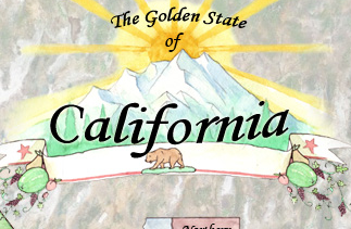
Shouldn't the title be "on" the banner instead of above it?
BTW - nice work on the map - looking great.
BTW - nice work on the map - looking great.

-

RjBeals
- Posts: 2506
- Joined: Mon Nov 20, 2006 5:17 pm
- Location: South Carolina, USA


Re: California 1.6
![]() by The Bison King on Fri Oct 08, 2010 5:59 pm
by The Bison King on Fri Oct 08, 2010 5:59 pm
It could be either really. I'll play around with that later. I may end up re-doing that banner I'm a little disappointed with it to be honest.
Since I'm rebuild the image (re-piecing it together not drawing/painting) does anyone have any big compositional suggestions? No would be the best time to tell me.
Since I'm rebuild the image (re-piecing it together not drawing/painting) does anyone have any big compositional suggestions? No would be the best time to tell me.
-
The Bison King
- Posts: 1957
- Joined: Thu Aug 27, 2009 5:06 pm
- Location: the Mid-Westeros
Re: California 1.6
![]() by Victor Sullivan on Sat Oct 09, 2010 11:24 am
by Victor Sullivan on Sat Oct 09, 2010 11:24 am
Victor Sullivan wrote:You should do something "flashy" to reflect California properly. This would also be good to set it apart from the "just a state map" mentality.
There!
Beckytheblondie: "Don't give us the dispatch, give us a mustache ride."
Scaling back on my CC involvement...
Scaling back on my CC involvement...
-
Victor Sullivan
- Posts: 6010
- Joined: Mon Feb 08, 2010 8:17 pm
- Location: Columbus, OH
Re: California 1.6
![]() by The Bison King on Sat Oct 09, 2010 11:55 am
by The Bison King on Sat Oct 09, 2010 11:55 am
Much better, but what is "flashy" to you?
-
The Bison King
- Posts: 1957
- Joined: Thu Aug 27, 2009 5:06 pm
- Location: the Mid-Westeros
Re: California 1.6
![]() by Victor Sullivan on Sat Oct 09, 2010 12:48 pm
by Victor Sullivan on Sat Oct 09, 2010 12:48 pm
The Bison King wrote:Much better, but what is "flashy" to you?
Bright colors, exaggerated stylizing, etc. etc...
Beckytheblondie: "Don't give us the dispatch, give us a mustache ride."
Scaling back on my CC involvement...
Scaling back on my CC involvement...
-
Victor Sullivan
- Posts: 6010
- Joined: Mon Feb 08, 2010 8:17 pm
- Location: Columbus, OH
Re: California 1.6
![]() by The Bison King on Mon Oct 11, 2010 6:35 pm
by The Bison King on Mon Oct 11, 2010 6:35 pm
I'm really sorry for the long delay. I've been more focused on my other map right now. hopefully I'll update soon but I probably won't start giving this the attention it needs until 7 nations is in Beta.
-
The Bison King
- Posts: 1957
- Joined: Thu Aug 27, 2009 5:06 pm
- Location: the Mid-Westeros
Re: California 1.6
![]() by The Bison King on Fri Oct 22, 2010 4:28 pm
by The Bison King on Fri Oct 22, 2010 4:28 pm
Good news, I've got back to work on this map. I'll probably be posting again by early next week if not sooner.
-
The Bison King
- Posts: 1957
- Joined: Thu Aug 27, 2009 5:06 pm
- Location: the Mid-Westeros
Re: California 1.6
![]() by The Bison King on Fri Oct 22, 2010 5:28 pm
by The Bison King on Fri Oct 22, 2010 5:28 pm
- Click image to enlarge.

...well... sooner. Here's the the new large I'm re-building. The map it's self is a little larger so most things have a little more space. The mountains are new too. I still need to figure out how I want to do cities. I'm thinking I might do something like the first Italy map. Also I need to figure out what to do with the negative space to the right of the map, because I never really planed on keeping what I had on he last draft.
-
The Bison King
- Posts: 1957
- Joined: Thu Aug 27, 2009 5:06 pm
- Location: the Mid-Westeros
Re: California 1.6
![]() by Industrial Helix on Sat Oct 23, 2010 10:47 am
by Industrial Helix on Sat Oct 23, 2010 10:47 am
Looking at this map I feel like I'm being assaulted by a rainbow of color. Which is good in the sense that it conveys sun, ect... but bad in the sense that I think it's getting jumbled up. I mean, look at the transition of color from the LA inset to the mainland to the minimap... its all very intense.
One possible solution is to desaturate the colors outside of LA in the inset, same for the Bay area. Then something ought to be done about all that white around the minimap... something to make the vibrancy of the minimap colors not compete so hard with the main map.
Lastly, the lines when you zoomed in to make the inset are all overly blurry. Either rescan it at a higher resolution or re do the back lines in photoshop.
As for the cities, doing it like the italy map is quite lame and I think you can do better. What about little city symbols, perhaps somewhat unique to the cities they represent. Each could have the principle buildings of the city represented. You've got the talent for it so you might as well.
Sketchblog [Update 07/25/11]: http://indyhelixsketch.blogspot.com/
Living in Japan [Update 07/17/11]: http://mirrorcountryih.blogspot.com/
Russian Revolution map for ConquerClub [07/20/11]: viewtopic.php?f=241&t=116575
Living in Japan [Update 07/17/11]: http://mirrorcountryih.blogspot.com/
Russian Revolution map for ConquerClub [07/20/11]: viewtopic.php?f=241&t=116575
-

Industrial Helix
- Posts: 3462
- Joined: Mon Jul 14, 2008 6:49 pm
- Location: Ohio


Re: California 1.6
![]() by The Bison King on Sat Oct 23, 2010 11:14 am
by The Bison King on Sat Oct 23, 2010 11:14 am
One possible solution is to desaturate the colors outside of LA in the inset, same for the Bay area.
Are you sure you didn't mean to say saturate? I'm a little confused by this, especially referring to the bay Area which is already pretty saturated.
Then something ought to be done about all that white around the minimap... something to make the vibrancy of the minimap colors not compete so hard with the main map.
Agreed and I'm taking suggestions
Lastly, the lines when you zoomed in to make the inset are all overly blurry. Either rescan it at a higher resolution or re do the back lines in photoshop.
I'll see what I can do.
As for the cities, doing it like the italy map is quite lame and I think you can do better. What about little city symbols, perhaps somewhat unique to the cities they represent.
Yeah that could be cool, though, I don't think a lot of those cities have particularly recognizable buildings.
Looking at this map I feel like I'm being assaulted by a rainbow
That's what happens when you go to California
-
The Bison King
- Posts: 1957
- Joined: Thu Aug 27, 2009 5:06 pm
- Location: the Mid-Westeros
Re: California 1.6
![]() by Victor Sullivan on Sat Oct 23, 2010 3:07 pm
by Victor Sullivan on Sat Oct 23, 2010 3:07 pm
I find the "Pacific Ocean" strange. Okay, I can see the water color effect and that's all well and good, but it doesn't really look like an ocean. Also, the ocean seems zoomed in a lot, in comparison to the land; the grain is much larger in the ocean than on the land. And I agree with IH, the white in the East is atrocious and should be fixed with maybe a muted brown or a tan of some sort, to signify there's land there. That being said, I don't feel assaulted by a rainbow (at least, I don't think so, never been assaulted by a rainbow before ), I think the colors are nice as is, though I'm still not sure I like this style for California. Also, the zoomed-in parts bleeding into the zoomed-out parts looks really strange to me.
-Sully
-Sully
Beckytheblondie: "Don't give us the dispatch, give us a mustache ride."
Scaling back on my CC involvement...
Scaling back on my CC involvement...
-
Victor Sullivan
- Posts: 6010
- Joined: Mon Feb 08, 2010 8:17 pm
- Location: Columbus, OH
Re: California 1.6
![]() by RedBaron0 on Sun Oct 24, 2010 2:00 am
by RedBaron0 on Sun Oct 24, 2010 2:00 am
The look is nice.... but I think is getting a little tired. I'd like to see you go in a different direction, broaden your horizons a little. I really hate to think this style is all you got.
Besides California is a modern, real place, unlike Celtic 7 or Thyseneal. I really think you'll need more graphically than the water color to pass this one though. It's early still, I'm looking forward to seeing what you got!
Besides California is a modern, real place, unlike Celtic 7 or Thyseneal. I really think you'll need more graphically than the water color to pass this one though. It's early still, I'm looking forward to seeing what you got!


-

RedBaron0
- Posts: 2657
- Joined: Sun Aug 19, 2007 12:59 pm
- Location: Pennsylvania


Re: California 1.6
![]() by Victor Sullivan on Sun Oct 24, 2010 11:57 am
by Victor Sullivan on Sun Oct 24, 2010 11:57 am
RedBaron0 wrote:The look is nice.... but I think is getting a little tired. I'd like to see you go in a different direction, broaden your horizons a little. I really hate to think this style is all you got.
Besides California is a modern, real place, unlike Celtic 7 or Thyseneal. I really think you'll need more graphically than the water color to pass this one though. It's early still, I'm looking forward to seeing what you got!
Yes, I agree:
Victor Sullivan wrote:You should do something "flashy" to reflect California properly. This would also be good to set it apart from the "just a state map" mentality.
Beckytheblondie: "Don't give us the dispatch, give us a mustache ride."
Scaling back on my CC involvement...
Scaling back on my CC involvement...
-
Victor Sullivan
- Posts: 6010
- Joined: Mon Feb 08, 2010 8:17 pm
- Location: Columbus, OH
Re: California 1.6
![]() by The Bison King on Sun Oct 24, 2010 1:01 pm
by The Bison King on Sun Oct 24, 2010 1:01 pm
RedBaron0 wrote:The look is nice.... but I think is getting a little tired. I'd like to see you go in a different direction, broaden your horizons a little. I really hate to think this style is all you got.
Besides California is a modern, real place, unlike Celtic 7 or Thyseneal. I really think you'll need more graphically than the water color to pass this one though. It's early still, I'm looking forward to seeing what you got!
Yeah I don't know. I'll admit that this has a long way to go, but I'm not really interested in doing a stylistic overhaul. It's not so much that this style is "all I got" it's more that I am trying to establish a style and this is the one I like. I don't really have an interest in continuing to do maps if I don't like what I'm doing. Like you said this is still early, why don't you wait a little longer till I actually go to town on this to decide if this is the right style or not.
the white in the East is atrocious and should be fixed with maybe a muted brown or a tan of some sort, to signify there's land there.
Obviously, like I said before that in no way is going to be there on the final graphics, but I'm thinking of something a little more than just a brown color... though I'm not sure what yet.
I find the "Pacific Ocean" strange. Okay, I can see the water color effect and that's all well and good, but it doesn't really look like an ocean.
What like a literal image of an ocean?
Also, the zoomed-in parts bleeding into the zoomed-out parts looks really strange to me.
Yes that is something I'll be looking to fix.
-
The Bison King
- Posts: 1957
- Joined: Thu Aug 27, 2009 5:06 pm
- Location: the Mid-Westeros
Re: California 1.6
![]() by RedBaron0 on Sun Oct 24, 2010 7:10 pm
by RedBaron0 on Sun Oct 24, 2010 7:10 pm
Of course I'm not saying you can't have water color elements ever again.... I'm really trying to just broaden your scope include new things, and make this map great. Many single state maps have been tried, and VERY-VERY few have even made it this far.
-
RedBaron0
- Posts: 2657
- Joined: Sun Aug 19, 2007 12:59 pm
- Location: Pennsylvania
Re: California 1.6
![]() by The Bison King on Tue Oct 26, 2010 2:04 pm
by The Bison King on Tue Oct 26, 2010 2:04 pm
well it's awesome to here that, but I feel a little bit stuck at the moment. I'm not sure where I want to go with the legend. I think I'm going to ditch the current banner, it's not really doing it for me. Maybe something a little more modern might be better. Pretty much the only thing I'm happy with right now are the water colors on the map it's self.
-
The Bison King
- Posts: 1957
- Joined: Thu Aug 27, 2009 5:06 pm
- Location: the Mid-Westeros
Re: California 1.6
![]() by The Bison King on Wed Oct 27, 2010 8:42 pm
by The Bison King on Wed Oct 27, 2010 8:42 pm
- Click image to enlarge.

NOT AN OFFICIAL DRAFT, THIS IS JUST A BRAIN STORM.
I'm usually not a fan of when photographs are thrown into the backgrounds of maps but I have a lot of Vacation photos from Cali. So I got this idea, what if I kind of aim to make it look like a tourist map. Maybe arrange the photo graphs in the back a little bit more like photos on a table. You know have more of them and make them more evidently photos.
I left the little city icons on their just to show you what one option would be, but the way I think I should go with that is to make the cities stars, reminiscent of sunset boulevard.
I'm also going to add a palm tree and banner in the bottom right for the signature.
-
The Bison King
- Posts: 1957
- Joined: Thu Aug 27, 2009 5:06 pm
- Location: the Mid-Westeros
Re: California 1.6
![]() by Victor Sullivan on Wed Oct 27, 2010 9:28 pm
by Victor Sullivan on Wed Oct 27, 2010 9:28 pm
The Bison King wrote:I'm usually not a fan of when photographs are thrown into the backgrounds of maps.
Yes, I agree with you here, what you have now looks very strange (I know, it's just a brainstorm).
The Bison King wrote:So I got this idea, what if I kind of aim to make it look like a tourist map. Maybe arrange the photo graphs in the back a little bit more like photos on a table. You know have more of them and make them more evidently photos.
Sounds neat, I'd like to see this idea.
The Bison King wrote:I left the little city icons on their just to show you what one option would be, but the way I think I should go with that is to make the cities stars, reminiscent of sunset boulevard.
Also a neat idea, I do like what you have already, but I'd love to see the stars ideas as well.
-Sully
Beckytheblondie: "Don't give us the dispatch, give us a mustache ride."
Scaling back on my CC involvement...
Scaling back on my CC involvement...
-
Victor Sullivan
- Posts: 6010
- Joined: Mon Feb 08, 2010 8:17 pm
- Location: Columbus, OH
Who is online
Users browsing this forum: No registered users
|
|||||||
| Conquer Club is not associated with RISK online in any way. Copyright © 2006-2025 by Big Wham LLC | |||||||