The Conquer 500
Moderator: Cartographers
Re: The Conquer 500 [GP] - Map & Gameplay Updated
Huge project at work end later this week ... updated imminent!!!
besides some missing terminology and the search for a better background ... anyone else have any suggestions for graphics?
=)
=D=
besides some missing terminology and the search for a better background ... anyone else have any suggestions for graphics?
=)
=D=
Where Have I Been? ... Testing a prototype board game that I co-designed called Alien Overrun!
-
 dolomite13
- Posts: 1379
- Joined: Mon Aug 18, 2008 5:54 pm


Re: The Conquer 500 [GP] - Map & Gameplay Updated
The checkered flag next to the title looks pixelated.

-

 natty dread
- Posts: 12877
- Joined: Fri Feb 08, 2008 8:58 pm
- Location: just plain fucked


Re: The Conquer 500 [GP] - Map & Gameplay Updated
I concur. The smiley face, too. Does that smiley guy have more than five fingers? It looks like it.
Beckytheblondie: "Don't give us the dispatch, give us a mustache ride."
Scaling back on my CC involvement...
Scaling back on my CC involvement...
-

 Victor Sullivan
- Posts: 6010
- Joined: Mon Feb 08, 2010 8:17 pm
- Location: Columbus, OH


Re: The Conquer 500 [GP] - Map & Gameplay Updated
The smiley face is lame in my opinion, this isn't walmart...


-

 RedBaron0
- Posts: 2657
- Joined: Sun Aug 19, 2007 12:59 pm
- Location: Pennsylvania


Re: The Conquer 500 [GP] - Map & Gameplay Updated
For the smileyface: give him a racing helmet and a wicked grin.
Make him less like
and more like
Make him less like
and more like

-

 natty dread
- Posts: 12877
- Joined: Fri Feb 08, 2008 8:58 pm
- Location: just plain fucked


Re: The Conquer 500 [GP] - Map & Gameplay Updated
It would fit better anyways... I'd prefer altogether gone and replaced by something more in line with the theme.


-

 RedBaron0
- Posts: 2657
- Joined: Sun Aug 19, 2007 12:59 pm
- Location: Pennsylvania


Re: The Conquer 500 [GP] - Map & Gameplay Updated
Maybe just a trophyRedBaron0 wrote:It would fit better anyways... I'd prefer altogether gone and replaced by something more in line with the theme.
Where Have I Been? ... Testing a prototype board game that I co-designed called Alien Overrun!
-

 dolomite13
- Posts: 1379
- Joined: Mon Aug 18, 2008 5:54 pm


Re: The Conquer 500 [GP] - Map & Gameplay Updated
natty_dread wrote:For the smileyface: give him a racing helmet and a wicked grin.
Make him less like
and more like
i rather like the smiley face too, especially with natty's suggestions.
the +40 bonus can be made clearer by wording it as +40 if you hold a track location in all 10 segments. don't forget to add for holding any number of regions +3 or something similar.
ian.
-

 iancanton
- Foundry Foreman

- Posts: 2431
- Joined: Fri Jun 01, 2007 5:40 am
- Location: europe


Re: The Conquer 500 [GP] - Map & Gameplay Updated
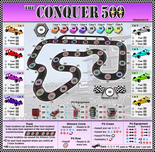
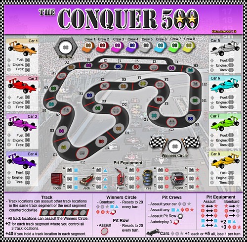
Here are two possible background images... any thoughts as to which looks best?
http://www.flickr.com/photos/30827466@N07/4954919373/
http://www.flickr.com/photos/30827466@N07/4954919367/
http://www.flickr.com/photos/30827466@N07/4954919373/

http://www.flickr.com/photos/30827466@N07/4954919367/

Last edited by dolomite13 on Fri Sep 03, 2010 5:30 pm, edited 2 times in total.
Where Have I Been? ... Testing a prototype board game that I co-designed called Alien Overrun!
-

 dolomite13
- Posts: 1379
- Joined: Mon Aug 18, 2008 5:54 pm


Re: The Conquer 500 [GP] - Map & Gameplay Updated
Both images are public domain, right? (in which case I like the 2nd one better)

-

 natty dread
- Posts: 12877
- Joined: Fri Feb 08, 2008 8:58 pm
- Location: just plain fucked


Re: The Conquer 500 [GP] - Map & Gameplay Updated
natty_dread wrote:Both images are public domain, right? (in which case I like the 2nd one better)
I agree with Dr. Dread.
Beckytheblondie: "Don't give us the dispatch, give us a mustache ride."
Scaling back on my CC involvement...
Scaling back on my CC involvement...
-

 Victor Sullivan
- Posts: 6010
- Joined: Mon Feb 08, 2010 8:17 pm
- Location: Columbus, OH


Re: The Conquer 500 [GP] - Map & Gameplay Updated
My vote goes to #2 as well.
-

 ender516
- Posts: 4455
- Joined: Wed Dec 17, 2008 6:07 pm
- Location: Waterloo, Ontario


Re: The Conquer 500 [GP] - Map & Gameplay Updated
Yes the research I did into the photos shows them to be from non copyright no charge royalty free locations and I have manipulated them almost like using pieces of a photo as a storyboard for the final image.natty_dread wrote:Both images are public domain, right? (in which case I like the 2nd one better)
=D=
Where Have I Been? ... Testing a prototype board game that I co-designed called Alien Overrun!
-

 dolomite13
- Posts: 1379
- Joined: Mon Aug 18, 2008 5:54 pm


Re: The Conquer 500 [GP] - Map & Gameplay Updated
ender516 wrote:My vote goes to #2 as well.
the presence of the car images in the background adds to the atmosphere. if u can do so easily, then remove the start-finish line from the background picture, since it's at odds with the layout of the conquer 500's track.
ian.
-

 iancanton
- Foundry Foreman

- Posts: 2431
- Joined: Fri Jun 01, 2007 5:40 am
- Location: europe


Re: The Conquer 500 [GP] - Background Image Discussion
i also say the second, despite not having followed this since page 3...
-
 00iCon
- Posts: 257
- Joined: Wed Apr 29, 2009 4:42 am
- Location: Sydney NSW


Re: The Conquer 500 [GP] - Many Updates
Latest Update
- Cleaned up the background a bit
- Made the car areas and the unit circles stand out more
- Updated some text in the key
- Changed the pit row unit circle from a hexagon to crossed wrenches.
- Added text denoting "no standard territory bonus"
- Cleaned up checkered flag images
- Removed happy face guy
To Do
- small map (first pass)
http://farm5.static.flickr.com/4127/496 ... 90_b_d.jpg
Where Have I Been? ... Testing a prototype board game that I co-designed called Alien Overrun!
-

 dolomite13
- Posts: 1379
- Joined: Mon Aug 18, 2008 5:54 pm


Re: The Conquer 500 [GP] - Many Updates
dolomite13 wrote:Added text denoting "no standard territory bonus"
located in the track infield, this is rather hard to find. a more logical place is in the legend, which does mean moving some text to fit it in.
the crossed wrenches immediately made me think of a skull-and-crossbones. a nice touch!
ian.
-

 iancanton
- Foundry Foreman

- Posts: 2431
- Joined: Fri Jun 01, 2007 5:40 am
- Location: europe


Re: The Conquer 500 [GP] - Background Image Discussion
You think the "No Territory Bonus" could go elsewhere? It just seems like the middle of the track is a distracting place to put that.
Beckytheblondie: "Don't give us the dispatch, give us a mustache ride."
Scaling back on my CC involvement...
Scaling back on my CC involvement...
-

 Victor Sullivan
- Posts: 6010
- Joined: Mon Feb 08, 2010 8:17 pm
- Location: Columbus, OH


Re: The Conquer 500 [GP] - Background Image Discussion
Agree with above, also the legend still has the old icon of the pit row.

-

 natty dread
- Posts: 12877
- Joined: Fri Feb 08, 2008 8:58 pm
- Location: just plain fucked


Re: The Conquer 500 [GP] - Background Image Discussion
natty_dread wrote:Agree with above, also the legend still has the old icon of the pit row.
Will fix both in next update =) I also noticed some small issues with readability around the map I will try and fix.
=D=
Where Have I Been? ... Testing a prototype board game that I co-designed called Alien Overrun!
-

 dolomite13
- Posts: 1379
- Joined: Mon Aug 18, 2008 5:54 pm


Re: The Conquer 500 [GP] - Background Image Discussion
When I went looking for "No standard territory bonus", I scanned all over the map, and nearly gave up and posted that it wasn't there. I don't quite know why, but it seems like it is hidden in plain sight. I think, if possible, it should go in the legend. If not, perhaps directly beneath the title? If the Pit Crews, Pit Row and the track itself were all shifted down a bit, there would be room, and it would be more likely to be read, right after reading the title.
Also, since the Winner's Circle and the Pit Row are single territories, the legend should say "- Bombards" and "- Assaults".
Also, since the Winner's Circle and the Pit Row are single territories, the legend should say "- Bombards" and "- Assaults".
-

 ender516
- Posts: 4455
- Joined: Wed Dec 17, 2008 6:07 pm
- Location: Waterloo, Ontario


Re: The Conquer 500 [GP] - Background Image Discussion
ender516 wrote:When I went looking for "No standard territory bonus", I scanned all over the map, and nearly gave up and posted that it wasn't there. I don't quite know why, but it seems like it is hidden in plain sight. I think, if possible, it should go in the legend. If not, perhaps directly beneath the title? If the Pit Crews, Pit Row and the track itself were all shifted down a bit, there would be room, and it would be more likely to be read, right after reading the title.
Also, since the Winner's Circle and the Pit Row are single territories, the legend should say "- Bombards" and "- Assaults".
Agreed =)
D
Where Have I Been? ... Testing a prototype board game that I co-designed called Alien Overrun!
-

 dolomite13
- Posts: 1379
- Joined: Mon Aug 18, 2008 5:54 pm


Re: The Conquer 500 [GP] - Background Image Discussion
What do folks think about the the pit equipment and car condition icons and colors?
=D=
=D=
Where Have I Been? ... Testing a prototype board game that I co-designed called Alien Overrun!
-

 dolomite13
- Posts: 1379
- Joined: Mon Aug 18, 2008 5:54 pm


Re: The Conquer 500 [GP] - Background Image Discussion
For the colors of the cars, is there a reason why they're not ordered in the standard CC way (y'know, 1-red, 2-green, 3-blue, etc.)?
Beckytheblondie: "Don't give us the dispatch, give us a mustache ride."
Scaling back on my CC involvement...
Scaling back on my CC involvement...
-

 Victor Sullivan
- Posts: 6010
- Joined: Mon Feb 08, 2010 8:17 pm
- Location: Columbus, OH


Who is online
Users browsing this forum: No registered users


