Baseball: King of Diamonds (v15 p.27)
Moderator: Cartographers
Re: A Baseball Map, But Not Like That Last One
really, greg maddux? what about phil niekro or christy mathewson instead?
pretty much everyone you have is old school besides maddux and smith... i like the old timer theme, and i think it should be consistent.
pretty much everyone you have is old school besides maddux and smith... i like the old timer theme, and i think it should be consistent.
-
 whitestazn88
- Posts: 3128
- Joined: Mon Feb 05, 2007 2:59 pm
- Location: behind you


Re: A Baseball Map, But Not Like That Last One
ps. love the map idea
-
 whitestazn88
- Posts: 3128
- Joined: Mon Feb 05, 2007 2:59 pm
- Location: behind you


Re: A Baseball Map, But Not Like That Last One
Even if the player names are old-timers, I doubt I'll make the graphical theme specifically old-timey
Then again, that might be a fun way to differentiate this map from the other sports maps...
Then again, that might be a fun way to differentiate this map from the other sports maps...
-

 Evil DIMwit
- Posts: 1616
- Joined: Thu Mar 22, 2007 1:47 pm
- Location: Philadelphia, NJ


Re: A Baseball Map, But Not Like That Last One
whitestazn88 wrote:really, greg maddux? what about phil niekro or christy mathewson instead?
pretty much everyone you have is old school besides maddux and smith... i like the old timer theme, and i think it should be consistent.
the.killing.44 wrote:jrh_cardinal wrote:I'm not sure about Maddux, maybe Walter Johnson or Spahn instead but I like everything else
Well I'd agree if there wasn't a pseudo-consensus that we wanted a more contemporary pitcher on the list.
both fielders and pitchers span all of baseball. I like the idea of a contemporary pitcher, and he's the most deserving of all the contemporary pitcher's (if you mention any steroid users i will cry)
-

 jrh_cardinal
- Posts: 2688
- Joined: Sat May 16, 2009 7:15 pm


Re: A Baseball Map, But Not Like That Last One
Ya, I think our list is pretty solid. Of course there are some deserving names we didn't include, but you can't have everyone.
-
 carlpgoodrich
- Posts: 408
- Joined: Tue Aug 04, 2009 2:12 pm


Re: A Baseball Map, But Not Like That Last One
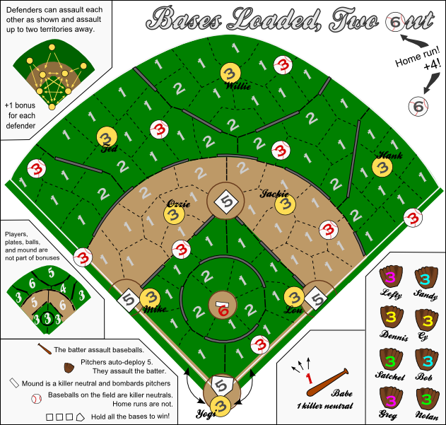
There are no Orioles on your list of ballplayers, and I must object. Not to anyone on the list specifically, I'd just love to see an O on there. I see your home city, so there's no way Schmidt is going off in favor of Brooks. I think I could make an argument for Cal in place of Ozzie though.
I do sort of agree with Maddux, I had to think for a minute of which Greg fit in there with the rest of the legends. However, he was an excellent pitcher and sure to be a first ballot HOFer so I think he can stick. I am surprised that Stephen is not listed - he is the chosen one after all
I think the defenders legend could be slightly rewritten. How about "Defenders assault each other as shown and can attack two territories away".
Shouldn't the mound be a red 6 to denote a killer neutral?
What about a bonus (+1) for each fielder you own? I am thinking they won't come into play much. I know they have the ranged attack, but with the balls being killer neutrals, after the first person they will be a 1 that is easily gone through, so I could see many players taking the same route out. (does that make sense?)
Jake
-

 Ace Rimmer
- Posts: 1911
- Joined: Mon Dec 01, 2008 1:22 pm


Re: A Baseball Map, But Not Like That Last One
jakewilliams wrote:I think I could make an argument for Cal in place of Ozzie though.
and i voted for brooks at 3rd
-

 jrh_cardinal
- Posts: 2688
- Joined: Sat May 16, 2009 7:15 pm


Re: A Baseball Map, But Not Like That Last One
jakewilliams wrote:I think the defenders legend could be slightly rewritten. How about "Defenders assault each other as shown and can attack two territories away".
"Assault" is the official CC lingo and if I change it to "attack" Andy will yell at me. The other changes don't fit in the space very well. Is this a clarity issue or just aesthetics?
Shouldn't the mound be a red 6 to denote a killer neutral?
Good catch... not that it matters for the final product.
What about a bonus (+1) for each fielder you own? I am thinking they won't come into play much. I know they have the ranged attack, but with the balls being killer neutrals, after the first person they will be a 1 that is easily gone through, so I could see many players taking the same route out. (does that make sense?)
I can see that. They're useful for extra mobility but I don't think a +1 bonus would hurt. Especially since the field bonuses are all so porous.
-

 Evil DIMwit
- Posts: 1616
- Joined: Thu Mar 22, 2007 1:47 pm
- Location: Philadelphia, NJ


Re: A Baseball Map, But Not Like That Last One
Evil DIMwit wrote:jakewilliams wrote:What about a bonus (+1) for each fielder you own? I am thinking they won't come into play much. I know they have the ranged attack, but with the balls being killer neutrals, after the first person they will be a 1 that is easily gone through, so I could see many players taking the same route out. (does that make sense?)
I can see that. They're useful for extra mobility but I don't think a +1 bonus would hurt. Especially since the field bonuses are all so porous.
I agree. Maybe even a "+X for Y" type of thing?
-
 carlpgoodrich
- Posts: 408
- Joined: Tue Aug 04, 2009 2:12 pm


Re: A Baseball Map, But Not Like That Last One
+1 for each one would be simpler than +1 for each 2. It'd also promote more stacking on defenders, but I think players would stack on them anyway.
-

 Evil DIMwit
- Posts: 1616
- Joined: Thu Mar 22, 2007 1:47 pm
- Location: Philadelphia, NJ


Re: A Baseball Map, But Not Like That Last One
Evil DIMwit wrote:jakewilliams wrote:I think the defenders legend could be slightly rewritten. How about "Defenders assault each other as shown and can attack two territories away".
"Assault" is the official CC lingo and if I change it to "attack" Andy will yell at me. The other changes don't fit in the space very well. Is this a clarity issue or just aesthetics?
Oops, I messed up. Basically change the "like so" to "as shown". Yes, leave both as assault, not attack. Clarity issue, I think "as shown" sounds clearer than "like so"
Jake
-

 Ace Rimmer
- Posts: 1911
- Joined: Mon Dec 01, 2008 1:22 pm


Re: A Baseball Map, But Not Like That Last One
I WAS BANNED FOR THE LAST 3 DAYS AND I DISAGREE WITH ALL OF THE PLAYERS WE AGREED ON
jk. They're good.
jk. They're good.
mrswdk is a ho
-

 Army of GOD
- Posts: 7189
- Joined: Tue Feb 24, 2009 4:30 pm


Re: A Baseball Map, But Not Like That Last One
i agree with the list of names....
this is looking good so far very much entertains my interests.
It could be me but the writting of the names appears difficult to read for me...could be the size or font...or it could be me sucking
this is looking good so far
It could be me but the writting of the names appears difficult to read for me...could be the size or font...or it could be me sucking

-

 lord voldemort
- Posts: 9596
- Joined: Sat Oct 20, 2007 4:39 am
- Location: Launceston, Australia


Re: A Baseball Map, But Not Like That Last One
jakewilliams wrote:Oops, I messed up. Basically change the "like so" to "as shown". Yes, leave both as assault, not attack. Clarity issue, I think "as shown" sounds clearer than "like so"
"as shown" doesn't fit in the space as well. "thus" fits all right, but it's a bit too formal for this game.
lord voldemort wrote:It could be me but the writting of the names appears difficult to read for me...could be the size or font...or it could be me sucking
It's the font. I'll make sure not to use that font for anything that small. Does anyone know any good basebally/sportish fonts?
-

 Evil DIMwit
- Posts: 1616
- Joined: Thu Mar 22, 2007 1:47 pm
- Location: Philadelphia, NJ


Re: A Baseball Map, But Not Like That Last One
Time for this one to get some more indepth gameplay analysis.
Sketchblog [Update 07/25/11]: http://indyhelixsketch.blogspot.com/
Living in Japan [Update 07/17/11]: http://mirrorcountryih.blogspot.com/
Russian Revolution map for ConquerClub [07/20/11]: viewtopic.php?f=241&t=116575
Living in Japan [Update 07/17/11]: http://mirrorcountryih.blogspot.com/
Russian Revolution map for ConquerClub [07/20/11]: viewtopic.php?f=241&t=116575
-

 Industrial Helix
- Posts: 3462
- Joined: Mon Jul 14, 2008 6:49 pm
- Location: Ohio


Re: A Baseball Map, But Not Like That Last One
is it just me, or does the map look crooked? I'd prefer the map to be from the vantage point of home plate.

There is no fog rule and I am no gentleman.
Robinette wrote:Kaskavel wrote:Seriously. Who is the female conqueror of CC?
Depends on what metric you use...
The coolest is squishyg
-

 squishyg
- Posts: 2651
- Joined: Sun Jan 04, 2009 11:05 pm


Re: A Baseball Map, But Not Like That Last One
squishyg wrote:is it just me, or does the map look crooked? I'd prefer the map to be from the vantage point of home plate.
I think it might be too wide (I could do some measurements, but I'm too lazy atm).
At the very least, it'd be nice to put the foul lines perpendicular to the edges of the map.
mrswdk is a ho
-

 Army of GOD
- Posts: 7189
- Joined: Tue Feb 24, 2009 4:30 pm


Re: A Baseball Map, But Not Like That Last One
Industrial Helix wrote:Time for this one to get some more indepth gameplay analysis.
I agree. My first comment is that I think the +5 on the pitchers is too high, maybe +3 would be better? Second, I think the region in far left field is harder to hold than the one with Hank, and should be worth at least as much, if not more.
-
 carlpgoodrich
- Posts: 408
- Joined: Tue Aug 04, 2009 2:12 pm


Re: A Baseball Map, But Not Like That Last One
squishyg wrote:is it just me, or does the map look crooked? I'd prefer the map to be from the vantage point of home plate.
I was kinda thinking the same thing. It's not pretty, but here's what it could look like from a different POV. Everything from the original fits and if I had the PSD file I could make it prettier!


-

 phantomzero
- Posts: 827
- Joined: Fri Dec 28, 2007 7:13 pm
- Location: 2742 high score 122710


Re: A Baseball Map, But Not Like That Last One
I like the idea, phantom and others. Would babe fit behind home plate? As the batter he belongs next to/behind home plate.
Couple other side notes that don't really matter at this point- there were two home runs, you'd have to squeeze in the second one under the mini-bonus field thing in right field. Also, it was kinda cool to have one of the home run balls be a letter in the title, not sure if that would be possible this way, at least with the small version of the map. And you're title is outdated
Couple other side notes that don't really matter at this point- there were two home runs, you'd have to squeeze in the second one under the mini-bonus field thing in right field. Also, it was kinda cool to have one of the home run balls be a letter in the title, not sure if that would be possible this way, at least with the small version of the map. And you're title is outdated
-

 jrh_cardinal
- Posts: 2688
- Joined: Sat May 16, 2009 7:15 pm


Re: A Baseball Map, But Not Like That Last One
carlpgoodrich wrote:I agree. My first comment is that I think the +5 on the pitchers is too high, maybe +3 would be better? Second, I think the region in far left field is harder to hold than the one with Hank, and should be worth at least as much, if not more.
I don't think +5 is too high. Can you give an argument for your position?
Agreed about the Left Field region.
phantomzero wrote:I was kinda thinking the same thing. It's not pretty, but here's what it could look like from a different POV. Everything from the original fits and if I had the PSD file I could make it prettier!
No PSDs. So far this is all done in vector format on Inkscape. If anyone wants the SVG, just ask.
- Leftmost region now worth 3
- Changed color a bit
- Added +1 per defender bonus
- Rearranged the overall layout. Do you guys like this more?
-

 Evil DIMwit
- Posts: 1616
- Joined: Thu Mar 22, 2007 1:47 pm
- Location: Philadelphia, NJ


Re: A Baseball Map
I didn't mind the other orientation, but this angle is perhaps more traditional. I find it odd to have Babe on deck right in front of the bullpen. (Yes, I know, that is not exactly what is depicted, but it is what I infer from this layout.) I would like to see some of the elements rearranged, but it might be easier for me to do it than to describe it. Could I get a copy of the SVG?
[Small point: "The batter assaults baseballs."]
[Small point: "The batter assaults baseballs."]
-

 ender516
- Posts: 4455
- Joined: Wed Dec 17, 2008 6:07 pm
- Location: Waterloo, Ontario


Re: A Baseball Map
Yeah, I think Babe needs to be at the plate at least close to the batter's box somehow.
-

 Ace Rimmer
- Posts: 1911
- Joined: Mon Dec 01, 2008 1:22 pm


Re: A Baseball Map
jakewilliams wrote:Yeah, I think Babe needs to be at the plate at least close to the batter's box somehow.
Not sure this is exactly what you guys meant, but making the batter and home plate the same territory is an interesting idea. It would drastically change the gameplay, since home plate is part of the objective and the batter can be attacked by all the pitchers. You would also have to get rid of the killer neutral on batter which I think would hurt the gameplay at the beginning of games. Overall, this probably isn't a good idea, but I do agree with you that they should be physically close
-
 carlpgoodrich
- Posts: 408
- Joined: Tue Aug 04, 2009 2:12 pm


Re: A Baseball Map
ender516 wrote:I didn't mind the other orientation, but this angle is perhaps more traditional. I find it odd to have Babe on deck right in front of the bullpen. (Yes, I know, that is not exactly what is depicted, but it is what I infer from this layout.) I would like to see some of the elements rearranged, but it might be easier for me to do it than to describe it. Could I get a copy of the SVG?
[Small point: "The batter assaults baseballs."]
SVG is available at http://rassyndrome.webs.com/CC/Base_Map_SVG.svg
carlpgoodrich wrote:jakewilliams wrote:Yeah, I think Babe needs to be at the plate at least close to the batter's box somehow.
Not sure this is exactly what you guys meant, but making the batter and home plate the same territory is an interesting idea. It would drastically change the gameplay, since home plate is part of the objective and the batter can be attacked by all the pitchers. You would also have to get rid of the killer neutral on batter which I think would hurt the gameplay at the beginning of games. Overall, this probably isn't a good idea, but I do agree with you that they should be physically close
In red is the big problem with this. I think the killer is fairly integral to the gameplay.
-

 Evil DIMwit
- Posts: 1616
- Joined: Thu Mar 22, 2007 1:47 pm
- Location: Philadelphia, NJ


Who is online
Users browsing this forum: No registered users


