God Nobunaga, You are such a fucking asshole! I like you, and I think it's funny. But god, you are such a dick.have fun with your little map and little friends. I hope you do a first nations all over the globePeople try to help and you get offended... I really am done here.. kinda below me
First Nations of South America!
Moderator: Cartographers
Forum rules
Please read the Community Guidelines before posting.
Please read the Community Guidelines before posting.
-
The Bison King
- Posts: 1957
- Joined: Thu Aug 27, 2009 5:06 pm
- Location: the Mid-Westeros
Re: First Nations of South America.. UPDATE page 8

-
Industrial Helix

- Posts: 3462
- Joined: Mon Jul 14, 2008 6:49 pm
- Gender: Female
- Location: Ohio
Re: First Nations of South America.. UPDATE page 8
Nobunga... if you kill our chances of a first nations of Africa I'm gonna kill you
Regarding the bonus situation int he north... throw up a poll and let the numbers decide. Everyone likes voting in an anonymous poll, right?
Regarding the bonus situation int he north... throw up a poll and let the numbers decide. Everyone likes voting in an anonymous poll, right?
Sketchblog [Update 07/25/11]: http://indyhelixsketch.blogspot.com/
Living in Japan [Update 07/17/11]: http://mirrorcountryih.blogspot.com/
Russian Revolution map for ConquerClub [07/20/11]: http://www.conquerclub.com/forum/viewto ... 1&t=116575
Living in Japan [Update 07/17/11]: http://mirrorcountryih.blogspot.com/
Russian Revolution map for ConquerClub [07/20/11]: http://www.conquerclub.com/forum/viewto ... 1&t=116575

Re: First Nations of South America.. UPDATE page 8
A poll will show people want this map to move on.Industrial Helix wrote:Nobunga... if you kill our chances of a first nations of Africa I'm gonna kill you
Regarding the bonus situation int he north... throw up a poll and let the numbers decide. Everyone likes voting in an anonymous poll, right?
BTW - Your slight jab at simple maps..... Most of CC enjoys the simple maps so this foundry move to more complex maps is ill advised, unless you want to put out tons of maps that very few people play. Yes sure variety is good, but just as in anything in life, you make the proper amounts of each.
Highest Rank: 26 Highest Score: 3480

-
natty dread

- Posts: 12876
- Joined: Fri Feb 08, 2008 8:58 pm
- Location: just plain fucked
Re: First Nations of South America.. UPDATE page 8
The thing with "simple maps" is that you can only do so many "simple maps" before they all start to repeat each other... I mean, what's the point of having 600 classic maps with maybe slightly different territory connections?

-
The Bison King
- Posts: 1957
- Joined: Thu Aug 27, 2009 5:06 pm
- Location: the Mid-Westeros
Re: First Nations of South America.. UPDATE page 8
Sorry but I disagree entirely. The first thing I thought when I found this site was "Holy Shit! Online Risk! With maps from all around the world!!!" It's the whole reason I joined this site in the first place. I like risk. The classic game, but just one world map isn't enough. Maybe you get tired of classic maps but I don't, and I don't think it's fair to say that there's no point in having 600, 700, or even a million of them.The thing with "simple maps" is that you can only do so many "simple maps" before they all start to repeat each other... I mean, what's the point of having 600 classic maps with maybe slightly different territory connections?
There can never be enough. There will always be more to conquer!
No offense Natty, just had to get that out there.
-
Evil DIMwit

- Posts: 1616
- Joined: Thu Mar 22, 2007 1:47 pm
- Gender: Male
- Location: Philadelphia, NJ
Re: First Nations of South America.. UPDATE page 8
Back on topic:
Well, Tisha, what's your choice? How are you going to handle bonus drops?
Well, Tisha, what's your choice? How are you going to handle bonus drops?


-
Industrial Helix
- Posts: 3462
- Joined: Mon Jul 14, 2008 6:49 pm
- Gender: Female
- Location: Ohio
Re: First Nations of South America.. UPDATE page 8
I didn't mean any offense to the mapmaker or those that enjoy "simple maps" as I enjoy simple maps myself. To be honest, I think a first nations of Africa would actually be pretty cool and still different enough to be a worthy map to make. Plus Tisha has the proven graphical flair to pull it off nicely.
As for the central american ordeal, I think it ought to be fine the way it is. Or at the very least throw in a link from carribean to somewhere in central America, perhaps even Guaymi.
As for the central american ordeal, I think it ought to be fine the way it is. Or at the very least throw in a link from carribean to somewhere in central America, perhaps even Guaymi.
Sketchblog [Update 07/25/11]: http://indyhelixsketch.blogspot.com/
Living in Japan [Update 07/17/11]: http://mirrorcountryih.blogspot.com/
Russian Revolution map for ConquerClub [07/20/11]: http://www.conquerclub.com/forum/viewto ... 1&t=116575
Living in Japan [Update 07/17/11]: http://mirrorcountryih.blogspot.com/
Russian Revolution map for ConquerClub [07/20/11]: http://www.conquerclub.com/forum/viewto ... 1&t=116575
-
The Bison King
- Posts: 1957
- Joined: Thu Aug 27, 2009 5:06 pm
- Location: the Mid-Westeros
Re: First Nations of South America.. UPDATE page 8
I agree, I have always felt like there should be another Africa map, and I think first nations would be a great way to do it!I think a first nations of Africa would actually be pretty cool and still different enough to be a worthy map to make
I also agree. Either leave it how it is or ad that link, but I think it's time to pick one and move on.As for the central american ordeal, I think it ought to be fine the way it is. Or at the very least throw in a link from carribean to somewhere in central America, perhaps even Guaymi.
and just for the record I think it's fine how it is, if it proves to be a problem in Beta ad that link then.
Re: First Nations of South America.. UPDATE page 8
Can we move this along please? Game play is fine as is.
Highest Rank: 26 Highest Score: 3480

Re: First Nations of South America.. UPDATE page 8
I've added a territory to the right of Potiguara, and will turn one of the Chilean territories Neutral.. but I'm not messing with Meso-America/North Andes..
Re: First Nations of South America.. UPDATE page 8
Why is this still in game play??
Highest Rank: 26 Highest Score: 3480
-
natty dread
- Posts: 12876
- Joined: Fri Feb 08, 2008 8:58 pm
- Location: just plain fucked
Re: First Nations of South America.. UPDATE page 8
Waiting for tisha's update, like she said in her last post...
Re: First Nations of South America.. UPDATE page 8
like it.. or else. added a territory to the east, and turned a Chile territory to a neutral 2.
give me a stamp.
give me a stamp.
-
Industrial Helix
- Posts: 3462
- Joined: Mon Jul 14, 2008 6:49 pm
- Gender: Female
- Location: Ohio
Re: First Nations of South America.. UPDATE page 11
Looks good to me.
Hopefully this will put my colleagues in the Graphics state of mind as I have a few graphical suggestions:
Move the Passable/Impassable above the bonus legend?
Hopefully this will put my colleagues in the Graphics state of mind as I have a few graphical suggestions:
Move the Passable/Impassable above the bonus legend?
Sketchblog [Update 07/25/11]: http://indyhelixsketch.blogspot.com/
Living in Japan [Update 07/17/11]: http://mirrorcountryih.blogspot.com/
Russian Revolution map for ConquerClub [07/20/11]: http://www.conquerclub.com/forum/viewto ... 1&t=116575
Living in Japan [Update 07/17/11]: http://mirrorcountryih.blogspot.com/
Russian Revolution map for ConquerClub [07/20/11]: http://www.conquerclub.com/forum/viewto ... 1&t=116575
-
Evil DIMwit
- Posts: 1616
- Joined: Thu Mar 22, 2007 1:47 pm
- Gender: Male
- Location: Philadelphia, NJ
Re: First Nations of South America.. UPDATE page 11
I'll give it two days for final problem sweeps, though I doubt there'll be any.
-
lord voldemort

- Posts: 9596
- Joined: Sat Oct 20, 2007 4:39 am
- Gender: Male
- Location: Launceston, Australia
- Contact:

-
fumandomuerte

- Posts: 620
- Joined: Sat Dec 29, 2007 1:27 am
- Gender: Male
- Location: The Cinderella of the Pacific

-
Evil DIMwit
- Posts: 1616
- Joined: Thu Mar 22, 2007 1:47 pm
- Gender: Male
- Location: Philadelphia, NJ
Re: First Nations of South America.. UPDATE page 11
And with no complaints, looks like it's time:

Congrats.
Congrats.

Re: First Nations of South America.. UPDATE page 11
Congratulations on the stamp
My first thought is that you can lose a bit of dead space by cropping the left edge of the map much closer to the C of Chorotega and shifting the key to the right a bit.
My first thought is that you can lose a bit of dead space by cropping the left edge of the map much closer to the C of Chorotega and shifting the key to the right a bit.

PB: 2661 | He's blue... If he were green he would die | No mod would be stupid enough to do that
-
natty dread
- Posts: 12876
- Joined: Fri Feb 08, 2008 8:58 pm
- Location: just plain fucked
Re: First Nations of South America.. UPDATE page 11
about time this gets moved. Well done tisha 
Highest Rank: 26 Highest Score: 3480
-
thenobodies80

- Posts: 5401
- Joined: Wed Sep 05, 2007 4:30 am
- Gender: Male
- Location: Milan
Re: First Nations of South America.. UPDATE page 11
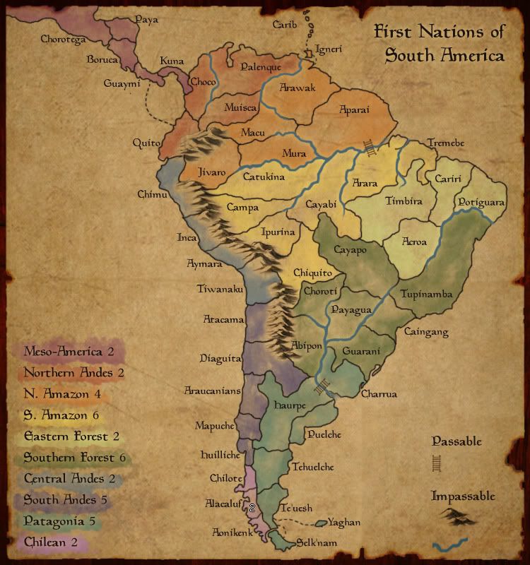
- Click image to enlarge.
The map is very nice, i think you want to use the same graphic style used in the other map....so i'd suggest to try to crop the dead space as suggested by MrBenn and then add the blue of the water. You can also try to make the bridges more noticeable, btw are you happy with them? if i'm not wrong you didn't like them so much....
Another thing you should consider is to test the colors, for example Central Andes and South Andes don't look so good testing the map with vischeck:

Finally i'd suggest to move a bit Igneri (label & island) to have more free space for the troops number and to make the connection with Arawak more noticeable (i think that on the small version the connection will be hard to see)
Looking forward your next update
-
natty dread
- Posts: 12876
- Joined: Fri Feb 08, 2008 8:58 pm
- Location: just plain fucked
Re: First Nations of South America.. UPDATE page 11
I'd say, swap the colours of South andes & Chilean, that should do it.
-
Evil DIMwit
- Posts: 1616
- Joined: Thu Mar 22, 2007 1:47 pm
- Gender: Male
- Location: Philadelphia, NJ
Re: First Nations of South America.. UPDATE page 11
It's a little hard to tell what continent Carib is part of. Not sure what's the best way to fix that.
Re: First Nations of South America.. UPDATE page 11
You could artificially enlarge those islands?Evil DIMwit wrote:It's a little hard to tell what continent Carib is part of. Not sure what's the best way to fix that.
PB: 2661 | He's blue... If he were green he would die | No mod would be stupid enough to do that