Conquer Club

[Abandoned] - Zombie Invasion!

Abandoned and Vacationed maps. The final resting place, unless you recycle.

Moderator: Cartographers

Forum rules
Please read the Community Guidelines before posting.

Re: Zombie Invasion- Version 2.0

Postby 00iCon on Tue May 18, 2010 8:33 am

natty_dread wrote:This is starting to look nice. But could you change that "more choppers" territory... How about just naming them Choppers 1 & 2 ?

I think it presents a slight comic relief, let it stay!
Also, i think naming it outpost gives the greatest sense of despair, fitting nicely with the theme.
QUENCH!!!!
User avatar
Corporal 1st Class 00iCon
 
Posts: 257
Joined: Wed Apr 29, 2009 4:42 am
Location: Sydney NSW

Re: Zombie Invasion- Version 2.0

Postby Industrial Helix on Wed May 19, 2010 7:24 am

I agree with 00icon on More choppers... it makes me laugh.

The big gameplay issue that bugs me when looking at the map is that overpass... it puts two starting positions in very close whereas the others are more far apart... unless I'm not catching some higher neutrals for that area or something.
Sketchblog [Update 07/25/11]: http://indyhelixsketch.blogspot.com/
Living in Japan [Update 07/17/11]: http://mirrorcountryih.blogspot.com/
Russian Revolution map for ConquerClub [07/20/11]: viewtopic.php?f=241&t=116575
User avatar
Cook Industrial Helix
 
Posts: 3462
Joined: Mon Jul 14, 2008 6:49 pm
Location: Ohio

Re: Zombie Invasion- Version 2.0

Postby natty dread on Wed May 19, 2010 7:30 am

The only thing that bothers me about "more choppers" is that it reminds of the "more russia" territory on doodle... It's kinda done already, it was funny the first time, but any further maps with "more xxx" territories are kinda meh...

That's just my opinion though, if people want more choppers then by all means give them more choppers.
Image
User avatar
Sergeant 1st Class natty dread
 
Posts: 12877
Joined: Fri Feb 08, 2008 8:58 pm
Location: just plain fucked

Re: Zombie Invasion- Version 2.0

Postby 00iCon on Thu May 20, 2010 4:40 am

natty_dread wrote:The only thing that bothers me about "more choppers" is that it reminds of the "more russia" territory on doodle... It's kinda done already, it was funny the first time, but any further maps with "more xxx" territories are kinda meh...

That's just my opinion though, if people want more choppers then by all means give them more choppers.

I guess that would ruin it a bit, but I actually haven't played doodle earth yet!

BTW, will crater connect to supply depot? There's a hole there.

Also, if your'e going with the perspective look, the top right corner of every building would need work.
User avatar
Corporal 1st Class 00iCon
 
Posts: 257
Joined: Wed Apr 29, 2009 4:42 am
Location: Sydney NSW

Re: Zombie Invasion- Version 2.0

Postby MarshalNey on Thu May 20, 2010 9:33 am

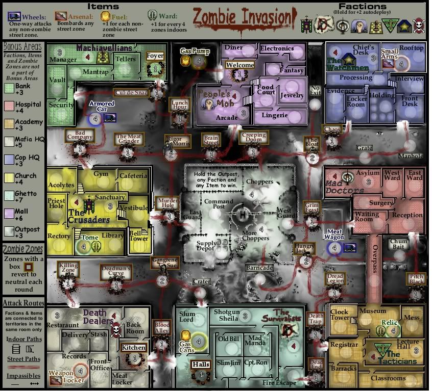
Slight Update:

Click image to enlarge.
image


Mostly, you might notice the changed fonts for the factions. Otherwise some more touch-up stuff.

natty_dread wrote:The only thing that bothers me about "more choppers" is that it reminds of the "more russia" territory on doodle... It's kinda done already, it was funny the first time, but any further maps with "more xxx" territories are kinda meh...

That's just my opinion though, if people want more choppers then by all means give them more choppers.


Whoa, Doodle Earth stole my witty name?

Seriously, though, I had no idea. I've only played Doodle once by accident (random map settings) and didn't care for the gameplay- not my style. The theme is hilarious though.

Anyway, if you think that "More Choppers" steals Doodle's thunder, I'll change it.

I like the name debates, though... the names need more work. Some of them are just filler right now.

Industrial Helix wrote:The big gameplay issue that bugs me when looking at the map is that overpass... it puts two starting positions in very close whereas the others are more far apart... unless I'm not catching some higher neutrals for that area or something.


Long ago when I first laid out the map, the Overpass got put in just to mix things up. Then, when Mr. Benn looong ago said the layout looked too similar to Drug War, I kept the Overpass just to keep the map a little more asymmetrical.

Anyway, I see what you're saying gameplay-wise, and I'm not sure if it's a problem or not. The Factions are all "protected" from other players-or other players are protected from the Factions, whichever way you want to look at it- by a neutral 3. The Factions and Items only connect to territories in the same room, and I made sure that those are all marked as neutral 3 on the map.

It might require some adjustment to bonuses or territories considering the relative difficulty those two buildings will have in holding their bonus regions, but for now I'd like to try and keep the Overpass if possible... I may axe it upon further consideration (headache)

00iCon wrote:BTW, will crater connect to supply depot? There's a hole there.

Also, if your'e going with the perspective look, the top right corner of every building would need work.


Errrr, phooey. I figured that it would look like a hole. In the color version of the background, before I grayscaled the streets to make them truly grim-looking, one could make out a burning car with a plume of smoke. Now the smoke cloud looks like a bit of a hole...

Well, anyway, to answer your question about the Crater connecting to Supply Depot... no. Not unless there needs to be a connection for gameplay purposes.

As for the upper right corners, I see what you're thinking but I'm not too concerned about it. I've extended the walls in the latest version (part of the "clean-up") which will hopefully help. The graphics polishing will, I warn everyone in advance, take quite a while as I'm sloooow. ;)

b00kw0rm wrote:The only room I have issues with is the Halls. It's very strange how it wraps around... kinda confusing as to what it connects to. The other rooms are fine.


OK, I might try adding some doors on the next version and see what it looks like. If successful, it would make the indoor connections explicit.


Thanks everyone for the continued feedback and interest, as always excellent observations.

For the next version, I think I'm going to concentrate on cleaning up the Legend and adding in some doors. I'll also be adding in two "safe" street territories on the left side of the map, to make them more accessible via Wheels.
User avatar
Captain MarshalNey
 
Posts: 781
Joined: Mon Sep 28, 2009 9:02 pm
Location: St. Louis, MO

Re: Zombie Invasion- Version 2.0

Postby Evil DIMwit on Thu May 20, 2010 9:44 am

MarshalNey wrote:
natty_dread wrote:The only thing that bothers me about "more choppers" is that it reminds of the "more russia" territory on doodle... It's kinda done already, it was funny the first time, but any further maps with "more xxx" territories are kinda meh...

That's just my opinion though, if people want more choppers then by all means give them more choppers.


Whoa, Doodle Earth stole my witty name?

Seriously, though, I had no idea. I've only played Doodle once by accident (random map settings) and didn't care for the gameplay- not my style. The theme is hilarious though.

Anyway, if you think that "More Choppers" steals Doodle's thunder, I'll change it.


You can keep "More Choppers." At worst I'll think of it as an homage.


I like the name debates, though... the names need more work. Some of them are just filler right now.


Don't get too caught up in those. When I was doing Doodle Earth probably the most annoying part was going back and forth between names of varying humor and literalness.

That said, which names would you say are filler?
ImageImage
User avatar
Captain Evil DIMwit
 
Posts: 1616
Joined: Thu Mar 22, 2007 1:47 pm
Location: Philadelphia, NJ

Re: Zombie Invasion- Version 2.0

Postby MarshalNey on Mon May 24, 2010 8:30 pm

Evil DIMwit wrote:You can keep "More Choppers." At worst I'll think of it as an homage.


Ahh, most gracious :D

Evil DIMwit wrote:That said, which names would you say are filler?


Well, keep in mind as I go through the names that the big limiting factor in my choices is space; I don't want to reduce the font size.

Okay, here's how I feel name-wise:

I like all of the Ghetto names- I'm pretty happy with a Slum Lord packing away a bunch of gas cans, and the "evict me over my dead body" names for the tenants.

I like most of the Mafia HQ names- the theme of a restaraunt "front" with a more seedy "back" is nice, but I know that some of the seediness could be spiced up. 'Records', 'Delivery' & 'Back Room' are OK, but they don't scream crime. I think 'Stash' probably works.

I like most of the Church names- it's meant to just resonate the theme of holy ground, maybe a haven to ward off evil. The names are standard, for the most part, but I like the 'Preist Hole' and the 'Library' with a Tome. Probably the weak part is the 'Gym' and the 'Cafeteria', as they don't fit the theme but are merely common things that one sees in big churches.

I like most of the Hospital names- I'm very happy with the Mad Doctors faction in the 'Asylum'. The 'E/W Wards' and 'Surgery' also seem fitting... 'Reception' and 'Waiting Room' sort of overlap, I just came up dry and opted to make a thin joke about how much
bureauacracy and waiting around everyone puts up with at a hospital.

I have mixed feelings about the Mall names- I really love the People's Mob in the Arcade, and think it would be mildly amusing/disturbing to see a log entry like "MarshalNey assaulted Lingerie from Food Court". On the other hand, there's no real thematic element running through the names. I'm happy with the names but I think that more could be done... does that make sense?

I'm okay with all of the Academy names- nothing 'pops' theme-wise here, but the military school idea gives the region a little life. The Relic in the 'Museum' is mildly interesting I think. I would have loved to put a Rifle in the Clock Tower (that was the original idea), but it just didn't fit space-wise or gameplay-balance-wise.

I'm ho-hum about all of the Police HQ names- very similarly to the Academy, this region has a lot of functional but not exciting names. If not for the 'Roof' and 'Small Arms', this would be my least favorite region name-wise.

The Bank names seem blah- The region is very small, but that's probably not an excuse for such meh names. 'Mantrap' is about as close as it gets to interesting.

I like most of the Zombie names- Some start to get repetitive I think, and a few seem over-the-top cheesy even for this map. My least favorite are 'Lunch Hour', 'Pitch Black' and 'Dread Legion'. I wish a few more could be associated with the streets or street names; my favorites along these lines are 'Brain Street' (which alternatively was 'Pain Street'- which do you like more?) and 'Cul-de-snac'.


So to sum up my thoughts...

Names that could be improved: 'Back Room', 'Delivery', 'Records', 'Gym', 'Cafeteria', 'Waiting Room', 'Reception', 'Lunch Hour', 'Pitch Black', 'Dread Legion', some other non-street themed Zombie names, and some theme for the Mall names(?).

Names that are 'filler': Academy, Police HQ and Bank names
User avatar
Captain MarshalNey
 
Posts: 781
Joined: Mon Sep 28, 2009 9:02 pm
Location: St. Louis, MO

Re: Zombie Invasion- Version 2.0

Postby b00kw0rm on Fri Jun 04, 2010 11:18 am

For the "More Choppers" territory, instead of putting on a heli, put on a few motorcycles. See if anyone notices... :P
Image
My Tournaments:
Age of Conquerors [WINNER: br4nd0n2002]
Team Clash [WINNERS: bfunny27 & DBandit70]
Sibling Rivalry [ONGOING]
User avatar
Private b00kw0rm
 
Posts: 118
Joined: Tue Mar 16, 2010 2:45 pm
Location: Stage 8-7

Re: Zombie Invasion- Version 2.0

Postby ender516 on Fri Jun 04, 2010 11:26 am

If you are still thinking of renaming the Outpost, you might consider "The Fort", "Fort Apache", or "The Alamo". Any of these might even be in quotations on the map, as it would be a nickname given the area by the zombie fighters.
User avatar
Sergeant 1st Class ender516
 
Posts: 4455
Joined: Wed Dec 17, 2008 6:07 pm
Location: Waterloo, Ontario

Re: Zombie Invasion- Version 2.0

Postby MarshalNey on Fri Jun 04, 2010 1:42 pm

"The Alamo".... perfect. Thanks Ender, keep'em coming :D

Nice inside joke, Bookworm... I'll see about putting it on (eventually).

Memorial Day saw some way out-of-state friends flying in to ol' Missouri, so I've been 'on vacation' this week from the map, but I'll have an update out soon. Thanks for the continued interest everyone.
User avatar
Captain MarshalNey
 
Posts: 781
Joined: Mon Sep 28, 2009 9:02 pm
Location: St. Louis, MO

Re: Zombie Invasion- Version 2.0

Postby ender516 on Fri Jun 04, 2010 8:25 pm

If you don't use the motorcycles for "More Choppers", you might move the troop circle so it doesn't obscure the helicopter quite so thoroughly (or move the 'copter, whatever).
User avatar
Sergeant 1st Class ender516
 
Posts: 4455
Joined: Wed Dec 17, 2008 6:07 pm
Location: Waterloo, Ontario

Re: Zombie Invasion- Version 2.0

Postby MarshalNey on Wed Jun 16, 2010 6:53 pm

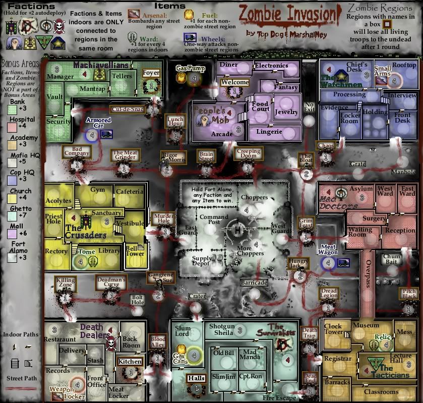
I'm not nearly done with the new legend, but it's been some time since I posted an update. I thought that this might give an idea of the layout I had in mind:

Click image to enlarge.
image


I actually seem to have a tiny bit of space, which I was thinking of using for describing "Death From Above" one-way attacks from the Clock Tower and Bell Tower (and possibly the Overpass).

Any thoughts?

ender516 wrote:If you don't use the motorcycles for "More Choppers", you might move the troop circle so it doesn't obscure the helicopter quite so thoroughly (or move the 'copter, whatever).


On the queue, coming when I finish fiddling with this update.
User avatar
Captain MarshalNey
 
Posts: 781
Joined: Mon Sep 28, 2009 9:02 pm
Location: St. Louis, MO

Re: Zombie Invasion- Version 2.5 (update still in progress)

Postby Evil DIMwit on Wed Jun 16, 2010 7:05 pm

My thoughts is, show me that the legend fits legibly in a 600x630 box, along with the map proper. You don't have to replicate the fancy graphics but it's important that the text is large enough to be readable.

Also, I don't like the new doors. They feel less intuitive than the gaps in the wall, if that makes sense.
ImageImage
User avatar
Captain Evil DIMwit
 
Posts: 1616
Joined: Thu Mar 22, 2007 1:47 pm
Location: Philadelphia, NJ

Re: Zombie Invasion- Version 2.5 (update still in progress)

Postby natty dread on Wed Jun 16, 2010 7:56 pm

I agree with e.d. about the doors. Other than that, this map is starting to look great. Good job.
Image
User avatar
Sergeant 1st Class natty dread
 
Posts: 12877
Joined: Fri Feb 08, 2008 8:58 pm
Location: just plain fucked

Re: Zombie Invasion- Version 2.5 (update still in progress)

Postby Top Dog on Wed Jun 16, 2010 10:18 pm

new key looks great, and is much more clearer... I like the few small changes graphically as well.. I dunno I personally kinda like the doors but that's just me...
High Score: 1384 w/ 42% games won
User avatar
Private 1st Class Top Dog
 
Posts: 507
Joined: Mon Dec 03, 2007 7:50 pm
Location: Right Here

Re: Zombie Invasion- Version 2.5 (update still in progress)

Postby danfrank on Wed Jun 16, 2010 10:25 pm

My first look.. WOW looks cool cant wait to play.. Keep up the good work =D>
Corporal 1st Class danfrank
 
Posts: 611
Joined: Mon Dec 24, 2007 1:19 am

Re: Zombie Invasion- Version 2.5 (update still in progress)

Postby MarshalNey on Fri Jun 18, 2010 12:31 pm

Thanks for the encouragement all. Hmmm, where to start...

Evil DIMwit wrote:My thoughts [are], show me that the legend fits legibly in a 600x630 box, along with the map proper. You don't have to replicate the fancy graphics but it's important that the text is large enough to be readable...


Hurumph, hurumph... very well. I've been studiously avoiding the small map, but it seems that the time has come. My gut instinct is that it won't be a real problem, just a whole lot of work to re-arrange and modify stuff. But enough gloom, on to work on the small map!

Evil DIMwit wrote:Also, I don't like the new doors. They feel less intuitive than the gaps in the wall, if that makes sense.


natty_dread wrote:I agree with e.d. about the doors.


Top Dog wrote:I like the few small changes graphically as well.. I dunno I personally kinda like the doors but that's just me...


Hmmm.... 2 vs. 1 opposed to the doors.

Here's my question, is the opposition to the doors mostly aesthetic, or do they actually make the map hard to read? My goal with the doors was to clear up problems that a few posters were having with the room connections.

If the doors won't do, I will need some way to make the rooms more clearly defined...

natty_dread wrote:Other than that, this map is starting to look great. Good job.
Top Dog wrote:new key looks great, and is much more clearer...
danfrank wrote:My first look.. WOW looks cool cant wait to play.. Keep up the good work


Again, thanks for the thumbs up everyone.

Danfrank, any thoughts on the doors, since you're getting fresh eyes on this? Are the room connections clear?
User avatar
Captain MarshalNey
 
Posts: 781
Joined: Mon Sep 28, 2009 9:02 pm
Location: St. Louis, MO

Re: Zombie Invasion- Version 2.5 (update still in progress)

Postby natty dread on Fri Jun 18, 2010 12:34 pm

Here's my question, is the opposition to the doors mostly aesthetic, or do they actually make the map hard to read? My goal with the doors was to clear up problems that a few posters were having with the room connections.


Not aesthetic... they actually look real nice, but make it kinda hard to see the connections. Remember: function trumps form... ;)
Image
User avatar
Sergeant 1st Class natty dread
 
Posts: 12877
Joined: Fri Feb 08, 2008 8:58 pm
Location: just plain fucked

Re: Zombie Invasion- Version 2.5 (update still in progress)

Postby MarshalNey on Sun Jun 20, 2010 11:30 pm

natty_dread wrote:Not aesthetic... they actually look real nice, but make it kinda hard to see the connections. Remember: function trumps form...


Good to know reasons, that's why I asked. Thanks for clarifying.

As for "function trumps form," that was the entire purpose of adding the doors in the first place, so if you feel that they actually make the map less clear, well that's a problem that need some thinking. However, others expressed concerns when there were just gaps, so if you (or anyone else) have suggestions, please stand up and speak.

Finally, Top Dog, do you think the map is more clear with the doors, unchanged, or less clear? You said you kind of liked them...

(btw, among other bastardized quotes by Frank Lloyd Wright, this is one that I also like: "The truth is more important than the facts.")
User avatar
Captain MarshalNey
 
Posts: 781
Joined: Mon Sep 28, 2009 9:02 pm
Location: St. Louis, MO

Re: Zombie Invasion- Version 2.5 (update still in progress)

Postby natty dread on Mon Jun 21, 2010 7:28 am

I don't know, maybe you could try small arrows...
Image
User avatar
Sergeant 1st Class natty dread
 
Posts: 12877
Joined: Fri Feb 08, 2008 8:58 pm
Location: just plain fucked

Re: Zombie Invasion- Version 2.5 (update still in progress)

Postby b00kw0rm on Tue Jun 22, 2010 9:36 am

On the right side of the map, next to the Chum Bait street territory, there is what appears to be the remnants of an unused army circle.
Image
My Tournaments:
Age of Conquerors [WINNER: br4nd0n2002]
Team Clash [WINNERS: bfunny27 & DBandit70]
Sibling Rivalry [ONGOING]
User avatar
Private b00kw0rm
 
Posts: 118
Joined: Tue Mar 16, 2010 2:45 pm
Location: Stage 8-7

Re: Zombie Invasion- Version 2.5 (update still in progress)

Postby danfrank on Tue Jun 22, 2010 10:01 pm

I would have quoted your post but i am no good at messages that long..


Back to the doors , Room connections are quite clear , The stairs and the doors are what make the perspective of the map . The only thing i see as far as the doors go is the connection between manager and foyer in the bank .. the top line needs to be lengthened a hair .. the green from the background is seen between the black shade line and the top of the door..
Corporal 1st Class danfrank
 
Posts: 611
Joined: Mon Dec 24, 2007 1:19 am

Re: Zombie Invasion- Version 2.5 (update still in progress)

Postby MarshalNey on Wed Jun 23, 2010 1:18 am

b00kw0rm wrote:On the right side of the map, next to the Chum Bait street territory, there is what appears to be the remnants of an unused army circle.


What? No... that's umm... a very circular fog swirl <cough, cough>

I'll fix it in the next update.

Thanks for the good eyes.

danfrank wrote:Back to the doors , Room connections are quite clear , The stairs and the doors are what make the perspective of the map . The only thing i see as far as the doors go is the connection between manager and foyer in the bank .. the top line needs to be lengthened a hair .. the green from the background is seen between the black shade line and the top of the door..


Ahhhh, thanks for the fresh eyes. Hmmmm.... yes, indeed you're right about that door/connection. It's always felt a little messy- I'll fix it on the next update.

You probably haven't seen the map without the doors, so I might post both on the next update and run a poll. Or, if you're particularly ambitious, you can always scour through the previous versions.

danfrank wrote:I would have quoted your post but i am no good at messages that long..


Oh no problem, thanks for posting and please feel free to keep doing so! :D Contributions like yours keep this project rolling...

However, if you're curious how to quote just a small part of a long post, here's a simple way to do it:
(1) Hit 'Post a Reply'
(2) scroll down to the part of the screen where it shows the latest page of posts
(3) highlight the text that you want to quote
(4) hit the "Quote button on that post and... done!

The other way is to copy the text you want to quote, then paste it into your post. Highlight it, and then hit the quote button in the toolbar. Finally, insert ="username" inside the first set of quote brackets (where username is actually the name of the person you want to quote). Example: if I wanted to quote you, I'd type

[quote= "danfrank"] blah blah text of quote blah blah [/quote]

except that I wouldn't leave a space in front of "danfrank"- I only did it in this case so that you could see the code
User avatar
Captain MarshalNey
 
Posts: 781
Joined: Mon Sep 28, 2009 9:02 pm
Location: St. Louis, MO

Re: Zombie Invasion- Version 2.5 (update still in progress)

Postby natty dread on Wed Jun 23, 2010 5:00 am

How about open doors?
Image
User avatar
Sergeant 1st Class natty dread
 
Posts: 12877
Joined: Fri Feb 08, 2008 8:58 pm
Location: just plain fucked

Re: Zombie Invasion- Version 2.5 (update still in progress)

Postby Top Dog on Sun Jun 27, 2010 7:02 pm

I just noticed the stairs now, i dunno if they were new or not but either way I love 'em... they give a 3d feeling to the map, and clarify connections... I support the doors as I've said I believe they clarify and also look good... now I'd also support natty's idea for open doors if you could pull it off... either way I'm a supporter ;)
High Score: 1384 w/ 42% games won
User avatar
Private 1st Class Top Dog
 
Posts: 507
Joined: Mon Dec 03, 2007 7:50 pm
Location: Right Here

PreviousNext

Return to Recycling Box

Who is online

Users browsing this forum: No registered users