AOS: Orient Express 1883 [quench'd]
Moderator: Cartographers
Re: Orient Express 1883 <v7> p1,11 - new poll!
I've always seen 'Montenegro' as one word, not two. Any particular reason why you have it as two (I may have missed the discussion)?
--Andy
--Andy
-

 AndyDufresne
- Posts: 24935
- Joined: Fri Mar 03, 2006 8:22 pm
- Location: A Banana Palm in Zihuatanejo


Re: Orient Express 1883 <v7> p1,11 - new poll!
AndyDufresne wrote:I've always seen 'Montenegro' as one word, not two. Any particular reason why you have it as two (I may have missed the discussion)?
--Andy
By my research it is how it was commonly spelled at the time (1883).
Like how Servia is Serbia these days...

-

 natty dread
- Posts: 12877
- Joined: Fri Feb 08, 2008 8:58 pm
- Location: just plain fucked


Re: Orient Express 1883 <v7> p1,11 - new poll!
I am sorry, But something came up and I was not able to finish this post.porkenbeans wrote:
These two illustrationss are only meant to show you the minimum brightness contrasts that I am advocating. If you were to make a sliding scale with 0 in the center, you would have to move the slider to the right to around a setting of +5 to get the dark back example. Adversely, if you moved the slider to the left to around -5, you would get the light back example. Your current image lies very close to the 0.
Distinguishing brightness contrast between two different colors is not an easy thing to do. You may find it easier if you greyscaled the image, then you would see quite plainly the brightness contrast levels.
The colors and textures are irrelevant at this stage. You can play with those settings after you have chosen, the desired brightness contrast levels.
If you should go with the light back, it will need to be very light because the land is very light. Darkening the land as I showed in the example, will help if you choose to go that route.
If you should go with the dark back, you can lighten the land, as I have shown in the other example. The levels can be played with, but these levels are the minimum starting points in my view. Now remember that I am not really concerned with the colors or textures that I added. That was only to show you that other tweaks in those areas, are things that you could play with as well. The blue that I overlaid is less red, and more green. A less "purpley" water might serve better, I don't know. Just made it that way to give you something different to ponder.

-

 porkenbeans
- Posts: 2546
- Joined: Mon Sep 10, 2007 4:06 pm


Re: Orient Express 1883 <v7> p1,11 - new poll!
Well, I am not convinced the brightness contrast needs to be that large here. In the lighter version I posted I have saturation contrast + opposite colour contrast, which seem to be sufficient to me. The rivers and oceans are easy to see, so I don't see reason to add any more contrast than what there already is.
Anyway, I should remind we're still at the gameplay phase here. I'll be more than happy to debate the visual aspects of the map with you once we move on to graphics...
Anyway, I should remind we're still at the gameplay phase here. I'll be more than happy to debate the visual aspects of the map with you once we move on to graphics...

-

 natty dread
- Posts: 12877
- Joined: Fri Feb 08, 2008 8:58 pm
- Location: just plain fucked


Re: Orient Express 1883 <v7> p1,11 - new poll!
In a perfect world,natty_dread wrote:Well, I am not convinced the brightness contrast needs to be that large here. In the lighter version I posted I have saturation contrast + opposite colour contrast, which seem to be sufficient to me. The rivers and oceans are easy to see, so I don't see reason to add any more contrast than what there already is.
Anyway, I should remind we're still at the gameplay phase here. I'll be more than happy to debate the visual aspects of the map with you once we move on to graphics...
I have noticed that most, if not all, maps that reach the GFX Workshop, are already well into the graphic production "faze". And in fact, are practically finished maps, with only miner tweaks to be performed.
Consider the fact that many a mapmakers have become fondly attached to their map, by the time it takes to get to GFX. I have always maintained, that graphics and gameplay, evolve side by side. Now I know that some of us do not believe in Evolution, but from of the evidence that I have seen, Evolution is true, All CC maps have "benn" produced in this fashion.
The GFX Workshop is just a tweaking station. The "painting" is just about ready, to be hung on the wall, when it arrives there.

-

 porkenbeans
- Posts: 2546
- Joined: Mon Sep 10, 2007 4:06 pm


Re: Orient Express 1883 <v7> p1,11 - new poll!
porkenbeans wrote:The GFX Workshop is just a tweaking station. The "painting" is just about ready, to be hung on the wall, when it arrives there.
With all respect I disagree. Granted, a lot of the intial graphical development occurs before the GFX shop. But once you get there, you have free reins on doing the graphics - you don't need to worry about gameplay & territory connections changing and you can "fix" them in place and concentrate fully on the visual.
Anyway, can we not derail the thread any further, I'm sure this debate would be better suited to the foundry discussions... I'd like to hear some feedback on the gameplay.
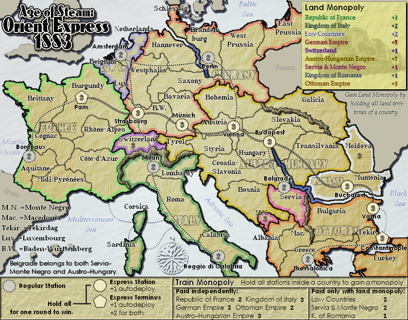
Evil_d said that the bonuses for low countries & servia-m.n seemed a little high. Should I lower them? Are there any other bonus values that require tweaking?

-

 natty dread
- Posts: 12877
- Joined: Fri Feb 08, 2008 8:58 pm
- Location: just plain fucked


Re: Orient Express 1883 <v7> p1,11 - new poll!
natty_dread wrote:Evil_d said that the bonuses for low countries & servia-m.n seemed a little high. Should I lower them? Are there any other bonus values that require tweaking?
On second thought, considering S-MN starts with two neutral territories, it's probably not so bad. Low countries probably not either; it's hardly a stronghold.
Perhaps bring the bonus for Ottoman Empire or Ottoman Train Empire down one, since it's so in the corner. Holding the line at Albania, Macedonia, and Bucharest gives 10/3/8(!) with excellent expansion potential.
Likewise the Italian train bonus seems high for just two territories.
-

 Evil DIMwit
- Posts: 1616
- Joined: Thu Mar 22, 2007 1:47 pm
- Location: Philadelphia, NJ


Re: Orient Express 1883 <v7> p1,11 - new poll!
On second thought, considering S-MN starts with two neutral territories, it's probably not so bad. Low countries probably not either; it's hardly a stronghold.
Gotcha. I'll keep them as they are.
Perhaps bring the bonus for Ottoman Empire or Ottoman Train Empire down one, since it's so in the corner. Holding the line at Albania, Macedonia, and Bucharest gives 10/3/8(!) with excellent expansion potential.
Ah, yes. 8 does seem a bit high for 3 borders. I could consider lowering the land bonus for Ottoman... then it would be 2 and 2.
Likewise the Italian train bonus seems high for just two territories.
Yes. However then I would like to transfer that bonus to italian land. Italy + stations has 5 borders, so I'd like it to have a +5 bonus... So I guess making it land 3 stations 2 would be suitable?
So:
Ottoman land -> 2
Italy land -> 3
Italy train -> 2

-

 natty dread
- Posts: 12877
- Joined: Fri Feb 08, 2008 8:58 pm
- Location: just plain fucked


Re: Orient Express 1883 <v7> p1,11 - new poll!
Am I missing something? Doesn't Italy+stations have 3 borders: Milan, Lombardy, Corsica?
-

 Evil DIMwit
- Posts: 1616
- Joined: Thu Mar 22, 2007 1:47 pm
- Location: Philadelphia, NJ


Re: Orient Express 1883 <v7> p1,11 - new poll!
Evil DIMwit wrote:Am I missing something? Doesn't Italy+stations have 3 borders: Milan, Lombardy, Corsica?
Oops, you're right... it's 3 borders. I don't know why I had the idea in my head that it had 5 borders? How odd.
Anyway, yeah, thanks for pointing that out, I guess it would be appropriate to have a 2+2 bonus for Italy then...
So then it's just
Ottoman land -> 2
Italy train -> 2

-

 natty dread
- Posts: 12877
- Joined: Fri Feb 08, 2008 8:58 pm
- Location: just plain fucked


Re: Orient Express 1883 <v7> p1,11 - new poll!
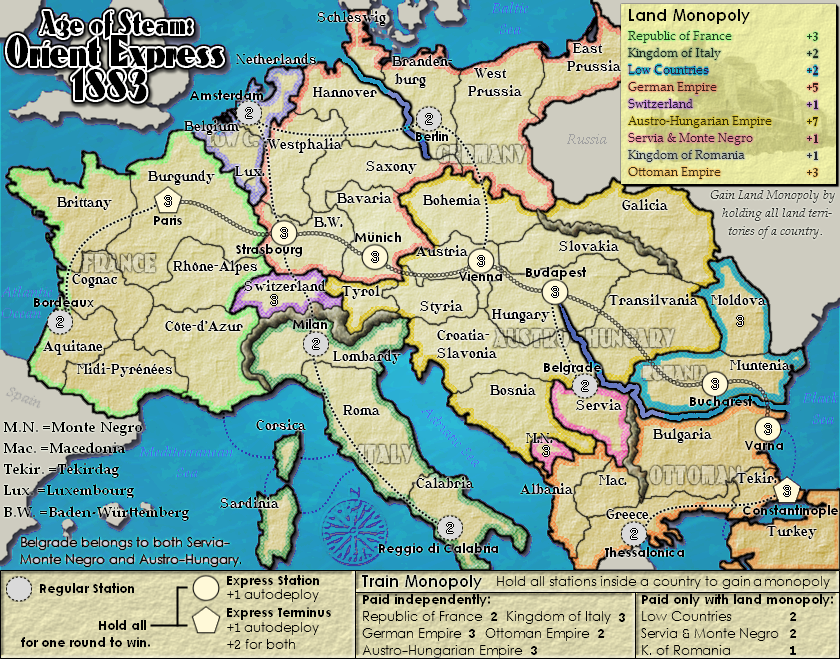
what's different?
-

 The Bison King
- Posts: 1957
- Joined: Thu Aug 27, 2009 5:06 pm
- Location: the Mid-Westeros


Re: AOS: Orient Express 1883 <v7> p1,11
Looks to me like the Ottoman land and Italy train bonuses he mentioned in the previous post.
-

 ender516
- Posts: 4455
- Joined: Wed Dec 17, 2008 6:07 pm
- Location: Waterloo, Ontario


Re: AOS: Orient Express 1883 <v7> p1,11
ender516 wrote:Looks to me like the Ottoman land and Italy train bonuses he mentioned in the previous post.
Yep, also mountains. I'm not planning on leaving them like that though... just experimenting.
Also abbreviations were switched to match the style of the belgrade text. I still have too many fonts on this. Got to change the upper legend font...

-

 natty dread
- Posts: 12877
- Joined: Fri Feb 08, 2008 8:58 pm
- Location: just plain fucked


Re: AOS: Orient Express 1883 <v7> p1,11
You could use just one font for both land territory names and station names, but make the station names, say, a strong red. I don't know which of the two fonts you have now that I would suggest using, though.
-

 ender516
- Posts: 4455
- Joined: Wed Dec 17, 2008 6:07 pm
- Location: Waterloo, Ontario


Re: AOS: Orient Express 1883 <v7> p1,11
ender516 wrote:You could use just one font for both land territory names and station names, but make the station names, say, a strong red. I don't know which of the two fonts you have now that I would suggest using, though.
Eh, I don't really like that idea, sorry. The station font is the same as the lower legend font but in bold. The only font that doesn't fit now is the upper legend font (which is also used for the non-playable area & sea names) so if I just change that to the same font as the lower legend then I'll be down to 2 fonts.

-

 natty dread
- Posts: 12877
- Joined: Fri Feb 08, 2008 8:58 pm
- Location: just plain fucked


Re: AOS: Orient Express 1883 <v7> p1,13
So the lower legend which explains the trains uses the same font as the train station labels. Okay, then the upper legend which explains the land monopolies could use the same font as the land territories, with the non-playable areas and sea names using an italic version of that. That should unify things.
-

 ender516
- Posts: 4455
- Joined: Wed Dec 17, 2008 6:07 pm
- Location: Waterloo, Ontario


Re: AOS: Orient Express 1883 <v7> p1,13
ender516 wrote:So the lower legend which explains the trains uses the same font as the train station labels. Okay, then the upper legend which explains the land monopolies could use the same font as the land territories, with the non-playable areas and sea names using an italic version of that. That should unify things.
You know, that's a great idea. I think I'll do it that way... in fact that's pretty much how it was originally.
To keep consistent I'd better change the abbreviations font as well...

-

 natty dread
- Posts: 12877
- Joined: Fri Feb 08, 2008 8:58 pm
- Location: just plain fucked


Re: AOS: Orient Express 1883 <v7> p1,13
I'm a bit worried about the Germany & Austro-hungary train boni. Now that I look at them they seem a bit high... You get 5 troops for holding 3 territories with 3 borders. And if you hold both, it's 10 troops for 6... 
There has got to be a way to balance the bonuses, while still keeping the train bonuses strong...

There has got to be a way to balance the bonuses, while still keeping the train bonuses strong...

-

 natty dread
- Posts: 12877
- Joined: Fri Feb 08, 2008 8:58 pm
- Location: just plain fucked


Re: AOS: Orient Express 1883 <v7> p1,13
Considering the auto-deploys on the main line, the train bonuses are strong.
Brainstorming: How about if you scrapped the train monopoly bonuses and the auto-deploy, and just gave +1 for every station held?
Brainstorming: How about if you scrapped the train monopoly bonuses and the auto-deploy, and just gave +1 for every station held?
-

 Evil DIMwit
- Posts: 1616
- Joined: Thu Mar 22, 2007 1:47 pm
- Location: Philadelphia, NJ


Re: AOS: Orient Express 1883 <v7> p1,13
Evil DIMwit wrote:Considering the auto-deploys on the main line, the train bonuses are strong.
Brainstorming: How about if you scrapped the train monopoly bonuses and the auto-deploy, and just gave +1 for every station held?
First impression: I likely may end up scrapping one or the other, but I don't quite warm up to the idea of doing away with both...
If one would have to be scrapped I guess it would be the autodeploys. They lose a lot of their appeal in non-conquest maps anyway... and the train monopoly really fits the theme of the map, it goes a long way creating the right atmosphere...
Also if it was +1 for each station, this would mean that the only thing differentiating the express stations from regulars would be the victory condition. And I think they deserve more...
So here's my counter-offer:
- scrap the autodeploy on all but termini.
- scrap the +2 for both termini bonus.
- make each train monopoly equivalent to amount of stations.
- make each total monopoly (land+train) balanced against each other.
- consider the termini autodeploy in the total bonuses, but not in the train boni.
This would make the train bonuses of france & ottoman slightly stronger than others, but it would balance out in the total bonuses.
This would also enable the train bonuses of single-station countries to be paid independently of the land, since you would no more be getting a +2 for one territory, simplifying the gameplay - and the legend.
How does it sound?

-

 natty dread
- Posts: 12877
- Joined: Fri Feb 08, 2008 8:58 pm
- Location: just plain fucked


Re: Orient Express 1883 <v6> p1,10 - new poll!
natty_dread wrote:You know, I'm starting to think that maybe I should just scrap the idea of a common name for the map pack... I mean, the names of the maps are already long enough... The current full name of this map for example is "Orient Expres 1883: Paris - Constantinople" so with the map pack name added to it it would be a real word monster...
The people who really like these maps would know that they belong to the same map pack anyway... and what if it turns out the later maps won't gather enough support and never get made, or run into some other problems... then it would be stupid to have just one map of a map pack...
YEah I agree.... unless you come up with a name that sings to you and is unique... I dont like the proposed ones much.
Maps Maps Maps!
Take part in this survey and possibly win an upgrade -->
https://docs.google.com/spreadsheet/embeddedform?formkey=dGg4a0VxUzJLb1NGNUFwZHBuOHRFZnc6MQ
Take part in this survey and possibly win an upgrade -->
https://docs.google.com/spreadsheet/embeddedform?formkey=dGg4a0VxUzJLb1NGNUFwZHBuOHRFZnc6MQ
-

 army of nobunaga
- Posts: 1989
- Joined: Sat Oct 13, 2007 10:06 pm
- Location: www.facebook.com/armyofnobu and Houston.


Re: AOS: Orient Express 1883 <v7> p1,13
There's still time to think about the name issue. Lots of people seem to like the AOS name, so I might as well go with it. So there are already a couple of "Age of..." maps, so what. If you try to be unique for uniqueness' sake, you most often end up with crap. I'll have the uniqueness in my map come from the gameplay and graphics, rather than the name 
But like I said there's still time, for now I'll be going with AOS, but it's not set in stone...
Anyway, how does the new gameplay plan sound? (see my previous post)
But like I said there's still time, for now I'll be going with AOS, but it's not set in stone...
Anyway, how does the new gameplay plan sound? (see my previous post)

-

 natty dread
- Posts: 12877
- Joined: Fri Feb 08, 2008 8:58 pm
- Location: just plain fucked


Re: AOS: Orient Express 1883 <v7> p1,13
If the changes make the gameplay and legend simpler, while maintaining balance, then there's no question that that is the way to go. A straightforward but enjoyable map is bound to be popular.
-

 ender516
- Posts: 4455
- Joined: Wed Dec 17, 2008 6:07 pm
- Location: Waterloo, Ontario


Who is online
Users browsing this forum: No registered users


