I wholeheartedly agree.
--Andy
Chinese Checkers [Quenched] May '07 re-opener?
Moderator: Cartographers
![]() by AndyDufresne on Thu Mar 01, 2007 12:22 am
by AndyDufresne on Thu Mar 01, 2007 12:22 am
-

 AndyDufresne
- Posts: 24935
- Joined: Fri Mar 03, 2006 8:22 pm
- Location: A Banana Palm in Zihuatanejo


![]() by oaktown on Thu Mar 01, 2007 12:53 am
by oaktown on Thu Mar 01, 2007 12:53 am
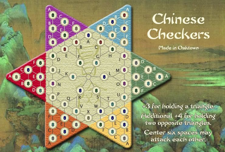
this is the one I like... I'm glad I tried all of the other styles, because it has convinced me that my early instincts were the right ones. I'm going to stick with these circles and do the other little things - softening the color transitions, fine-tuning the coordinates, etc - based on this map. Hopefully we're getting close to a finished product.

-

oaktown
- Posts: 4451
- Joined: Sun Dec 03, 2006 9:24 pm
- Location: majorcommand


![]() by Captain Crash on Thu Mar 01, 2007 2:45 am
by Captain Crash on Thu Mar 01, 2007 2:45 am
Agree can't wait to play!!
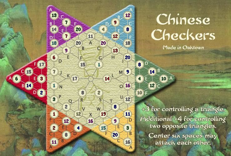
So +10 for two opposite triangles, right?
Cool!

So +10 for two opposite triangles, right?
Cool!


-

Captain Crash
- Posts: 252
- Joined: Thu Feb 01, 2007 7:06 pm
- Location: Melbourne
![]() by yeti_c on Thu Mar 01, 2007 8:39 am
by yeti_c on Thu Mar 01, 2007 8:39 am
Captain Crash wrote:Agree can't wait to play!!
So +10 for two opposite triangles, right?
Cool!
This is an interesting point...
would it be more succint to say
+3 for a triangle.
+10 for two opposite triangles.
C.
PS edited from corners - to triangles

Highest score : 2297
-

yeti_c
- Posts: 9624
- Joined: Thu Jan 04, 2007 9:02 am


![]() by Enigma on Thu Mar 01, 2007 6:46 pm
by Enigma on Thu Mar 01, 2007 6:46 pm
oaktown wrote:this is the one I like... I'm glad I tried all of the other styles, because it has convinced me that my early instincts were the right ones. I'm going to stick with these circles and do the other little things - softening the color transitions, fine-tuning the coordinates, etc - based on this map. Hopefully we're getting close to a finished product.
you did exactly what i was going to suggest, put the kanji back in the background. i love it.
the shift of "made in oaktown" looks good too.
Do you need an excuse to have a war? I mean, who for? Can't you just say "You got lots of cash and land, but I've got a big sword, so divy up right now, chop chop."
Terry Pratchet
Terry Pratchet
-

Enigma
- Posts: 367
- Joined: Mon Jul 03, 2006 10:23 pm
- Location: Classified


![]() by oaktown on Thu Mar 01, 2007 9:27 pm
by oaktown on Thu Mar 01, 2007 9:27 pm
EvilOtto wrote:How about "+3 for holding a triangle" as more succinct? But the way it is seems fine ad clear.
good change - and it makes the line shorter. you'll see it in the next version.
-
oaktown
- Posts: 4451
- Joined: Sun Dec 03, 2006 9:24 pm
- Location: majorcommand
![]() by johloh on Thu Mar 01, 2007 9:34 pm
by johloh on Thu Mar 01, 2007 9:34 pm
Id change the other "additional +4 for holding two opposite triangles" then too. keep it consistent.good change - and it makes the line shorter. you'll see it in the next version.
but im done! i think this one is ready. the background/board looks really good, i like how warm and rich the colors look in both. i think it looks great. and its awesome to look back at your first image, that is my favorite part of these threads...seeing the major progress. well done!
-

johloh
- Posts: 472
- Joined: Mon Dec 04, 2006 12:58 pm
- Location: San Francisco

![]() by sully800 on Fri Mar 02, 2007 1:40 am
by sully800 on Fri Mar 02, 2007 1:40 am
Oh man, here's a problem I noticed a little while ago but I forgot to mention it...
When you moved around the title and instructions, the instructions got placed on a relatively light and busy portion of the map which I think makes it hard to read. Can you perhaps tone down the background in that spot or add some sort of shadow to the text to make it easier on the eyes?
When you moved around the title and instructions, the instructions got placed on a relatively light and busy portion of the map which I think makes it hard to read. Can you perhaps tone down the background in that spot or add some sort of shadow to the text to make it easier on the eyes?
-

sully800
- Posts: 4978
- Joined: Wed Jun 14, 2006 5:45 pm
- Location: Bethlehem, Pennsylvania


![]() by oaktown on Fri Mar 02, 2007 1:49 am
by oaktown on Fri Mar 02, 2007 1:49 am
sully800 wrote:When you moved around the title and instructions, the instructions got placed on a relatively light and busy portion of the map which I think makes it hard to read. Can you perhaps tone down the background in that spot or add some sort of shadow to the text to make it easier on the eyes?
It's been mentioned, by somebody... that's why we ended up putting an outline on the legend text, but not on the title. I'll tinker with it a bit, but I won't lose too much sleep over text that will only be read once or twice when somebody first plays the map.
-
oaktown
- Posts: 4451
- Joined: Sun Dec 03, 2006 9:24 pm
- Location: majorcommand
![]() by Coleman on Fri Mar 02, 2007 2:26 am
by Coleman on Fri Mar 02, 2007 2:26 am
yeti_c wrote:I'm not sure the orange triangle country label text is that easy to read?
Esp E & F...
C.
Whoa, you mentioned those letters and then I actually looked at them and the pain was intense. Yeah, something definitely needs to be done about that.
-

Coleman
- Posts: 5402
- Joined: Tue Jan 02, 2007 10:36 pm
- Location: Midwest


![]() by socralynnek on Fri Mar 02, 2007 6:46 am
by socralynnek on Fri Mar 02, 2007 6:46 am
I don't know how many colorblind people play CC.
But they might nt know where "Purple C" is on the board.
Maybe yu could write "Purple Triangle" on the outside of it. Maybe just the small word "Purple" in a small font on the left line of each triangle?
Might help non-native speakers or even non-English speakers also, but i guess everyone who plays here knows at least enough English to know the colors...
-
socralynnek
- Posts: 64
- Joined: Tue May 30, 2006 8:33 am
- Location: Germany
![]() by Wisse on Fri Mar 02, 2007 6:53 am
by Wisse on Fri Mar 02, 2007 6:53 am
socralynnek wrote:I don't know how many colorblind people play CC.
But they might nt know where "Purple C" is on the board.
Maybe yu could write "Purple Triangle" on the outside of it. Maybe just the small word "Purple" in a small font on the left line of each triangle?
Might help non-native speakers or even non-English speakers also, but i guess everyone who plays here knows at least enough English to know the colors...
yup its handy for color blind people


-

Wisse
- Posts: 4448
- Joined: Fri Oct 13, 2006 2:59 pm
- Location: The netherlands, gelderland, epe
![]() by oaktown on Fri Mar 02, 2007 9:47 am
by oaktown on Fri Mar 02, 2007 9:47 am
socralynnek wrote:Maybe yu could write "Purple Triangle" on the outside of it. Maybe just the small word "Purple" in a small font on the left line of each triangle?
Again, if you look back at previous pages I started with it, because I'm colorblind (never sure how many red/green cards I have on this site) and I appreciate any colorblind assistance. However, I dropped it because the consensus was that it wasn't necessary. I can put it back in there, but then am I going to see posts telling me that I should take it out because I don't need it?
Maybe somebody should suggest putting a colorful chinese dragon along the side of the map.
-
oaktown
- Posts: 4451
- Joined: Sun Dec 03, 2006 9:24 pm
- Location: majorcommand
![]() by WidowMakers on Fri Mar 02, 2007 10:56 am
by WidowMakers on Fri Mar 02, 2007 10:56 am
oaktown wrote:Maybe somebody should suggest putting a colorful chinese dragon along the side of the map.
Hey Oaktown, that is not a bad idea. Why don't you try putting a dragon. It would make the board very COOL. LOL
Just kidding. This is a great map. Can't wait to play.
-
WidowMakers
- Posts: 2774
- Joined: Mon Nov 20, 2006 9:25 am
- Location: Detroit, MI


![]() by Enigma on Fri Mar 02, 2007 2:03 pm
by Enigma on Fri Mar 02, 2007 2:03 pm
*laughing* i love how the last 4 or more suggestions have been issues that have been around many a time... 

pooor oaktown...
 dont give up on us.
pooor oaktown...
Do you need an excuse to have a war? I mean, who for? Can't you just say "You got lots of cash and land, but I've got a big sword, so divy up right now, chop chop."
Terry Pratchet
Terry Pratchet
-
Enigma
- Posts: 367
- Joined: Mon Jul 03, 2006 10:23 pm
- Location: Classified
![]() by oaktown on Fri Mar 02, 2007 2:35 pm
by oaktown on Fri Mar 02, 2007 2:35 pm
Enigma wrote:*laughing* i love how the last 4 or more suggestions have been issues that have been around many a time...
pooor oaktown...
The poll results above are something like three weeks old now, but I'm keeping them up because I know that the day I drop them some yutz will suggest that I go back to the black background.
relatively, this is an easy map. the playability issues are covered, we're just quibbling over shades and tones. even the army coordinates are easy 'cuz it's a big grid. I can't imagine what other map creators are going through... eastern front, senate, high seas, etc.
-
oaktown
- Posts: 4451
- Joined: Sun Dec 03, 2006 9:24 pm
- Location: majorcommand
Who is online
Users browsing this forum: No registered users
|
|||||||
| Conquer Club is not associated with RISK online in any way. Copyright © 2006-2025 by Big Wham LLC | |||||||