WWII-Stalingrad [QUENCHED]
Moderator: Cartographers
Re: WWII-Stalingrad [D,GP,GR]
^^ thank-you tnb80

* Pearl Harbour * Waterloo * Forbidden City * Jamaica * Pot Mosbi
-

 cairnswk
- Posts: 11510
- Joined: Sat Feb 03, 2007 8:32 pm
- Location: Australia


Re: WWII-Stalingrad [D,GP,GR] V35 (P36)
another 14 days, and this will have been out there for 1 year.... 

* Pearl Harbour * Waterloo * Forbidden City * Jamaica * Pot Mosbi
-

 cairnswk
- Posts: 11510
- Joined: Sat Feb 03, 2007 8:32 pm
- Location: Australia


Re: WWII-Stalingrad [D,GP,GR] V35 (P36)
Sometimes I think the foundry out to be renamed the Sarlacc Pit...
Sketchblog [Update 07/25/11]: http://indyhelixsketch.blogspot.com/
Living in Japan [Update 07/17/11]: http://mirrorcountryih.blogspot.com/
Russian Revolution map for ConquerClub [07/20/11]: viewtopic.php?f=241&t=116575
Living in Japan [Update 07/17/11]: http://mirrorcountryih.blogspot.com/
Russian Revolution map for ConquerClub [07/20/11]: viewtopic.php?f=241&t=116575
-

 Industrial Helix
- Posts: 3462
- Joined: Mon Jul 14, 2008 6:49 pm
- Location: Ohio


Re: WWII-Stalingrad [D,GP,GR] V35 (P36)
Industrial Helix wrote:=D> About time!
Sometimes I think the foundry out to be renamed the Sarlacc Pit...
Thank goodness for Wikipedia. I haven't seen Return of The Jedi in decades, and I doubt I ever knew the name of that thing.
-

 ender516
- Posts: 4455
- Joined: Wed Dec 17, 2008 6:07 pm
- Location: Waterloo, Ontario


Re: WWII-Stalingrad [D,GP,GR] V35 (P36)
congratulations !
Hurray !
fantastic effort of yours

Hurray !
fantastic effort of yours
Barbarus hic ego sum, quia non intellegor ulli.
-

 lt_oddball
- Posts: 364
- Joined: Mon Mar 05, 2007 11:17 am
- Location: Fortress Europe


Re: WWII-Stalingrad [D,GP,GR] V35 (P36)
natty_dread wrote:Congrats on the stamp and the coming anniversary
Industrial Helix wrote:=D> About time!
Sometimes I think the foundry out to be renamed the Sarlacc Pit...
lt_oddball wrote:congratulations !
Hurray !
fantastic effort of yours
Thanks guys for your feedback.

* Pearl Harbour * Waterloo * Forbidden City * Jamaica * Pot Mosbi
-

 cairnswk
- Posts: 11510
- Joined: Sat Feb 03, 2007 8:32 pm
- Location: Australia


Re: WWII-Stalingrad [D,GP,GR] V35 (P36)
cairnswk wrote:another 14 days, and this will have been out there for 1 year....
Let's hurry up and get some XML done then

PB: 2661 | He's blue... If he were green he would die | No mod would be stupid enough to do that
-

 MrBenn
- Posts: 6880
- Joined: Wed Nov 21, 2007 9:32 am
- Location: Off Duty


Re: WWII-Stalingrad [D,GP,GR] V35 (P36)
Are you looking for an XML coder, cairnswk, or are you handling it yourself?
-

 ender516
- Posts: 4455
- Joined: Wed Dec 17, 2008 6:07 pm
- Location: Waterloo, Ontario


Re: WWII-Stalingrad [D,GP,GR] V35 (P36)
ender516 wrote:Are you looking for an XML coder, cairnswk, or are you handling it yourself?
No Ender516, saraith has already done the first pass on the xml as you can see from previous page 88 map.
There is just finalisation of centering etc, and xml check to get done as soon as saraith has it in hand...

* Pearl Harbour * Waterloo * Forbidden City * Jamaica * Pot Mosbi
-

 cairnswk
- Posts: 11510
- Joined: Sat Feb 03, 2007 8:32 pm
- Location: Australia


Re: WWII-Stalingrad [D,GP,GR] V35 (P36)
cairnswk wrote:ender516 wrote:Are you looking for an XML coder, cairnswk, or are you handling it yourself?
No Ender516, saraith has already done the first pass on the xml as you can see from previous page 88 map.
There is just finalisation of centering etc, and xml check to get done as soon as saraith has it in hand...
Oh, sorry, I hadn't noticed a post with the XML. I've got Napoleonic Europe 1812 in solid shape and was looking for something else to chew on.
-

 ender516
- Posts: 4455
- Joined: Wed Dec 17, 2008 6:07 pm
- Location: Waterloo, Ontario


Re: WWII-Stalingrad [D,GP,GR] V35 (P36)
this looks great. will be an instant classic I believe.
I read somewhere in this theme about the "want" of more snow... I kind of agree. But I like it how it is as well.
This was a dirty hungry COLD battle. Very cold. Your map kind of reminds me of springtime =D
Anyway. Goodjob and thanx for the map.
before I hit submit, I might need to look it up, but you might be right... Maybe the battle of stalingrad did start in spring, but im pretty sure it ended in the winter of the next year and it was the cold that helped it.
Maps Maps Maps!
Take part in this survey and possibly win an upgrade -->
https://docs.google.com/spreadsheet/embeddedform?formkey=dGg4a0VxUzJLb1NGNUFwZHBuOHRFZnc6MQ
Take part in this survey and possibly win an upgrade -->
https://docs.google.com/spreadsheet/embeddedform?formkey=dGg4a0VxUzJLb1NGNUFwZHBuOHRFZnc6MQ
-

 army of nobunaga
- Posts: 1989
- Joined: Sat Oct 13, 2007 10:06 pm
- Location: www.facebook.com/armyofnobu and Houston.


Re: WWII-Stalingrad [D,GP] V35 (P36)
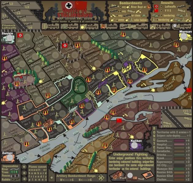
V35.


* Pearl Harbour * Waterloo * Forbidden City * Jamaica * Pot Mosbi
-

 cairnswk
- Posts: 11510
- Joined: Sat Feb 03, 2007 8:32 pm
- Location: Australia


Re: WWII-Stalingrad [D,GP,GR] V35 (P36)
army of nobunaga wrote:this looks great. will be an instant classic I believe.
well thank you aon, something more in your line rather than a map that less than 5% of the world's population plays eh?
I read somewhere in this theme about the "want" of more snow... I kind of agree. But I like it how it is as well.
This was a dirty hungry COLD battle. Very cold. Your map kind of reminds me of springtime =D
Anyway. Goodjob and thanx for the map.
before I hit submit, I might need to look it up, but you might be right... Maybe the battle of stalingrad did start in spring, but im pretty sure it ended in the winter of the next year and it was the cold that helped it.
yes the invasion started in July which is summer in the north of course and ended in winter, and yes this portrays more of the beginning of the battle, but with opportunity to move to towards spring and winter.
the overall colour theme started more darkly, but has grown a little more springish due the constraints of finding colours for the colour-blind that are dissimilar enough to allow good receognition.

* Pearl Harbour * Waterloo * Forbidden City * Jamaica * Pot Mosbi
-

 cairnswk
- Posts: 11510
- Joined: Sat Feb 03, 2007 8:32 pm
- Location: Australia


Re: WWII-Stalingrad [D,GP,GR] V35 (P36)
I've just spent a couple of hours trying to enhance this map, but alas, i like it's clean style...yes cluttered but still readable, and i don't think it needs anything else.

* Pearl Harbour * Waterloo * Forbidden City * Jamaica * Pot Mosbi
-

 cairnswk
- Posts: 11510
- Joined: Sat Feb 03, 2007 8:32 pm
- Location: Australia


Re: WWII-Stalingrad [D,GP,GR] V35 (P36)
It does need something - to go straight into BETA, this is an awesome map on a par with Waterloo.
This will be an instant hit, what a map.
This will be an instant hit, what a map.
-

 chipv
chipv
- Head Tech

- Posts: 2814
- Joined: Mon Apr 28, 2008 5:30 pm


Re: WWII-Stalingrad [D,GP,GR] V35 (P36)
chipv wrote:It does need something - to go straight into BETA, this is an awesome map on a par with Waterloo.
This will be an instant hit, what a map.
Thanks chipv
i only hope that it is enjoyed.
I have changed the grey to ghost green on S2 Sheykin, i think this colour works better overall with the yellow and purple and is also still quite distinct for the CB.

* Pearl Harbour * Waterloo * Forbidden City * Jamaica * Pot Mosbi
-

 cairnswk
- Posts: 11510
- Joined: Sat Feb 03, 2007 8:32 pm
- Location: Australia


Re: WWII-Stalingrad [D,GP,GR] V35 (P36)
Looking awesome Cairns. Glad to have you back.

High score: 2724/#163 on scoreboard/COLONEL
-

 neanderpaul14
- Posts: 1216
- Joined: Wed Aug 06, 2008 3:52 pm
- Location: "Always mystify, mislead and surprise the enemy if possible." - Thomas J. Jackson


Re: WWII-Stalingrad [D,GP,GR] V35 (P36)
As soon as the XML is done, I'll happily send this one straight to the turtle.... tell your coder to get their skates on 

PB: 2661 | He's blue... If he were green he would die | No mod would be stupid enough to do that
-

 MrBenn
- Posts: 6880
- Joined: Wed Nov 21, 2007 9:32 am
- Location: Off Duty


Re: WWII-Stalingrad [D,GP,GR] V35 (P36)
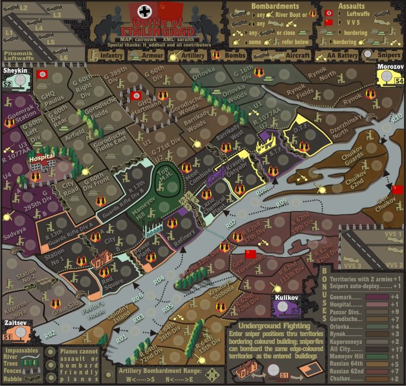
While I'm looking at it, I can see a couple of minor nitpicks... The colours on the legend appear to be very slightly different to those on the main map. This might be an optical illusion, but the purple of Goemark (just seen it as Goemrak on the map) looks richer on the main map and slightly more muted on the legend. Same for Rynok.
The other thing that I just wanted to query was that Rynok is the only area which has soldiers facing different directions. I don;t think this has any relevance to the gameplay, so it may be more aesthetically pleasing to have all four of them facing the same direction.
Other than that, I think that's it!

PB: 2661 | He's blue... If he were green he would die | No mod would be stupid enough to do that
-

 MrBenn
- Posts: 6880
- Joined: Wed Nov 21, 2007 9:32 am
- Location: Off Duty


Re: WWII-Stalingrad [D,GP,GR] V35 (P36)
MrBenn wrote:While I'm looking at it, I can see a couple of minor nitpicks... The colours on the legend appear to be very slightly different to those on the main map. This might be an optical illusion, but the purple of Goemark (just seen it as Goemrak on the map) looks richer on the main map and slightly more muted on the legend. Same for Rynok.
Fixed. Please refresh
The other thing that I just wanted to query was that Rynok is the only area which has soldiers facing different directions. I don;t think this has any relevance to the gameplay, so it may be more aesthetically pleasing to have all four of them facing the same direction.
Not so. there was one soldier facing left in the Lazar Chemical Plant, and another in the R 1077 units.
I don't agree with you on that "aesthetic", and yes, it has no reelvance to gameplay.
To this degree, i have left the existing ones as be, and turned a couple more facing left in the city, to give the sense of resistance fighting.


* Pearl Harbour * Waterloo * Forbidden City * Jamaica * Pot Mosbi
-

 cairnswk
- Posts: 11510
- Joined: Sat Feb 03, 2007 8:32 pm
- Location: Australia


Re: WWII-Stalingrad [D,GP,GR] V36
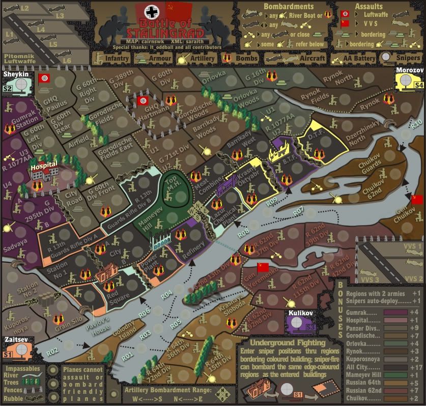
OK, this is V36 for testing and opinion.
I have changed the harsh straight outline of the sniper terts to a dotted line.
I like it myself as i think it doesn't overalod the color scheme and stick out too much like dogs' b...s, but still allows identification of the terts.
What do others think?

I have changed the harsh straight outline of the sniper terts to a dotted line.
I like it myself as i think it doesn't overalod the color scheme and stick out too much like dogs' b...s, but still allows identification of the terts.
What do others think?


* Pearl Harbour * Waterloo * Forbidden City * Jamaica * Pot Mosbi
-

 cairnswk
- Posts: 11510
- Joined: Sat Feb 03, 2007 8:32 pm
- Location: Australia


Re: WWII-Stalingrad [D,GP,GR] V36 (P39) Opinion?
I preferred the solid lines; the dotted ones look a little bit more cluttered.
The territory name of Goemark Station is still misspelt as Goemrak Station
The territory name of Goemark Station is still misspelt as Goemrak Station

PB: 2661 | He's blue... If he were green he would die | No mod would be stupid enough to do that
-

 MrBenn
- Posts: 6880
- Joined: Wed Nov 21, 2007 9:32 am
- Location: Off Duty


Re: WWII-Stalingrad [D,GP,GR] V36 (P39) Opinion?
MrBenn wrote:I preferred the solid lines; the dotted ones look a little bit more cluttered.
OK
The territory name of Goemark Station is still misspelt as Goemrak Station
so what are you saying it should be?

* Pearl Harbour * Waterloo * Forbidden City * Jamaica * Pot Mosbi
-

 cairnswk
- Posts: 11510
- Joined: Sat Feb 03, 2007 8:32 pm
- Location: Australia


Who is online
Users browsing this forum: No registered users


