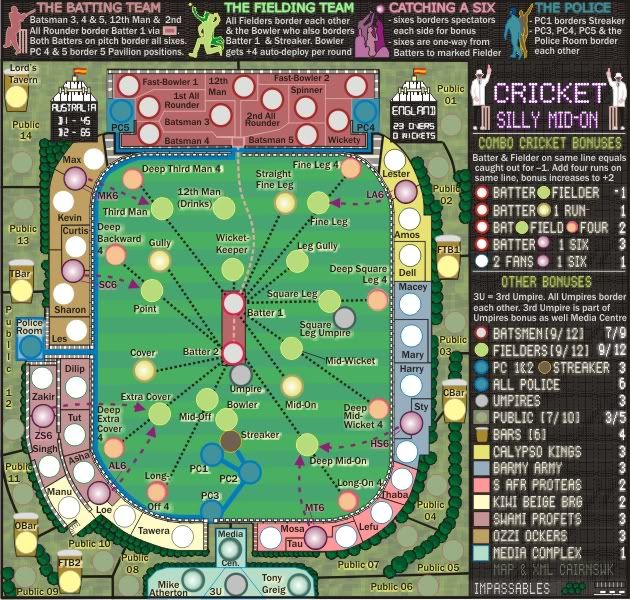
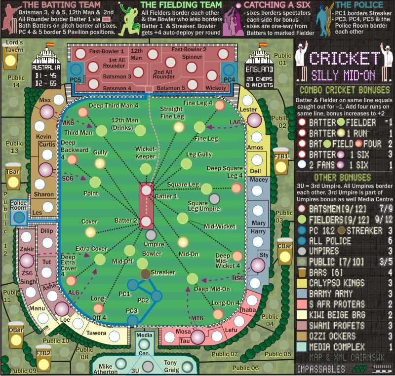
natty_dread wrote:Now that you mention it, yes those texts in the upper edge (Batting team, Fielding team, Catching six etc.) look a bit fuzzy.
The legend text looks much better now though.
Hopscotcher wrote:More Specifically..........
The Batting Team needs to be........ Less Fuzzy
The Fielding Team needs to be....... One Shade Lighter Green
Catching a Six needs to be........ One Shade Brighter Purple
The Police needs to be........ Less Dark blue. It's in with the black, which makes it blend.
Maybe it would help if you made the very thin strip where the names are a tad lighter?
I know this must be a pain, but I haven't looked at this forever and the first thing my eyes did was go whaaaaaaaaaaaat does that say?
Does this look better? please refresh your browser.


