Conquer Club

WWII-Stalingrad [QUENCHED]

Care to peruse completed maps? Take a stroll through the Atlas.

Moderator: Cartographers

Forum rules
Please read the Community Guidelines before posting.

Re: WWII-Stalingrad [D,GP] V30 (P29)

Postby cairnswk on Sun Apr 04, 2010 6:30 pm

natty_dread wrote:Well, it's only a minor detail so don't sweat it.

One more thing. I've been thinking if perhaps adding some grunge to the territories would look better... I'm not sure though, the current look is clean and legible, but on the other hand some grunge might help creating a mood of a city under battle. Then again, the impassables and such already do a fair job at this... :-k

Well, your map, your choice. I'm just thinking out loud here...


Uh huh, appreciate your thoughts....i relaise it looks a lilttle on the "clean" side, but i would rather have this than players being not able to read the tert names, and these are already toned according to the continents to make them flow with the style.
I had experimented with grunge previously and it only detracted from being able to read it.
I think the combination of impassables and bomb flames and icons gives the impression of a city under attack. :)
Image
* Pearl Harbour * Waterloo * Forbidden City * Jamaica * Pot Mosbi
User avatar
Private cairnswk
 
Posts: 11510
Joined: Sat Feb 03, 2007 8:32 pm
Location: Australia

Re: WWII-Stalingrad [D,GP] V30 (P29)

Postby natty dread on Sun Apr 04, 2010 6:35 pm

In that case, go with the clean look.
Image
User avatar
Sergeant 1st Class natty dread
 
Posts: 12877
Joined: Fri Feb 08, 2008 8:58 pm
Location: just plain fucked

Re: WWII-Stalingrad [D,GP] V30 (P29)

Postby ender516 on Sun Apr 04, 2010 6:48 pm

Definitely stick to the clean look for the sake of legibility. This map does not look like a reproduction of a contemporary map which might have been used in the field at the time of the battle and therefore would need to look used; this is a modern symbolic representation of the situation at the time, and is extremely dense with information, which should be clear to all players.
User avatar
Sergeant 1st Class ender516
 
Posts: 4455
Joined: Wed Dec 17, 2008 6:07 pm
Location: Waterloo, Ontario

Re: WWII-Stalingrad [D,GP] V30

Postby cairnswk on Sun Apr 04, 2010 6:53 pm

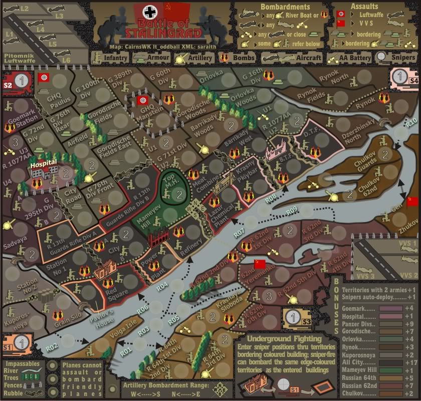
Adjusted V30

Image

Click image to enlarge.
image
Image
* Pearl Harbour * Waterloo * Forbidden City * Jamaica * Pot Mosbi
User avatar
Private cairnswk
 
Posts: 11510
Joined: Sat Feb 03, 2007 8:32 pm
Location: Australia

Re: WWII-Stalingrad [D,GP] V30 (P29)

Postby isaiah40 on Sun Apr 04, 2010 8:32 pm

This is really looking good cairns!! Just one thing, the division line denoting the E, W across the river. Is there anyway you can maybe put a slight outer glow? Those dots are really hard to see.

Other wise great job!
Lieutenant isaiah40
 
Posts: 3990
Joined: Mon Aug 27, 2007 7:14 pm

Re: WWII-Stalingrad [D,GP] V30 (P29)

Postby cairnswk on Sun Apr 04, 2010 9:24 pm

isaiah40 wrote:This is really looking good cairns!! Just one thing, the division line denoting the E, W across the river. Is there anyway you can maybe put a slight outer glow? Those dots are really hard to see.

Other wise great job!


No probs isaiah40 :)
Image
* Pearl Harbour * Waterloo * Forbidden City * Jamaica * Pot Mosbi
User avatar
Private cairnswk
 
Posts: 11510
Joined: Sat Feb 03, 2007 8:32 pm
Location: Australia

Re: WWII-Stalingrad [D,GP] V30 (P29)

Postby thenobodies80 on Mon Apr 05, 2010 12:26 pm

Ahhh....finally on the sofa, with a full stomach after two days devoted to one of the most beloved Italian activities...eating
A perfect moment to take some time and look more closely at this great map. :)

Sorry for the "shopping-list style" of this post but with a so tricky map i want to be sure to post all my thoughts/concerns:

  • Colors
    • Goemark color in the legend is different from the one you used for the territories and doing a colorblind test i see that the land color looks very similar to the City territories color so i would suggest to use the lighter version you used in the legend.
    • Talking about the colorblind test I have some concers about the sniper colors, to be precise S1 and S3. And Maybe S2 borders could get lost into the hill green.
      Image
    • Kuporosnoya zone, the black border on the river side doesn't match the zone borders, infact the river color is visible inside the land zone.
    • The coloured outline used for the city territories bombarded by the snipers; i think that it looks very good where the territory is complitely outlined, like BTF & DTF. I think you should outline all them, specially if you compare how rubbles look like with and without the outline. For the rubbles that have a "not sniper" border, you should try to use the black border...personally i think that, right now, all the rubbles not outlined look a bit stickied on the map...
    • Has S3 sniper position the same color of building?
  • Icons
    • An important thing for tricky maps is that everything needs to be explained very well and clear for the future players. I think that your AA Batteries and Artillery icons could create some doubts. Why to have some flipped if unnecessary? Have some of them flipped made me think that their direction could affect what they could attack or who could attack them. I think that is an example where the graphics should look to the gameplay, so I suggest to have them in the same direction and consider them only like icons, with legend that explain how the bombardment range work.
    • Some icons positioning should be refined, an example Gran Silo Infantry, GHQ Manstein Infantry, etc (i'm sure you'll find all them, but if you want i can write a list ;) )
  • Territory Labels
    • No way to have Pavlov's House label inside the territory?( At least in the big version O:) )
    • Personally i find hard to read the first R in the R 62nd 2nd div label, but it's a so small thing that i don't consider it an issue.
  • Artillery Bombardment Range
    • Personally i don't have problem to follow the dotted line except for the small part over the water. i also think you should try to make it more clear between Gran Silo and Station N°2, and between Refinery and Lazur Chemichal Plant. Infact in both those places the dotted line get lost in the rubble.
  • Circles
    • Aren't they too big? In some territories you have few free space, use smaller circles could help (e.g. Gen Zhukov). Anyway, this is how your circles look like:Image
  • Connections
    • All the connections are clear imo. Maybe you can redraw the one between Chulkov 62nd and Gen Zhulkov ,that is with no doubts clear but it doesn't look "cairnswk"-made.... i think you understand what i mean ;)
  • Title
    • The rectangle below the text...i don't know if it is so good, with the gradient you used it looks different from the style used on the map...it looks more a old layer still visible that a part of the title... :-k Maybe use the background texture instead of that gradient?


Honestly there's another thing, but i think that it's more a hallucination due to too much food rather than something real...but why the lighter grey soldiers in the title have alien heads? (I'm a bit embarrassed by this last thing I wrote :oops: :lol: )

Nobodies
User avatar
Sergeant 1st Class thenobodies80
 
Posts: 5400
Joined: Wed Sep 05, 2007 4:30 am
Location: Milan

Re: WWII-Stalingrad [D,GP] V30 (P29)

Postby cairnswk on Mon Apr 05, 2010 3:35 pm

thenobodies80 wrote:Ahhh....finally on the sofa, with a full stomach after two days devoted to one of the most beloved Italian activities...eating
A perfect moment to take some time and look more closely at this great map. :)

Sorry for the "shopping-list style" of this post but with a so tricky map i want to be sure to post all my thoughts/concerns:

Shopping list. no probs

[*]Colors
[*]Goemark color in the legend is different from the one you used for the territories and doing a colorblind test i see that the land color looks very similar to the City territories color so i would suggest to use the lighter version you used in the legend.

They are both the same color. so i don't know if this is illusional because i see the difference also...and i haven't just eaten :lol:
Anyways, i've changed the color and the same thing happens, they still remain slightly different albeit more distinguishabe.

[*]Talking about the colorblind test I have some concers about the sniper colors, to be precise S1 and S3. And Maybe S2 borders could get lost into the hill green.
http://vischeck.homeip.net/uploads/vc_EXmhPn_sim.jpg

Mmmm, can't see the image you've given...but I will think about alternatives, later

[*]Kuporosnoya zone, the black border on the river side doesn't match the zone borders, infact the river color is visible inside the land zone.
Fixed

[*]The coloured outline used for the city territories bombarded by the snipers; i think that it looks very good where the territory is complitely outlined, like BTF & DTF. I think you should outline all them, specially if you compare how rubbles look like with and without the outline. For the rubbles that have a "not sniper" border, you should try to use the black border...personally i think that, right now, all the rubbles not outlined look a bit stickied on the map...

Mmmm, as far as i can tell all the buidling terts have outlines, i'm not sure what you mean here, so can you show me what you are talking about.

[*]Has S3 sniper position the same color of building?[/list]
Fixed.

[*]Icons
[list][*]An important thing for tricky maps is that everything needs to be explained very well and clear for the future players. I think that your AA Batteries and Artillery icons could create some doubts. Why to have some flipped if unnecessary? Have some of them flipped made me think that their direction could affect what they could attack or who could attack them. I think that is an example where the graphics should look to the gameplay, so I suggest to have them in the same direction and consider them only like icons, with legend that explain how the bombardment range work.

Simply because some are flipped i don't think is a problem. I'd prefer to have the left-side ones the right of the map, and vice-versa. It adss to the German v Russian theme. I think the legend explains it very well under Artillery Bombardment Range.

[*]Some icons positioning should be refined, an example Gran Silo Infantry, GHQ Manstein Infantry, etc (i'm sure you'll find all them, but if you want i can write a list ;) )
I'd prefer a list from you, since my mind thinks they all OK, and yours does not. :)

[*]Territory Labels
[*]No way to have Pavlov's House label inside the territory?( At least in the big version O:) )

Perhaps in the big version, we'll see.

[*]Personally i find hard to read the first R in the R 62nd 2nd div label, but it's a so small thing that i don't consider it an issue.
Space is tight there.

[*]Artillery Bombardment Range
[*]Personally i don't have problem to follow the dotted line except for the small part over the water. i also think you should try to make it more clear between Gran Silo and Station N°2, and between Refinery and Lazur Chemichal Plant. Infact in both those places the dotted line get lost in the rubble.

I don't think it does, i can see it quite well, although we will see when this goes into Beta..
and i beleive the dotted line over water is much clearer now, as spotted by isaiah40
[*]Circles
[*]Aren't they too big? In some territories you have few free space, use smaller circles could help (e.g. Gen Zhukov). Anyway, this is how your circles look like:Image

The circles on the small map are correct size. The circles on the large map are not correct size, since at this time the large map has not been split from the small map and the large map is merely an upscaled version of the small map. I thought you might have known how i do this process after all my maps. ;)

[*]Connections
[*]All the connections are clear imo. Maybe you can redraw the one between Chulkov 62nd and Gen Zhulkov ,that is with no doubts clear but it doesn't look "cairnswk"-made.... i think you understand what i mean ;)

Well, it was Coreldraw-made, not cairnswk-made...fixed.

[*]Title
[*]The rectangle below the text...i don't know if it is so good, with the gradient you used it looks different from the style used on the map...it looks more a old layer still visible that a part of the title... :-k Maybe use the background texture instead of that gradient?
It is meant to be different since it is not part of the map.

Honestly there's another thing, but i think that it's more a hallucination due to too much food rather than something real...but why the lighter grey soldiers in the title have alien heads? (I'm a bit embarrassed by this last thing I wrote :oops: :lol: )

Nose in place on both statues.

Thanks tnb80. :)

saraith has been contacted again and will have the xml soon.

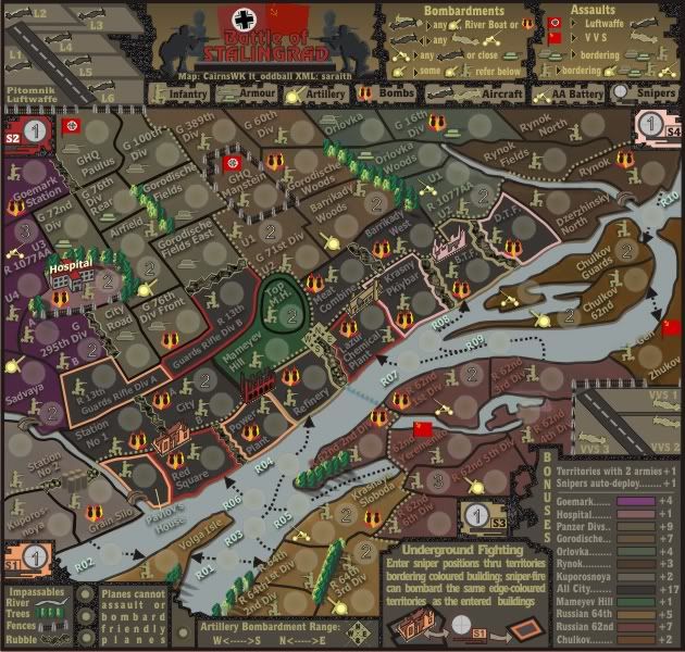
Version 31 below.
Image

Click image to enlarge.
image
Image
* Pearl Harbour * Waterloo * Forbidden City * Jamaica * Pot Mosbi
User avatar
Private cairnswk
 
Posts: 11510
Joined: Sat Feb 03, 2007 8:32 pm
Location: Australia

Re: WWII-Stalingrad [D,GP] V31 (P31)

Postby persianempire on Wed Apr 07, 2010 12:19 am

lookin good ;) , refresh me on what the dotted line is? its not an impassable or a front? liitl confused.. also still no go on nazi insignia? its in qwerts ww2 europe , kinda covered but u no wat it is. great job on the snipers!
User avatar
Major persianempire
 
Posts: 187
Joined: Sat Oct 17, 2009 1:57 am

Re: WWII-Stalingrad [D,GP] V31 (P31)

Postby saraith on Wed Apr 07, 2010 1:25 am

persianempire wrote:lookin good ;) , refresh me on what the dotted line is? its not an impassable or a front? liitl confused.. also still no go on nazi insignia? its in qwerts ww2 europe , kinda covered but u no wat it is. great job on the snipers!


the Dotted line is a Front... sort of. It's there to indicate the Artillery range within the city
User avatar
Corporal 1st Class saraith
 
Posts: 476
Joined: Tue Aug 12, 2008 4:13 am
Location: Cow-Town

Re: WWII-Stalingrad [D,GP] V31 (P31)

Postby thenobodies80 on Wed Apr 07, 2010 3:07 am

About the swastika, as already explained on other occasions, the symbol should not be used on any CC maps. This represents official CC policy, and is not open to negotiation.

Personally, I think this is a very good map and seeing that the debate concerns only about a detail that wouldn't make the map more or less funny to play is a bit sad imo :cry: :?
User avatar
Sergeant 1st Class thenobodies80
 
Posts: 5400
Joined: Wed Sep 05, 2007 4:30 am
Location: Milan

Re: WWII-Stalingrad [D,GP] V31 (P31)

Postby cairnswk on Wed Apr 07, 2010 4:13 am

persianempire wrote:... also still no go on nazi insignia?...

No, that has been ruled out from the very start. :)
Image
* Pearl Harbour * Waterloo * Forbidden City * Jamaica * Pot Mosbi
User avatar
Private cairnswk
 
Posts: 11510
Joined: Sat Feb 03, 2007 8:32 pm
Location: Australia

Re: WWII-Stalingrad [D,GP] V31 (P31)

Postby cairnswk on Wed Apr 07, 2010 4:16 am

thenobodies80 wrote:....
Personally, I think this is a very good map and seeing that the debate concerns only about a detail that wouldn't make the map more or less funny to play is a bit sad imo :cry: :?

Not quite on baord with you here tnb80...can you explain better what you are saying.

Also, any feedback from the changes i made...are you OK with all this?
Image
* Pearl Harbour * Waterloo * Forbidden City * Jamaica * Pot Mosbi
User avatar
Private cairnswk
 
Posts: 11510
Joined: Sat Feb 03, 2007 8:32 pm
Location: Australia

Re: WWII-Stalingrad [D,GP] V31 (P31)

Postby thenobodies80 on Wed Apr 07, 2010 4:36 am

Sorry, cairns...it wasn't referred to you or to the map, i was only complaining about the swastika problem.It happens for each historical map that covers the WWII period. :roll:

However, this evening i'll make the clarifications that you asked to me about the territories with colored borders and the "icon list" ;)
User avatar
Sergeant 1st Class thenobodies80
 
Posts: 5400
Joined: Wed Sep 05, 2007 4:30 am
Location: Milan

Re: WWII-Stalingrad [D,GP] V31 (P31)

Postby thenobodies80 on Wed Apr 07, 2010 4:10 pm

cairnswk wrote:
thenobodies80 wrote:Colors
[*]Goemark color in the legend is different from the one you used for the territories and doing a colorblind test i see that the land color looks very similar to the City territories color so i would suggest to use the lighter version you used in the legend.

They are both the same color. so i don't know if this is illusional because i see the difference also...and i haven't just eaten :lol:
Anyways, i've changed the color and the same thing happens, they still remain slightly different albeit more distinguishabe.


Strange :-k i thought about a dark layer still visible for some reason. opacity is 100%?
But i'm agree, it's more distinguishable ;)
Maybe a stupid idea, but if for a strange reason you can't replicate the same color you could save your image as it is now, then pick the darker color from the png/jpg image and, easily, fill the rectangle in the legend....i know, it is a stupid system, but i tried and it was good :)

cairnswk wrote:
thenobodies80 wrote:Talking about the colorblind test I have some concers about the sniper colors, to be precise S1 and S3. And Maybe S2 borders could get lost into the hill green.
http://vischeck.homeip.net/uploads/vc_EXmhPn_sim.jpg

Mmmm, can't see the image you've given...but I will think about alternatives, later


Sorry, expired link...try now ;)
http://img707.imageshack.us/img707/3949 ... adv31l.jpg

cairnswk wrote:
thenobodies80 wrote:The coloured outline used for the city territories bombarded by the snipers; i think that it looks very good where the territory is complitely outlined, like BTF & DTF. I think you should outline all them, specially if you compare how rubbles look like with and without the outline. For the rubbles that have a "not sniper" border, you should try to use the black border...personally i think that, right now, all the rubbles not outlined look a bit stickied on the map...

Mmmm, as far as i can tell all the buidling terts have outlines, i'm not sure what you mean here, so can you show me what you are talking about.


Yes Sir! Look the rubbles :)
Image


cairnswk wrote:
thenobodies80 wrote:Some icons positioning should be refined, an example Gran Silo Infantry, GHQ Manstein Infantry, etc (i'm sure you'll find all them, but if you want i can write a list ;) )
I'd prefer a list from you, since my mind thinks they all OK, and yours does not. :)


    Grain Silo
    R64th 3rd div
    R62nd 2nd div
    GHQ Manstein
    R62nd 3rd div
    Orlovka

cairnswk wrote:Also, any feedback from the changes i made...are you OK with all this?


Yes! :D
User avatar
Sergeant 1st Class thenobodies80
 
Posts: 5400
Joined: Wed Sep 05, 2007 4:30 am
Location: Milan

Re: WWII-Stalingrad [D,GP] V31 (P31)

Postby cairnswk on Wed Apr 07, 2010 4:34 pm

can you remove the vischeck from the spolier please, it does not download for me thanks :)
Image
* Pearl Harbour * Waterloo * Forbidden City * Jamaica * Pot Mosbi
User avatar
Private cairnswk
 
Posts: 11510
Joined: Sat Feb 03, 2007 8:32 pm
Location: Australia

Re: WWII-Stalingrad [D,GP] V31 (P31)

Postby thenobodies80 on Wed Apr 07, 2010 5:08 pm

removed ;)
User avatar
Sergeant 1st Class thenobodies80
 
Posts: 5400
Joined: Wed Sep 05, 2007 4:30 am
Location: Milan

Re: WWII-Stalingrad [D,GP] V31 (P31)

Postby saraith on Thu Apr 08, 2010 3:55 am

First Draft of the XML is uploaded...

http://allenar.freehostia.com/CC/stalingrad_draft_1.xml

TODO:
Verify Tert names
Double-check borders and Bombardments
tweak Army placement
Playtest
Last edited by saraith on Thu Apr 08, 2010 4:18 am, edited 1 time in total.
User avatar
Corporal 1st Class saraith
 
Posts: 476
Joined: Tue Aug 12, 2008 4:13 am
Location: Cow-Town

Re: WWII-Stalingrad [D,GP] V31 (P31)

Postby cairnswk on Thu Apr 08, 2010 4:08 am

thenobodies80 wrote:....

cairnswk wrote:
thenobodies80 wrote:The coloured outline used for the city territories bombarded by the snipers; i think that it looks very good where the territory is complitely outlined, like BTF & DTF. I think you should outline all them, specially if you compare how rubbles look like with and without the outline. For the rubbles that have a "not sniper" border, you should try to use the black border...personally i think that, right now, all the rubbles not outlined look a bit stickied on the map...

Mmmm, as far as i can tell all the buidling terts have outlines, i'm not sure what you mean here, so can you show me what you are talking about.


Yes Sir! Look the rubbles :)
Image


OK, so explain this further what you are trying to say.
I see the rubbles, but I don't understand what you are getting me to look at.
Do they need more white border outline.
PLease explain to me. :?: :?:
Image
* Pearl Harbour * Waterloo * Forbidden City * Jamaica * Pot Mosbi
User avatar
Private cairnswk
 
Posts: 11510
Joined: Sat Feb 03, 2007 8:32 pm
Location: Australia

Re: WWII-Stalingrad [D,GP] V31 (P31)

Postby cairnswk on Thu Apr 08, 2010 4:13 am

saraith wrote:First Draft of the XML is uploaded...
[url]
http://allenar.freehostia.com/CC/stalingrad_draft_1.xml[/url]

TODO:
Verify Tert names
Double-check borders
Verify Bombardments
Playtest


OK, thanks saraith, that's looking very good...on the end of each territory, we need to have whether it is
INF (infantry)
ARM (armour)
AA BAT
etc
etc.
if you would please, so that players can identify which spot they are going to move/assault/bombard because some bordered terrotories have 2 units on them. :)
Image
* Pearl Harbour * Waterloo * Forbidden City * Jamaica * Pot Mosbi
User avatar
Private cairnswk
 
Posts: 11510
Joined: Sat Feb 03, 2007 8:32 pm
Location: Australia

Re: WWII-Stalingrad [D,GP] V31 (P31)

Postby thenobodies80 on Thu Apr 08, 2010 4:45 am

cairnswk wrote:OK, so explain this further what you are trying to say.
I see the rubbles, but I don't understand what you are getting me to look at.
Do they need more white border outline.
PLease explain to me. :?: :?:


No not the white border outlinr.
The image isn't only a copy/paste thing. If you compare the image i've posted with your map, you'll notice that i've added a coloured line around the rubbles. In other words the territory borders (red or black in the image) covered by the rubbles. Sorry, i thought you would have noticed it O:)

Nobodies
User avatar
Sergeant 1st Class thenobodies80
 
Posts: 5400
Joined: Wed Sep 05, 2007 4:30 am
Location: Milan

Re: WWII-Stalingrad [D,GP] V31 (P31)

Postby saraith on Thu Apr 08, 2010 4:51 am

cairnswk wrote:
saraith wrote:First Draft of the XML is uploaded...
[url]
http://allenar.freehostia.com/CC/stalingrad_draft_1.xml[/url]

TODO:
Verify Tert names
Double-check borders
Verify Bombardments
Playtest


OK, thanks saraith, that's looking very good...on the end of each territory, we need to have whether it is
INF (infantry)
ARM (armour)
AA BAT
etc
etc.
if you would please, so that players can identify which spot they are going to move/assault/bombard because some bordered terrotories have 2 units on them. :)


I've already identified the 2-unit terts like this...

- <continent>
<name>Sadvaya</name>
<bonus>1</bonus>
- <components>
<territory>Sadvaya Artillery</territory>
<territory>Sadvaya Infantry</territory>

</components>
</continent>

Do we want them further Identified? Do we want to label terts like German 72nd Div. which is clearly an armored unit, with that extra identifier? German 72nd Div. - ARM

I just want to clarify before I make all those changes 8-[
User avatar
Corporal 1st Class saraith
 
Posts: 476
Joined: Tue Aug 12, 2008 4:13 am
Location: Cow-Town

Re: WWII-Stalingrad [D,GP] V31 (P31)

Postby jasnostj on Thu Apr 08, 2010 4:23 pm

Hey guys,

Congratulations on this map effort. It's going to be great.

However, a few remarks, and sorry for not reading all 32 pages of feedback to see how things became the way they are now, and maybe saying something stupid. Despite of my avatar, I don't know much about Stalingrad. I do know this much though:

1. Zhukov was never in the city itself. He was commanding the overall Stalingrad area (with Vasilevsky), not the fighting inside the city. Yeryomenko (preferred phonetic spelling) and Chuikov (wrongly spelled Chulkov on Denezhny island - the one on the right, looked it up) were the guys on the ground.

2. Mannstein was never in the city. He was sent to relieve Paulus, but never got there. The rest is history.

3. Check up on the spelling of the geographical names. With my knowledge of Russian I can see plenty that must be wrong. On Google maps I can find:
- MamAyev Kurgan is the correct name for the hill
- Goemark=Gumrak
- Gorodische=GorodisHche
- Kuporosnoya=KuporosnoyE
- Sadvaya=SadOvaya
- Volga Isle=Golodny Island
- and last but certainly not least (how the heck did that train wreck happen?) Krasny Pkiybar=Krasny Oktyabr.
User avatar
Private jasnostj
 
Posts: 146
Joined: Tue May 29, 2007 6:57 am

Re: WWII-Stalingrad [D,GP] V31 (P31)

Postby persianempire on Thu Apr 08, 2010 11:32 pm

jasnostj, your right about manstein not reaching stalingrad but there are 2 german hqs on this map and it would look kin of retarted with paulus as 1 and just a random german hq as the other. but your wrong about zhukov. he was inside the city at all times , commanding soviet forces to “hug” nazi foces. in fact he was twice the hero of the red army for his efforts in stalingrad. i dont no why you think he wasnt but he was , at times his command hq was only a stones throw away from wehrmacht soldiers, it was his grittiness among his men in stalingrad that won the battle for stalin and sealed the fate of hitlers reich.
User avatar
Major persianempire
 
Posts: 187
Joined: Sat Oct 17, 2009 1:57 am

Re: WWII-Stalingrad [D,GP] V31 (P31)

Postby cairnswk on Fri Apr 09, 2010 3:46 am

saraith wrote:...

I've already identified the 2-unit terts like this...

- <continent>
<name>Sadvaya</name>
<bonus>1</bonus>
- <components>
<territory>Sadvaya Artillery</territory>
<territory>Sadvaya Infantry</territory>

</components>
</continent>

Do we want them further Identified? Do we want to label terts like German 72nd Div. which is clearly an armored unit, with that extra identifier? German 72nd Div. - ARM

I just want to clarify before I make all those changes 8-[


Yes, i can see where you've done that for Sadvaya, which could probably be shortened to Sadvaya Inf etc.
I'd only use the 3 letters for those unit IDs.

Yes please....Example
"G 72nd Div Arm"
"R 1077AA U3 AA Bat"
"R 1077AA U4 Inf"
"G 389th Div Inf"
"G 76th Div Rear Arm"
"R 13th Guards Rifle Div B Inf"
"Mameyev Hill Inf"

Keep it short, abbreviated, you know. :)
Image
* Pearl Harbour * Waterloo * Forbidden City * Jamaica * Pot Mosbi
User avatar
Private cairnswk
 
Posts: 11510
Joined: Sat Feb 03, 2007 8:32 pm
Location: Australia

PreviousNext

Return to The Atlas

Who is online

Users browsing this forum: No registered users