Wow, thanks for all the comments. Makes me feel all warm & fuzzy inside.

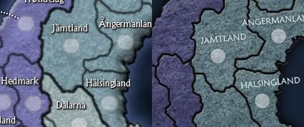
First of all... T.K, sorry, I forgot to post the updated images last night, I had such a busy time with the newsletter...
So here they are:
- Click image to enlarge.


Then, I'd like to respond to some of the comments.
Mightor wrote:As a dane I did, however, stumpled that you call regions Nordjylland, Midtjylland and then SYDDANMARK, not Sønderjylland - as we call it. We do, however, have a region called SydDanmark, but that covers all Sønderjylland og Fyn into same region (politically).
Well, if you feel Sønderjylland would be a more accurate name, I have no problem with changing it. It will also need an XML update though... so before I do this, I'd like to ask all you Danes, do you all agree on the name change?
White Moose wrote:The South Finland and South Norway is 10 territories large (counting the capital), yet still you only get a +4 from it. Denmark is 7 territories and gives only +2... Those numbers seen very wierd.
Well, when considering bonus values, you have to also consider the number of borders you need to defend to hold that bonus. And the number of territories that can attack the bonus area, and the number of adjacent bonus areas... I can assure you the bonuses have been thought out very thoroughly. If you wish, take a peek at the bonus value data on the first post...
For a more specific answer, South Finland gets +4 because you can hold it by only defending 2 territories. Denmark also has 2 borders, but it has less territories and it can be expanded to include the Faroe islands, to make the bonus +3.
The name.. I think it sounds rather wierd. I would change it to "Scandinavia". Yes, normally only Sweden, Norway and Denmark is included in that name. But it's grown to include Finland and Iceland aswell.
I disagree. Scandinavia means the Scandinavian peninsula, which can be understood to mean Sweden, Norway and perhaps Denmark, and a part of Finland, but Iceland most definitely is not a part of it. Nor are Faroe and Svalbard...
Nordic Countries is the english translation of the term Norden / Pohjoismaat / Norðurlöndin which is an official definition and includes the 5 countries featured in the map (and their territories). The 5 Nordic Countries have had close relations long before EU or Schengen treaties. You have not needed a passport for travel inside the Nordic Countries in years, even before EU... So, I just feel Nordic Countries is the most accurate definition of the area, also I would like the term to become more recognized outside the area, therefore I'm sticking with it.
I hope you are aware that you've missed lots of provinces, in sweden and that Lappland isn't divided into south and north. So i'm hoping you just did that you improve the gameplay.
Yes, it is for gameplay reasons, and mostly because we have size restrictions on maps... I can't just fit all the smaller regions in while maintaining legibility. I've had to sacrifice accuracy at some places for better gameplay and/or legibility. However I feel the accuracy is as good as can be expected from a CC map of 5 different countries...

Lufsen75 wrote:I think it looks fine. I just want it to come soon.
Thank you. Also thanks to White Moose and Mightor for their constructive and well thought-out feedback.
ArgoW wrote:i gotta say this fails no närke in it lol..... na good job looks nice
Hah, thanks... if you can't find your hometown in the map (too bad for you for not living in a capital) I hope you'll at least find your home province... if you can't find your home province, I hope you'll at least find your home country... If you can't find your home country, then you're probably drunk...


