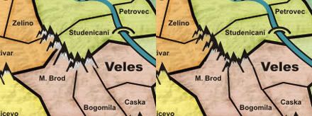
Just to be clear, post the map image with the 888 is certainly welcome, but nobody forces you to do so.
If you already have your XML "ready", you can simply post in this thread the links of your map images (respectively large and small version) and your xml link.
Who wants to see the results can use the links you provided with the tools we have on the site and then leave here the suggestions

I really like the V1.7, but personally i'm not a fan of all those straight borders. In the same time i've to admit that they suit perfectly with the style of your map. After all is only a personal preference and not a real issue...

I'm really happy to see how this map is so userfriendly, everything is very clear and readable and this means that you have only to squeeze your skill to obtain the best possible graphics for this map, just a refinement of some small things imo.....by the way, maybe i missed it, but there's a small version somewhere?
A question: Have you tried a horizontal text (one or two lines) instead of a vertical one for the text in brackets that define what are the areas with the lakes? Maybe with a smaller font?


