Conquer Club

[Abandoned] - Zombie Invasion!

Abandoned and Vacationed maps. The final resting place, unless you recycle.

Moderator: Cartographers

Forum rules
Please read the Community Guidelines before posting.

[Abandoned] - Zombie Invasion!

Postby MarshalNey on Fri Mar 12, 2010 7:51 pm

Image

Map Idea: Ach, zombies... run, Hans, run! Zombies have flooded into the streets of downtown from a nearby cemetery. They are feeding upon the living, destroying private property and resisting arrest.

There's a National Guard outpost with a helipad nearby, and you intend to fight your way to it. Luckily, you've managed to find some like-minded people who are willing to make an escape attempt or die trying. Unluckily, they want you to lead them. The streets are filled with fog and shadow; you'll have to gather some major weapons and maybe a big honking truck if you're going to get all of your fellow lemmings to safety.

Current Maps (updated 10/5/11)
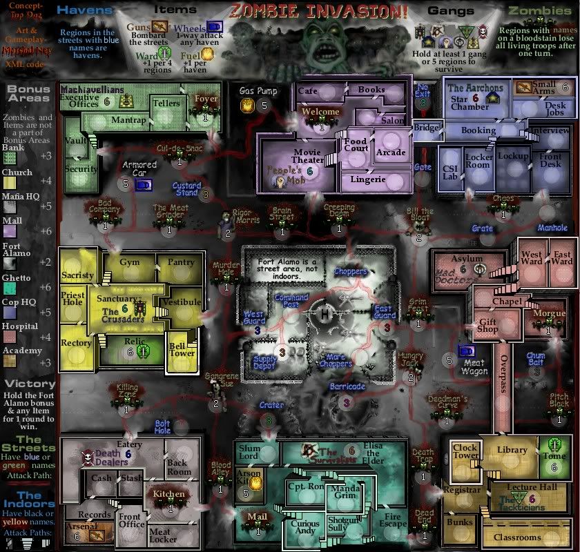
Big Map (840 x 800)
Currently up-to-date
A blank army circle indicates open, random deployment.
Any other value is set for the start of the game. Colored values are starting positions; white values are neutral or killer neutral- see the legend for details.
Click image to enlarge.
image


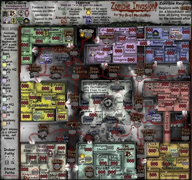
Small Map (Not Updated... Yet)
Used as an 888 test to see if CC numbers would fit in the space provided.
A red number of '888' indicates open, random deployment or player starting position.
A white number indicates a starting neutral or killer neutral.
Click image to enlarge.
image


Mapmaker Concerns:

1) Does the Losing Condition seem balanced or is it too restrictive/risky?

2) Are all of the region connections obvious?

3) Does the gameplay come across clearly? Is this map too cluttered or is it OK?

4) Any suggestions for flavor- name ideas in particular are welcome here.


Graphics Concerns Are:

1) Do the buildings need any further major work? (The outside walls are getting some texture)

2) Is the legend too cramped?

3) Fonts- are there too many, and do they look OK?

4) Do the icons need any further work?

5) General thematic flavor- anything missing?


Feedback of any kind is always appreciated!


Map Goals: I'm attempting to simulate a sense of dread and isolation for the players, and set up the map itself as an enemy (in addition to the opposing players of course).

As for gameplay, I want the map to have "Zombie Gauntlets" (long stretches of low value killer neutrals) that players will need to run through in order to move from region to region. Also, I'm looking to have a gameplay objective that involves the center and 8 starting positions. I like the idea of items as well, and have incorporated them into the map gameplay.

This map is meant to have largely open deployment.


Foundry Concerns:
(1) None yet

Community Concerns:
(1) Change the Comic Sans font in the streets (altered... need opinions)
(2) Enhance the color of the street names (DONE)
(3) Give the streets more detail (under consideration)
(4) Give the buildings more detail (IN PROGRESS)

Unique aspects:
--Low-level killer neutrals all over the map.

--Gauntlets of killer neutrals that players must face in order to move troops between regions.

--An item in or near each building (see item descriptions below)- each of the 4 types of Item have a different power. Two of them give bonuses, the other two allow bombardment or movement.

-- A Victory and a Losing Condition

Recent Map Modifications (10/2/11)
There are too many changes and I am honestly too lazy to enumerate them all in detail; however I can give a broad summary...

Gameplay Changes
(1) Changed the term "Faction" to "Gang" (for space purposes)
(2) "Gangs" (see above) are now a part of the bonus areas that they occupy (they were combined with the room that they were in to create a single region).
(3) Gangs no longer give an autodeploy; rather they just start with a lot of troops on the drop (10 at the moment), and a player must hold at least 1 gang- or 1 haven- as part of a losing condition.
(4) Made a number of minor alterations to attack routes in the streets and indoors, particularly in the Ghetto bonus area.
(5) Simplified the power of the Relic items from "+1 for every 4 regions indoors" to "+1 per 4 regions" (overall region count)
(6) Defined the term "Haven" to take the place of the phrase "non-zombie street region"
(7) Added a haven starting position to be coupled with each gang and made holding at least 1 haven- or 1 gang- as part of a losing condition.
(7) Slightly expanded the power of the Guns items to include all of the streets, not just havens
(8) Saturated the color of the Ghetto bonus area to make it more distinguisable from the Mob HQ and Fort Alamo bonus areas
(9) Enhanced the intensity of the blue color for the havens.
(10) Separated the Items that were indoors into their own room, and colored them to indiicate that they are not a part of a bonus area.

Graphical Changes
Main Map:
(1) Changed and enhanced the faux 3D perspective on all of the buildings and Fort Alamo
(2) Darkened the street background (the map is cluttered enough without distracting brightness)
(3) Moved various zombie regions in the streets for clarity
(4) Altered the zombie icon to 3 zombie figures
(5) Used a single font for the indoors and a separate single font for the streets
Legend:
(6) Homogenized the legend fonts (used 2 not counting the title)
(7) Added cartoon/comic style zombie scenes to the title and legend background
(8) Re-organized the legend instructions
(9) Changed the title font and gave it a light green backdrop
(10) Altered the Comic Sans font in the streets to look more 'tatty'

Current map modifications in progress- To Do list in order of priority:
(1) Add texture to the outside walls of the buildings
(2) Add asphalt/cracks/dirty texture to some parts of the background.
(3) Add texture (yellow stripe, etc.) to the streets (if necessary). Not keen on doing this as the fog is meant to come across as pretty thick, but if the streets are too bland I'll give it a try.
(3) Add 'battle damage' to the buildings (if necessary). Also not eager to try this out as the map already has plenty of distracting elements.

Map Statistics:
Name of map: Zombie Invasion!

Mapmakers: MarshalNey, based off of a proposal by Top Dog, and ender for XML

Map Size (large version): 840 x 800 pixels

Map Size (small version): 630 x 600 pixels

Number of regions: 110 total, 70 deployable
    Bonus Areas
      Total regions: 88 (includes any region that can provide a bonus)
      Indoor bonus regions: 70
      Street bonus regions: 18
      Deployable: 70 (includes 8 starting factions)
        Indoors: 57
        Street: 13
      Neutral: 18 (all 8 Items are neutral, plus 10 other regions)
        Neutral Indoors:13
        Neutral Street: 5

    Zombie Areas (killer neutral)
      Total regions: 22
      Killer Neutral-1s: 18
      Killer Neutral-2s: 4
      Indoors: 4
      Street: 18

Starting Deployment:
2-player or 3-player games: 23
4-player games (also doubles): 17
5-player games: 14
6-player games (also triples): 11
7-player games: 10
8-player games (also quads): 8

Number of bonus areas: 9 total

Bonus area descriptions:
Notes on the Victory Objective
    The Victory Objective (regions needed to be held to win the game) consists of holding:
      Any 1 Item (there are 8 Items on the map, all starting at neutral 5 or 6) and
      the Fort Alamo bonus area (6 regions, 3 are split as starting positions).

Fort Alamo (located in the center):
Bonus: +3
Regions: 6 bonus area
Borders: 4
Neutrals: none
Killer Neutrals: none
Special: 3 regions are split between 3 players as starting positions

Hospital (located in the middle of the righthand side):
Bonus: +4
Regions: 6 bonus area + 1 Zombie
Borders: 3
Starting Position: Mad Doctors (Gang)
Item Name/Type: Meat Wagon/Wheels (located in the streets)
Neutrals: none
Killer Neutrals: none

Bank (located at top of the lefthand side):
Bonus: +3
Regions: 5 bonus area + 1 Zombie
Borders: 3
Starting Position: Machiavellians (Gang)
Item Name/Type:Armored Car/Wheels (located in the streets)
Neutrals: none
Killer Neutrals: 1 zombie region separates 2 regions from 4 others.

Academy (located at the bottom of the righthand side):
Bonus: +3
Regions: 6 bonus area + 1 Item (Tome)
Borders: 2
Starting Position: Tackticians (Gang)
Item Name/Type:Tome/Ward
Neutrals: Tome starts at 6
Killer Neutrals: none

Mafia HQ (located at the bottom of the lefthand side):
Bonus: +5
Regions: 7 bonus area + 1 Item (Arms Locker) + 1 Zombie Region
Borders: 4
Starting Position: Death Dealers(Gang)
Item Name/Type: Arms Locker/Arsenal
Neutrals: Arsenal starts at 6
Killer Neutrals: 1 zombie region separates 1 region, 2 regions and 4 regions from each other

Cop HQ (located at the top of the righthand side):
Bonus: +5
Regions: 9 bonus area + 1 Item (Small Arms)
Borders: 3
Starting Position: The Aarchons(Gang)
Item Name/Type: Small Arms/Arsenal
Neutrals: Small Arms starts at 6
Killer Neutrals: none

Church(located in the middle of the lefthand side):
Bonus: +4
Regions: 8 bonus area + 1 Item (Relic)
Borders: 2
Starting Position: The Crusaders(Gang)
Item Name/Type: Relic/Ward
Neutrals: Relic starts at 6
Killer Neutrals: none

Mall (located in the middle of the top side):
Bonus: +6
Regions: 7 bonus area + 1 Zombie Region
Borders: 6
Starting Position: People's Mob(Gang)
Item Name/Type: Gas Pump/Fuel (located in the streets)
Neutrals: none
Killer Neutrals: 1 zombie region separates 1 region, 2 regions and 6 regions from each other.

Ghetto (located in the middle of the bottom side):
Bonus: +6
Regions: 7 bonus area + 1 Item (Gas Cans) + 1 Zombie Region
Borders: 7
Starting Position: The Survivalists(Gang)
Item Name/Type: Gas Cans/Fuel
Neutrals: Gas Cans starts at 6
Killer Neutrals: 1 zombie region separates 1 region, 1 region, 1 region and 5 regions from each other.


Items
Items exist that give powerful abilities or bonuses. Any Item is 1/8 of the victory objective (and no more). There is one Item located in or near each building except the helipad. Items located in buildings are only adjacent to a region in the same room. They are:

Wheels
There are 2 Wheels in the game- one outside of the Bank and outside of the Hospital. They provide a one-way attack against any non-zombie zones located outside of a building (including other items).

Arsenal
There are 2 Arsenals in the game- one in the Police HQ, the other in the Mafia HQ. They can bombard any zone outside of a bulding.

Fuel
There are 2 Fuels in the game- one outside of the Mall and the other in the Ghetto. They give +1 reinforcements for every non-zombie zone owned outside of a building.

Ward
There are 2 Wards in the game- one in the Church and one in the Academy. They give +1 reinforcements for every 4 territories held inside of a building.

Factions
Factions are starting points for each player. They give a +2 autodeploy each turn and are only adjacent to a region in the same room. Any faction counts as 1/8 of the victory objective (and no more). The Factions are:

Mad Doctors, located in the Hospital and only adjacent to the Asylum.

The Aarchons, located in the Police HQ and only adjacent to the Desk Jobs.

People's Mob, located in the Mall and only adjacent to the Movie Theater.

The Machiavellians, located in the Bank and only adjacent to the Manager.

The Crusaders, located in the Church and only adjacent to the Sanctuary.

Death Dealers, located in the Mafia HQ and only adjacent to the Diner.

The Survivalists, located in the Ghetto and only adjacent to Shotgun Sheila.

The Tacticians, located in the Academy and only adjacent to the Lecture Hall.

Zombie Regions
Zombie Regions are scattered throughout the map, mostly in the streets outside of the buildings. They revert to neutral at the end of a round.

Zombie Gauntlets
One of the 'core' gameplay features of this map is the Zombie Gauntlet. A Zombie Gauntlet is a string of killer neutral territories that a player must rush through all in one round in order to get any troops to the other end.

Zombie Gauntlets exist in the pathways between buildings and the Helipad in the center. So, once a player has been kicked out of a building, the only way to get back in is to run through a Zombie Gauntlet (or take hold of a Wheels territory, see the Items section above).

All normal zombie regions revert to 1 neutral troop at the end of a round. Currently, there are 4 "Champion" zombie regions at the 4 street intersections that revert to 2 neutral troops instead of 1.

Previous Versions:
Large
http://i841.photobucket.com/albums/zz334/MarshalNey/ZomMap2.jpg
http://i841.photobucket.com/albums/zz334/MarshalNey/ZomMap3-1.jpg
http://i841.photobucket.com/albums/zz334/MarshalNey/ZomMap4-2.jpg
http://i841.photobucket.com/albums/zz334/MarshalNey/ZomMap6.jpg
http://i841.photobucket.com/albums/zz334/MarshalNey/ZomMap7.jpg
http://i841.photobucket.com/albums/zz334/MarshalNey/ZomMap8.jpg
http://i841.photobucket.com/albums/zz334/MarshalNey/ZomMap9.jpg
http://i841.photobucket.com/albums/zz334/MarshalNey/ZomMapLeg.jpg

Small
http://i841.photobucket.com/albums/zz334/MarshalNey/ZomMapLegSmall.jpg
http://i841.photobucket.com/albums/zz334/MarshalNey/ZomMapSmall9.jpg
Last edited by isaiah40 on Sat Jun 02, 2012 1:34 pm, edited 57 times in total.
Reason: vacation tag added
User avatar
Captain MarshalNey
 
Posts: 781
Joined: Mon Sep 28, 2009 9:02 pm
Location: St. Louis, MO

Re: Zombieland

Postby mookhaz on Sat Mar 13, 2010 4:10 pm

make this happen!
User avatar
Corporal 1st Class mookhaz
 
Posts: 10
Joined: Sun Dec 27, 2009 11:27 pm
Location: Santa Cruz CA

Re: Zombieland

Postby soundman on Sat Mar 13, 2010 8:28 pm

I like the map posted above. Really like the idea!
User avatar
Lieutenant soundman
 
Posts: 450
Joined: Mon Feb 04, 2008 12:36 pm
Location: Washington

Re: Zombieland

Postby MarshalNey on Sun Mar 14, 2010 4:00 pm

soundman wrote:I like the map posted above. Really like the idea!


Thanks, soundman, for the kind words.

Is there anything in particular you like about the map that makes it unique? In other words, if you could keep one thing about this map, what would it be?

I was putting the map out there as a concept, and I'd like to know what strikes other people as particularly good (or bad).

mookhaz wrote:make this happen!


Again, mookhaz, thanks for the boost.

Could you tell me what excites you most about the map (and which map you're referring to just to be sure)?


Any thoughts in general, as well as criticism, would be very helpful.

Thanks guys for commenting and I'd really like to hear more of your input. :)

Marshal Ney
User avatar
Captain MarshalNey
 
Posts: 781
Joined: Mon Sep 28, 2009 9:02 pm
Location: St. Louis, MO

Re: Zombieland

Postby soundman on Sun Mar 14, 2010 4:07 pm

MarshalNey wrote:
soundman wrote:I like the map posted above. Really like the idea!


Thanks, soundman, for the kind words.

Is there anything in particular you like about the map that makes it unique? In other words, if you could keep one thing about this map, what would it be?

I was putting the map out there as a concept, and I'd like to know what strikes other people as particularly good (or bad).


I like how it's broken up into 8 sections with the large number of street territs connecting them. I'm not too sure about the factions and I think better "items" could be found. But a nice start.
User avatar
Lieutenant soundman
 
Posts: 450
Joined: Mon Feb 04, 2008 12:36 pm
Location: Washington

Re: Zombieland

Postby natty dread on Sun Mar 14, 2010 4:17 pm

So far I like what I see. The graphical style fits the theme of the map, although it could use some refining. However that's not something that you should worry about right now...

First of all... you seem to have starting positions, each in a different bonus area, but those bonus areas seem to have different bonus values. This could give an unfair advantage based on the drop... I'd suggest either:

- mixed drop, like in third crusade, where you have one starting position territory with more troops on it, and the rest of the bonuses starting at random 3:s.

or
- make the bonuses more similar to other conquest maps: +x for every y territories within an area.

The items seem really powerful as well.... they may require some balancing, and their locations need to be considered carefully. I'll have to think on these and get back to you later...

Good work though, I'm looking forward to see where this goes.
Image
User avatar
Sergeant 1st Class natty dread
 
Posts: 12877
Joined: Fri Feb 08, 2008 8:58 pm
Location: just plain fucked

Re: Zombieland

Postby Industrial Helix on Sun Mar 14, 2010 7:09 pm

Interesting map... who made it? MarshalNay, is that you?

I don't understand what a zombie territory or a non zombie territory is.

I like how if you hold the car, you one way assault any street territory. In general I like the different features. I'd like to see a helicopter on that pad though.

Might I suggest more street territories. For some reason I envision something along the lines of the upcoming Monsters map, with each monster being a zombie and given a name like Larry, Bob, Joe or something generic like that. All the zombies that one might have to plow through would reset to neutral each round... cause, you know, you can't keep a good zombie down.

Glad to see this map still in continued development.
Sketchblog [Update 07/25/11]: http://indyhelixsketch.blogspot.com/
Living in Japan [Update 07/17/11]: http://mirrorcountryih.blogspot.com/
Russian Revolution map for ConquerClub [07/20/11]: viewtopic.php?f=241&t=116575
User avatar
Cook Industrial Helix
 
Posts: 3462
Joined: Mon Jul 14, 2008 6:49 pm
Location: Ohio

Re: Zombieland

Postby Top Dog on Sun Mar 14, 2010 10:53 pm

It looks really great, man! I think this could easily pass to the next step if you sent a form in. I'd say if you've got the ability (obviously), and the time (my downfall), then hey go for it....

Good amount of territories... The objective idea could work... Not so sure about some of the terr. names but I'm sure they aren't final either.... Seems unbalanced to have some bonus zones with a zombie terr. in it and others w/o... Otherwise keep it up man, I support you 110%
I'll try and stay around to help w/ what I can
-TD
Last edited by Top Dog on Mon Mar 15, 2010 6:02 pm, edited 1 time in total.
High Score: 1384 w/ 42% games won
User avatar
Private 1st Class Top Dog
 
Posts: 507
Joined: Mon Dec 03, 2007 7:50 pm
Location: Right Here

Re: Zombieland

Postby 00iCon on Mon Mar 15, 2010 7:29 am

You have to specify which territories can attack each other in the buildings. eg. the Strategos (could also have a better name) building is quite ambiguous.
Also, more blood graphics please, especially on the streets.
And perhaps more zombies more tightly packed, they don't need fancy names.
You could also swap the Crusaders and Death Dealers in order to alternate between 'good' and 'bad' groups.
So far, it's excellent! =D>
User avatar
Corporal 1st Class 00iCon
 
Posts: 257
Joined: Wed Apr 29, 2009 4:42 am
Location: Sydney NSW

Re: Zombieland

Postby MarshalNey on Mon Mar 15, 2010 9:49 pm

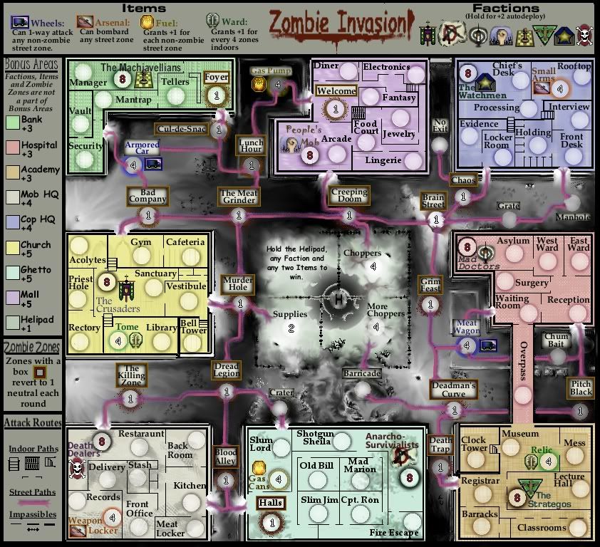
Here's a slight revision to the background (some vague helicopters) and now I've got only the neutral values and starting values showing; the rest is definitely going to be open deployment.

Click image to enlarge.
image
User avatar
Captain MarshalNey
 
Posts: 781
Joined: Mon Sep 28, 2009 9:02 pm
Location: St. Louis, MO

Re: Zombieland

Postby MarshalNey on Mon Mar 15, 2010 10:17 pm

soundman wrote:... I'm not too sure about the factions and I think better "items" could be found...


Thanks for the quick reply, soundman ;) About the factions- is it the names/symbols/buildings that seem weak, or is it the gameplay? A similar question for the items- are the types/names weak, or the gameplay mechanics?

Are there any of the factions and/or items that you like?


natty_dread wrote:So far I like what I see. The graphical style fits the theme of the map, although it could use some refining. However that's not something that you should worry about right now...


Yeah, I'm not really a graphic artist, more of a tactile pen-and-paper guy. But TopDog's thread inspired me to mess with GIMP :)

natty_dread wrote:I'd suggest either... mixed drop, like in third crusade, where you have one starting position territory with more troops on it, and the rest of the bonuses starting at random 3:s.


This sounds like an excellent idea, and it's what I'll be using for future versions.

natty_dread wrote:Good work though, I'm looking forward to see where this goes.


Thanks, between you and IHelix that means a lot.


Industrial Helix wrote:Interesting map... who made it? MarshalNay, is that you?


Yes, I've decided to try out a rough concept map and see what happens. I've been PMing with TopDog and he really doesn't have the time to work on it (in the near future, anyway). He was receptive of what I sent to him so I decided to post it to the thread, with his permission.

Industrial Helix wrote:...I don't understand what a zombie territory or a non zombie territory is.


Well, I'm not surprised since I stuck the explanation sort of in a dusty corner of the legend. Any of the territories with a 'boxed' name (the red and gold borders) reverts to 1 neutral.

Industrial Helix wrote:Might I suggest more street territories. For some reason I envision something along the lines of the upcoming Monsters map, with each monster being a zombie and given a name like Larry, Bob, Joe or something generic like that. All the zombies that one might have to plow through would reset to neutral each round... cause, you know, you can't keep a good zombie down.


Hmmm, more street territories would be nice to accentuate the "Zombie Gauntlet" gameplay feature. I actually had more zombies in my original MSPaint sketch, but I took some territories out because the map seemed visually cluttered... it still looks a bit dense, I think, but maybe that's just because I've been staring at it so long.

As for the names, I think that's a great idea. Maybe not for all of them, but make some key crossroads with some 'Zombie Hero' type names... Pete Gangrene? The Bloat?

Any help with names would be appreciated... I'm not really wed to any of them, although I do have my favorites. I've been trying to keep a black humor tone.
User avatar
Captain MarshalNey
 
Posts: 781
Joined: Mon Sep 28, 2009 9:02 pm
Location: St. Louis, MO

Re: Zombieland

Postby TaCktiX on Mon Mar 15, 2010 10:27 pm

Alright, quick rundown of nitpicks.

- Floorplan idea is nifty, but entirely too confusing. Having 4 different passables and as many impassables (typo on the map, btw) is overkill. Simplify it, having solid borders where there is no connection, and open space where there are. You've still got your floorplan, but we don't have to worry about lots of symbols. That, and you can graphically buff out two symbols easier than you can nine.
- Starting deployment is far too high. Consider that the territories will pick up +2 autodeploy on turn start, and the player will get 3 more armies. That's 13 armies TO START. I suggest lowering it down to 3 or 4.
- More Choppers? Seriously? Come on, use some L4D inspiration and have a better territory name.
- The buildings are too flat compared to the streets, their connectors, and the helipad. Have some fun with it, perhaps take inspiration from Operation Drug War.
User avatar
Corporal 1st Class TaCktiX
 
Posts: 2392
Joined: Mon Dec 17, 2007 8:24 pm
Location: Rapid City, SD

Re: Zombieland

Postby MarshalNey on Tue Mar 16, 2010 1:20 am

Top Dog wrote:Good amount of territories... The objective idea could work... Not so sure about some of the terr. names but I'm sure they aren't final either.... Seems unbalanced to have some bonus zones with a zombie terr. in it and others w/o...


Hey TD, thanks for the support :)

Yeah, the tert names are always an open invitiation for suggestions. Even if you have just general thoughts on the theme for the names.

I did think about having a zombie tert in all of the buildings (like in my original MSPaint sketch), but I wanted to mix it up a bit and put them in just a few... plus it saved on space in what felt like a cramped map even at 840 x 765 pixels. I tried to adjust the bonus with this in mind... however if you see problems with the bonuses or think that they should all have a zombie tert (or none of them), just let me know.

Top Dog wrote:I think this could easily pass to the next step if you sent a form in. I'd say if you've got the ability (obviously), and the time (my downfall), then hey go for it....


Hmmmm... I wanted to get feedback on the feasibility of the concept first, if it's positive then I'll put in the design brief.

If I do submit a separate design brief, it might be better to post this to a new thread... what do you think, TD?


00iCon wrote:You have to specify which territories can attack each other in the buildings. eg. the Strategos (could also have a better name) building is quite ambiguous.


Yeah, I'm not a fan of the Strategos name either... any thoughts for a replacement?

The floorplan style is always a concern... for instance I'm aware that the Halls tert in the Ghetto building and the Welcome tert in the Mall are potentially confusing in their exact dimensions. But the Academy building has the biggest problems, I agree. The main problem I'm facing is space. It really constricts how I can arrange the rooms. I could make the fonts and army circles smaller, but I like how big and easy to read they are right now.

Anyway, I'm going to fiddle with it some more; I'll probably axe some of the window dressing in order to make it more clear.

00iCon wrote:Also, more blood graphics please, especially on the streets.
And perhaps more zombies more tightly packed, they don't need fancy names.


Heh, you like the gore, eh? Well, hopefully once I get some more graphical guidance (and experience) I'll make it more bloody.

IHelix also suggested more zombie terts... I'll see what I can do. Again, clutter is my concern, I don't want this map to feel cramped.

You don't like the fancy names... :( But isn't quality better than quantity? (Ignore for the moment that we're talking about zombie hordes... hmmm OK maybe you've got a point)

00iCon wrote:You could also swap the Crusaders and Death Dealers in order to alternate between 'good' and 'bad' groups.
So far, it's excellent!


Heh, I never really divided the factions into 'good' and 'evil'... that sort of neat. Now I'm wondering however which ones go exactly where. Let's see- 'evil'... Death Dealers, Machiavellians, Mad Doctors and... er, Strategos? Please don't say you think Anarchists are inherently evil? ;)

Thanks for the vote of confidence, btw, iCon. Your comments are always welcome.
User avatar
Captain MarshalNey
 
Posts: 781
Joined: Mon Sep 28, 2009 9:02 pm
Location: St. Louis, MO

Re: Zombieland

Postby natty dread on Tue Mar 16, 2010 7:17 am

There's no such thing as "good" and "evil" unless we're talking about disney films or politicians...

Seriously though, in the real life concepts like "good" and "evil" are often not so clear-cut. Everyone is good from his own perspective. Anyway, you already have the antagonist for this story, which is the zombies, so any further dividing of groups into "the good guys" and "the bad guys" would seem confusing and phony at the same time...
Image
User avatar
Sergeant 1st Class natty dread
 
Posts: 12877
Joined: Fri Feb 08, 2008 8:58 pm
Location: just plain fucked

Re: Zombieland

Postby Top Dog on Tue Mar 16, 2010 4:05 pm

I'd like to see the color coding for your key be more clear... right now if I look at the key it takes me a while to find the same color building on the map... (try using the color picker tool if you did not before)

About the items:
The car... in the top left corner for example can security attack the armored car? and then once you hold armored car no other players can attack you through that route? leaving Foyer as the only border? is this correct...
The arsenal... small arms in the top right for example, could bombard blood alley in the bottom left if it wanted to? or ANY street zone correct?
Fuel gives each regular street terr. a +1 auto-deploy or +1 for reinforcements?
Ward... does holding relic (bottom right) give you +1 for holding 4 zones in just that building or any building?
Some of these I think I know but just for clarifications on your idea.
High Score: 1384 w/ 42% games won
User avatar
Private 1st Class Top Dog
 
Posts: 507
Joined: Mon Dec 03, 2007 7:50 pm
Location: Right Here

Re: Zombieland

Postby MarshalNey on Thu Mar 18, 2010 6:35 pm

TaCktiX wrote: Floorplan idea is nifty, but entirely too confusing. Having 4 different passables and as many impassables (typo on the map, btw) is overkill. Simplify it, having solid borders where there is no connection, and open space where there are. You've still got your floorplan, but we don't have to worry about lots of symbols.


That makes a lot of sense, I was just being artsy and putting in stuff that I thought looked neat rather than thinking practical and readable.

(impassible is also an acceptable spelling... of the adjective anyway, not the made-up noun used in Foundry jargon... so perhaps I'm still in error.)

TaCktiX wrote: That, and you can graphically buff out two symbols easier than you can nine..


Er, not quite sure what this last sentence meant... not hip to the jargon, methinks. By 'buff out' symbols, do you mean polish up in later map editions? Again, that argument would make lots of sense.

TaCktiX wrote: Starting deployment is far too high. Consider that the territories will pick up +2 autodeploy on turn start, and the player will get 3 more armies. That's 13 armies TO START. I suggest lowering it down to 3 or 4


Hmmm... well, 3 is too low for sure unless I do something else to protect the auto-deploy from a first-turn steal. With open deployment, it's sort of a conundrum... but you're right about 8 being too high, I just grabbed that number without much thought.

I don't think 4 is good enough to discourage attacks completely, either. Some players are willing to do 6-versus-4 attacks. Then again 5 seems to high when we consider the havoc that could be wrought on other players by 10 armies.

No matter which way I go, the order of the drop becomes too advantageous for players who go first. At least with the current setup. I'll have to think on this. Suggestions are welcome.

TaCktiX wrote: More Choppers? Seriously? Come on, use some L4D inspiration and have a better territory name.


Well, actually the simplistic repetition was intentional, meant to be mildly amusing. Sort of like "Not Mexico" in the USApocalypse Map. Obviously though it didn't do the trick.

I'm certainly open to other names, I know I have a lot of them and really I want them to be a strength of the map, and add the flavor it needs.

TaCktiX wrote: The buildings are too flat compared to the streets, their connectors, and the helipad. Have some fun with it, perhaps take inspiration from Operation Drug War.


Good graphical suggestion- although Operation Drug War isn't my favorite map to view... actually I kind of avoid playing it based on its looks. It sort of reminds me of a bunch of tackleboxes full of brightly colored lures rather than buildings full of items and furniture.

In order to raise the buildings and add more perspective, I'll have to compress the streets, which could cause some headaches, but it'll get done. I probably won't do it right away, however, as I'm pursuing the gameplay and overall feasibility of the map first.


Thanks Tac for taking the time and giving the veteran advice. Very much appreciated. As for the overall rough look, layout, theme and gameplay, does the map hold promise or is it still trying to find its way?
User avatar
Captain MarshalNey
 
Posts: 781
Joined: Mon Sep 28, 2009 9:02 pm
Location: St. Louis, MO

Re: Zombieland

Postby MarshalNey on Thu Mar 18, 2010 6:54 pm

Top Dog wrote:I'd like to see the color coding for your key be more clear... right now if I look at the key it takes me a while to find the same color building on the map...

I'm inclined to agree, the colors are a bit tough to distinguish (yes I did use the color picker). Trouble is partly that I gave the regions a bit of a custom texture afterwards that altered the overall effect slightly. I'll fix it.

Top Dog wrote:The car... in the top left corner for example can security attack the armored car? and then once you hold armored car no other players can attack you through that route? leaving Foyer as the only border? is this correct...

The Armored Car (and the Meat Wagon) can be attacked normally, they don't block routes except by the strength of the armies occupying them. The Armored Car can 1-way attack other safe places on the streets, which cannot attack back, but adjacent territories can attack the Armored Car as normal.

Top Dog wrote:The arsenal... small arms in the top right for example, could bombard blood alley in the bottom left if it wanted to? or ANY street zone correct?
Fuel gives each regular street terr. a +1 auto-deploy or +1 for reinforcements?
Ward... does holding relic (bottom right) give you +1 for holding 4 zones in just that building or any building?


You are correct about the Arsenals. They can bombard anything in the streets, no matter how far away.

Fuel gives +1 reinforcements per 'safe' street territory.

Ward gives +1 reinforcements for 4 zones in any building.

As Natty said, the Items are somewhat powerful, which is why each building has one in it or nearby.

Hope this clarifies things.
User avatar
Captain MarshalNey
 
Posts: 781
Joined: Mon Sep 28, 2009 9:02 pm
Location: St. Louis, MO

Re: Zombieland

Postby TaCktiX on Fri Mar 19, 2010 8:16 pm

Thanks Tac for taking the time and giving the veteran advice. Very much appreciated. As for the overall rough look, layout, theme and gameplay, does the map hold promise or is it still trying to find its way?


Doing me job, and to answer your question, I would highly suggest you submit a design brief on the matter.
User avatar
Corporal 1st Class TaCktiX
 
Posts: 2392
Joined: Mon Dec 17, 2007 8:24 pm
Location: Rapid City, SD

Re: Zombieland

Postby MarshalNey on Mon Mar 22, 2010 3:34 pm

OKay, it looks like TopDog has edited the thread rather than making me start a new one (thanks TD).

Anyway, I've been tinkering on the map using the above suggestions and have posted a revised map.

Changes:

Gameplay
-- I put the starting faction values at 4 troops. However, I made them only connect to the territory in the same room, and then made that territory a 3 value neutral to start. This should act as blocker to keep the factions safe from a 1st-turn snatch, but also keep the faction armies from rampaging too far into others' turf before they get a turn. The values might need some adjustment, but I think the idea is sound.

-- I also made the items only connect to the territory in the same room, for consistency.

-- Added 4 Zombie Zones to the streets as 'zombie champions'- Hungry Jack, The Bloat, Rigor Morris and Gangrene Sally (Again, if you find the names painful, I'm very open to suggestions). The 'zombie champions' will be a killer neutral 2, and located at the 4 main intersections.

-- Added 1 indoor Zombie Zone to the Mafia HQ (the Kitchen)

Graphics
-- Simplified the building layouts, took out the 'flavor' accessories

-- Took out most of the impassible and indoor attack route symbols. I left in the staircases for now, they do seem to add a bit to the look I think without making the map confusing.

-- Added some blood splatter to the Zombie Zones

-- Put some texture on the color-codes for the bonus areas in the legend

Feel free to let me know if the changes addressed your concerns adequately and of course if you have any further suggestions.
Last edited by MarshalNey on Mon Mar 22, 2010 8:57 pm, edited 1 time in total.
User avatar
Captain MarshalNey
 
Posts: 781
Joined: Mon Sep 28, 2009 9:02 pm
Location: St. Louis, MO

Re: Zombieland

Postby b00kw0rm on Mon Mar 22, 2010 7:25 pm

I really like it...

Any way to make the items a little more visible? It's kinda hard to find them as it is.
User avatar
Private b00kw0rm
 
Posts: 118
Joined: Tue Mar 16, 2010 2:45 pm
Location: Stage 8-7

Re: Zombieland

Postby Industrial Helix on Mon Mar 22, 2010 9:51 pm

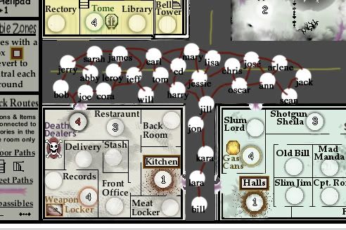
The number one thing I really dislike about this map are the lack of zombies. I get that the street squares represent the zombies with their killer neutrals, but it doesn't scream end of the world, zombie horrorfest. I'd prefer something more along these lines:

Image

Have all of those start at 1 and revert to 1. Some counting will be necessary to ensure there are fair connections between buildings, but that's only fair. Even better would be if you could do something like the monsters map and have actual zombies, or make an army circle that is an overhead shot of a zombie and use their arms to connect them?

Anyway, I'd rather have hordes of zombies rather than one.
Sketchblog [Update 07/25/11]: http://indyhelixsketch.blogspot.com/
Living in Japan [Update 07/17/11]: http://mirrorcountryih.blogspot.com/
Russian Revolution map for ConquerClub [07/20/11]: viewtopic.php?f=241&t=116575
User avatar
Cook Industrial Helix
 
Posts: 3462
Joined: Mon Jul 14, 2008 6:49 pm
Location: Ohio

Re: Zombieland

Postby MarshalNey on Tue Mar 23, 2010 12:51 am

Industrial Helix wrote:The number one thing I really dislike about this map are the lack of zombies. I get that the street squares represent the zombies with their killer neutrals, but it doesn't scream end of the world, zombie horrorfest. I'd prefer something more along these lines:

Image


I've considered (to a smaller degree) the sort of thing you're proposing, and in the end I opted for the background to convey the 'horde' theme of the map.

Specifically, the above scheme has a lot of 'useless' territories; bob, jerry, will, sean, et al. will never really be used because there are other better ways for players to get where they want to go.

The problem here is that the zombie zones in the streets have to act like gauntlets in order to have the gameplay function I'm looking for. This means that each zombie must be part of a unique linear path in order to have any real functionality. Yes, it is true that redundancy allows multiple players to take the same path without attacking each other; however this effectively makes no difference since players will normally leave only 1 troop on each zombie zone (being killer neutral) so that there would be no advantage to taking a non-conquered route over a conquered one.

If Zombie Neutrals were a reality, the above argument would carry less weight. However, since they might be a long ways off, I'd rather design the map with the Zombie Neutrals in mind, but not to base any large gameplay elements off of the possibilty.

Furthermore, there are several disadvantages to this scheme, not the least of which is that it will clutter the map and destroy any chance for a foggy, dismal look to the streets. And I would have to sacrifice any real thematic support from the zombie zone names (sorry but short first names just don't really add anything for me). While that isn't perhaps any great loss at the moment, it's a look and feel that I'd like to have for a more polished end product.

My biggest objection is the number of territories. I've played the Hive two times now and realized that I don't enjoy super-massive maps, even if in this case it is mostly killer neutrals. I want the gauntlets to be medium in length, not something that requires 30 troops just to cross... I'm not a fan of maps that require massive buildups just to get something done.

On the other hand, I really want to accomodate your concerns; you're right that tons of territories could really scream "here come the hordes".

Industrial Helix wrote:Have all of those start at 1 and revert to 1. Some counting will be necessary to ensure there are fair connections between buildings, but that's only fair. Even better would be if you could do something like the monsters map and have actual zombies, or make an army circle that is an overhead shot of a zombie and use their arms to connect them?

Anyway, I'd rather have hordes of zombies rather than one.


Modifying the circles could work, it has occured to me...

I'll have to think on the number of zombie zones.... increasing it really pulls the look of the map in the opposite direction of what I'm hoping to create.

Thanks for the quick feedback and food for thought (my brain was starving :))
User avatar
Captain MarshalNey
 
Posts: 781
Joined: Mon Sep 28, 2009 9:02 pm
Location: St. Louis, MO

Re: Zombieland

Postby MarshalNey on Tue Mar 23, 2010 9:06 am

b00kw0rm wrote:I really like it...


Thanks! ;)

Is there anything in particular that strikes you as worthwhile? When making changes, it's good to know what not to change as well.

b00kw0rm wrote:Any way to make the items a little more visible? It's kinda hard to find them as it is.


Hmmmm, yes I think a few people have had some trouble finding them, particularly the arsenals in the corners. It's strange to me, since they stand out to my eyes, but then again I made it so I'm probably not a good judge.

Do you think modifying the font (like giving it a bright outline) would do the trick? I already have a symbol by the territory and the army circle has a colored ring, although I could brighten that up too.

Thanks for the feedback- if you have the time feel free to post again, it's much appreciated.
User avatar
Captain MarshalNey
 
Posts: 781
Joined: Mon Sep 28, 2009 9:02 pm
Location: St. Louis, MO

Re: Zombieland- Version 1.2

Postby b00kw0rm on Tue Mar 23, 2010 1:05 pm

The artwork is great, and the mood is just right. It also looks like it could get frantic near the end of the game, with everyone making a mad dash to the helipads.

Just a question, is the helipad area a zombified area? It's out in the open, so it should have a negative effect for being there, aka lose # troops per turn due to the zombie attacks.

Currently the items are mostly colorless, and blend in with the pale backgrounds. The van was hard to find because the blue color is pretty close to the gray of the ground. The fuel is the easiest because of the bright color. Not sure the font color would be enough, but it would help. (it's how I found the van). Possibly making the font, tag border, and image border brighter would make it easier.

I like the current amount of spaces between the different buildings, but I agree with 'Comrade' Industrial Helix that it doesn't convey the sense of a massive horde. Maybe draw in a bunch of little zombies in the outside, grouped around each outside space?

I'd also like a way of getting one of the bottommost buildings to the other besides having to go around the entire loop.
User avatar
Private b00kw0rm
 
Posts: 118
Joined: Tue Mar 16, 2010 2:45 pm
Location: Stage 8-7

Re: Zombieland- Version 1.2

Postby fumandomuerte on Tue Mar 23, 2010 1:13 pm

You can try the dungeon crafter 3 to draw your city, You'll just have to add "tileable" textures to the library in order to use them in the program. DC3 uses basically 3 layer levels (floor, objects, walls; bottom to top order) and 2 standard grid sizes, 72x72 pixels for floor tiles and 18x18 pixels for wall frames (it auto-adds a shadow effect to the walls). It's free so you should give it a try.
Download Dungeon Crafter III

P.S. You can get graphics similar to those used on the Siege! and Draknor maps ;)
Image
Thanks to the CC staff for the perma-ban on ۩░▒▓₪№™℮₪▓▒░۩!
User avatar
Captain fumandomuerte
 
Posts: 620
Joined: Sat Dec 29, 2007 1:27 am
Location: The Cinderella of the Pacific

Next

Return to Recycling Box

Who is online

Users browsing this forum: No registered users