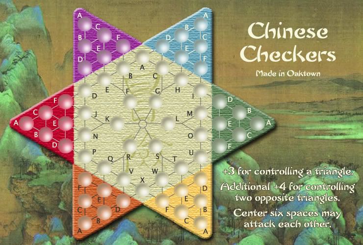
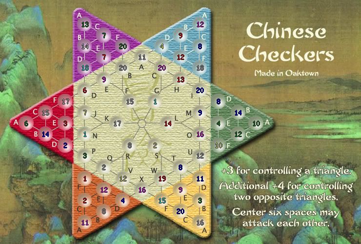
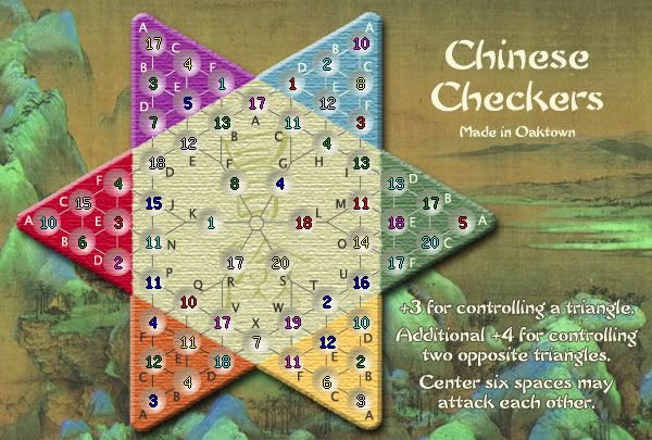
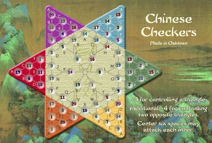
Moderator: Cartographers
KEYOGI wrote:Take 23 off the Y coordinate and add 3 to the X coordinate. I think that should do the trick.
oaktown wrote:If people like the general look of the circles, I can make the transition from the background color to the circles a bit smoother, but it's work that I won't do if these circles are not meant to be.
EvilOtto wrote:My preference is still no texture inside the circles, so they are smooth. A little color might be okay, but I think the texture just confuses the eye. You don't want the transition to be too smooth; there should be an edge there. Anyone agree/disagree?
KEYOGI wrote:Take 23 off the Y coordinate and add 3 to the X coordinate. I think that should do the trick.
oaktown wrote:HELP! I've spent the last hour recording the coordinates of the center of every row and column of circles according to photoshop, and re-doing the XML so that there is no variation. Now the army counts are WAY off... everycount up above the circle and skewed toward the center horizontally. Does CC not figure coordinates from the edge of the map? If that's the case, the only way I can get them all right is by eye-balling them one at a time, which sucks. I seem to remember reading that somebody else was having the same problem, but I can't find it.
Anyway, here's the latest. No significant changes since the new 'depth' circles were dropped in, but the board has been sized slightly within the frame.
oaktown wrote:and if anybody's curious, here's the small map with the lighter textured circles. XML done, coordinates entered and I already see couple that are off. I've noticed all army counts are a bit to the right and maybe a pixel low (I blame the CC coordinate shift, maybe it's Y+22 and X-4), but I'm keeping it because that way the numbers hit the lighter part of the circles and are easier to read.
I've noticed some developers post their XML - I'll do so if anybody cares.
Enigma wrote:im totally fine with this not being changed, but it looks like the circles are almost a little too large, especially evident in purple-A. there seems to be a little too much space to the upper left. maybe the edges could be blended into the background a little more? cuz the circles on light backgrounds, like the center ones, look wonderful.
Users browsing this forum: No registered users