Conquer Club

Napoleonic Europe 1812 - Ver 41/44 [Quenched]

Care to peruse completed maps? Take a stroll through the Atlas.

Moderator: Cartographers

Forum rules
Please read the Community Guidelines before posting.

Re: Napoleonic Europe 1812 (an original idea from Raskholnikov)

Postby Incandenza on Sat Nov 07, 2009 8:47 pm

Kabanellas wrote:Thanks Incandenza for the critics.

Though I donā€™t entirely agree (in the essence) with what you said, I think youā€™ve pointed out some issues that do concern me as well.


Okay, now we're talking. For the record, I really like your Third Crusade map, and hope I can help this map meet that lofty standard. Plus you've already proved that you have the discipline to see the long foundry process through to its conclusion... this process can be a bitch. :D

The new draft certainly addresses many of my comments, and nobodies already made a head start on bringing to your attention some of the problems that the color-blind will face.

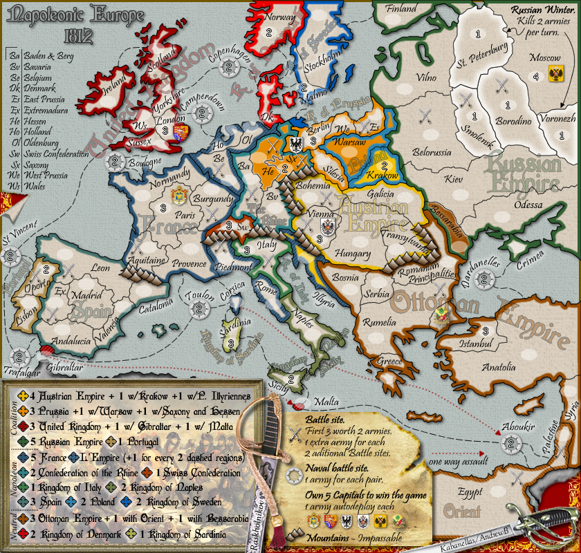
The bonus legend could be cleaned up... I mentioned perhaps sorting the legend alphabetically (within the existing three-way split you have). You could also maybe start thinking about removing some of the "Kingdoms", much the same way that The Rhine lost "Confederacy". Obv the UK is the UK, but the various kingdoms of Sweden, Sardinia, Italy, etc. could just be labeled as "Sweden", etc. The places where this might cause some confusion, i.e. "Kingdom of Denmark" and "Kingdom of Naples" (where the bonus name is also the name of one of the terits within the kingdom) could be alleviated by potentially renaming the Denmark and Naples terits... tho at that point, with the other names cleaned up, you might be able to get away with leaving them as is...

Also within the bonus, sometimes you write out the word "with", sometimes it's a "w/"... you might want to change all of the former to the latter, and maybe make more use of ampersands.

Some of the terit names need to be reconciled: i.e. on the abbreviation legend He is "Hessen & Westphalia", but the bonus legend speaks only of "Hessen". I also maintain that you should consider changing Aboukir to The Nile, but that's small potatoes.

The overall problem, weirdly, is that the large map looks great. All the legibility issues and what not simply don't apply. But you have to have a small map, and a substantial portion of CC (including yours truly, rocking my MacBook) plays exclusively on the small map. And, well, the small map at this point (brace yourself, bad joke coming) is your waterloo. I assume that the small map is at the maximum dimensions according to the CC guidelines (if it's not, you might want to consider growing it a touch, a little bit might go a long way).

The question is how to make the small map more legible: the terit bonus colors could be bolder (especially in the Rhine and Eastern Europe areas), the terit labels could certainly be bolder... but of course those two aims work at cross-purposes, especially where you look at terits like Oldernburg and Holland, where the brighter the terit names, the more difficult it will be to see the dashed bonus indicators. Some of the gameplay elements (the one-way attacks in particular) certainly need to be more prominent. As to the question of how you'll make the bonus colors more amenable to the color-blind... I think more input might be required, but some small palette swaps could be done now (esp. changing either UK or Denmark to something other than reddish, and Poland and the Rhine are pretty close as well). I know the small map thing sucks, but until lack deems otherwise, a legible small map is a requirement.

I'm not sure what the solution for the small map is going to be, graphics aren't my metier. But I like complex maps, and this one shows promise. I'd just like to be able to play it without having to pop some preemptive Tylenol.
THOTA: dingdingdingdingdingdingBOOM

Te Occidere Possunt Sed Te Edere Non Possunt Nefas Est
User avatar
Colonel Incandenza
 
Posts: 4949
Joined: Thu Oct 19, 2006 5:34 pm
Location: Playing Eschaton with a bucket of old tennis balls

Re: Napoleonic Europe 1812 (an original idea from Raskholnikov)

Postby Raskholnikov on Sun Nov 08, 2009 2:58 am

Okay, now we're talking. For the record, I really like your Third Crusade map, and hope I can help this map meet that lofty standard. Plus you've already proved that you have the discipline to see the long foundry process through to its conclusion... this process can be a bitch. :D

True, but it doesn't have to be - at least not to the extent to which it actually alienates and even turns off individuals who are all excited to make a contribution. It kills all the fun and it makes good people go away (where is Qwertl these days?) In this light, I really appreciate the dramatic change in the way you presented your comments in this post. I found it to be extremely helpful and constructive, and I happen to agree with most of your suggestions. Please find below my comments on each item; again, they are my own, Kab may have his.


The new draft certainly addresses many of my comments, and nobodies already made a head start on bringing to your attention some of the problems that the color-blind will face.

Yes, that was very helpful. I for one had never seen a map from that perspective. Lesson learned....


The bonus legend could be cleaned up... I mentioned perhaps sorting the legend alphabetically (within the existing three-way split you have). You could also maybe start thinking about removing some of the "Kingdoms", much the same way that The Rhine lost "Confederacy". Obv the UK is the UK, but the various kingdoms of Sweden, Sardinia, Italy, etc. could just be labeled as "Sweden", etc. The places where this might cause some confusion, i.e. "Kingdom of Denmark" and "Kingdom of Naples" (where the bonus name is also the name of one of the terits within the kingdom) could be alleviated by potentially renaming the Denmark and Naples terits... tho at that point, with the other names cleaned up, you might be able to get away with leaving them as is...

Yes, the Kingdoms could be cleaned up. Problem is, they are part of the overall graphic design. Plus, there is a consistency problem. if we remove Kingdoms, do we remove Empires too? Anyway, let's see what Kab thinks. I am open to addressing this if he is.

Also within the bonus, sometimes you write out the word "with", sometimes it's a "w/"... you might want to change all of the former to the latter, and maybe make more use of ampersands.

Sounds great. Will do.


Some of the terit names need to be reconciled: i.e. on the abbreviation legend He is "Hessen & Westphalia", but the bonus legend speaks only of "Hessen". I also maintain that you should consider changing Aboukir to The Nile, but that's small potatoes.

The Hessen issue is a pure question of space: Westphalia just didn't fit in. This means we'd have to change the territory name to Hessen only, which is a pretty big leap geogpraphically if you actually look at it and see it goes from Mecklembourg on the Baltic through Westphalia and Saxony all the way down to Hessen. But if it really needs to be done, this is one of those times where I agree that consistency and legibilty can trump geogrpahical accuracy...


As to the Aboukir / Nile debate, the naval battle is called the Battle of Aboukir in the entire francophone world. Famous paintings with this title have been created. I know the English sometimes refer to it also as Battle of the Nile, but i think Aboukir is the correct use (having studied in a French high school!). There were also two land battles fought and won by Bonaparte: the Battle of the Pyramids (or Nile) and the Land battle of Aboukir. The Battle we have designated as a bonus, in Egypt, is the Battle of the Pyramids / Nile. In short, I think Aboukir is correct and i also like it. Let's agree to disagree on this for now and leave it for the end :)


The overall problem, weirdly, is that the large map looks great. All the legibility issues and what not simply don't apply. But you have to have a small map, and a substantial portion of CC (including yours truly, rocking my MacBook) plays exclusively on the small map. And, well, the small map at this point (brace yourself, bad joke coming) is your waterloo. I assume that the small map is at the maximum dimensions according to the CC guidelines (if it's not, you might want to consider growing it a touch, a little bit might go a long way).

LOL Funny. And yes, it is.

The question is how to make the small map more legible: the terit bonus colors could be bolder (especially in the Rhine and Eastern Europe areas), the terit labels could certainly be bolder... but of course those two aims work at cross-purposes, especially where you look at terits like Oldernburg and Holland, where the brighter the terit names, the more difficult it will be to see the dashed bonus indicators. Some of the gameplay elements (the one-way attacks in particular) certainly need to be more prominent. As to the question of how you'll make the bonus colors more amenable to the color-blind... I think more input might be required, but some small palette swaps could be done now (esp. changing either UK or Denmark to something other than reddish, and Poland and the Rhine are pretty close as well). I know the small map thing sucks, but until lack deems otherwise, a legible small map is a requirement.

For Oldenburg, Holland and Belgium we could, for the small map, shorten the territory lables to two letter words (Ol, Ho, Be) like all other Rhine territories, and add the full names to the legend at the left hand-side of the map. Colors and bold features are Kab's department and I totally defer to him on this. For Corsica one way assaults Aboukir, we could make the asterisk bigger and maybe bold red. I we remove the graphic Kingdom of..... titles, we may even be able to put this text right next to Corsica itself, along the Italian coast.

The only other one way assault is Gibraltar-Malta; again, we could make the text bolder. Let's see what Kab thinks.


I'm not sure what the solution for the small map is going to be, graphics aren't my metier. But I like complex maps, and this one shows promise. I'd just like to be able to play it without having to pop some preemptive Tylenol.

I totally get you and agree. It then becomes a question of the degree of perfection to be achieved, which again is rather subjective. But yes, we will try our best to have the best possible small map.

Thanks again for taking interest in our map and for your valuable constructive criticism. It was a pleasure to reply this time!
User avatar
Private Raskholnikov
 
Posts: 638
Joined: Fri Sep 11, 2009 3:40 pm

Re: Napoleonic Europe 1812 (an original idea from Raskholnikov)

Postby jefjef on Mon Nov 09, 2009 12:20 am

You may want to add "888" to all your neutrals too. Couple terts look problematic.

The corse/Aboukir - * - try it as a bright red and a little larger

The swords in Rumelia tert. It might be more noticeable if you could position it near the armies circle. It's kind of out of sight/out of mind where it is.

Getting rid of the sword sure opened that area up. Very nice!
This post was made by jefjef who should be on your ignore list.
Image
drunkmonkey wrote:I'm filing a C&A report right now. Its nice because they have a drop-down for "jefjef".
User avatar
Colonel jefjef
 
Posts: 6026
Joined: Mon Feb 23, 2009 8:41 pm
Location: on my ass

Re: Napoleonic Europe 1812 (an original idea from Raskholnikov)

Postby Raskholnikov on Wed Nov 18, 2009 6:05 am

Hi Kab,

Any thoughts on Incandenza's latest comments? Let's try to deal with the ones that can be resolved and try to come up with a version ready to move onwards and upwards ;)

Many thanks,

R
User avatar
Private Raskholnikov
 
Posts: 638
Joined: Fri Sep 11, 2009 3:40 pm

Re: Napoleonic Europe 1812 (an original idea from Raskholnikov)

Postby MrBenn on Wed Nov 18, 2009 7:54 am

The graphics here are definitely of a good standard.

My real concerns are to do with legibility and clarity - while I won't recite Incandenza's assessment, I can assure you that everything he says above is spot-on; you're unlikely to find a better analysis in these parts ;-)
Incandenza wrote:But form must follow function, and the look and theme of the map must be utterly subservient to gameplay and legibility.


From a practical point of view, you also need to decide who is doing what. As far as I can surmise, there are three people with a vested interest in the project (Kabanellas, Raskholnikov, and AndrewB), while foundry protocol dictates that a maximum of two people are eligible for a mapmaking medal.
Image
PB: 2661 | He's blue... If he were green he would die | No mod would be stupid enough to do that
User avatar
Lieutenant MrBenn
 
Posts: 6880
Joined: Wed Nov 21, 2007 9:32 am
Location: Off Duty

Re: Napoleonic Europe 1812 (an original idea from Raskholnikov)

Postby Raskholnikov on Wed Nov 18, 2009 8:03 am

Yes, we are working on legibility and clarity. As for medals don't worry about it, I don't need any. I'm here to enjoy designing fun maps and play on them, I'm not looking for any kind of recognition or virtual medals. On an aside, AndrewB as of now seems unable to do the XML, so we need to find another team member willing to help with that. Eventually, he and Kab can have the medals. I'll be happy to have the map quenched ;)
User avatar
Private Raskholnikov
 
Posts: 638
Joined: Fri Sep 11, 2009 3:40 pm

Re: Napoleonic Europe 1812 (an original idea from Raskholnikov)

Postby RjBeals on Wed Nov 25, 2009 10:40 am

FYI.

This is probably one of the best maps i've seen come through the foundry in the past couple years. It's georgous, creative, and unique. I really hope that you both stick with it. Please. If it reaches beta, the other 99% of conquer club who don't visit the map foundry will be blown away, and you will be a celebrity around here ;)
Image
User avatar
Private RjBeals
 
Posts: 2506
Joined: Mon Nov 20, 2006 5:17 pm
Location: South Carolina, USA

Re: Napoleonic Europe 1812 (an original idea from Raskholnikov)

Postby Raskholnikov on Wed Nov 25, 2009 11:59 am

We both put a lot of time and effort into it and had a lot of fun in the process. Which is why I will not go on without Kab. A map is one thing; a friend who has been hurt and insulted and humiliated for no reason whatsoever is quite another. If Kab finds it in his heart to forgive and forget and go on with his work on this map - and the other two amazing ones he has in the works - I will happily do the same; but not without him. In any case, thanks so much for your kind comments.
User avatar
Private Raskholnikov
 
Posts: 638
Joined: Fri Sep 11, 2009 3:40 pm

Re: Napoleonic Europe 1812 (an original idea from Raskholnikov)

Postby Industrial Helix on Sat Nov 28, 2009 8:40 pm

Did you guys ever figure out if the Russian Winter -2 per round is feasible with the XML? Since you've kept it I'm assuming it is...
Sketchblog [Update 07/25/11]: http://indyhelixsketch.blogspot.com/
Living in Japan [Update 07/17/11]: http://mirrorcountryih.blogspot.com/
Russian Revolution map for ConquerClub [07/20/11]: viewtopic.php?f=241&t=116575
User avatar
Cook Industrial Helix
 
Posts: 3462
Joined: Mon Jul 14, 2008 6:49 pm
Location: Ohio

Re: Napoleonic Europe 1812 (an original idea from Raskholnikov)

Postby Raskholnikov on Sun Nov 29, 2009 1:27 am

Yes, it is. ;)
User avatar
Private Raskholnikov
 
Posts: 638
Joined: Fri Sep 11, 2009 3:40 pm

Re: Napoleonic Europe 1812 (an original idea from Raskholnikov)

Postby Kabanellas on Sun Nov 29, 2009 12:26 pm

Thanks Incandenza for your right-on-the-spot critics!

Iā€™m posting Version 25 with the changes that, I think, will touch the points you brought to our attention.

-Hessen & Westphalen was reduced to Hessen
-Took out the Kingdom in Italy
-Made abbreviations for Belgium, Holland and Oldenburg
-Changed the one way assault legend to a more (I hope) perceptible arrow line
-Changed the red in Denmark for a brighter one, more distinct from the one used in the UK.

Soon Iā€™ll be posting the small version with the latest changes.

Click image to enlarge.
image
Major Kabanellas
 
Posts: 1482
Joined: Fri Feb 27, 2009 12:21 pm
Location: Porto, Portugal

Re: Napoleonic Europe 1812 - Version 25

Postby Raskholnikov on Sun Nov 29, 2009 12:36 pm

Superb. Thanks, Kab! Does anyone have other issues they wish to address? Look forward to hearing them...

Kab, in the legend, can you please change P. Illyriennes to Illyria? Thanks.
User avatar
Private Raskholnikov
 
Posts: 638
Joined: Fri Sep 11, 2009 3:40 pm

Re: Napoleonic Europe 1812 - Version 25

Postby cubfanpgh on Sun Nov 29, 2009 2:41 pm

You might want to consider changing the name of "Sussex" to either "Wessex" or "West Country". Wessex, a semi-fictional name for the area made popular by Thomas Hardy, largely coincides with "Sussex" on the current map, while West Country coincides as well. I might suggest Wessex, as the region on the map is itself artificial. Sussex is a small region in the east of the map region, while Wessex is a larger region in the center.

Whether you change the name or not is of little importance. The map seems simply wonderful, and I can't wait to play it.
User avatar
Cadet cubfanpgh
 
Posts: 48
Joined: Tue Mar 04, 2008 8:59 pm
Location: Pittsburgh

Re: Napoleonic Europe 1812 - Version 25

Postby eigenvector on Sun Nov 29, 2009 6:51 pm

Hey!!

This map looks fantastic, it's going to be a splendid addition to our embarrassment of riches here. :D

I am a bit puzzled about the names of some battles and provinces - you have Borodino, Egypt and Palestine, for example. Now there was a battle of Borodino but there weren't battles of Egypt or Palestine (rather, there were, say, Pyramids and Acre, respectively). So the usage adopted so far seems a bit inconsistent. Do you think it's an issue?

Keep up the good work!! =D>
Cook eigenvector
 
Posts: 95
Joined: Tue Jul 24, 2007 4:27 am

Re: Napoleonic Europe 1812 - Version 25

Postby Raskholnikov on Sun Nov 29, 2009 9:52 pm

Battles are not named. For example there is a battle in Belgium. Clearly, that's Waterloo. But the territory's name is Belgium. Borodino is the name of a region, so there the name of the region and battle coincide. There simply is no space to also include battle names. Thanks for the comments.
User avatar
Private Raskholnikov
 
Posts: 638
Joined: Fri Sep 11, 2009 3:40 pm

Re: Napoleonic Europe 1812 - Version 25

Postby Commander9 on Sun Nov 29, 2009 11:36 pm

So far this looks very promising. Just got few questions.. (sorry, if those were written somewhere, because I didn't saw those)

1. Is this design final? I kind of dislike this font (hurts my eyes). Also, are you sticking with the colours, that are here right now?

2. Should the region Vilno be called Baltic region or North West region (as the russians used to call them) because lithuanian capital isn't actually even the biggest city in the region. (just wondering about the name)
But... It was so artistically done.
Lieutenant Commander9
 
Posts: 757
Joined: Fri Aug 22, 2008 1:51 am
Location: In between Lithuania/USA.

Re: Napoleonic Europe 1812 - Version 25

Postby Raskholnikov on Mon Nov 30, 2009 12:28 am

1.
Is this design final? I kind of dislike this font (hurts my eyes). Also, are you sticking with the colours, that are here right now?


The design is not final until the map is quenched. However, changing fonts would mean a vast majority of forum mebmers would agree this is a terrible one. So far, you are the first not to like it ( lol ok maybe the 2nd or 3rd if you count .44).

2. Should the region Vilno be called Baltic region or North West region (as the russians used to call them) because lithuanian capital isn't actually even the biggest city in the region. (just wondering about the name)

Under the Russian Empire, that was the Vilno military district. It referred to the Army HQ, not neccessarily to the biggest city or a descripition of the entire region. We tried to follow that as much as possible.

Thanks for your comments, input and interest.
User avatar
Private Raskholnikov
 
Posts: 638
Joined: Fri Sep 11, 2009 3:40 pm

Re: Napoleonic Europe 1812 - Version 25

Postby jefjef on Mon Nov 30, 2009 2:50 am

I like the font.

I also still think the Rumelia battle site swords should be located closer to the army circle. When I look at terts, I as others do, usually focus on the army circles & name.
This post was made by jefjef who should be on your ignore list.
Image
drunkmonkey wrote:I'm filing a C&A report right now. Its nice because they have a drop-down for "jefjef".
User avatar
Colonel jefjef
 
Posts: 6026
Joined: Mon Feb 23, 2009 8:41 pm
Location: on my ass

Re: Napoleonic Europe 1812 - Version 25

Postby Raskholnikov on Mon Nov 30, 2009 3:36 am

The sabres are located in each case as closely as possible to a historical battle site. The Rumelia sabres represent the second Battle of Russe, on the Danube, of Oct. 1811, which ended with a comprehensive Turkish defeat. the signature of the Peace Treaty of Bucharest in 1812 and the annexation of Bessarabia by Russia, just days before Napoleon's invasion of Russia.

That's why the sabres are there and I do not wish to move them somewhere historically inaccurate.
User avatar
Private Raskholnikov
 
Posts: 638
Joined: Fri Sep 11, 2009 3:40 pm

Re: Napoleonic Europe 1812 - Version 25

Postby Commander9 on Mon Nov 30, 2009 9:02 am

Ok, gotcha. Actually, I'm not sure if this will be helpful, but I've got a suggestion: You could make Vilno to be double allegiance or something like that, as if you look into historic accuracy, Lithuanians (well, the ones from the bigger Lithuania, not the Prussians one) kind of welcomed Napoloen as a savior (as they've hoped to regain their freedom). Then again, that might ruin the balance (it's hard to talk about, when you've never played the map)
But... It was so artistically done.
Lieutenant Commander9
 
Posts: 757
Joined: Fri Aug 22, 2008 1:51 am
Location: In between Lithuania/USA.

Re: Napoleonic Europe 1812 - Version 25

Postby eigenvector on Mon Nov 30, 2009 3:21 pm

Raskholnikov wrote:Battles are not named. For example there is a battle in Belgium. Clearly, that's Waterloo. But the territory's name is Belgium. Borodino is the name of a region, so there the name of the region and battle coincide. There simply is no space to also include battle names. Thanks for the comments.


Ok, I understand now - it's fine.

But then I have a new issue to raise, about the name Borodino in particular. See, it's just a village and not a very fitting name for a region.

I'd suggest you rename it Mozhaysk (wiki spelling) which is the larger nearby town and the next strategic point right after Smolensk on the way to Moscow.

Nowadays, by the way, the whole area is called Moscow District (with a local government separate from the metropolitan area) and I *presume* it was part of the Moscow guberrniya back in 1812 - I can look it up if you wish. But you already have a Moscow on the map...

Best wishes.

P.S.
The Russian Winter is a brilliant idea :)
Cook eigenvector
 
Posts: 95
Joined: Tue Jul 24, 2007 4:27 am

Re: Napoleonic Europe 1812 - Version 25

Postby Kabanellas on Mon Nov 30, 2009 5:22 pm

Thanks Eigen ;)
Major Kabanellas
 
Posts: 1482
Joined: Fri Feb 27, 2009 12:21 pm
Location: Porto, Portugal

Re: Napoleonic Europe 1812 - Version 25

Postby Raskholnikov on Mon Nov 30, 2009 9:14 pm

Yes, the Russian winter was all Kab's baby - he insisted on it.
User avatar
Private Raskholnikov
 
Posts: 638
Joined: Fri Sep 11, 2009 3:40 pm

Re: Napoleonic Europe 1812 - Version 25

Postby Sasky on Mon Dec 07, 2009 6:21 pm

This map looks great! Fast-track-it, lol!
Colonel Sasky
 
Posts: 8
Joined: Fri Jan 16, 2009 1:27 am

Re: Napoleonic Europe 1812 - Version 25

Postby lt_oddball on Tue Dec 08, 2009 6:20 am

Nice map concept.. =D>

But don't you think you'll get in troubles with the placement of troop numbers in all these small mid european provinces ?
Maybe you should blow up the central european map (as if you'd look upon a midsized ball/globe ..ireland/portugal/egypt/etc viewed at an angle).

And better have the TOULON naval dot be able to attack the ABOUKIR naval dot one way...makes more sense (france should control the marseille seas before it could sail and invade egypt undetected).
Barbarus hic ego sum, quia non intellegor ulli.
User avatar
Major lt_oddball
 
Posts: 364
Joined: Mon Mar 05, 2007 11:17 am
Location: Fortress Europe

PreviousNext

Return to The Atlas

Who is online

Users browsing this forum: No registered users