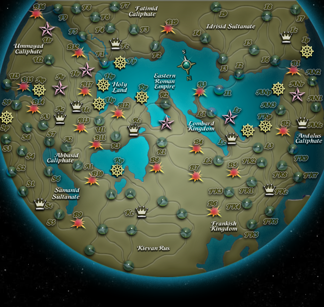
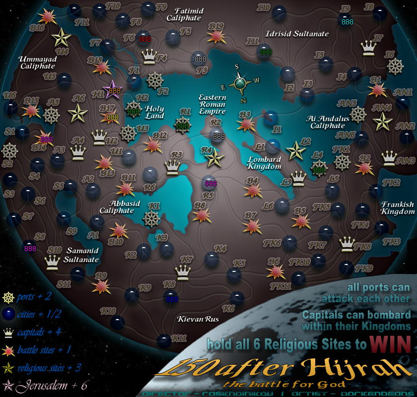
Raskholnikov wrote:Hi Pork,
First of all, let me tell you that overall, i love it! i think you're going totally in the right direction and I agree with most changes you made.
A few comments:
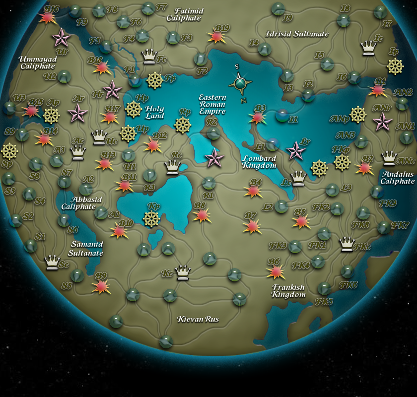
1. Please correct what I indicated in red and white in terms or road connections and names.
2. You gave lower case letters to the Port, Capital and Religious site part of all city codes. I think they should be capitalised.
3. The typeface for all city codes is, I think, much too big. Check the New World Map. I'd make the letters smaller, thinner, crisper, without white highlight around them. As they are, they take way too much space and kinda overpower the map itself. The codes must be as discrete as possible while still legible.
4. The roads are great - but i would make the bevel darker, so that the connections can be as clear as possible. Now they sometimes tend to get too morphed in the background.
5. Please add the map title and full legend with symbols explanations, bonus structure etc as in the map i sent you.
6. Oh and please, add Sicily in a way which makes it look like the rest of the land areas around it. Right now Palermo is floating....

Once these changes are done, I can add the Empires' flags and we can have a complete, new version of the map to put up in the first post and open to comments. i can't wait!
Again, thank you for all your persevernce, hard work and great ideas and creative input!
R
2.) With all the lettering and abbreviations going on, the map can be a bit confusing. So I thought that, to make it more clear, I would Cap all the Kingdom names in the abbreviations, and use lower case for cities, ports, shrines, and battles. Otherwise, they are melded together, and confusion ensues.
3.) yes I agree that the text should be as small as possible, and should blend in rather than stand out. There is just too much of it to do otherwise. It would simply take over the map. I used a 16 pix. font, when it is scaled down for the small version, I think that it will be of minimal size to be legible. As for the glow coupled with the drop shadow. Well that is an attempt at making the text larger without making it seem so, and keep with the goal of making it blend in. My thoughts on this, is this- With the text a similar color to the background, (to make it blend in), the glow is needed for contrast, so you can read it. and the drop shadow does two things. It contrasts the glow and raises the text up. All this together allows for the text to actually be larger, but not seem so. And at the same time helps the text to blend in. Without this treatment the text would need to be either a very light or very dark color, and that means that it would stand out instead of blend in. I did a lot of experimenting before I came up with this particular treatment. Everything else was either too contrasting, which made it stand out too much, or was too blended in, which made it very hard to read.
I will go scale down the map to what the small version will be and post it. Then we can decide if the text could be made smaller or not.
4.) I have the opacity turned way down on the roads. I will pump it up some to see if you like it better or not. The roads, like the text is very overpowering presence on the map. I have tried my best to make them both blend in as much as possible, and still make them legible. Its all about the fine tuning at this stage.
Check, and will do on the other directives, that you mentioned.


