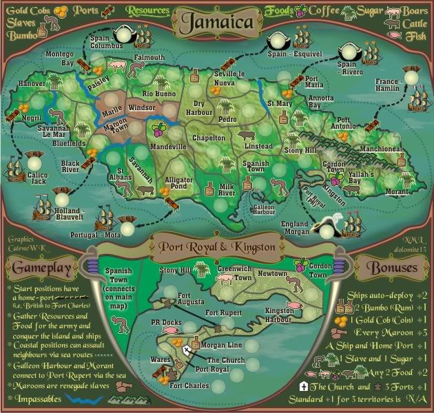
natty_dread wrote:For the record, the icons do look very nice now.
Excellent to hear
Moderator: Cartographers
natty_dread wrote:For the record, the icons do look very nice now.


isaiah40 wrote:I don't like that glow, it makes the icons look like they are pasted on, and not part of the map.


porkenbeans wrote:Thank you cairns,
I am so glad that you are understanding me, and know that I am trying to help in a constructive sort of way.
When I said that I don't read the thread, I should have been more precise with my words. I should have added an "initially" in there.
Back to the map. I took your map into photoshop to try and show you, just what I was talking about with the drop shadow on the legend. Well I got that done, but found myself having such a blast that I kept going. To me, It just kept looking better and better. I am sure that not all will agree, but that's the way I see it.
Anyways, Here is what I came up with. I hope that you will see something, that you may want to use.


cairnswk wrote:porkenbeans wrote:Thank you cairns,
I am so glad that you are understanding me, and know that I am trying to help in a constructive sort of way.
When I said that I don't read the thread, I should have been more precise with my words. I should have added an "initially" in there.
Back to the map. I took your map into photoshop to try and show you, just what I was talking about with the drop shadow on the legend. Well I got that done, but found myself having such a blast that I kept going. To me, It just kept looking better and better. I am sure that not all will agree, but that's the way I see it.
Anyways, Here is what I came up with. I hope that you will see something, that you may want to use.
pnb, that is one of the most constructive posts i've seen in a long time and i thank you, sincerely for taking the time to show what you mean.I like the way that inset lifted the legend away from the map.
I don't know if i can do some of that in Coreldraw, but i'll give it a go.
Watch this space.


cairnswk wrote:


MrBenn wrote:
Final Forge
---The Jamaica Map has reached the ‘Final Forge’ Stage. The map has passed rigorous gameplay and graphics examinations, and major concerns have been addressed. If you have any other concerns, please make your voice heard. If after a reasonable amount of time there has not been any objection or protest, the map will be deemed finished with the 'Foundry Brand' of approval and will be submitted for live play. As long as there is still discussion or posts that have yet to be commented on, the map will remain in Final Forge until said discussion has reached the conclusion that the map has reached its final and polished version.
Post questions and concerns if any.


isaiah40 wrote:...


Congrats cairns!! Finally!!
MrBenn wrote:...
These images look pretty good to me.
I'd caution against suggesting any overhauls now - maybe a slight tweak here or there could be beneficial, but I think you need to be careful not to overdo things.


the.killing.44 wrote:Yes, please leave the legend as is. The separation by decor adds to the old-style feel, whereas a noisy (in both Photoshop and real terms) drop shadow is less authentic.


cairnswk wrote:the.killing.44 wrote:Yes, please leave the legend as is. The separation by decor adds to the old-style feel, whereas a noisy (in both Photoshop and real terms) drop shadow is less authentic.
Is V29 suitable above...44?
i wasn't planning on changing the legend any further.


the.killing.44 wrote:cairnswk wrote:the.killing.44 wrote:Yes, please leave the legend as is. The separation by decor adds to the old-style feel, whereas a noisy (in both Photoshop and real terms) drop shadow is less authentic.
Is V29 suitable above...44?
i wasn't planning on changing the legend any further.
I'd go back to v28, personally.


dolomite13 wrote:Looks great cairn... if none of the unit circles have moved and no borders or connections changed and no territory names changed since I did the xml I think it is ready to be checked as well.
=D=


cairnswk wrote:dolomite13 wrote:Looks great cairn... if none of the unit circles have moved and no borders or connections changed and no territory names changed since I did the xml I think it is ready to be checked as well.
=D=
dolomite13. some of the unit circles have been movd because of the increase in the icons.
Kngston Harbour & Falmouth are teh two that come to mind, but there is also centering issues to take care of as some of those units are off the mark.
Thanks.


dolomite13 wrote:OK have a look at the coordinates etc ...
Please make a list of anything you see that needs to be changed =)
=D=
Map Maker - http://www.conquerclub.com/mapmaker/index.php
SMALL - http://i155.photobucket.com/albums/s282 ... a_V29S.jpg
LARGE - http://i155.photobucket.com/albums/s282 ... a_V29L.jpg
XML - http://www.bigottergames.com/downloads/jamaicaV29.xml
"Summary: 0 errors and 0 warnings detected in jamaicaV29.xml (48 continents, 52 territories)"


cairnswk wrote:Dolomite13
there are major centering issues which require attention if you would please.
Can you recheck all the coordinates.


dolomite13 wrote:I centered a few more but not all of them yet... I only work 1/2 day tomorrow so I will finish them then.
Almost There =)
=M=


Users browsing this forum: No registered users