
natty_dread wrote:Yeah, sharpen the text in the legend. It is a bit smudgy. Maybe try another font?
thanks Guys. Does this help any.gimil wrote:Hi Cairns,
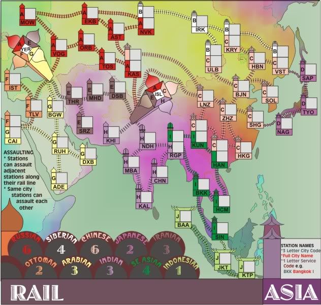
To further address nobodies issue with the legends text, I personally find them readable but not comfortable readable. I think it needs to be a good bit crisper to make it perfectly readable, I am worried that someone with lesser eyesight than myself (with my specs on) may begin to struggle with the texts readability. Also the I and J lines on the legends are of similar colour it took me a few seconds to realise what line was what, someone who is colourblind may be less fortunate.
Apart from that I like the difference in style on this map. It definitely feels African, at least to me.
Cheers,
gimil
I've changed the font completely and reworked the labels.
I don't have issue with the colours between the I J lines as they are distinctly different ends of the green scale and those lines and stations are marked on the map for the colour blind. I've even widened the ticket to make it better.

- Click image to enlarge.


