The HIVE [Quenched]
Moderator: Cartographers
Re: Jumbo Hex Map *V5*
Great map, but is there actually room for troop numbers? It seems to me as if they would overlap the territory names, making it result in one giant turtle soup...
-

 iceco
iceco
- Posts: 72
- Joined: Wed Jun 25, 2008 4:02 am


Re: Jumbo Hex Map *V5*
my two cents:
a. big logos are tacky and irrelevant to a map. so in my map example i de-emphasized them without removing them
b. map size is an issue as constant scrolling sux on big maps with lots of moving. so i present an alternative on my map example to constrict all the pertinent info to one line. don't clutter an elegant map with text
b1. impassable border text is not needed as this map type has existed elsewhere without an explanation needed. also map hover will clue you in on borders.
b2. text for how the cells are named shouldn't be needed as the cell naming needs to be obvious to be useful
b3. storage cells border each other removed
c. gave the cluster node the name of a Queen type. although it doesn't make sense for a hive to have 5 queens, it does fit with a warfare style map where one queen is trying to take over.
d. the comb sizes are too big to be useful when playing. compare it to the large World map which has no 10+ cell terrs.
e. suggestion: make queens/cluster node cells a negative bonus
f. i like the new colors, great work on that in V3
AND THE MOST IMPORTANT THING IS TO NOT LET THE MAP GO LIVE WITHOUT EXTENSIVE PLAY TESTING!
far too many maps have come out lately with great ideas but just bomb when actually played. no need to rush.
my map example, i didn't perfect it, just wanted to show examples, using your orig design

'cHANCE favors the prepared mind' Louis Pasteur | Latest Tourney Wins:
Don't Take Too Long 2x2, Freemium with a Premium doubles tournament -RunnerUp
Don't Take Too Long 2x2, Freemium with a Premium doubles tournament -RunnerUp
-

 ctgottapee
- Posts: 122
- Joined: Fri Feb 23, 2007 7:31 pm
- Location: north of the DMZ


Re: Jumbo Hex Map *V5*
ctgottapee wrote:AND THE MOST IMPORTANT THING IS TO NOT LET THE MAP GO LIVE WITHOUT EXTENSIVE PLAY TESTING!
the only real test play we have is going live as BETA
De gueules à la tour d'argent ouverte, crénelée de trois pièces, sommée d'un donjon ajouré, crénelé de deux pièces
Gules an open tower silver, crenellated three parts, topped by a apertured turret, crenellated two parts
Gules an open tower silver, crenellated three parts, topped by a apertured turret, crenellated two parts
-

 pamoa
pamoa
- Posts: 1242
- Joined: Sat Sep 01, 2007 3:18 am
- Location: Confederatio Helvetica


Re: Jumbo Hex Map *V5*
just a swift glance.
I like the colour and hexesstyle map.
Questions:
1) How did you decide on where to have the impassable lines and where not ? (seems some zones are very well protected and others a bit more open..) and why aren't there a few impassable lines WITHIN the largest bonuszones (15 terr.) so that in an early stage a player with majority spawn (there, but just not major enough to conquer it whole BEFORE the adversaries have conquered a few small bonuszones) can decide on expanding in the largest bonuszone instead of that everyone aims immediately for all the smallest bonuszones and expand from there) ?
2) "territory bonus capped at 10 " is not clear enough.
Make it e.g. "only basic territories bonus capped at max 30/3".
3) what do you mean by "all honey storage cells border eachother " ?
I can attack from L12 to HSC 3 (which is a territory ?) occupy HSC3 and from there attack HSC1, occupy that one and attack C5 immediately .?
Is that the idea ?
Barbarus hic ego sum, quia non intellegor ulli.
-

 lt_oddball
- Posts: 364
- Joined: Mon Mar 05, 2007 11:17 am
- Location: Fortress Europe


Re: Jumbo Hex Map *V5*
lt_oddball wrote:just a swift glance.
I like the colour and hexesstyle map.
Questions:
1) How did you decide on where to have the impassable lines and where not ? (seems some zones are very well protected and others a bit more open..) and why aren't there a few impassable lines WITHIN the largest bonuszones (15 terr.) so that in an early stage a player with majority spawn (there, but just not major enough to conquer it whole BEFORE the adversaries have conquered a few small bonuszones) can decide on expanding in the largest bonuszone instead of that everyone aims immediately for all the smallest bonuszones and expand from there) ?
2) "territory bonus capped at 10 " is not clear enough.
Make it e.g. "only basic territories bonus capped at max 30/3".
3) what do you mean by "all honey storage cells border eachother " ?
I can attack from L12 to HSC 3 (which is a territory ?) occupy HSC3 and from there attack HSC1, occupy that one and attack C5 immediately .?
Is that the idea ?
1) I just made the impassables between the groups. I tried to make each type of group (3,6,9...) have the same as number of border hexes. SO all 3 hex groups have 1 border hex and so on. I did not add impasses in the middle of large groups because...I just didn't. But i am open to GP border changes.
2) I will see if I can fit it in.
3) Yes.
Thanks
WM

-
 WidowMakers
- Posts: 2774
- Joined: Mon Nov 20, 2006 9:25 am
- Location: Detroit, MI


Re: Jumbo Hex Map *V5*
great map guys!
it will be the ground of many epic battles!
i have not much to say, cause normally i make critics and suggestion only for the graphics and this map is quite perfect right now. some tweaks certainly will change, but at the moment i can see nothing wrong in the graphic. only a question: army circles?
for the gameplay, i appreciate the original bonus sistem but i'm not much expert so i leave to other the discussions about it.
keep working! i want to paly with this map!
edit: did you tested the small version? i'm scared that this map can be unclear in the small version...
-

 pikkio
- Posts: 188
- Joined: Mon Mar 05, 2007 8:58 am
- Location: UK


Re: Jumbo Hex Map *V5*
I like the idea of a very large map, although I think that there might be too many territs here. Once you get the army counts on it, it will look like a sea of numbers, and may be just too hard to distinguish between them. I think that you have gone beyond the playable limit. Also with everything in such perfect rows, it will be somewhat monotonous, to say the least.
I think that you could possible pull this off if you were to decrease the territ count a bit, and consider a slightly different pattern that is not so ordered in perfect rows.
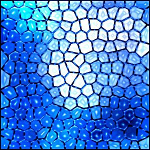
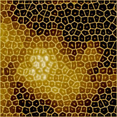
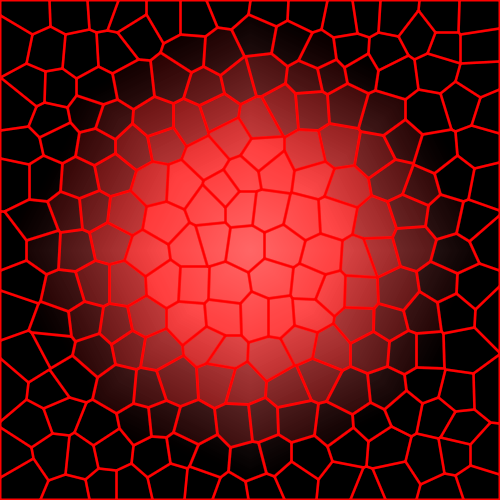
here are some examples of what I mean.
I think that you could possible pull this off if you were to decrease the territ count a bit, and consider a slightly different pattern that is not so ordered in perfect rows.
here are some examples of what I mean.

-

 porkenbeans
- Posts: 2546
- Joined: Mon Sep 10, 2007 4:06 pm


Re: Jumbo Hex Map *V5*
ctgottapee wrote:my two cents:
a. big logos are tacky and irrelevant to a map. so in my map example i de-emphasized them without removing them
b. map size is an issue as constant scrolling sux on big maps with lots of moving. so i present an alternative on my map example to constrict all the pertinent info to one line. don't clutter an elegant map with text
b1. impassable border text is not needed as this map type has existed elsewhere without an explanation needed. also map hover will clue you in on borders.
b2. text for how the cells are named shouldn't be needed as the cell naming needs to be obvious to be useful
b3. storage cells border each other removed
c. gave the cluster node the name of a Queen type. although it doesn't make sense for a hive to have 5 queens, it does fit with a warfare style map where one queen is trying to take over.
d. the comb sizes are too big to be useful when playing. compare it to the large World map which has no 10+ cell terrs.
e. suggestion: make queens/cluster node cells a negative bonus
f. i like the new colors, great work on that in V3
AND THE MOST IMPORTANT THING IS TO NOT LET THE MAP GO LIVE WITHOUT EXTENSIVE PLAY TESTING!
far too many maps have come out lately with great ideas but just bomb when actually played. no need to rush.
my map example, i didn't perfect it, just wanted to show examples, using your orig design
DID NOT SHOW MAP TO KEEP POST SIZE SMALLER
http://img269.imageshack.us/img269/2369/mapalt.jpg
Thanks for the post. If I had not missed it yesterday, I would have posted sooner.
- A) I have to disagree with you on the logos or title of a map. If done properly, they actually add to the feel and the atmosphere of the map quite well. Plus, a map is not 100% game. There is also an artistic feel that needs to be present. Many people did not like the NO THEME map style.
Once we settled on the BEE theme, people became much more responsive and happy. A good looking legend/Title helps with the theme feel.
And if you have seen my other maps, yo u will notice the legend and titles on them. They are larger than others but they blend well and serve a good artistic purpose. (Arms Race / Canada / ConquerMan / Draknor / Rail USA / KOTM / Poker club.
Many of these Titles/headers/legends could be made graphically simpler and smaller, but the feel of the map would also be lost.
B) While I agree that scrolling is a pain, it is necessary in this case due to the size. Removing 30 pixels of vertical height will not help much.
B1) Well here again I need to disagree. You would not believe the number of complaints that pop up around, not understanding a map. There are many times when people don't understand the map and the rules are written there in front of them. Due to the size and the complexity, the IMPASSABLE BORDER line WILL be on the legend. It is needed to explain to people. Also you make a reference to "HOVER" and I assume you mean BoB or Clickible maps. Not everyone has this so that will not be there to help all players.
B2) It might be obvious to you but see B1. There needs to be logic in why things work the way they do. The information is presented well and does not take up much space. It is also needed because the XML requires a naming scheme.
B3) If the "STORAGE CELLS BORDER EACH OTHER" is removed, people will not know that they can attack and then complain.
While I understand the you are trying to save space and get rid of text, the amount of saved space is not worth the decrease in information.
C) Queens were also suggested by several others. But I did not like the idea of having 5 queens. The "node" were originally designed to help players move quickly around the map. They all need to have the same name so the legend text is simpler (All ______ border each other) But if others don't have issue, All Queens border each other is fine by me.
D) I did this for 2 reasons
- 1) There are a lot of bonus regions already. The 12 and 15 group bonuses represent over 120 hexes. Taking away the 12 and 15 would mean there would be TONS MORE of 3,6 and 9. Many more 3,6 and 9's would mean many more quick bonuses. I wanted to have several big bonuses that are really worth getting. These bonuses are not easy at first but they will give a player a big punch later on in the game.
2) The bonus variation on this map is much more rigid than World 2.1 Here the bonus group sizes are 3,6,9,12,and 15. On World 2.1, the bonus groups can be from individual 3(Central America) to entire continent 25 (Africa) and can be more moldable since they are not setup based on a repeating pattern. SO really, World 2.1 has larger groups than this map. This map is just 3X bigger.
F) Thanks
Thanks
WM

-
 WidowMakers
- Posts: 2774
- Joined: Mon Nov 20, 2006 9:25 am
- Location: Detroit, MI


Re: Jumbo Hex Map *V5*
porkenbeans wrote:I like the idea of a very large map, although I think that there might be too many territs here. Once you get the army counts on it, it will look like a sea of numbers, and may be just too hard to distinguish between them. I think that you have gone beyond the playable limit. Also with everything in such perfect rows, it will be somewhat monotonous, to say the least.
I think that you could possible pull this off if you were to decrease the territory count a bit, and consider a slightly different pattern that is not so ordered in perfect rows.
here are some examples of what I mean.
Thanks for the post pork. I agree that there will be tons of numbers and it will be very busy. But that is the point. I will post a version with numbers to let everyoen see. It si crowded but all is viewable.
Also the unsymmetrical shapes actually make it harder to cram in territories. The hex style fits perfectly since the 88's and the hex names are staggered. it makes for good packing.
WM

-
 WidowMakers
- Posts: 2774
- Joined: Mon Nov 20, 2006 9:25 am
- Location: Detroit, MI


Re: Jumbo Hex Map *V5*
I hear where you are coming from, but I have to disagree on your conclusion that you can cram more territs in, because they are in orderly rows. Not true. In the examples That I posted, there are actually 4 different shapes. 3, 4, 5, and 6 sided. They take up all the available space, and are for the most part, of equal size. It makes no difference what shape the territs are. If the relative size are the same, you can create just as many territs either way. It looks like you have just over 300 territs. I think that if you reconsidered lowering the number down to no more than 250, you can make them a little larger and can also make it much more interesting and challenging too, if you went with a layout that was not so organized in straight rows. You would still have the map w/the most territs. but it would have more appeal to the strategists among us.WidowMakers wrote:porkenbeans wrote:I like the idea of a very large map, although I think that there might be too many territs here. Once you get the army counts on it, it will look like a sea of numbers, and may be just too hard to distinguish between them. I think that you have gone beyond the playable limit. Also with everything in such perfect rows, it will be somewhat monotonous, to say the least.
I think that you could possible pull this off if you were to decrease the territory count a bit, and consider a slightly different pattern that is not so ordered in perfect rows.
here are some examples of what I mean.
Thanks for the post pork. I agree that there will be tons of numbers and it will be very busy. But that is the point. I will post a version with numbers to let everyoen see. It si crowded but all is viewable.
Also the unsymmetrical shapes actually make it harder to cram in territories. The hex style fits perfectly since the 88's and the hex names are staggered. it makes for good packing.
WM
Last edited by porkenbeans on Mon Sep 14, 2009 4:14 pm, edited 1 time in total.

-

 porkenbeans
- Posts: 2546
- Joined: Mon Sep 10, 2007 4:06 pm


Re: Jumbo Hex Map *V5*
porkenbeans wrote:I hear where you are coming from, but I have to disagree on your conclusion that you can cram more territs in, because they are in orderly rows. Not true. In the examples That I posted, there are actually 4 different shapes. 3, 4, 5, and 6 sided. They take up all the available space, and are for the most part, of equal size. It makes no difference what shape the territs are. If the relative size are the same, you can create just as many territs either way. It looks like you have just over 300 territs. I think that if you reconsidered lowering the number down to no more than 250, you can make them a little larger and can also make it much more interesting and challenging too, if you went with a layout that was not so organized in straight rows. You would still have the map w/the most territs. but it would have more appeal to the strategists among us.
I have 350 terts here.
Actually it does make a difference on teh shape
1) If you look at your shapes, the borders are all different lengths. That means some are harder and easier to see if there are impassables. The hex map is build on 6 sides and all of them being equal so it is easy to tell what is passable and what is not.
2) If you put 888 in each of those shapes, some would fit and others would not.
3) There is not an easy way to keep territory names and 888 positioned properly. Some shapes are tall, others are wide.
4) There is no naming convention with random shapes. With columns and an organized alpha-numeric, players can easily find the location of a hex. Your images would require a lot more looking and searching for territories. Plus how would you name them. There are not enough letters to just go A,B,C... adn having AAA, AAB, AAC... gets confusing as well.
I also don't know why having different sided shapes with less territories would be more challenging. Please explain
I appreciate the help but I don't think it would gain the map anything as far as GP and just make it smaller and less organized to deal with the territory issues.
WM

-
 WidowMakers
- Posts: 2774
- Joined: Mon Nov 20, 2006 9:25 am
- Location: Detroit, MI


Re: Jumbo Hex Map *V5*
I am not trying to beat a dead horse here. But I want you to understand me. The concerns that you have with naming them, and finding them, is a good point, but it can easily be addressed if you just have different colored regions. then it would be no problem in having enough letters. Also by doing this you actually make it easier to locate a territ. Also if you think about it, the different colors and different shapes would add to the map in the way of bonus possibilities.
I have done a lot of thinking on this, as I myself have thought of making the map with the highest territ count. As a matter of fact my first thoughts were to make it the exact same way as you have, but I thought that it was just too damn boring once I saw what it looked like. I tried different shapes in organized rows as you have. The one that I liked the most was an octagon and square pattern. It was not as boring, but I still was not happy with it. It hit me one day when I was looking at some stained glass and mosaic tile artwork. I thought that if I were to take on the project, That is the way I would need to go. You could still create the highest territ count map, and make it something that had some artistic value as well. Not to mention the added complication in the way of evaluating and playing the map.
Do you know what the highest teriit count map is at CC ? I do NOT think that you need over 300 to top it. 200 -250 should be a number to shoot for in my opinion.

-

 porkenbeans
- Posts: 2546
- Joined: Mon Sep 10, 2007 4:06 pm


Re: Jumbo Hex Map *V5*
How's retirement 
so i'm not a huge fan But i'm 100% for having such a grand sized map
-colours are a perfect choice not colour blind issues with that one
-as i mentioned in a pm i had my qualms but with all the "buzz" and the added bee theme
its nothing but thumbs up
-your numbering system is better then before a lot more easy to follow
-only nit pick is m's and n's look simialar (maybe try and make the text stand out a little more
but it not a critical thing imo
-Gameplay well with no rules other than a standard gameplay is perfect and additions would
ruin in all important info is nicely setup on the legend and nothing is questionable
as I'm not a big Unlimited player this map will require a neat stratgy and a good killing spree
two of the main things that will make this peoples favorites goodjob WM
ps sorry for not having anything bad to say there isn't any major issues i can see
-

 Danyael
- Posts: 352
- Joined: Fri Jul 04, 2008 4:26 pm
- Location: Winnipeg, Manitoba


Re: Jumbo Hex Map *V5*
Thanks again pork but we are going to have to disagree here. Feel free to start your stained glass map. If you need any help or ideas, I will try to help. We will be sticking with the hexes (Bee Theme) and moving forward.porkenbeans wrote:I am not trying to beat a dead horse here. But I want you to understand me. The concerns that you have with naming them, and finding them, is a good point, but it can easily be addressed if you just have different colored regions. then it would be no problem in having enough letters. Also by doing this you actually make it easier to locate a territ. Also if you think about it, the different colors and different shapes would add to the map in the way of bonus possibilities.
I have done a lot of thinking on this, as I myself have thought of making the map with the highest territ count. As a matter of fact my first thoughts were to make it the exact same way as you have, but I thought that it was just too damn boring once I saw what it looked like. I tried different shapes in organized rows as you have. The one that I liked the most was an octagon and square pattern. It was not as boring, but I still was not happy with it. It hit me one day when I was looking at some stained glass and mosaic tile artwork. I thought that if I were to take on the project, That is the way I would need to go. You could still create the highest territ count map, and make it something that had some artistic value as well. Not to mention the added complication in the way of evaluating and playing the map.
Do you know what the highest teriit count map is at CC ? I do NOT think that you need over 300 to top it. 200 -250 should be a number to shoot for in my opinion.
Thanks
WM

-
 WidowMakers
- Posts: 2774
- Joined: Mon Nov 20, 2006 9:25 am
- Location: Detroit, MI


Re: Jumbo Hex Map *V5*
Danyael wrote:How's retirement
so i'm not a huge fan But i'm 100% for having such a grand sized map
-colours are a perfect choice not colour blind issues with that one
-as i mentioned in a pm i had my qualms but with all the "buzz" and the added bee theme
its nothing but thumbs up
-your numbering system is better then before a lot more easy to follow
-only nit pick is m's and n's look simialar (maybe try and make the text stand out a little more
but it not a critical thing imo
-Gameplay well with no rules other than a standard gameplay is perfect and additions would
ruin in all important info is nicely setup on the legend and nothing is questionable
as I'm not a big Unlimited player this map will require a neat stratgy and a good killing spree
two of the main things that will make this peoples favorites goodjob WM
ps sorry for not having anything bad to say there isn't any major issues i can see
Retirements fine lol
Thanks for the post. I can look into the M vs N fonts stuff. I have a few ideas already.
WM

-
 WidowMakers
- Posts: 2774
- Joined: Mon Nov 20, 2006 9:25 am
- Location: Detroit, MI


Re: Jumbo Hex Map *V5*
Thanks WM. btw, what IS the map w/most territs at CC ?WidowMakers wrote:Thanks again pork but we are going to have to disagree here. Feel free to start your stained glass map. If you need any help or ideas, I will try to help. We will be sticking with the hexes (Bee Theme) and moving forward.porkenbeans wrote:I am not trying to beat a dead horse here. But I want you to understand me. The concerns that you have with naming them, and finding them, is a good point, but it can easily be addressed if you just have different colored regions. then it would be no problem in having enough letters. Also by doing this you actually make it easier to locate a territ. Also if you think about it, the different colors and different shapes would add to the map in the way of bonus possibilities.
I have done a lot of thinking on this, as I myself have thought of making the map with the highest territ count. As a matter of fact my first thoughts were to make it the exact same way as you have, but I thought that it was just too damn boring once I saw what it looked like. I tried different shapes in organized rows as you have. The one that I liked the most was an octagon and square pattern. It was not as boring, but I still was not happy with it. It hit me one day when I was looking at some stained glass and mosaic tile artwork. I thought that if I were to take on the project, That is the way I would need to go. You could still create the highest territ count map, and make it something that had some artistic value as well. Not to mention the added complication in the way of evaluating and playing the map.
Do you know what the highest teriit count map is at CC ? I do NOT think that you need over 300 to top it. 200 -250 should be a number to shoot for in my opinion.
Thanks
WM

-

 porkenbeans
- Posts: 2546
- Joined: Mon Sep 10, 2007 4:06 pm


Re: Jumbo Hex Map *V5*
porkenbeans wrote:Thanks WM. btw, what IS the map w/most territs at CC ?
Conquerman has 151
But my other map will have more than both (once the XML update happens)
Name: Maze Craze
# of Territories: 454 TOTAL – 192 Start Neutral

-
 WidowMakers
- Posts: 2774
- Joined: Mon Nov 20, 2006 9:25 am
- Location: Detroit, MI


Re: Jumbo Hex Map *V5*
yeah i guess making coments doesn't help much once the map is designed as it just becomes a defense course
of course the creator has every right. for example, you like the microsot approach to legends, i like the apple approach; who is to say who is right accept looking at play stats
i really don't understand how you can defend giant logos though. there almost needs to be a rule against it. but then again, i guess the players vote by play.
'cHANCE favors the prepared mind' Louis Pasteur | Latest Tourney Wins:
Don't Take Too Long 2x2, Freemium with a Premium doubles tournament -RunnerUp
Don't Take Too Long 2x2, Freemium with a Premium doubles tournament -RunnerUp
-

 ctgottapee
- Posts: 122
- Joined: Fri Feb 23, 2007 7:31 pm
- Location: north of the DMZ


Re: Jumbo Hex Map *V5*
While I like porkenbeans idea's as well, I like this map too. Keep it up. Should make for very interesting game play.

-

 phantomzero
- Posts: 827
- Joined: Fri Dec 28, 2007 7:13 pm
- Location: 2742 high score 122710


Re: Jumbo Hex Map *V5*
porkenbeans wrote:WOW, 454 ?
That is fricken awesome.
It will be interesting. But most many of them 192 are neutral and they respawn each turn.
Here is the thread if you are interested.
viewtopic.php?f=242&t=46602

-
 WidowMakers
- Posts: 2774
- Joined: Mon Nov 20, 2006 9:25 am
- Location: Detroit, MI


Re: Jumbo Hex Map *V5*
Is there enough room for 3 digit numbers on the small map ? if there is, I do not believe that there could ever be a map w/more territs, ...unless they increase the size restrictions on maps. 

-

 porkenbeans
- Posts: 2546
- Joined: Mon Sep 10, 2007 4:06 pm


Re: Jumbo Hex Map *V5*
Any other comments here?
To-Do
WM
- 1) GFX?
2) Legend?
3) Names?
4) Game Play?
To-Do
- 1) Try to make the N and M letters look more distinct.
2) Reword some of the legend text.
WM

-
 WidowMakers
- Posts: 2774
- Joined: Mon Nov 20, 2006 9:25 am
- Location: Detroit, MI


Re: Jumbo Hex Map *V5*
I don't really like the dotty pattern around the exterior. I'm not sure what should replace it but it gives off a tacky vibe.
-

 Evil DIMwit
- Posts: 1616
- Joined: Thu Mar 22, 2007 1:47 pm
- Location: Philadelphia, NJ


Who is online
Users browsing this forum: No registered users


